Pain Management Booking Website Template
Relief is a single-column landing page template built for chronic pain specialty clinics. It guides patients through a five-step educational journey before inviting them to book a consultation. With an award badge header, an interactive booking form, and a soft Cloud Canvas color system, it builds the trust that pain patients need before taking that next step.
by Rocket studio
Quick summary
Relief is a single-column flow landing page designed for chronic pain centers. It opens with a credential-led header and unfolds as a numbered patient journey. An interactive booking form sits at the midpoint, and a secondary email-capture path meets patients who are still researching. The template is built to earn trust before it asks for anything.
Who this template is for
This template is built for chronic pain specialty clinics and pain management practices in the United States. It speaks directly to providers whose patients have already tried other routes without lasting results.
- Pain management physicians and interventional pain specialists who offer minimally invasive procedures
- Clinic marketing teams building a patient acquisition page for nerve blocks, spinal cord stimulators, or regenerative injections
- Healthcare practice owners who want a structured, educational page that converts cautious, research-heavy patients into booked consultations
What problem this template solves
Chronic pain patients arrive at a new provider carrying accumulated skepticism. They have been dismissed, undertreated, or handed another prescription. A generic clinic page does nothing to address that baggage. This template solves that.
- It validates the patient experience before making any ask, using an educational step-by-step format that shows understanding first
- It replaces vague "we can help" messaging with a clear, numbered treatment journey that removes the fear of the unknown
- It offers two conversion paths, an immediate booking form and a low-commitment guide download, so patients at different stages of readiness are both served
What you get with this template
You get a fully structured, single-column landing page with every section pre-built and purposefully ordered. No placeholder layouts or blank content zones.
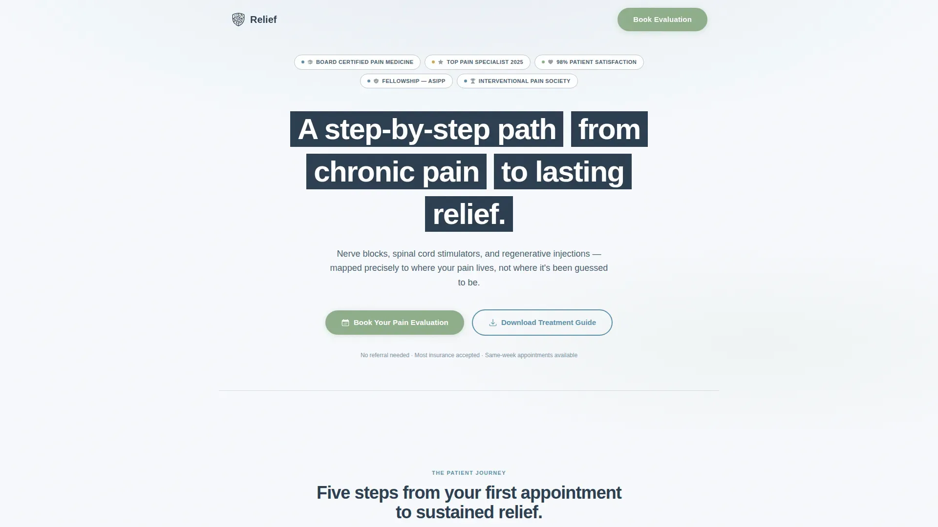
- A credential-forward hero section with an award badge row, headline, and primary call-to-action button
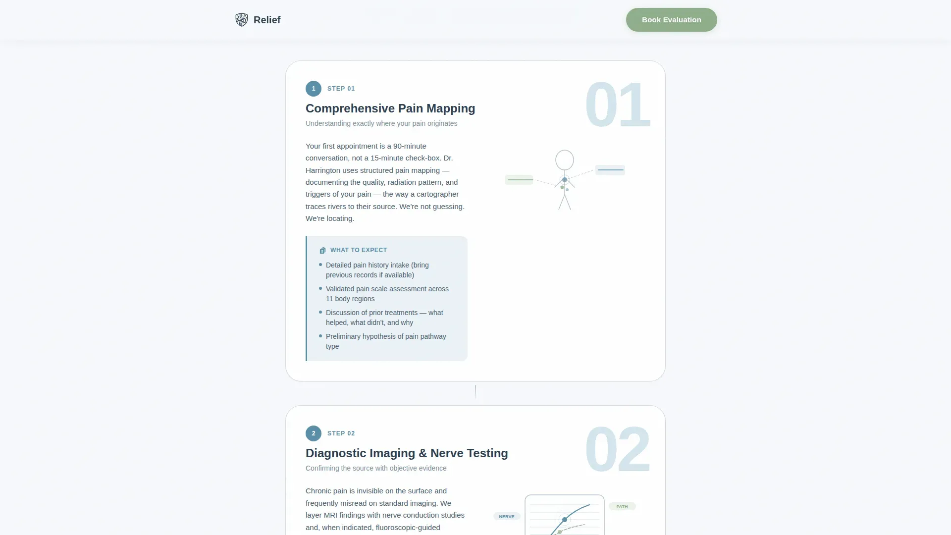
- A five-step illustrated patient journey with "What to Expect" callout boxes for each stage
- An interactive mid-page booking form with a visual body map selector, duration dropdown, prior-treatment checkboxes, and appointment window picker
- A secondary email-capture section for the "Download Our Treatment Guide" path
- A three-testimonial social proof section with specific patient outcomes and a linear single-row footer
Feature list
This section covers the core functional and design components included in the Relief template.
Five-Step Patient Journey Guide
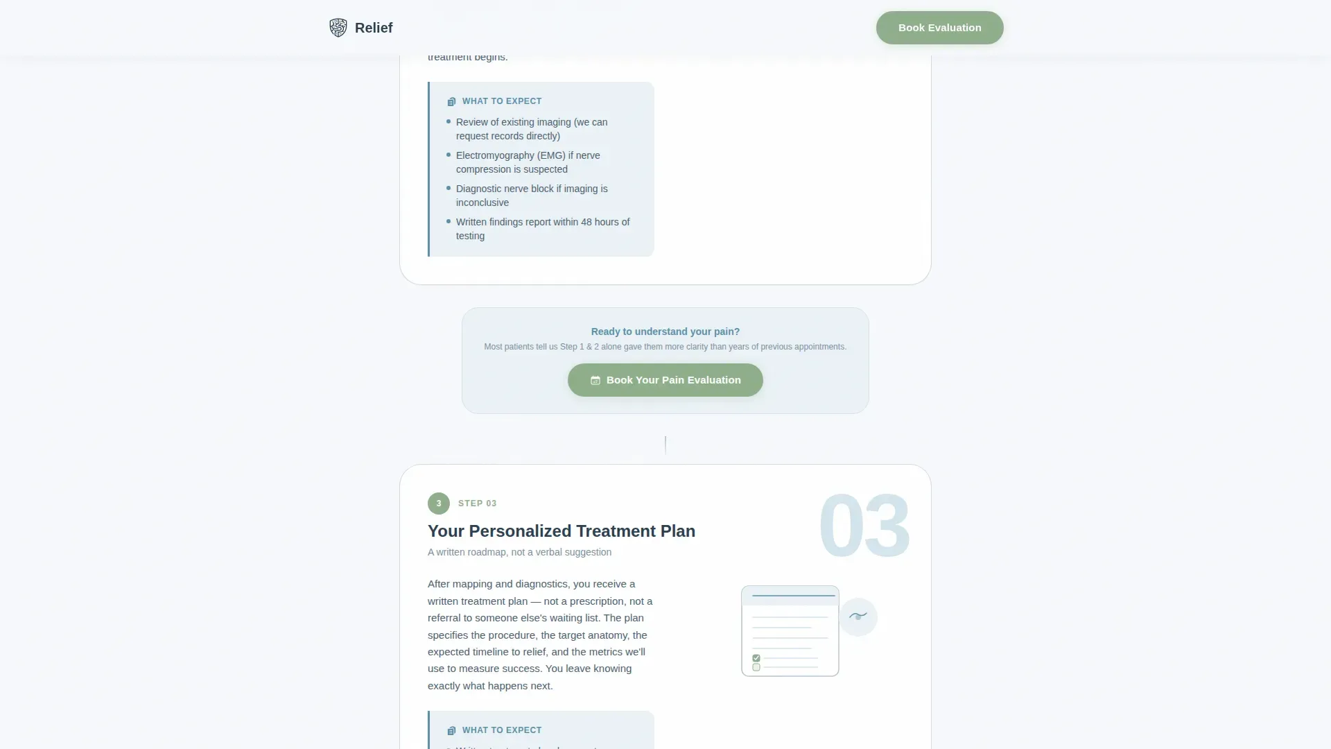
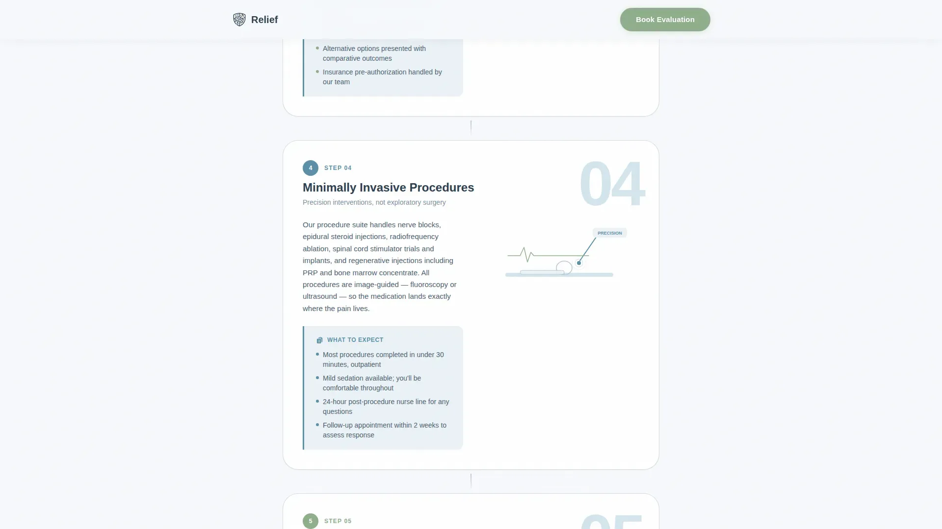
The page scrolls as a numbered sequence: Comprehensive Pain Mapping, Diagnostic Imaging and Nerve Testing, Your Personalized Treatment Plan, Minimally Invasive Procedures, and Ongoing Recovery and Adjustment. Each step includes a short paragraph, a simple line illustration, and a "What to Expect" callout box. The rhythm is deliberate and calm, teaching before it ever asks.
Interactive Mid-Page Booking Form
The booking form appears after Step 2, where educational trust has already been established. It collects pain location via a visual body map selector, pain duration via a dropdown with week, month, and year options, prior treatments via a checkbox list, and a preferred appointment window. This placement is intentional and grounded in the patient decision journey.
Dual Conversion Path Design
A primary "Book Your Pain Evaluation" call-to-action appears beneath the header badges and again after Step 2. A secondary "Download Our Treatment Guide" email-capture section serves patients who are not yet ready to book. Both paths are present and purposefully positioned to capture patients at different readiness levels.
Award Badge Credential Header
The hero section opens with a row of board certifications, regional honors, patient satisfaction seals, and a fellowship insignia. These appear before the headline and before any call-to-action. Credentials are positioned as trust signals rather than decorative elements, dissolving skepticism before the patient reads a single word of clinic copy.
Cloud Canvas Color System
The template uses a carefully defined four-color palette: cirrus white (#F7F9FC) for backgrounds, deep slate (#2C3E50) for body text, reassurance blue (#5B8FA8) for primary elements, and gentle affirmation sage (#8FAE8B) reserved exclusively for calls to action and progress indicators. Every color choice reflects clinical warmth, not clinical coldness.
Scroll-Reveal Step Animations
The step counter and each journey section use scroll-reveal animations to pace the reading experience. Hover states are present on interactive elements. The animation level is intentionally moderate, calm enough for a patient in discomfort, engaging enough to maintain focus.
Page sections overview
| Section | Purpose |
|---|---|
| Header Badge Row | Displays credentials and trust seals before headline |
| Hero Headline Block | Anchors the promise with a single clear statement |
| Primary call to action Button | Opens booking path directly from the hero |
| Step 1: Pain Mapping | Introduces comprehensive pain pathway assessment |
| Step 2: Imaging & Testing | Explains diagnostic imaging and nerve testing process |
| Mid-Page Booking Form | Captures appointment intent at peak trust moment |
| Step 3: Treatment Plan | Describes personalized minimally invasive plan creation |
| Step 4: Procedures | Outlines the minimally invasive procedure stage |
| Step 5: Recovery Support | Covers ongoing recovery and plan adjustment |
| Guide Email Capture | Collects email for patients not ready to book |
| Patient Voices Section | Shows three testimonials with specific outcomes |
| Linear Footer Row | Delivers single-row footer with essential links |
Design & branding system
The design language is Educational Guide, built on the Cloud Canvas color system. It feels like a consultation room with morning light through sheer curtains: clinical enough to signal competence, warm enough to invite honesty.
- Typography uses Plus Jakarta Sans for all headings and DM Sans for body text, pairing structure with approachability
- Section dividers use overcast gray (#B8C4D0) as thin, quiet rules that separate content without creating visual noise
- Sage green (#8FAE8B) is reserved strictly for bookable actions and progress indicators, creating a consistent visual language that tells patients exactly where to act
Mobile & speed optimization
This template was designed with a mobile-first priority. Chronic pain patients often research during flare-ups and sleepless nights, reaching for their phone rather than a laptop.
- The single-column flow layout adapts naturally to smaller screens without requiring a separate mobile layout
- Server components handle static sections for fast initial load, while client components are used only where interactivity is required, such as the booking form and email capture
- Scroll-reveal animations are calibrated to be smooth without being resource-heavy, supporting a comfortable reading experience on mobile devices
How this template helps you convert
The Relief template is structured around one core insight: chronic pain patients need to feel understood before they will act. Every layout decision supports that goal.
- The award badge header handles skepticism at first glance, giving credentials a front-row position before the patient reads anything else
- The five-step journey educates before it asks, so by the time the booking form appears after Step 2, the patient already understands the process and trusts the provider
- The dual conversion path means no patient leaves empty-handed, either they book an evaluation or they download the treatment guide and enter a follow-up relationship
Other information about this template
This template is built specifically for the United States market. All date formats, currency, and geographic references follow US conventions.
- The booking form is designed for US-based scheduling workflows, with appointment windows formatted for US time and date standards
- The Patient Voices section includes three testimonials structured around specific pain types and measurable outcomes, reflecting real patient profiles like the warehouse supervisor with a herniated disc or the retiree managing fibromyalgia
- The footer follows Pattern 1, a linear single-row layout, keeping the end of the page clean and uncluttered
- The page is built with no hero photography of smiling patients, replacing stock imagery with earned credentials and illustrated journey steps
Theme
Educational Guide
Creative direction
Step-by-Step Guide
Color system
Cloud Canvas
Style
Single Column Flow
Direction
Booking/Scheduling
Page Sections
Five-step Educational Patient Journey
Interactive Mid-page Booking Form
Dual Conversion Path Layout
Award Badge Credential Header
Cloud Canvas Color System
Scroll-reveal Step Animations
Related questions
Who is this landing page template designed for?
Can I customize the five-step journey for my clinic's process?
What does the booking form collect from patients?
What is the purpose of the treatment guide email-capture section?
Does the template work for a solo practitioner as well as a group practice?



