Relocation Consulting Landing Page Template
Relocate is a click-through landing page template built for relocation consulting firms managing complex international moves. It uses a zigzag layout to pair consultant profiles with client outcome stories, building trust through human proof. The Corporate Precision design uses deep charcoal and polished amber to project calm authority. A single primary call to action drives visitors toward a consultation booking page.
by Rocket studio
Quick summary
Relocate is a single-page template for relocation consulting firms that handle high-stakes international moves. The zigzag layout alternates consultant portraits with client stories, stacking real proof as visitors scroll. Deep charcoal and warm amber set a boardroom-ready tone. Every section points toward one goal: earning the click to a consultation booking page.
Who this template is for
This template is built for specialist firms that manage the full arc of an international relocation, not just the logistics. It speaks directly to the companies and consultants who coordinate visa timelines, school placements, and family transitions alongside career moves.
- Global mobility managers at mid-sized technology companies relocating engineering teams to cities like Munich or Singapore
- Human resources directors at pharmaceutical firms coordinating research team moves across borders
- Relocation consulting practices serving C-suite executives and their families who need full-service, white-glove transition support
What problem this template solves
Relocation consulting is a trust business. Prospective clients arrive with layered anxiety about career disruption, family upheaval, and processes they have never navigated before. A generic service page cannot carry that weight. This template solves the credibility gap by replacing abstract service lists with paired human stories told at scroll pace.
- Visitors cannot quickly assess whether a firm has handled a move like theirs before; the zigzag consultant-and-client pairing answers that directly
- A single undifferentiated page loses high-intent visitors who want process clarity; the secondary timeline download link captures those visitors before they leave
- Most consulting pages bury the call to action; this template repeats the primary action prompt at every zigzag junction so momentum is never lost
What you get with this template
You get a fully structured single-page layout that sequences human proof, service context, and conversion prompts in a deliberate order. Every section is pre-designed for the relocation consulting use case, so you are not adapting a generic business template.
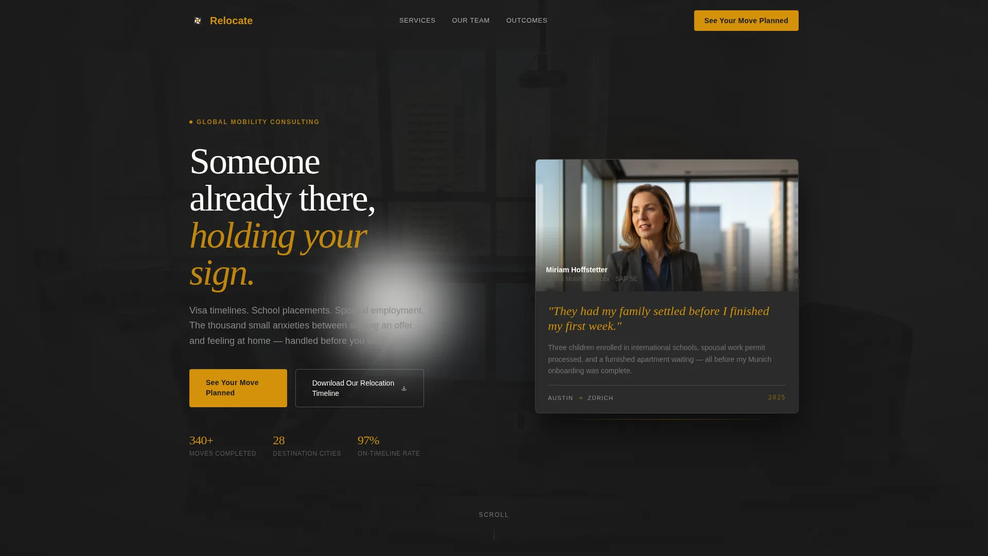
- A testimonial card header featuring a pull-quote in oversized amber type, a consultant photograph, and a city-pair itinerary stamp anchoring the bottom
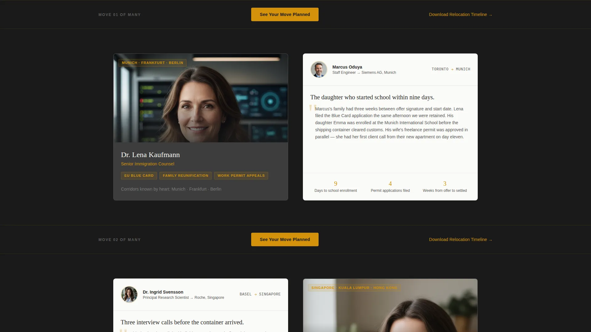
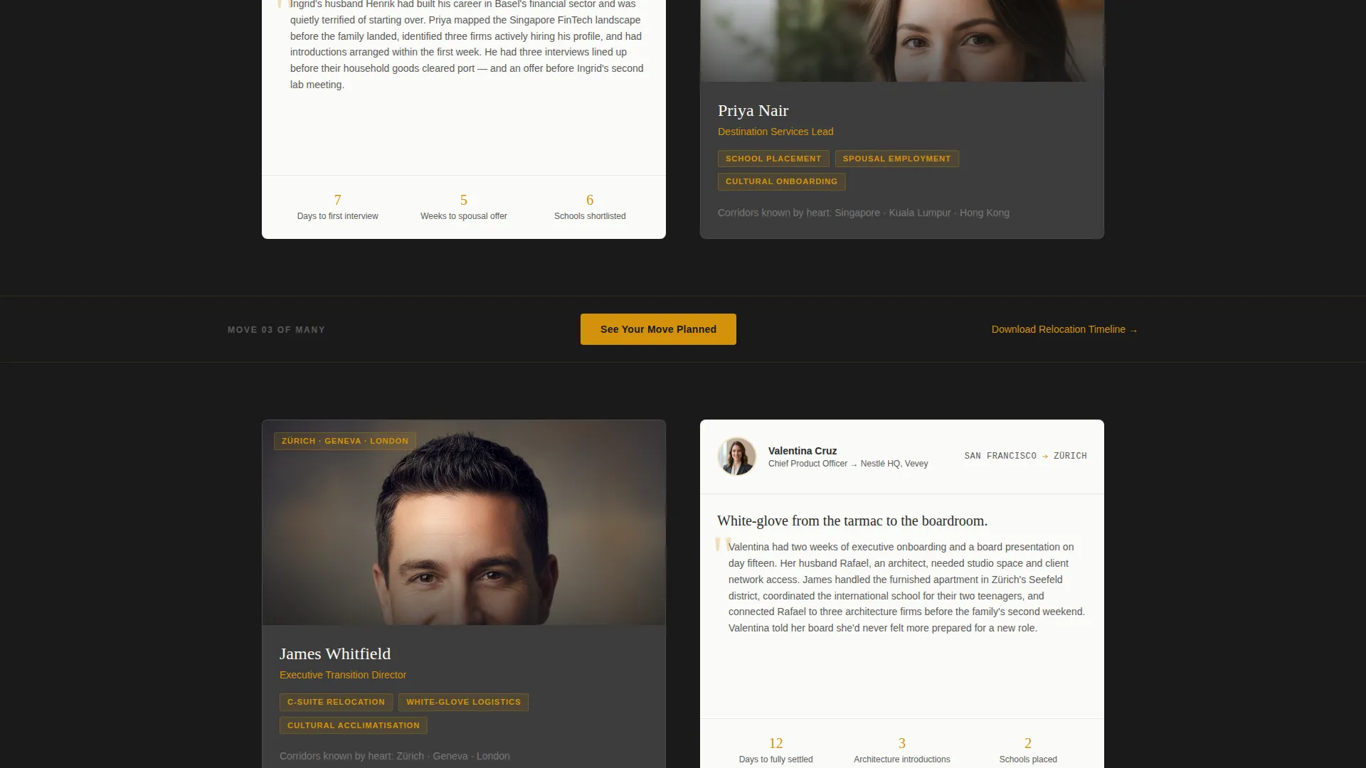
- A repeating zigzag section pairing specialist portraits and expertise descriptions on one side with client outcome narratives on the other
- A primary click-through call to action and a secondary text link designed to capture visitors at different stages of readiness
Feature list
This template is built around a specific set of design and layout decisions that work together to build trust and drive click-through on a relocation consulting page.
Testimonial Card Header
The header opens with a real-frame testimonial rather than a hero banner. It features a consultant photograph set in a glass-walled conference room context, a pull-quote in oversized amber type, and a city-pair stamp such as "Austin to Zürich" at the base. The card floats against a charcoal background with a subtle paper-edge shadow.
Zigzag Consultant and Client Layout
Each alternating section pairs a relocation specialist's portrait and expertise block on one side with a client outcome narrative on the other. The rhythm builds a layered body of proof as visitors scroll, making it feel like introductions at a dinner party rather than a list of credentials.
Repeating Amber Call to Action
The primary call to action, "See Your Move Planned," appears first beneath the header testimonial and then repeats at each zigzag junction. It is always rendered in amber against charcoal so it reads immediately without disrupting the editorial flow of the surrounding content.
Secondary Timeline Download Link
A text-based secondary link, "Download Our Relocation Timeline," appears for visitors who are not yet ready to book a consultation. It bridges high-intent readers into a follow-up sequence by offering a week-by-week process map without requiring a form on this page.
Corporate Precision Color System
The palette uses deep boardroom charcoal for backgrounds and typography, polished amber exclusively on calls to action and pull-quotes, and crisp contract white to create breathing room between content blocks. The result is a visual hierarchy that feels authoritative and calm rather than promotional.
City Corridor Specificity
Each specialist block is written to name the city corridors that consultant knows well. This specificity reassures prospective clients that the firm has done their exact move before, turning geographic familiarity into a conversion argument.
Page sections overview
| Section | Purpose |
|---|---|
| Testimonial Card Header | Opens with peer proof and a city-pair anchor to establish immediate credibility |
| Primary call to action Block | Places the first "See Your Move Planned" prompt directly beneath the header |
| Zigzag Pair One | Introduces first specialist portrait alongside a client outcome narrative |
| Zigzag Pair Two | Introduces second specialist and client story with destination city specifics |
| Zigzag Pair Three | Deepens proof with a third consultant and family transition narrative |
| Repeating call to action Junctions | Amber call to action block appears at each zigzag break to capture readiness |
| Secondary Download Link | Text link offering the relocation timeline for high-intent, not-yet-ready visitors |
Design & branding system
The design language is called Corporate Precision. It draws its authority from restraint: dark surfaces, heavy paper-stock typography, and a single warm accent color that acts like a brass nameplate catching light. Nothing competes for attention except the elements that are meant to convert.
- Charcoal (#2D2D2D) dominates backgrounds and primary typography; warm briefing-paper gray (#5C5C5C) handles secondary text; amber (#D4920B) appears only on calls to action, pull-quotes, and progress indicators; contract white (#FAFAF7) creates space between blocks
- Photography direction favors candid professional settings, a global mobility director photographed mid-sentence in a glass-walled conference room rather than posed stock imagery
- Typography uses clean sans-serif for names and titles, with oversized amber type reserved for pull-quotes so they carry visual weight without shouting
Mobile & speed optimization
The zigzag layout is structured so that alternating left-right blocks reflow into a clean vertical stack on smaller screens. The consultant portrait always appears above its paired client narrative, preserving the storytelling sequence on any device.
- Each content block is self-contained, so the stacked mobile view reads as a natural top-to-bottom sequence of introductions without losing the pairing logic
- Amber call to action buttons remain visually distinct at every breakpoint, ensuring the primary conversion prompt is never buried or overlooked on a phone screen
How this template helps you convert
The page is built as a click-through, meaning its only job is to earn a single confident click toward a consultation booking page. Every layout decision supports that goal.
- The testimonial card header leads with a peer voice rather than a service claim, so visitors encounter proof before they encounter a pitch, lowering resistance from the first scroll
- The zigzag pairing of specialists and client outcomes answers the buyer's most specific question, "Has this firm handled a move like mine?", by stacking destination-specific stories that grow more detailed and personal as the visitor scrolls further
Other information about this template
This template is part of a professional services collection focused on specialty consulting. The zigzag alternating structure and click-through page direction make it well suited for any high-trust consulting practice that leads with human outcomes rather than service catalogs.
- The page type is a single-page landing page, not a multi-page website, so all content is sequenced within one scroll flow
- The secondary download link is designed to work without a form on the landing page itself, keeping the page clean while still capturing high-intent visitors
- The template style, Corporate Precision with charcoal and amber, translates well across print collateral and digital channels, giving a relocation consulting brand a consistent visual identity
Theme
Educational Guide
Creative direction
Case Study Narrative
Color system
Ink & Paper
Style
Zigzag/Alternating
Direction
Click-Through
Page Sections
Testimonial Card Header with Pull-quote
Zigzag Consultant and Client Pairing
Repeating Click-through Call to Action
Secondary Timeline Download Link
Corporate Precision Color System
City Corridor Specificity Blocks
Related questions
What kind of business is this template designed for?
Does this template include a contact form or booking widget?
Can I customize the consultant portraits and client stories?
How many zigzag sections does this template include?
Is the pull-quote in the header editable?



