Stem Cell Therapy Medical Tourism Landing Page Template
Renew is a single-page landing page template built for cross-border stem cell therapy clinics. It guides research-mode visitors through a Problem-to-Solution arc, using expandable comparison tables, country-by-country breakdowns, and transparent cost sections. A floating testimonial card opens the page, and dual conversion paths offer a guide download and a medical review booking.
by Rocket studio
Quick summary
Renew is a content-led landing page template for medical tourism clinics offering regenerative stem cell treatments. The design follows a warm, clinical-lite Healing Space aesthetic. Visitors arrive in their current reality of exhausted options and scroll toward clarity, guided by comparison tables, patient stories, and cost breakdowns before reaching two clear conversion paths.
Who this template is for
This template is built for clinic networks and medical tourism coordinators who need to reach patients who have already tried conventional treatments at home. It suits organizations offering regenerative therapies across multiple international destinations and needing to earn patient trust before asking for any personal information.
- Cross-border stem cell therapy clinics serving English-speaking patients
- Medical tourism coordinators presenting multi-destination treatment options
- Regenerative medicine practices targeting adults with degenerative conditions and parents researching pediatric protocols
What problem this template solves
Patients researching stem cell therapy abroad are overwhelmed. They face conflicting search results, unanswered questions about safety, and no clear way to compare clinics, cell sources, or destination countries. Most pages either oversell without evidence or bury the useful details behind a lead form. Renew flips that pattern.
- Visitors arrive skeptical and leave with structured, cited information before any ask is made
- The comparison-first layout removes the "is this legitimate?" friction that causes research-mode visitors to bounce
- Dual conversion paths serve both ready-to-act visitors and those still in deep research mode
What you get with this template
Renew delivers a fully structured single-page layout with high interactivity and a clear content hierarchy. Every section is built to move the visitor one step closer to trusting the clinic without pressuring them before they are ready.
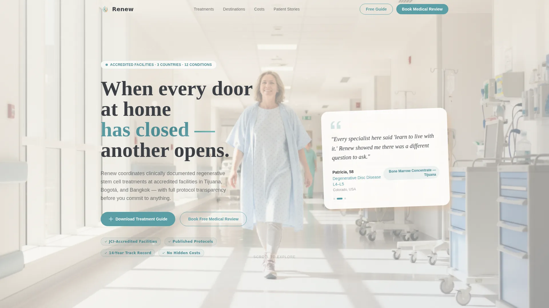
- A hero section with a floating, oversized testimonial card and a slow-dissolving cinematic background
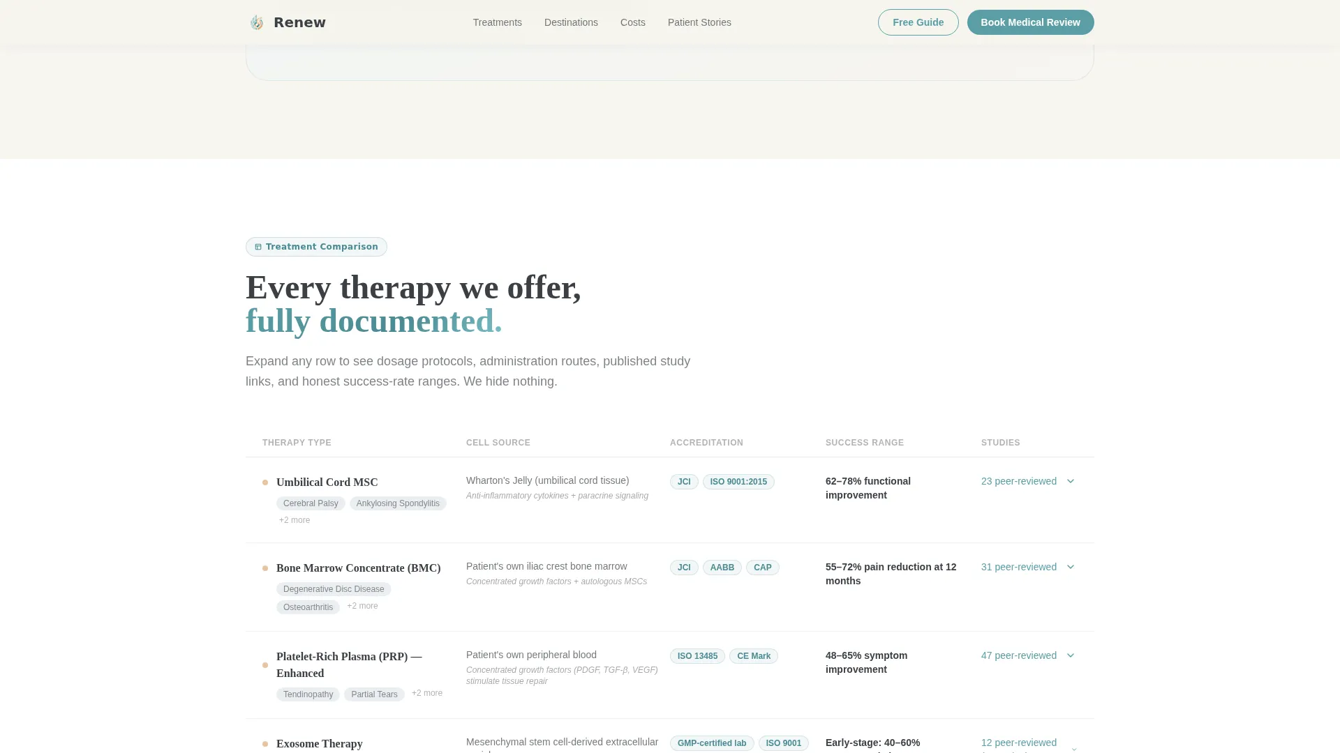
- Expandable treatment comparison tables covering cell sources, protocols, accreditation standards, and study links
- A dual call-to-action section with a two-field guide download form and a link to a longer medical review intake form
Feature list
This template is built around several purposeful design and content features. Each one serves the core goal of turning a hesitant researcher into a confident patient.
Floating Testimonial Hero Card
The hero opens with a real patient quote rendered as an oversized pull-quote card. The card includes first name, age, condition, and country of origin. It floats just off-center over a slow-dissolving background that cycles through muted recovery room and travel imagery, creating immediate emotional connection without feeling staged.
Expandable Treatment Comparison Tables
The core of the page is an interactive comparison table covering therapy types, cell sources such as umbilical cord tissue and bone marrow concentrate, accreditation standards, and country-level regulatory frameworks. Each table row is scannable but can be expanded to reveal published study links, dosage protocols, and success-rate ranges.
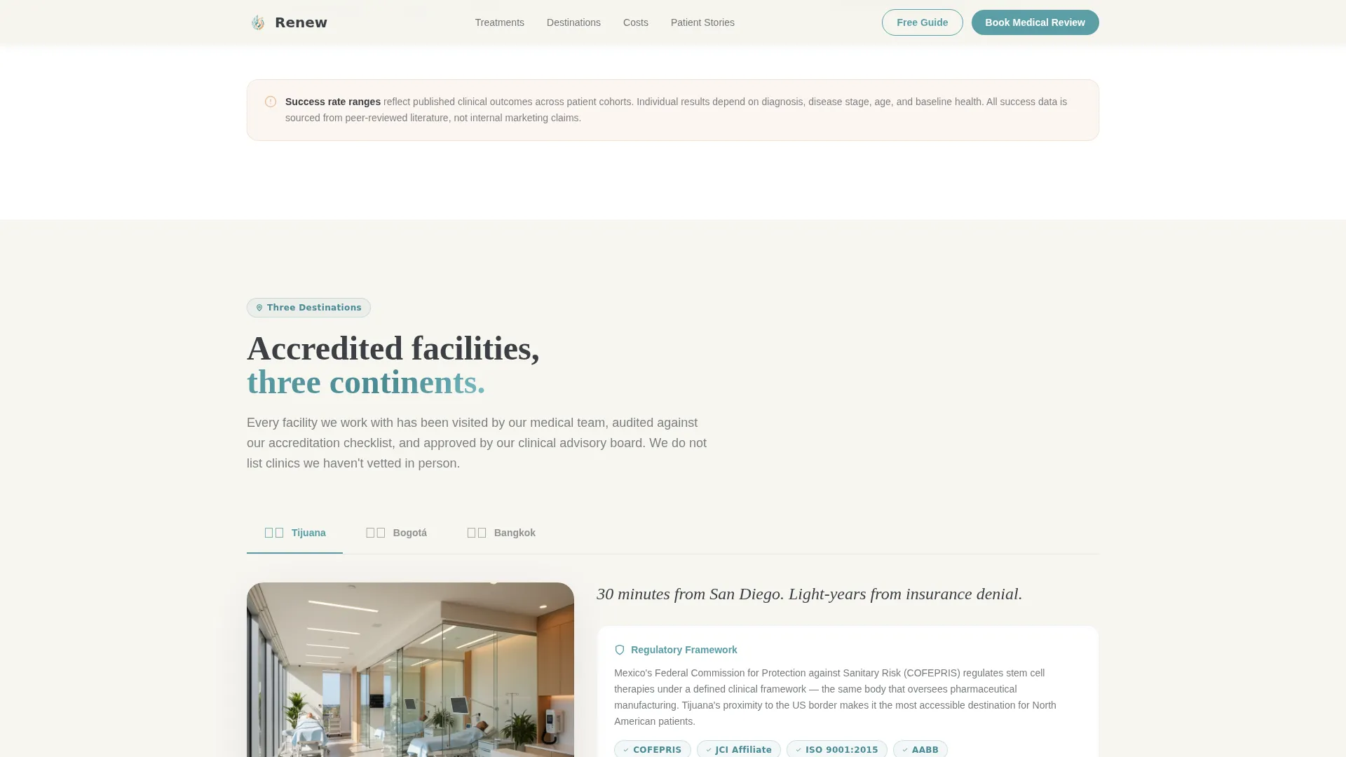
Country-by-Country Destination Framework
A tabbed comparison section places Tijuana, Bogotá, and Bangkok side by side. Visitors can switch between destinations to review facility accreditation, regulatory context, and logistical considerations without leaving the page.
Dual Conversion Path Section
The conversion section offers two paths simultaneously. The primary path is a two-field form gating a downloadable Treatment Comparison Guide, asking only for email and primary condition via a dropdown of twelve diagnoses. The secondary path links to a fuller medical review intake form requesting medical history, prior imaging, and preferred destination.
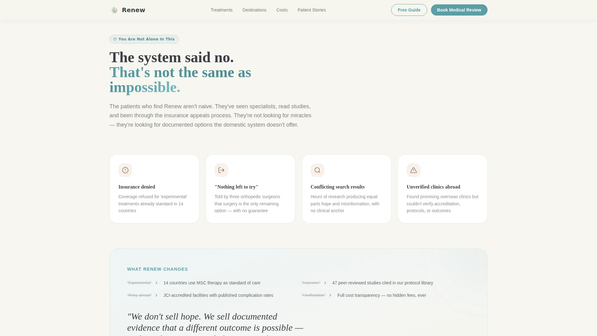
Problem Arc Copy Structure
The page opens in the visitor's current reality and builds toward clarity. An empathy-first problem section acknowledges failed treatments, insurance denials, and late-night research sessions before introducing solutions. This narrative arc keeps readers scrolling because they feel understood before they feel sold to.
Cost Transparency and Patient Journey Sections
Dedicated sections present cost ranges in USD with no hidden framing, alongside patient journey timelines and post-treatment follow-up schedules. These sections answer the "how much and what happens next" questions that typically push patients to abandon a page.
Page sections overview
| Section | Purpose |
|---|---|
| Hero Testimonial Card | Opens with patient quote over dissolving cinematic background |
| Problem Arc Copy | Acknowledges exhausted options with empathy-first framing |
| Treatment Comparison Table | Compares cell sources, protocols, accreditation, and study links |
| Country Destination Framework | Side-by-side tab view of Tijuana, Bogotá, and Bangkok |
| Cost Transparency Breakdown | USD cost ranges with no hidden figures |
| Dual Call to Action | Guide download form and medical review booking link |
| Footer | Horizontal flow footer pattern with supporting links |
Design & branding system
The visual identity follows a Healing Space theme. Every color and type choice is deliberate: warm enough to feel human, restrained enough to feel credible. The palette is called Cloud Canvas and uses soft, muted tones throughout.
- Backgrounds use cumulus white (#F7F5F0) and atmospheric mist (#D6DDE3); body text sits in calm charcoal (#3B3F45); warm skin tone (#E8C4A2) provides accent warmth
- Teal (#5B9EA6) appears only on calls to action, progress indicators, and linked text, so every instance feels intentional and draws the eye naturally
- Typography pairs DM Sans for body text with Fraunces serif for headings, balancing approachability with clinical authority
Mobile & speed optimization
The template is built desktop-first to match the research-mode behavior of its primary audience: adults on laptops doing deep comparison work late at night. Full mobile support is included so no visitor is turned away regardless of device.
- Static sections use server components for efficient rendering; interactive table and form elements are handled by client components
- Scroll-blur background animation, staggered section entrances, and expandable table rows are all included and optimized for smooth playback on modern devices
How this template helps you convert
Renew earns conversion by giving clinical depth away before asking for anything. The entire page structure is designed to resolve doubt at every scroll point, so by the time a visitor reaches the form, they are answering "which protocol fits me?" rather than "is this real?"
- The hero testimonial card creates immediate emotional credibility with a specific, named patient story, reducing bounce before the visitor even begins reading
- Comparison tables and country frameworks replace generic claims with structured, expandable evidence, building the kind of trust that makes a guide download feel like a natural next step rather than a data transaction
Other information about this template
Renew is designed for the specific research depth that stem cell therapy medical tourism requires. It goes further than a typical health services landing page by treating the visitor as an informed adult making a serious medical decision.
- The dropdown condition field in the guide download form covers twelve of the most frequently treated diagnoses, helping clinics segment interest from the first conversion point
- Social proof elements include patient testimonials with name, age, condition, and country of origin alongside accreditation badges and published study citations
- The footer follows a horizontal flow pattern, keeping the page feeling organized and complete without adding visual weight at the bottom
Theme
Healing Space
Creative direction
Problem→Solution Arc
Color system
Cloud Canvas
Style
Comparison Table
Direction
Content/Resource
Page Sections
Floating Testimonial Hero Card
Expandable Treatment Comparison Tables
Country Destination Tab Switcher
Dual Conversion Path Section
Cost Transparency and Journey Timelines
Problem Arc Narrative Structure
Related questions
What kind of clinic should use the Renew template?
Can I edit the comparison table to reflect my own treatment protocols?
How does the dual conversion path work?
Is this template suitable for a single-destination clinic?
What makes this different from a standard medical services landing page?



