Repair — Certified Appliance Technician Landing Page Template
Diagnose is a comparison-table landing page built for a same-day Sydney appliance repair service. It leads with a stats dashboard, guides visitors through honest repair-versus-replace tables for every major appliance, and closes with a three-step booking form. The result is a calm, trustworthy page that turns a stressful breakdown into a confident booking decision.
by Rocket studio
Quick summary
Diagnose is a single-page template designed for a same-day appliance repair service operating across Greater Sydney. It opens with live-counting metrics, moves through FAQ-led comparison tables that show the real cost of replacing versus repairing, and ends at a focused booking form. The tone is calm and competent, built to reassure landlords, parents, and property managers under time pressure.
Who this template is for
This template suits service businesses that need to earn trust quickly and convert anxious visitors into booked appointments. It is especially well matched to local trade and repair services with a defined service area and a clear pricing story to tell.
- Appliance repair operators serving a metropolitan or regional area
- Landlords and property managers who need a reliable, fast-response repair contact
- Any local service provider wanting to replace a generic site with a focused, trust-first landing page
What problem this template solves
When an appliance breaks, homeowners face a noisy decision: repair it, or replace it? Most service pages ignore that question entirely. This template answers it head-on with comparison tables, so visitors arrive at the booking form already convinced rather than still searching.
- Removes decision paralysis by showing honest repair-versus-replace cost data in structured tables
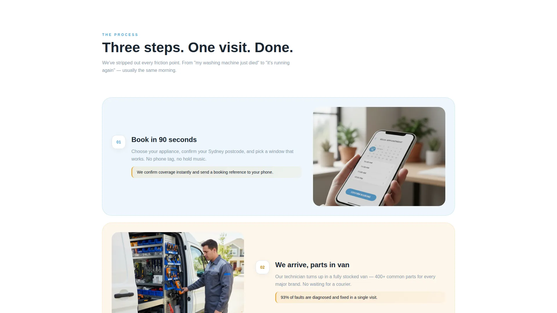
- Replaces vague "call us" prompts with a three-step booking form that confirms coverage by postcode instantly
- Captures undecided visitors through a low-friction photo-upload quote path before they leave
What you get with this template
You get a complete, section-led landing page that handles both the persuasion and the conversion in one scroll. Every section serves a clear role, from the opening metrics dashboard to the booking form at the bottom.
- A stats header with three animated counters and a subtle Sydney suburb silhouette map
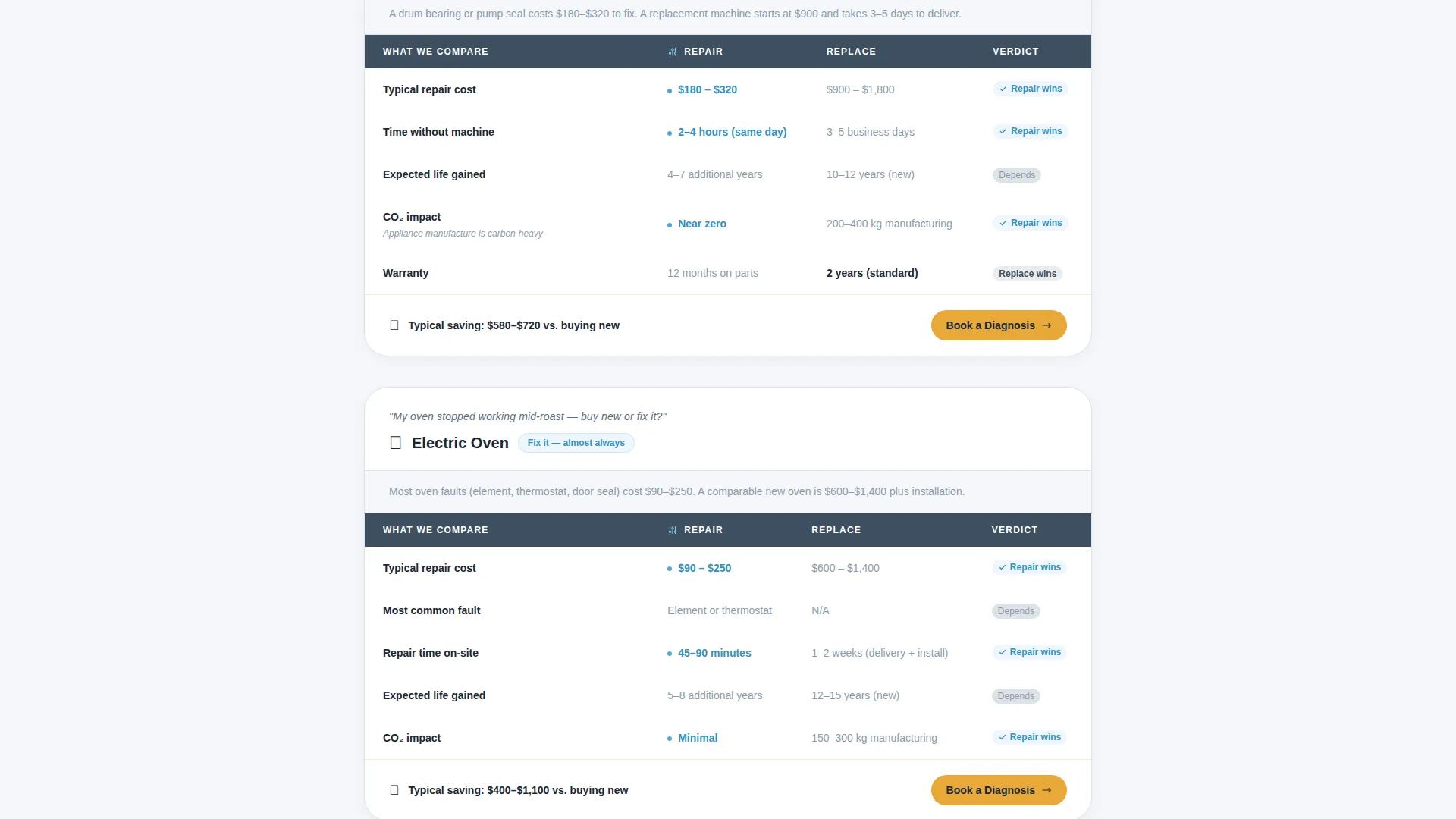
- FAQ-driven comparison tables covering common to complex appliances, each row showing repair cost, replacement cost, expected lifespan gained, and environmental impact
- A three-step booking form with appliance-type icons, a live postcode coverage checker, and a real-time time slot picker
Feature list
This template delivers a tightly scoped set of components. Each one is built to move a stressed homeowner from uncertainty to a confirmed booking.
Animated Stats Dashboard
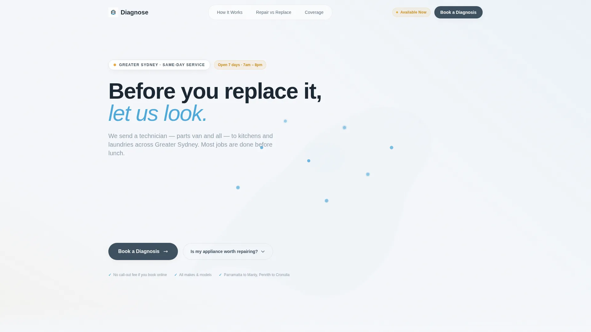
Three large counters tick upward on page load, displaying total Sydney repairs completed, first-visit fix rate, and average response time. A soft silhouette map of Sydney suburbs pulses at service hotspots in the background, grounding the numbers in a real service area.
FAQ-Led Comparison Tables
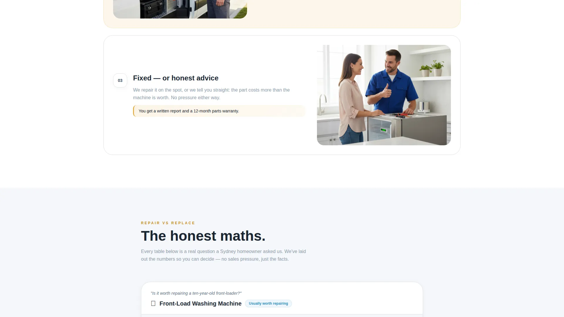
Each scroll section opens with a genuine homeowner question, then answers it with a structured table. Rows compare repair cost against replacement cost, show expected lifespan gained, and include environmental impact context. The sequence moves from everyday appliances to more complex ones, with stakes and savings building as the visitor scrolls.
Three-Step Booking Form
The primary call to action anchors to a form with three clear steps. Visitors choose their appliance type from an icon-led selector covering washer, dryer, fridge, oven, dishwasher, and other. A postcode field confirms service coverage in real time. A preferred time slot picker then shows the next-available windows.
Photo Upload Quote Path
A secondary conversion path sits alongside the main form. Visitors who are not ready to book can upload a photo of the fault and request a quick quote instead. This captures the lead at lower commitment without disrupting the primary booking flow.
Slate and Sky Visual System
The color palette pairs workshop slate with bright Sydney sky blue, clean appliance white for backgrounds, and diagnostic amber for callouts and interactive highlights. The result is a toolkit-like visual clarity that feels professional without feeling corporate.
Educational Scroll Architecture
The page is structured so each section teaches something useful before asking for action. Trust builds progressively as the visitor moves from the header metrics through the comparison tables and toward the booking form, reducing drop-off at the conversion point.
Page sections overview
| Section | Purpose |
|---|---|
| Stats Metrics Header | Opens with animated repair counters and a Sydney suburb map to establish credibility immediately |
| Hero Headline Area | Fades in the "Before you replace it, let us look" message beneath the dashboard |
| Fridge Comparison Table | Answers whether repairing an older fridge is worth it with a cost and lifespan breakdown |
| Washing Machine Table | Compares front-loader repair versus. replacement with environmental impact context |
| Oven and Cooktop Table | Shows repair savings for one of the most commonly replaced kitchen appliances |
| Dishwasher Table | Covers a mid-stakes appliance where repair often wins on cost and timeline |
| Complex Appliance Table | Handles more involved repairs where the savings case is strongest |
| Three-Step Booking Form | Guides the visitor through appliance type, postcode, and time slot selection |
| Photo Quote Upload | Offers a lower-friction lead capture for visitors not yet ready to book |
Design & branding system
The Slate and Sky color system gives this template a no-nonsense, workshop-ready feel. Every color choice has a job: backgrounds stay neutral and easy to read, interactive elements draw the eye, and amber callouts signal where attention matters most.
- Workshop slate (#3D4F5F) for structural elements and text, conveying calm authority
- Bright Sydney sky (#4DA8DA) for primary interactive components and section accents
- Diagnostic amber (#E8A838) for callout highlights, call to action buttons, and comparison table emphasis rows
- Clean appliance white (#F5F7FA) as the base background, keeping the page airy and easy to scan
Mobile & speed optimization
The layout is designed to work cleanly on a phone screen, which matters for this audience. A landlord getting a call about a broken oven on a Tuesday morning is likely on their phone, not a desktop.
- Comparison tables are structured to remain readable at small screen widths without horizontal scrolling
- The three-step booking form collapses into a single-column flow on mobile, keeping the process friction-free
- Icon-based appliance selectors and large tap targets make the form accessible on touch screens
How this template helps you convert
The page is structured as a trust-building journey, not a brochure. Visitors arrive skeptical and leave with enough information to make a confident decision.
- The stats dashboard establishes credibility before the visitor reads a single word of copy, using real repair numbers and response time data to set expectations immediately.
- The comparison tables do the selling without selling. By showing the honest math on repair versus replacement, they position the technician as a trusted advisor rather than just another tradie.
- The dual conversion paths mean fewer visitors leave empty-handed. Those ready to commit book a time slot; those still uncertain submit a photo and receive a quote, keeping them in the pipeline.
Other information about this template
This template is built around the Educational Guide theme, which means the design prioritizes clarity and useful information over visual spectacle. The FAQ-driven creative direction is central to how trust is earned on this page. Every comparison table doubles as a content asset, giving homeowners a reason to stay and read rather than bounce to a search result.
- The template style is a comparison table format, making it one of the more content-rich landing page structures available for local service businesses
- The Booking and Scheduling landing page direction means the page has a single, clear purpose: move visitors to a confirmed appointment or a captured lead
- The header concept is a Stats and Metrics dashboard, a format that works particularly well for services where proof of volume and speed matters to the target audience
- The intersection of the Sydney local services subcategory with the appliance repair niche means the postcode coverage confirmation feature is a deliberate trust signal for visitors checking whether they are in the service zone
- The page is suited to operators covering a broad metro area, from inner suburbs to coastal and western corridors, where service-area clarity is a common visitor concern before booking
Theme
Educational Guide
Creative direction
FAQ-Driven
Color system
Slate & Sky
Style
Comparison Table
Direction
Booking/Scheduling
Page Sections
Animated Stats Dashboard Header
Faq-led Comparison Tables
Three-step Booking Form
Photo Upload Quote Path
Slate and Sky Color System
Educational Scroll Architecture
Related questions
Can I update the comparison table data to match my own pricing?
Does the postcode coverage field connect to a live database?
Can I add or remove appliance types from the booking form selector?
Is the photo upload feature part of the main booking form?
Can this template work for a repair service outside of Sydney?



