Local Funeral Services Professional Website Template
Requiem is a single-page funeral music landing page built for a live classical ensemble offering cello, harp, and soprano voice at funeral homes and graveside services. The page leads with an origin story, earns emotional trust through narrative and photos, and guides visitors toward a tiered donation model that funds live music for families who cannot afford it.
by Rocket studio
Quick summary
Requiem is a carefully designed funeral music landing page for a live classical ensemble. It uses an asymmetric 60/40 grid, a deep plum and gold color system, and an origin-story creative direction to move grieving families, funeral directors, and remote adult children toward a meaningful donation. The page offers three giving tiers and a personal dedication form.
Who this template is for
This landing page serves a specific and tender intersection of music, grief, and generosity. It is built for classically trained ensembles who want to create a dignified online presence and raise funds to bring live music to families who cannot otherwise afford it. It also works well for anyone who needs to plan or honor a service with carefully chosen songs.
- Live ensemble musicians offering cello, harp, or soprano voice at funeral homes and graveside venues
- Funeral directors who want to add a professional live music option to service packages
- Grieving family members and friends who want to honor a loved one who has passed with meaningful, live music
What problem this template solves
Selecting appropriate songs for a funeral can be one of the hardest decisions a family makes in the hours after a loss. Recorded music on a portable speaker can feel hollow at the moment families need grace most. This landing page solves the problem of communicating the value of live music at a funeral service in a way that is empathetic, professional, and clear. It gives an ensemble a dignified digital home and a structured path for donors to act.
- Families searching at two in the morning need a page that feels calm and trustworthy, not commercial
- Funeral directors assembling service details need clear ensemble options and repertoire highlights in one place
- Donors need a simple, meaningful way to fund live music for families who cannot afford it
What you get with this template
This page is a complete single-page layout built around the emotional arc of an origin story. Every section is ordered to reflect the journey from personal loss to collective hope. You get a fully structured landing page with distinct sections, a tiered donation selector, a dedication form, and a footer pattern ready for your ensemble's details.
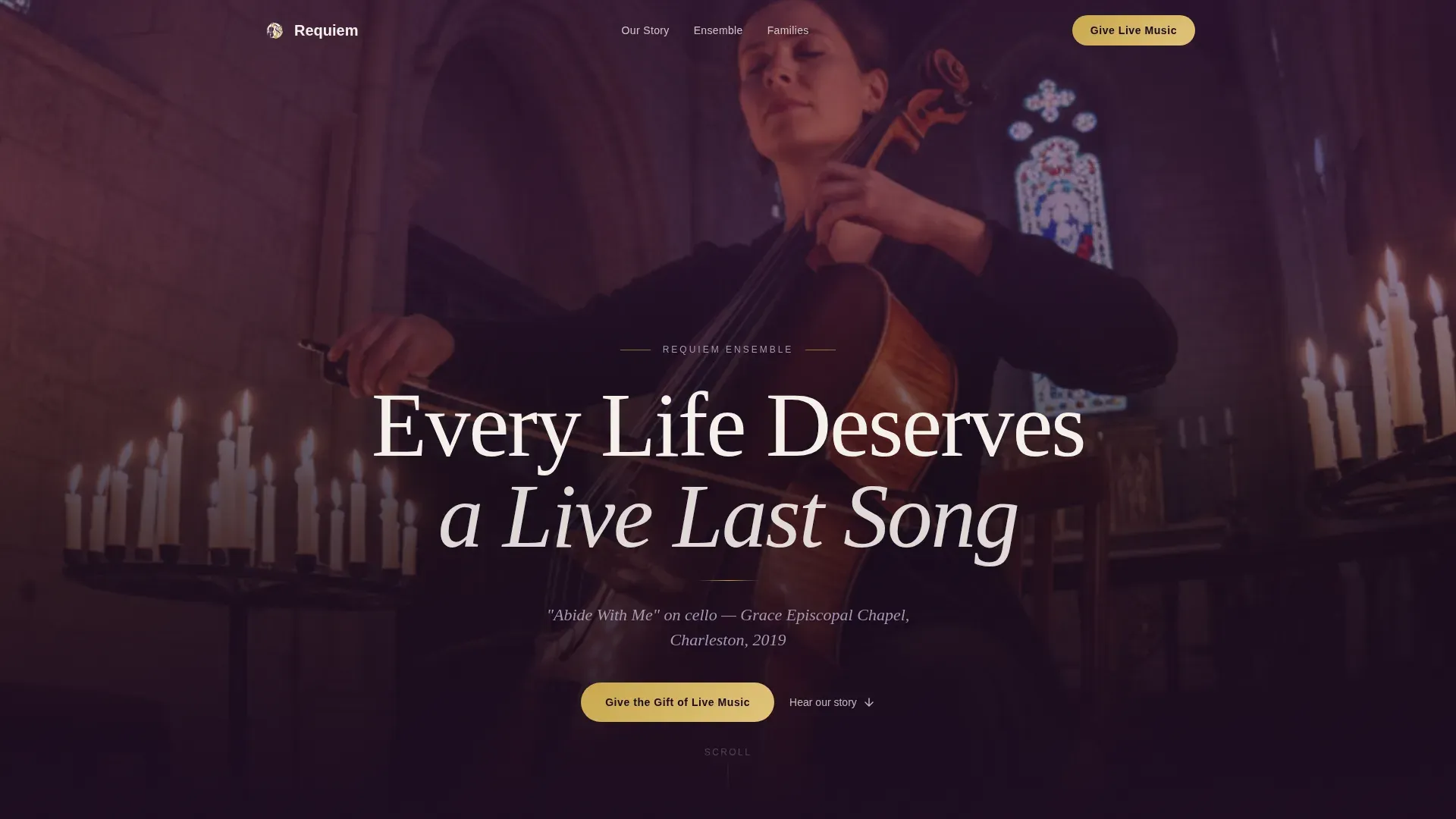
- A hero section with a giant centered serif headline, gold rule, and deep plum background
- An asymmetric 60/40 grid origin story with space for narrative text and still photography
- A three-tier donation selector with named giving amounts and a "Dedicate in Someone's Name" form
Feature list
This section covers the core design and functional features built into the Requiem landing page. Each feature is grounded in the template's brief and serves the goal of making live funeral music accessible and fundable.
Asymmetric 60/40 Grid Layout
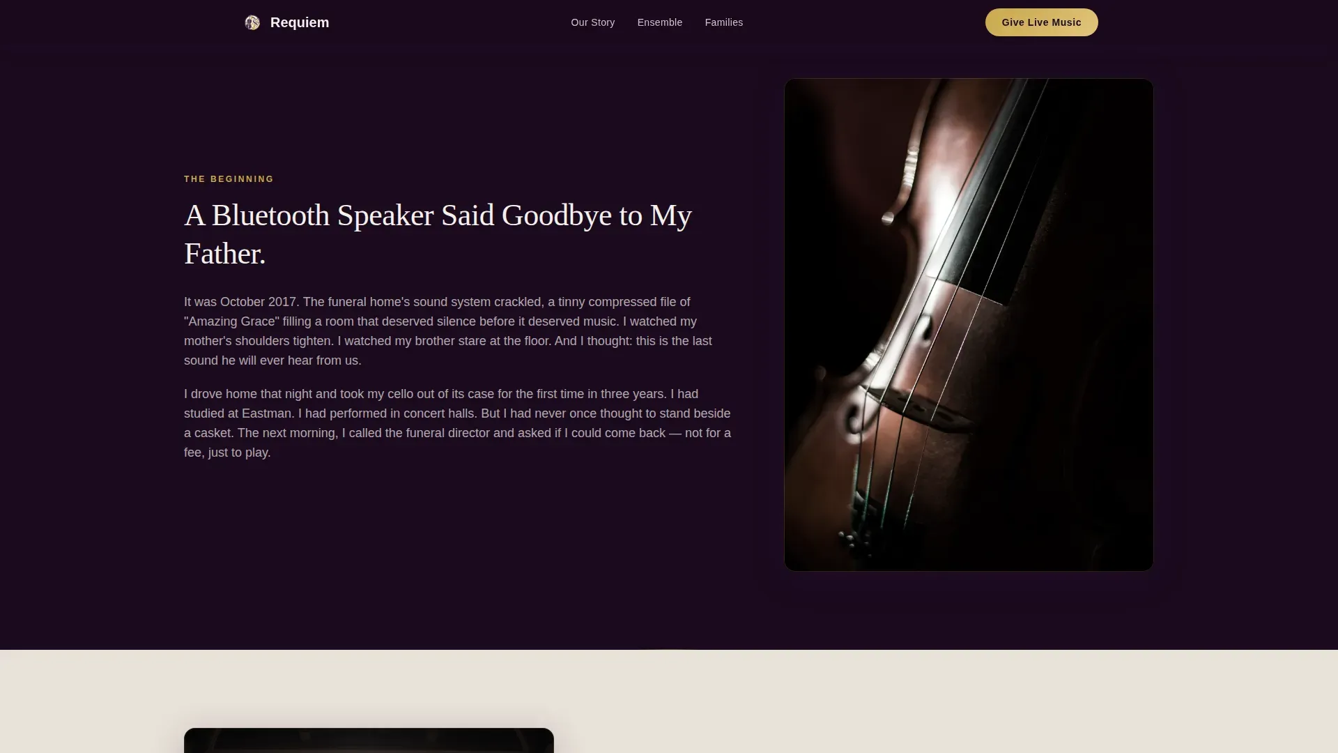
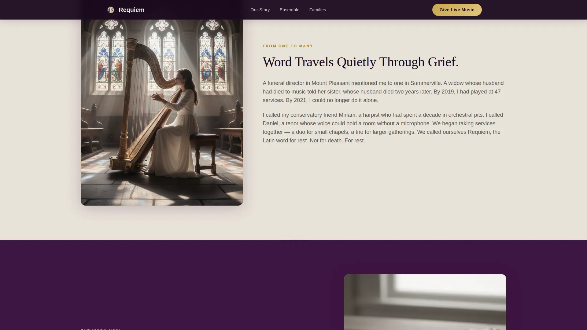
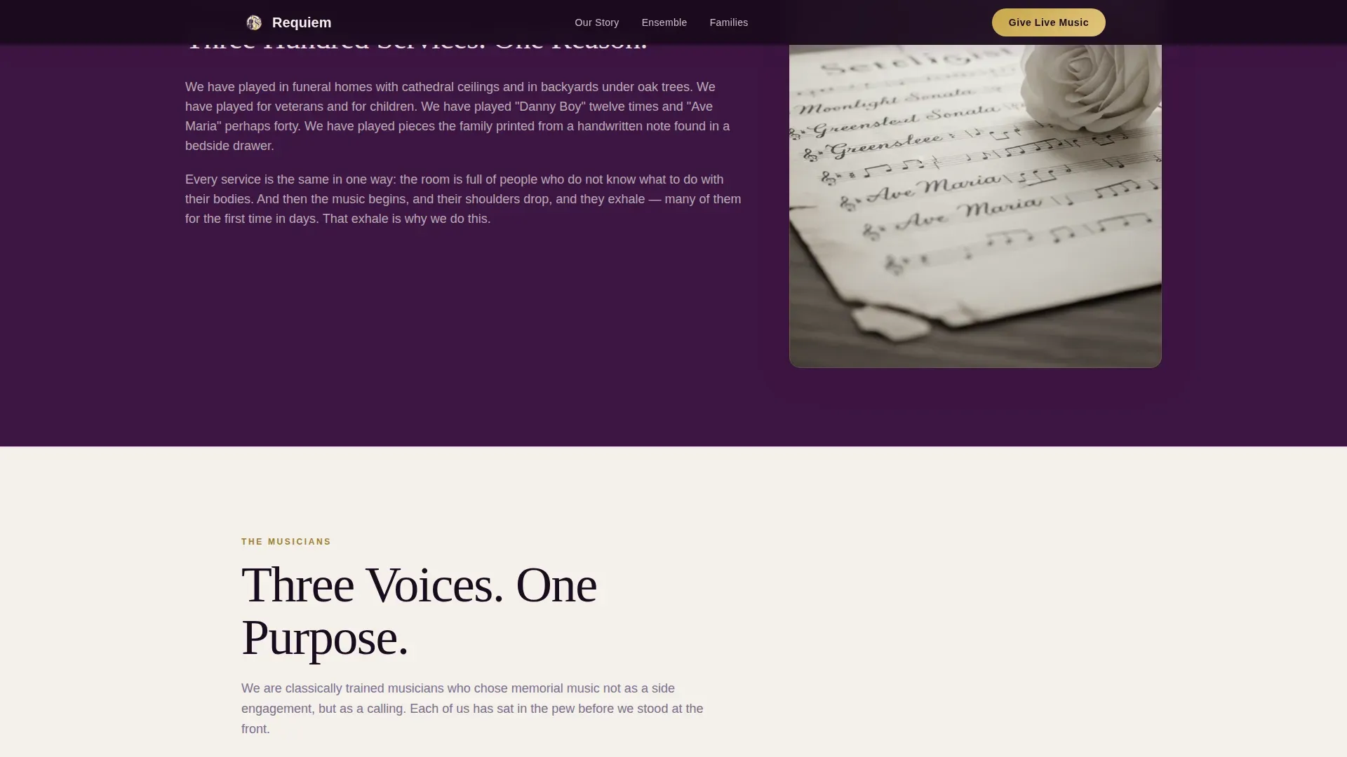
The page uses a 60/40 column split throughout its origin story and ensemble sections. The wider column holds narrative text that builds emotional credibility. The narrower column holds still photos: hands on strings, a chapel doorway, a handwritten setlist. This ratio shifts section by section, giving the scroll a natural, rhythmic order that reflects the music it represents. The design works across the entire page without repeating the same visual pattern twice in a row.
Three-Tier Donation Selector
The donation section offers three named giving options. Each tier is clearly labeled with a dollar amount and a specific purpose: $75 funds one graveside musician, $150 covers a chapel duo, and $350 underwrites a full ensemble for a family who cannot afford one. Visitors can choose the tier that matches their intent and means. This structure makes the act of giving feel specific and impactful rather than abstract.
"Dedicate in Someone's Name" Form
A secondary call-to-action opens a short form where donors can add a dedication. The form collects the donor's name, the honoree's name, and an optional memory of fifty words or fewer. This touch transforms a financial transaction into a personal tribute. It gives donors a meaningful way to honor someone who has passed while supporting live music for another grieving family.
Origin Story Narrative Section
The page opens its scroll with the founder's own experience of loss. The section describes the funeral where recorded music felt empty and the decision to stand beside a casket with a cello for the first time. This creative direction builds trust through accumulation rather than argument. By the midpoint of the page, visitors are no longer reading about a service. They are inside a memory of their own.
Musician Ensemble Bento Grid
A dedicated section uses an asymmetric bento grid to present the ensemble's musicians, their instruments, and brief professional bios. Professional musician profiles create a personal connection and reassure potential clients and donors of quality and expertise. This section widens the story from one musician to an ensemble, from one service to hundreds, giving the page its emotional and professional credibility.
Testimonials and Social Proof Section
The page includes a section for real family testimonials and funeral director quotes. Each testimonial references specific hymns, named chapels, and the before-and-after emotional experience of a service with live music. Testimonials from families and funeral directors serve as social proof and build trust. This section is the source of the page's most persuasive content because it lets listeners speak for themselves.
Page sections overview
| Section | Purpose |
|---|---|
| Hero Headline | Sets tone with giant centered serif headline against deep plum |
| Origin Story | 60/40 grid narrative of founder's personal loss and first performance |
| The Ensemble | Bento grid of musician profiles, instruments, and bios |
| Families Served | Testimonials with specific hymns and emotional resonance |
| Donation Tiers | Three-tier selector and "Dedicate in Someone's Name" dedication form |
| Footer Pattern | Logo and tagline left, navigation links right |
Design & branding system
The visual identity follows a Pastoral Calm theme. The design feels like a velvet-lined instrument case opened in a candlelit room. Every color choice and typographic decision whispers rather than speaks. The palette and layout work together to reflect dignity without severity and warmth without cheerfulness. High-quality professional photos of hands on strings, chapel doorways, and handwritten setlists reinforce the emotional tone without becoming commercial.
- Deep plum (#3C1642) anchors the hero, headers, and primary text areas; muted heather (#7B6D8B) softens secondary backgrounds; parchment ivory (#F4F0EB) carries body text; restrained gold (#C9A84C) marks interactive elements and donation buttons
- Display text uses a refined serif typeface at large scale; body text uses a clean, readable sans-serif to mix warmth with clarity
- All photos are emotional and respectful, set in real chapel and graveside contexts, and chosen to reflect the service rather than sell it
Mobile & speed optimization
Grief has no device preference. A family member searching for live funeral music at two in the morning is almost certainly on a phone. The page is built with equal priority for mobile and desktop, so every section reads clearly and every donation option is easy to reach regardless of screen size. Scroll-linked reveals and CSS-first animations keep the page feeling responsive without relying on heavy technology.
- The donation tier selector and dedication form are touch-friendly and easy to complete on a small screen
- Images are optimized so the page loads without delay, even on a mobile connection during urgent planning
- Staggered text animations and parallax depth effects are implemented with CSS-first technology to minimize load overhead
How this template helps you convert
This landing page is structured to earn the donation before asking for it. Every section adds emotional weight in a deliberate order, so by the time a visitor reaches the giving tiers, they have already lived inside the story. The page offers two conversion paths: an immediate donation and a personal dedication.
- The primary call-to-action, "Give the Gift of Live Music," appears first at the story's emotional peak and is repeated in the footer, giving visitors two natural moments to act without feeling pressured
- The "Dedicate in Someone's Name" secondary path offers a lower-commitment entry point that still results in a donation, making it easy for donors who want to honor someone specific rather than give anonymously
- Testimonials and specific giving-tier language reflect real impact, so visitors can choose the option that matches their capacity and feel certain their contribution will reach a real family at a real service
Other information about this template
This section covers additional context that helps you understand how the Requiem landing page fits into the broader landscape of funeral music, music website templates, and classical repertoire traditions.
- The word "requiem" has deep historical roots. Mozart's Requiem is one of the most famous choral works in classical music, commissioned as a tribute to a deceased wife and completed by Franz Xaver Süssmayr after Mozart's death in 1792. The "Dies Irae" movement is particularly noted for its dramatic intensity, and the Kyrie remains one of the most recognized movements in the choral repertoire. The requiem mass tradition is a meaningful source of inspiration for the tone and order of this template's design.
- This template is an example of a music landing page that is easy to customize for different ensemble sizes or service styles. Customizable music website templates allow musicians to alter design elements to reflect their style and add their own photos, song lists, and text without needing coding skills.
- A well-designed funeral program can enhance the service and provide guests with a keepsake. This page can support the display of song lyrics, readings, and tributes that help family and friends reflect and remember the life of the person who passed.
- Incorporating technology thoughtfully into a funeral service can make the event more interactive and memorable for listeners. The dedication form and donation tiers are interesting examples of how digital tools can add a human touch to an otherwise difficult planning process.
- The page design offers options to add a logo, set a custom header image, and choose a version of the color palette that best matches the ensemble's identity. These options make it easy to create a professional online presence that reflects the praise and honor the ensemble brings to every service.
- Cultural sensitivity is built into the template's open repertoire approach. The ensemble can list songs from various religious and cultural traditions, including hymns, classical works, and contemporary pieces, so every family feels seen and served.
- The page's footer follows an Arc Browser Split pattern: logo and tagline on the left, links on the right. This clean order keeps the end of the page organized and easy to read without adding visual noise.
Theme
Pastoral Calm
Creative direction
Origin Story
Color system
Plum Executive
Style
Asymmetric Grid (60/40)
Direction
Donation/Fundraising
Page Sections
Asymmetric 60/40 Origin Story Grid
Three-tier Donation Selector
Dedication Form with Personal Memory
Musician Bios and Ensemble Grid
Family Testimonials Section
Scroll-linked Animation System
Related questions
Can I customize the donation amounts shown on the page?
Does the page include space for audio or video samples of the ensemble?
How does the Dedicate in Someone's Name form work?
Is this page suitable for ensembles that serve different cultural or religious traditions?
What contact information does the page collect from families or funeral directors?


