Restaurant PPC Agency Landing Page Template
Reservations is a masonry-layout landing page built for boutique restaurant pay-per-click agencies. It opens with a full-viewport Type Over Image header, moves through a gallery-style case study wall, and closes with a selective waitlist form. The Cloud Canvas palette and Atelier Studio theme give every section the quiet confidence of a dining room set and ready for service.
by Rocket studio
Quick summary
Reservations is a single-page template designed for a restaurant pay-per-click agency running a selective client waitlist. The masonry card layout tells real client stories, the oversized serif header sets the tone immediately, and a minimal waitlist form converts the right prospects at the right moment.
Who this template is for
This template is built for performance marketing agencies that specialize in restaurant paid search. It speaks directly to boutique shops that want to position their work as curated and evidence-backed, not commoditized.
- Restaurant pay-per-click agencies managing paid search for independent or multi-unit operators
- Hospitality-focused marketing consultancies running selective intake processes
- Agency founders who want their website to feel like a portfolio, not a brochure
What problem this template solves
Independent restaurants and hospitality groups often pay high commissions to third-party platforms they do not control. An agency solving this problem needs a landing page that proves its value before asking for a commitment. Generic agency templates fail to do that.
- No clear way to show before-and-after results in a visually compelling format
- Standard form pages do not communicate scarcity or selective access
- Cookie-cutter layouts undermine the premium positioning boutique agencies need
What you get with this template
You get a fully designed, single-page layout built around visual proof and strategic restraint. Every section has a clear job: establish authority, show evidence, then gate access.
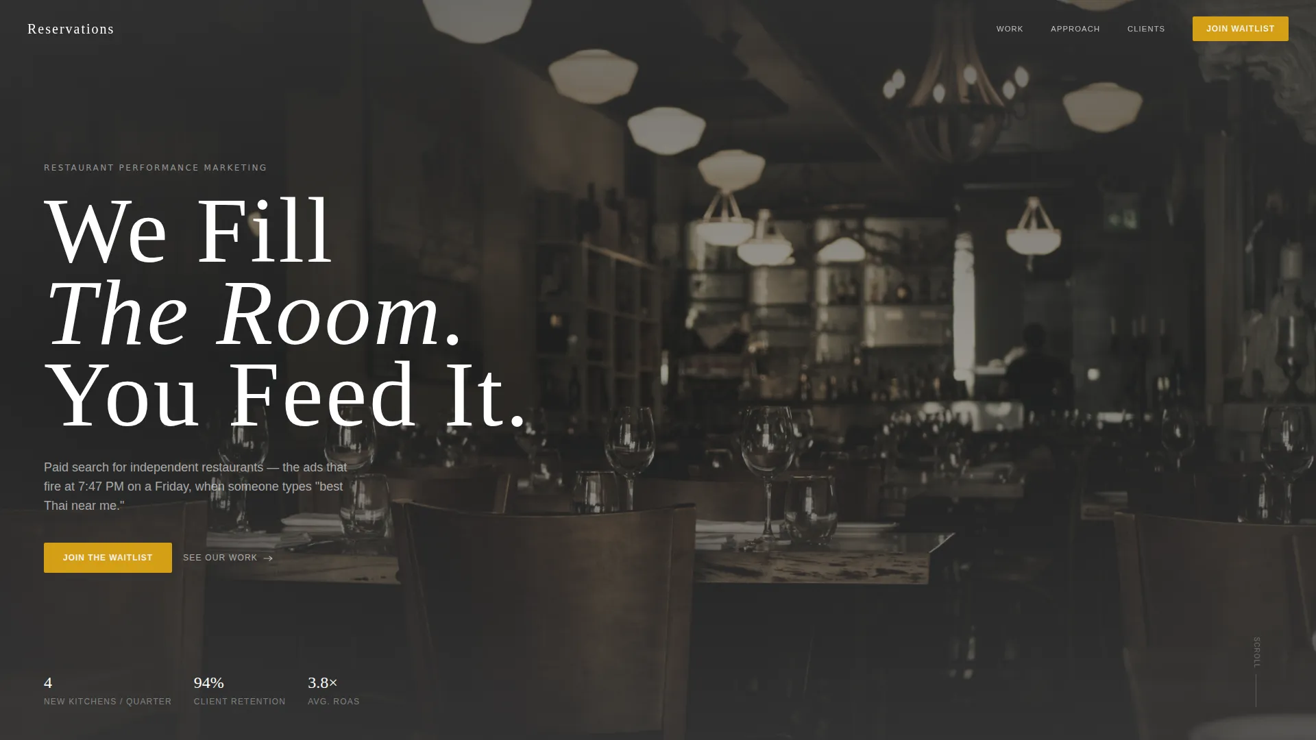
- A full-viewport header with desaturated restaurant photography and oversized serif type
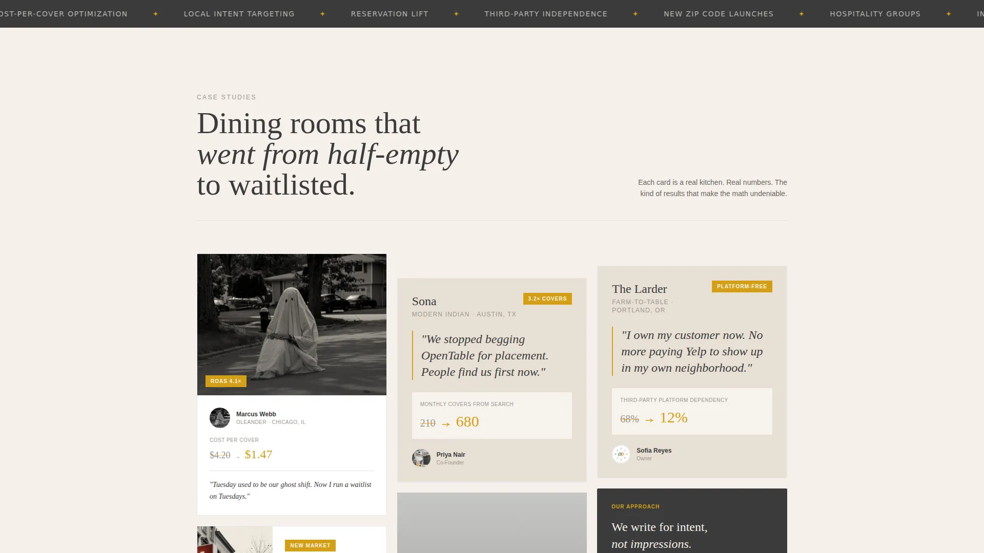
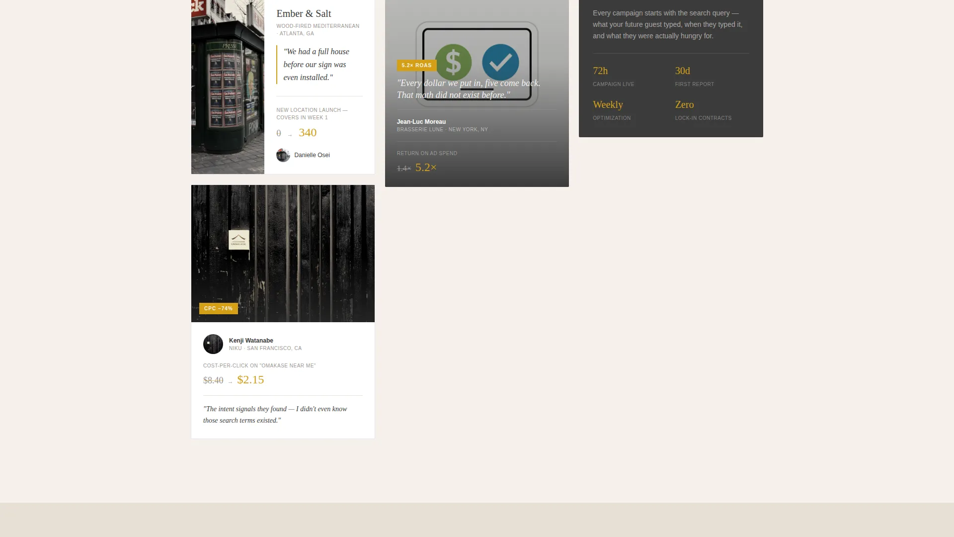
- A scrollable masonry case study wall where each card tells one client story
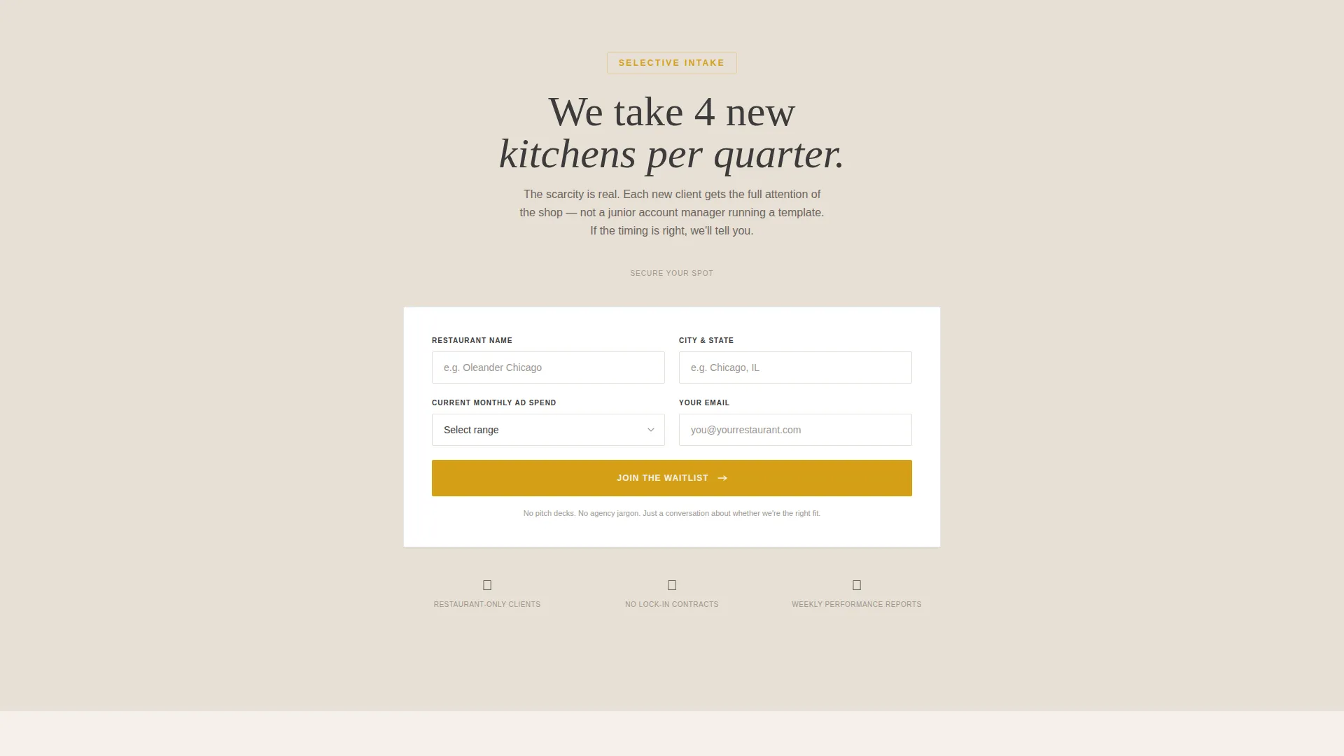
- A waitlist form section with a spend-tier dropdown and a single scarcity headline above it
Feature list
This template delivers a focused set of layout components, each serving the agency's specific conversion goal.
Full-Viewport Type Over Image Header
A softly desaturated photograph of an empty restaurant interior fills the entire first screen. Oversized serif type reads "We Fill The Room. You Feed It." The image is warm-shifted and slightly grainy, giving it a painterly, editorial quality.
Masonry Case Study Card Wall
Each card in the masonry grid features one restaurant client: an owner portrait, the restaurant name, a before-and-after performance metric, and a single pull-quote. Cards vary in height, some image-heavy, some text-dominant, so the scroll feels like browsing a gallery exhibition rather than scanning a data table.
Selective Waitlist Form
The form captures restaurant name, location, current monthly ad spend via a four-tier dropdown (under $2,000, $2,000 to $5,000, $5,000 to $15,000, and $15,000 and above), and an email address. A single line above the form reads "We take 4 new kitchens per quarter," making the scarcity concrete and credible.
Saffron Call-to-Action System
The accent color, saffron thread (#D4A017), is reserved exclusively for interactive elements and the primary call-to-action button. The "Join the Waitlist" button uses saffron against graphite so the eye lands there naturally after the case study wall has done its work.
Alternating Background Sections
Backgrounds rotate between plaster white (#F5F0EB) and warm linen (#E8E0D5) as sections change. The alternation creates visual rhythm without introducing new colors, keeping the palette disciplined and the page easy to scan.
Page sections overview
| Section | Purpose |
|---|---|
| Viewport Header | Establish tone and positioning immediately |
| Masonry Case Studies | Show client proof through individual story cards |
| Scarcity Headline | Signal limited quarterly intake above the form |
| Waitlist Form | Capture qualified prospect details |
Design & branding system
The template follows an Atelier Studio theme using the Cloud Canvas color system. The palette feels like a designer's worktable in morning light: matte paper, charcoal sketches, and one warm brass light source.
- Four-color palette: plaster white (#F5F0EB), pencil graphite (#3B3B3B), warm linen (#E8E0D5), and saffron thread (#D4A017) used only for interactive elements and calls to action
- Typography is oversized, wide-tracked serif in the header, dropping to clean body text in cards and form sections
- Graphite carries all body text; saffron appears only where the reader's eye should move next
Mobile & speed optimization
The masonry layout reflows cleanly for smaller screens, keeping the card-based storytelling intact on mobile without losing the gallery-wall feeling.
- Cards stack into a single or double column on narrow viewports, preserving portrait images and pull-quotes
- The waitlist form reduces to a minimal vertical stack, keeping the spend-tier dropdown and email field easy to tap
- Alternating section backgrounds maintain visual separation even on small screens where grid density is reduced
How this template helps you convert
The page is structured as a deliberate sequence: proof first, access second. Every layout decision supports that sequence.
- The case study wall accumulates evidence as the visitor scrolls, so by the time they reach the waitlist form the conclusion feels earned rather than pushed.
- The scarcity line above the form ("We take 4 new kitchens per quarter") reframes the call to action as a reservation worth securing, not just a contact form to fill out.
- The spend-tier dropdown pre-qualifies leads at the point of submission, so the agency receives only prospects whose budgets align with its intake criteria.
Other information about this template
This template is part of a curated set of agency and portfolio landing pages designed for niche service businesses. It is particularly well suited for teams whose positioning depends on demonstrating selectivity.
- The Atelier Studio theme and Cloud Canvas color system are consistent with other templates in the same design family, making it easy to adapt for related hospitality or creative agency use cases
- The masonry layout supports any number of case study cards, so the evidence wall can grow as the agency's client roster expands
- The waitlist structure works equally well for relaunches, new market entries, or seasonal intake windows
Theme
Atelier Studio
Creative direction
Creator Spotlight
Color system
Cloud Canvas
Style
Masonry/Pinterest
Direction
Waitlist/Coming Soon
Page Sections
Full-viewport Type Over Image Header
Masonry Case Study Card Wall
Selective Waitlist Form
Saffron Call-to-action System
Alternating Background Rhythm
Related questions
Can I replace the case study cards with my own client results?
Is the waitlist form connected to any external tool?
Can I update the quarterly intake number in the scarcity line?
Does the header require a custom restaurant photograph?
Can a non-paid-search hospitality agency use this template?



