Restaurant PR Agency Landing Page Template
Reservations is a dark, immersive landing page template built for restaurant PR agencies. It opens with a bold, viewport-filling headline and flows through cinematic case studies in an asymmetric 60/40 grid. A selective waitlist form closes the page, signaling scarcity and authority. The result feels less like a website and more like a well-timed reservation.
by Rocket studio
Quick summary
Reservations is a single-page template designed for a restaurant PR agency that positions itself as the force behind sold-out opening nights and magazine cover placements. The layout is asymmetric, the visual language is cinematic, and every section builds toward one goal: earning a qualified inquiry from an ambitious restaurateur.
Who this template is for
This template speaks directly to founders and creative directors running a restaurant PR or hospitality marketing agency. It is built for people who sell exclusivity and results, not packages and pricing.
- Restaurant PR agencies onboarding new hospitality clients
- Boutique hospitality marketing studios with a selective client roster
- Independent PR consultants representing executive chefs or hospitality groups
What problem this template solves
Most agency landing pages look like capability decks. They list services, stack logos, and bury the pitch. Ambitious PR agencies need a page that communicates authority before a single word is read.
- Generic agency templates dilute the perception of premium, specialist positioning
- A standard contact form fails to signal the right level of selectivity or industry fluency
- Most layouts cannot carry cinematic photography and data-driven results at the same time
What you get with this template
You get a fully structured, single-page layout designed to feel as deliberate as the restaurants it promotes. Every section has a defined role in building trust and guiding the right visitor toward a waitlist inquiry.
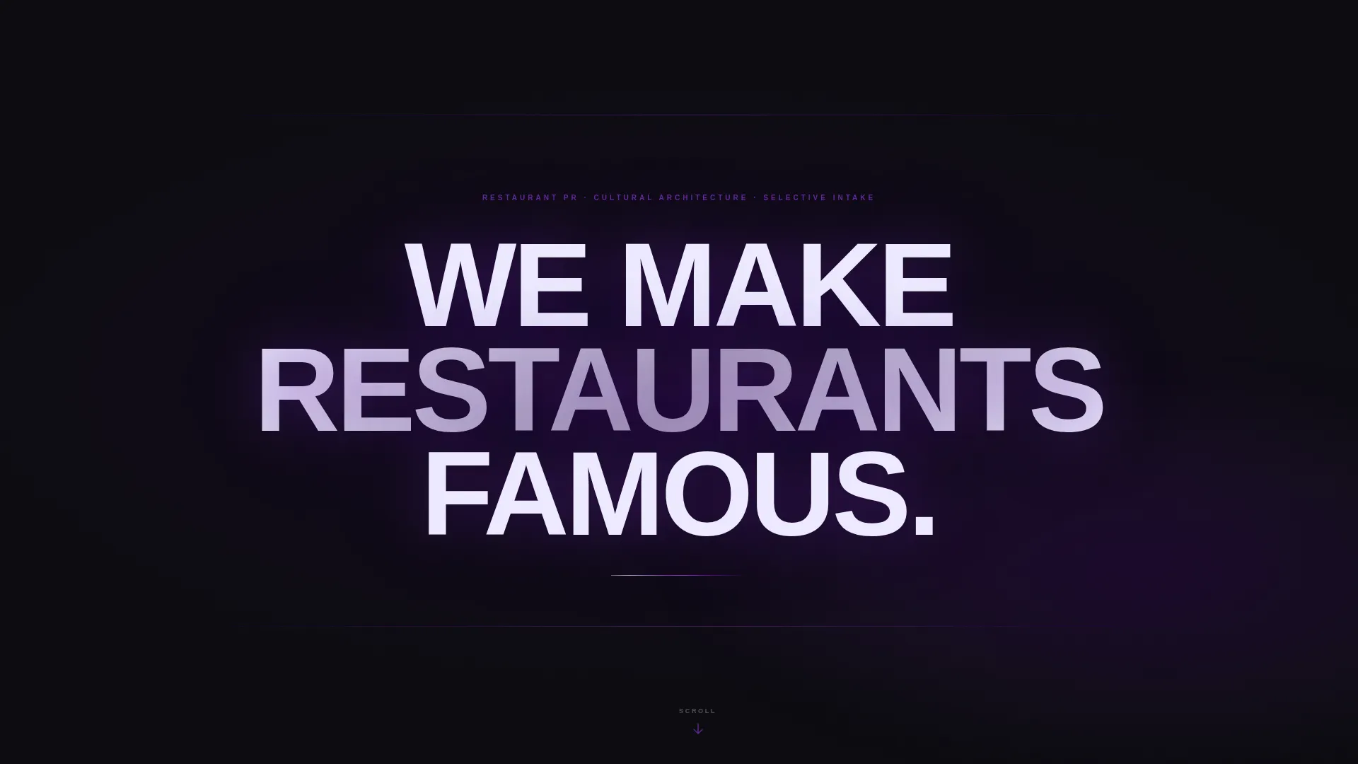
- A viewport-filling headline section with a slow indigo gradient pulse and a blinking scroll cue
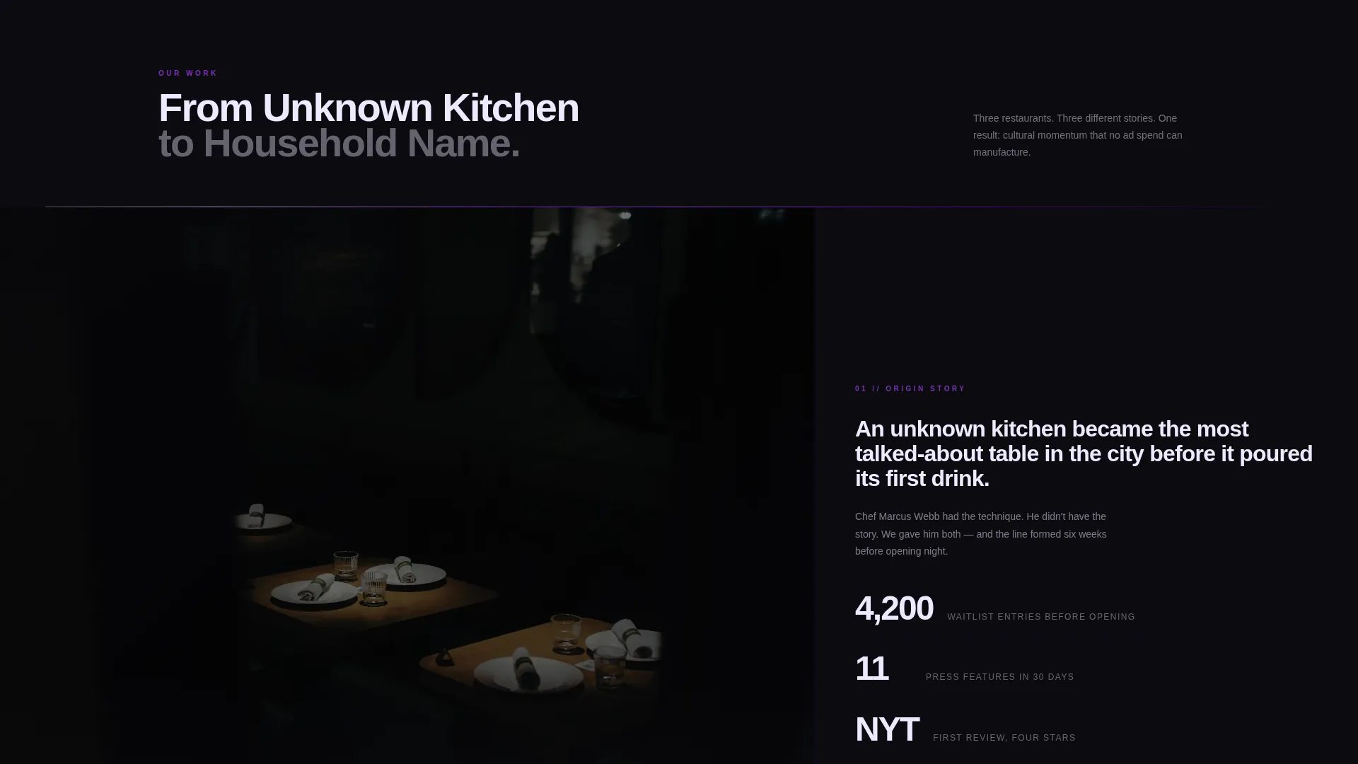
- An asymmetric 60/40 scrolling case study section pairing full-bleed photography with staggered results text
- A selective waitlist form section with a scarcity signal and a custom confirmation screen
Feature list
This template delivers a tightly composed set of design and layout features rooted in the source brief.
Viewport-Filling Giant Headline
The header opens on pure black with the agency's statement scaled to fill the full screen. Wide letter-spacing, a sharp grotesque typeface, and a slowly pulsing indigo gradient behind the text create immediate authority. A single blinking arrow at the bottom edge invites the scroll.
Asymmetric 60/40 Case Study Grid
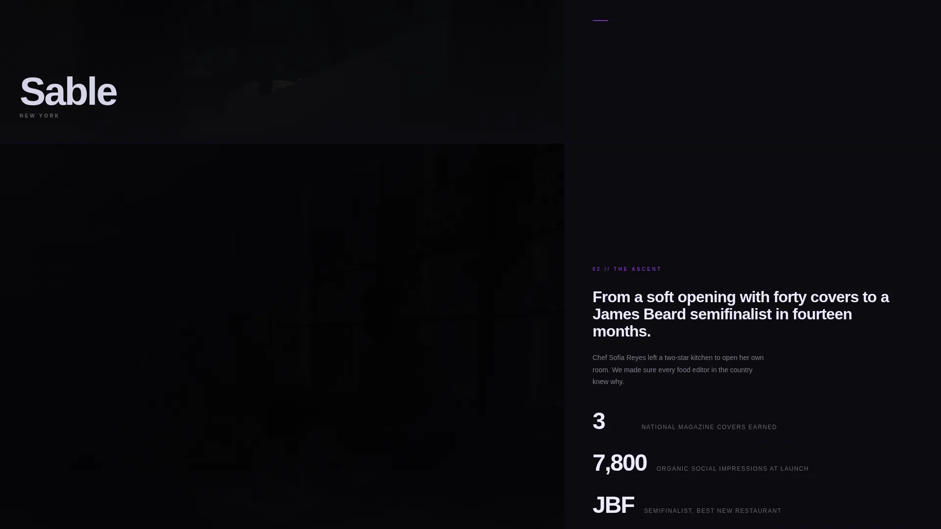
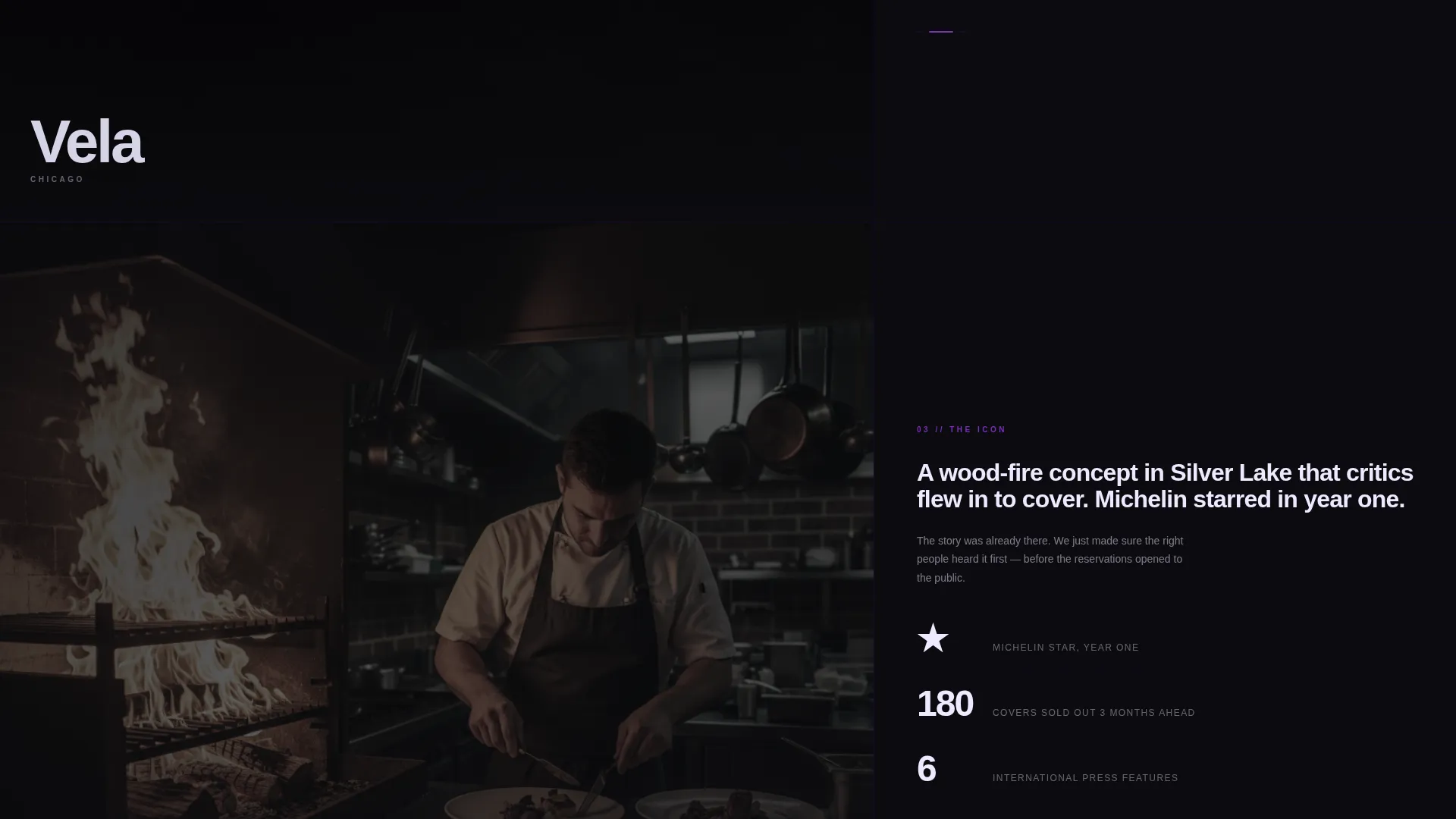
The core scrolling section splits the viewport into a 60% visual column and a 40% results column. Full-bleed moody restaurant photography occupies the wider side while staggered text blocks on the narrower side surface earned media results, opening-night metrics, and industry milestones. Each scroll transition dims the current image to black before the next one appears.
Cinematic Scroll Rhythm
Each case study panel transitions like a course arriving at a table. The previous image dims to black, and the next breathes in. The narrative escalates from unknown kitchen to household name, with each panel darker and more cinematic than the last.
Inverted Final Section
After the last case study, the layout inverts to white text on an indigo background. This visual break signals a shift in tone and draws full attention to the call to action. The contrast is intentional and hard to miss.
Selective Waitlist Form
The primary call-to-action reads "Request a Seat at the Table." The form collects restaurant name, city, an opening timeline dropdown, and an optional Instagram handle. No email is requested first, which lowers friction and signals that the agency understands how the industry communicates.
Custom Confirmation Screen
After submission, the page transitions to a full-black screen displaying a single line: "We'll be in touch before the critics are." The confirmation reinforces the brand voice and leaves the visitor with a strong final impression.
Page sections overview
| Section | Purpose |
|---|---|
| Giant Headline Header | Sets authority and tone instantly |
| Scrolling Case Studies | Demonstrates results through cinematic storytelling |
| Results Text Blocks | Surfaces earned metrics alongside photography |
| Inverted call to action Section | Signals the ask with high-contrast visual shift |
| Waitlist Request Form | Collects qualified inquiries with low friction |
| Confirmation Screen | Closes the experience with a memorable brand line |
Design & branding system
The visual identity runs on an Electric Indigo color system built around four carefully chosen values. Deep void black dominates every background. Charged indigo bleeds through section dividers and hover states. Ultraviolet marks interactive elements. Spectral electric white carries all primary typography.
- Typography uses a sharp grotesque typeface with wide tracking for headlines and clean weight contrast for body copy
- Interactive states use ultraviolet highlights so hover moments feel charged rather than decorative
- The overall palette is described as neon reflecting off wet pavement: magnetic, secretive, and unmistakably deliberate
Mobile & speed optimization
The template is structured with a single-page, section-led flow that keeps the layout focused and avoids unnecessary complexity. The asymmetric grid and full-bleed photography are designed to adapt without losing the cinematic quality of the desktop experience.
- The single-page structure limits layout overhead and keeps the scrolling experience fluid across devices
- Section transitions and scroll-triggered effects are built into the layout so the rhythm of the experience carries through at any screen size
- The minimal form fields reduce interaction friction on mobile, where a shorter input sequence improves completion
How this template helps you convert
Every design decision in this template is built to move the right visitor toward a single action: requesting a seat at the table.
- The giant headline and pulse animation create an immediate impression that earns the scroll before any copy is read.
- The case study grid pairs visual proof with concrete results, building credibility section by section before the ask appears.
- The scarcity signal beneath the form ("We take three new clients per quarter") and the low-friction field order work together to increase the likelihood that a qualified visitor completes the request.
Other information about this template
This template is categorized under Portfolio and Agency use cases, with a specific focus on restaurant marketing and PR. It is a strong fit for any agency that competes on positioning rather than price.
- The template style is Asymmetric Grid (60/40), a layout approach that suits agencies whose work is inherently visual
- The theme is Dark Immersive, making it a natural choice for hospitality brands that operate in premium, atmosphere-driven markets
- The waitlist and coming-soon landing page direction makes this template useful for agencies launching a rebrand or announcing a new intake cycle
- The page type is a single landing page, not a multi-page website, so all navigation is scroll-based and the visitor journey is fully linear
Theme
Dark Immersive
Creative direction
Immersive Visual
Color system
Electric Indigo
Style
Asymmetric Grid (60/40)
Direction
Waitlist/Coming Soon
Page Sections
Viewport-filling Giant Headline
Asymmetric 60/40 Case Study Grid
Cinematic Scroll Transitions
Inverted High-contrast Call to Action Section
Selective Waitlist Request Form
Custom Full-black Confirmation Screen
Related questions
Can I edit the case study content and photography?
Is this template suitable if my agency does not use selective intake messaging?
What kind of photography works best in the 60% column?
Can the waitlist form fields be changed?
Does the confirmation screen message have to stay as written?



