Restaurant Direct Guest Relationship Lead Capture Website Template
Reserve is a hub-and-spoke restaurant lead capture landing page template built for operators who want to stop paying per-cover fees and start owning their guest relationships. It combines an anchor navigation flow, an inline savings calculator, comparison tables, and reservation widgets to turn search traffic into seated, returning diners.
by Rocket studio
Quick summary
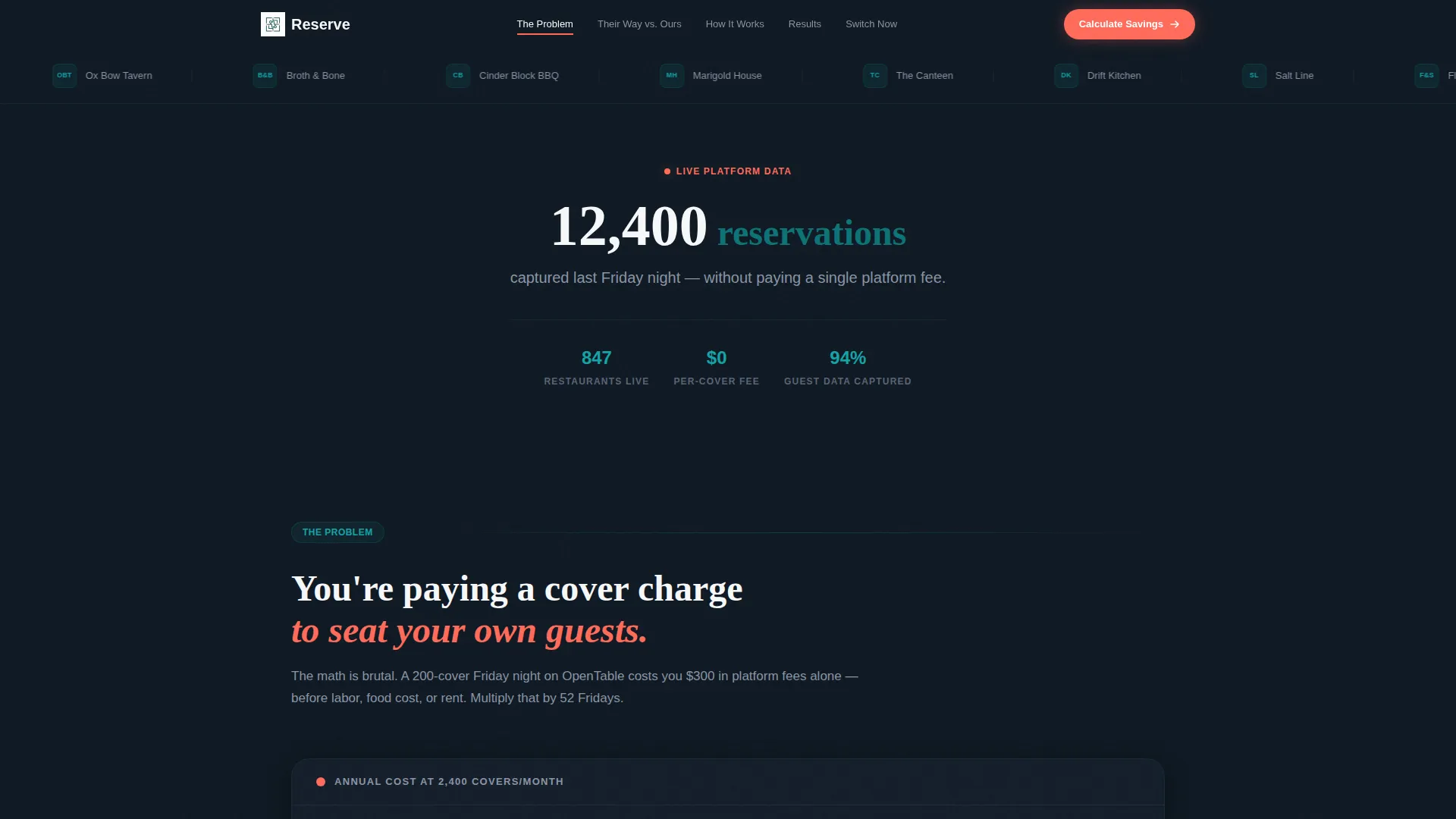
Reserve is a single-page, anchor-nav restaurant lead capture landing page that moves visitors through a Problem-to-Solution arc. It opens with a scrolling logo bar and a single bold stat, then guides operators through five focused spokes ending in a sticky savings calculator that converts intent into email leads.
Who this template is for
This template is designed for restaurant and food-service operators who depend on direct web traffic for bookings and guest data. It speaks to people who are actively losing money on third-party reservation fees and want a smarter way to capture leads.
- Independent restaurant owners looking to reduce reliance on third-party booking platforms
- Ghost kitchen operators who rely entirely on their own web traffic to fill orders
- Multi-location general managers who need one consistent front-end experience across all venues
What problem this template solves
Most restaurants hand their guest data to third-party platforms every time someone books a table. The cost shows up as a per-cover fee, but the real loss is the guest relationship that never belonged to the restaurant in the first place.
- Restaurants overpay per cover on external booking platforms without owning the lead
- Guest contact data stays locked inside third-party systems, blocking repeat-visit marketing
- Multi-location operators lack a single, branded entry point that feeds all their hostess stands
What you get with this template
Reserve gives you a fully structured, five-spoke landing page that walks a skeptical visitor from cost awareness to confident sign-up. Every section is purpose-built and ready to customize with your own numbers and branding.
- A scrolling logo bar header, five anchor-nav spokes, and a sticky bottom call to action bar
- An inline savings calculator with a monthly covers field, platform dropdown, and average check input
- Side-by-side comparison tables with a grayed competitor column and a teal platform column with coral checkmarks
Feature list
This template ships with six purpose-built components that support the full conversion journey from first impression to captured lead.
Scrolling Logo Bar Header
A horizontal ticker of restaurant and ghost kitchen brand logos scrolls slowly against the midnight dashboard background. It opens the page with social proof before a single word of copy is read, and it pairs with a single fading stat that anchors credibility immediately.
Five-Spoke Anchor Navigation
A pinned top nav links directly to five page sections: The Problem, Their Way versus. Ours, How It Works, Results, and Switch Now. Visitors can jump to any spoke or follow the linear scroll. Either path builds conviction toward the primary call to action.
Inline Savings Calculator
The calculator sits inside the page and activates after the first spoke. Visitors enter monthly covers, select their current platform from a dropdown, and input their average check size. A projected annual savings figure renders instantly in electric coral before the form asks for email and restaurant name.
Side-by-Side Comparison Tables
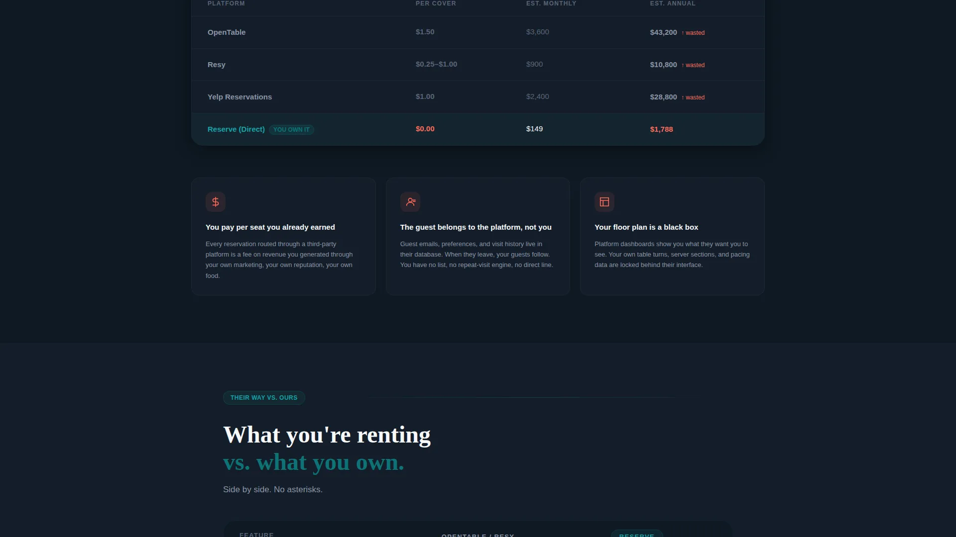
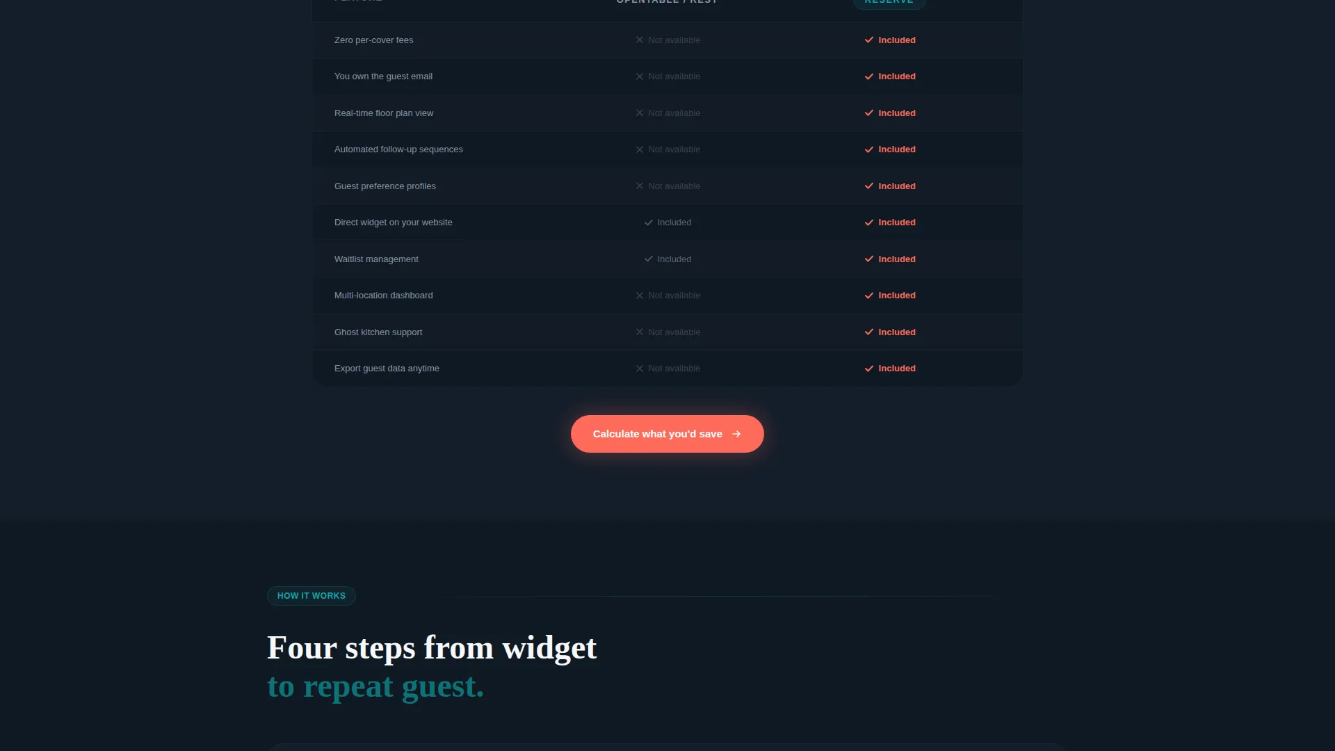
Spoke two presents a feature-by-feature comparison with the competitor column rendered in a muted gray and the platform column lit in deep teal. Electric coral checkmarks tick down the feature list, making the value gap visible at a glance without requiring the visitor to read dense text.
Reservation Widgets and Smart Forms
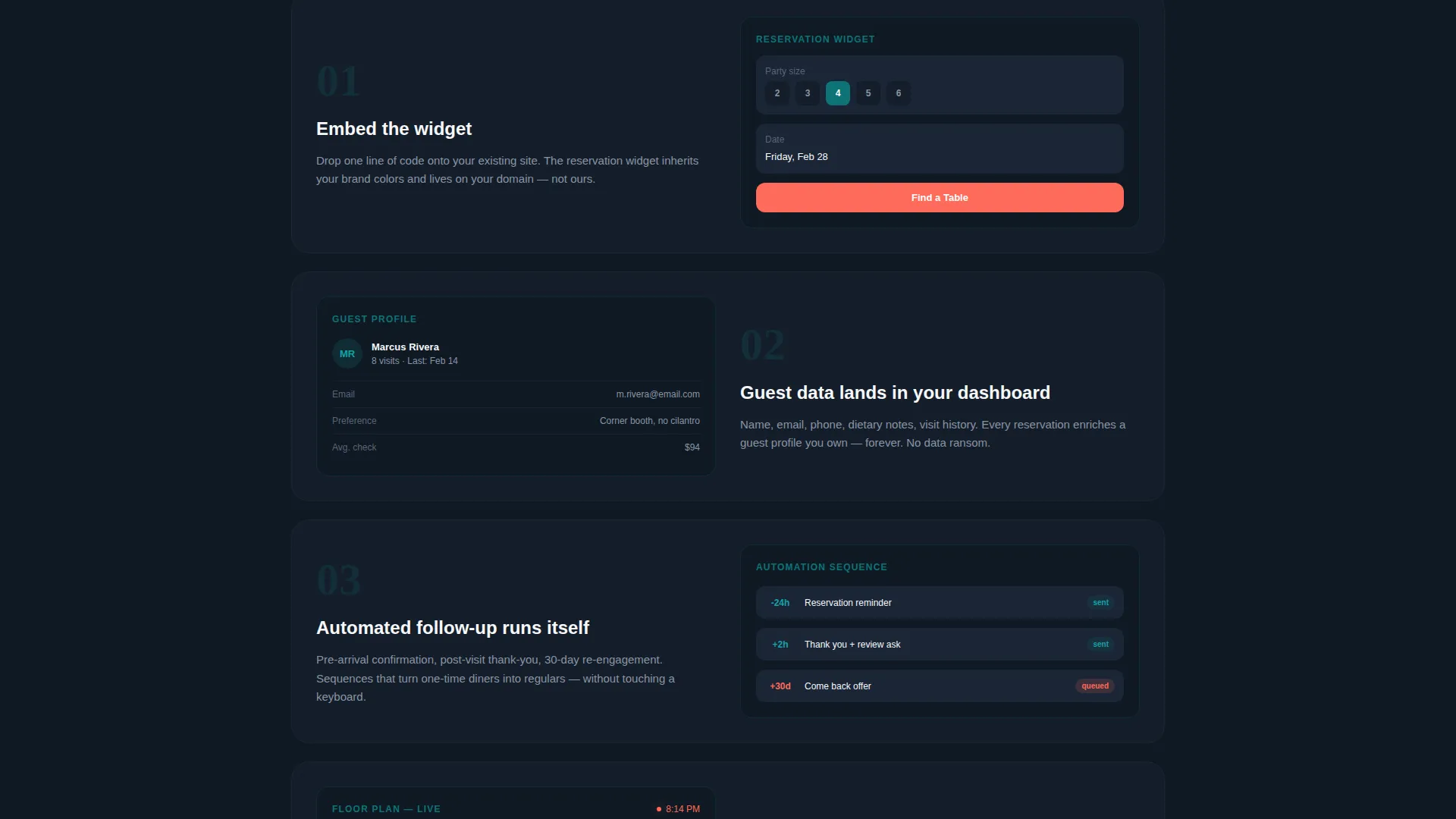
The template includes reservation widget placeholders and guest data capture fields that reflect a real platform flow. Timed offer prompts and follow-up sequence frames are built into the page structure so the value of direct booking is demonstrated, not just described.
Sticky Bottom call to action Bar
After the visitor passes the first spoke, a sticky bar appears at the bottom of the screen carrying the primary call to action: "Calculate Your Savings." It stays visible during scroll so the conversion entry point is never more than one tap away.
Page sections overview
| Section | Purpose |
|---|---|
| Logo Bar Header | Opens with scrolling brand proof and a single high-volume stat |
| The Problem Spoke | Breaks down per-cover costs versus owning the lead directly |
| Their Way versus. Ours | Side-by-side comparison table with grayed competitor and lit platform columns |
| How It Works | Product screen walkthrough of reservation flow and guest data capture |
| Results Spoke | Shows outcome data and escalating stakes for inaction |
| Switch Now Spoke | Hosts the inline savings calculator and primary email capture form |
| Sticky call to action Bar | Persistent bottom bar with "Calculate Your Savings" trigger |
Design & branding system
The visual identity follows a Dashboard Pro theme using the Teal Catalyst color system. The palette is inspired by the precise glow of a restaurant point-of-sale screen in a dimly lit dining room: always on, quietly commanding, never decorative for its own sake.
- Deep operations teal (#0D7377) anchors headers, nav, and the active platform column in comparison tables
- Midnight dashboard (#0F1923) fills background panels and the logo bar ticker for a dense, high-contrast base
- Clean linen white (#F7F8FA) surfaces card backgrounds and body copy areas to maintain readability
- Electric coral (#FF6B5A) is reserved exclusively for calls to action, coral checkmarks, and the calculator output figure
Mobile & speed optimization
The template is structured for lean rendering across all screen sizes. The anchor nav collapses cleanly on smaller viewports, and the sticky call to action bar adapts to touch targets so the calculator entry point stays reachable throughout the scroll.
- Anchor navigation and sticky call to action bar are built to reflow on mobile without breaking the spoke sequence
- The inline calculator fields and dropdown are sized for comfortable touch input on phone screens
- No hero images or stock photography are used, keeping the visual load low from the first section
How this template helps you convert
Reserve is engineered around one principle: make the cost of inaction a visible, dollar-denominated wound. Every design and copy decision escalates urgency without resorting to generic pressure tactics.
- The savings calculator turns a vague frustration into a specific annual number, giving the visitor a concrete reason to hand over their email before they leave the page.
- The comparison table puts the competitor in visible decline beside a lit platform column, so the value gap becomes self-evident without requiring a sales pitch.
- The sticky bottom bar keeps the primary call to action present at every scroll depth, reducing the friction between decision and action to a single tap.
Other information about this template
Reserve is categorized under restaurant website templates in the technology section of the marketplace. It is purpose-built for the restaurant lead capture niche and is designed to complement direct booking strategies for operators who want to reduce platform dependency.
- Template style: Hub and Spoke with anchor navigation, following a single-page landing page structure
- Theme: Dashboard Pro with the Teal Catalyst color system applied throughout
- Creative direction: Problem-to-Solution Arc driving every spoke from cost awareness to captured lead
- Conversion direction: Comparison and Versus layout, with the competitor always positioned as the visible alternative
- Header concept: Logo Bar with a slow-scrolling ticker and a single stat fade-in, no hero imagery
Theme
Dashboard Pro
Creative direction
Problem→Solution Arc
Color system
Teal Catalyst
Style
Hub & Spoke (Anchor Nav)
Direction
Comparison/Versus
Page Sections
Scrolling Logo Bar with Live Stat
Five-spoke Anchor Navigation
Inline Savings Calculator
Side-by-side Comparison Tables
Reservation Widgets and Capture Forms
Sticky Bottom Call to Action Bar
Related questions
Who is this landing page template designed for?
What does the savings calculator show visitors?
Can I customize the comparison table with my own features?
Does this template use any stock photography?
How does the anchor navigation work on this landing page?



