Instant Fine Dining Booking Landing Page Template
Ticket is a restaurant technology consulting landing page built for operators who are done patching broken systems. It uses a case-study narrative layout with a zigzag alternating structure, a pinned lead-generation form, and a precise slate-and-sky color system. The design moves prospects from recognizing their problem to booking a tech audit in one focused scroll.
by Rocket studio
Quick summary
Ticket is a single-page restaurant technology consulting template built around case-study storytelling. It opens with a testimonial card, escalates through four client narratives, and closes with a pinned lead-capture form. The design system uses deep charcoal, brushed graphite, and open-sky blue to project operational precision and quiet confidence.
Who this template is for
This template is built for restaurant technology consultants who work with serious operators. It speaks directly to the kinds of clients who measure problems in dollars and deadlines, not vague inefficiencies.
- Multi-unit restaurant operators running fifteen to sixty locations who need a clear technology integration story
- Independent fine-dining owners and franchise groups facing urgent POS, labor, or online ordering challenges
- Consultants who close on credibility and want their page to reflect the precision of their work
What problem this template solves
Restaurant technology consultants are often invisible online. Their work is complex, their results are measurable, but most landing pages fail to show either. This template fixes that gap.
- Generic consulting pages bury the outcome and lead with the service, losing operators before the first scroll
- Prospects with broken integrations or rising food cost variance need to see a result before they trust a pitch
- Most templates offer no structured lead path for visitors who are researching but not yet ready to call
What you get with this template
You get a fully structured, single-page layout built around a narrative that escalates from a single-unit turnaround to a sixty-location rollout. Every section is designed to move a specific type of operator closer to a conversation.
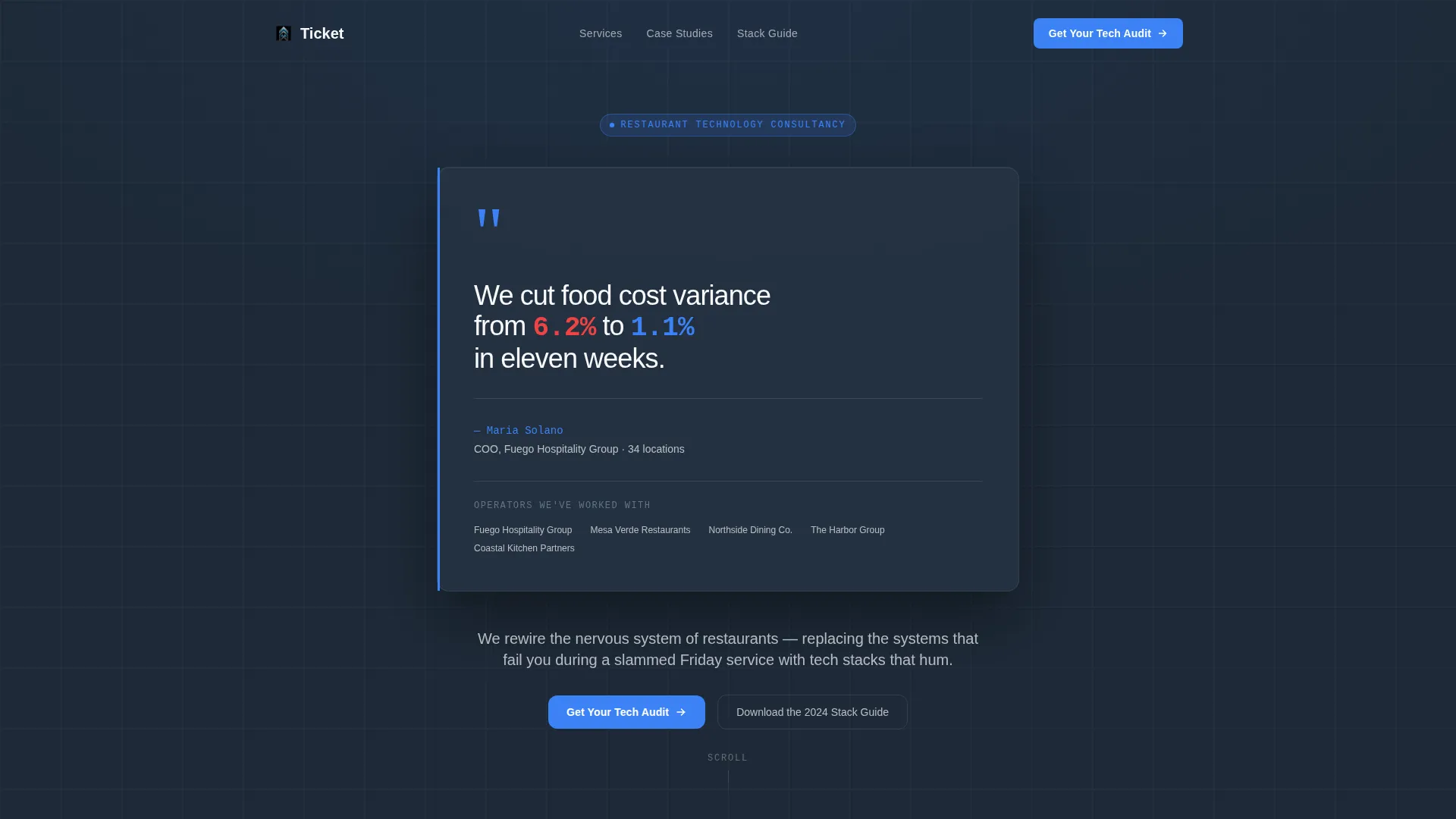
- A header testimonial card with a named operator quote, measurable result, and receipt-print micro-animation
- Four zigzag case-study sections with before-and-after data bars that animate on scroll
- A dual lead-capture path: a primary three-field audit form and a secondary PDF download gated by email
Feature list
A paragraph introducing the features: each component below reflects a deliberate design and functional choice from the source brief, built to support a high-trust, lead-generation-focused consulting page.
Zigzag Case Study Layout
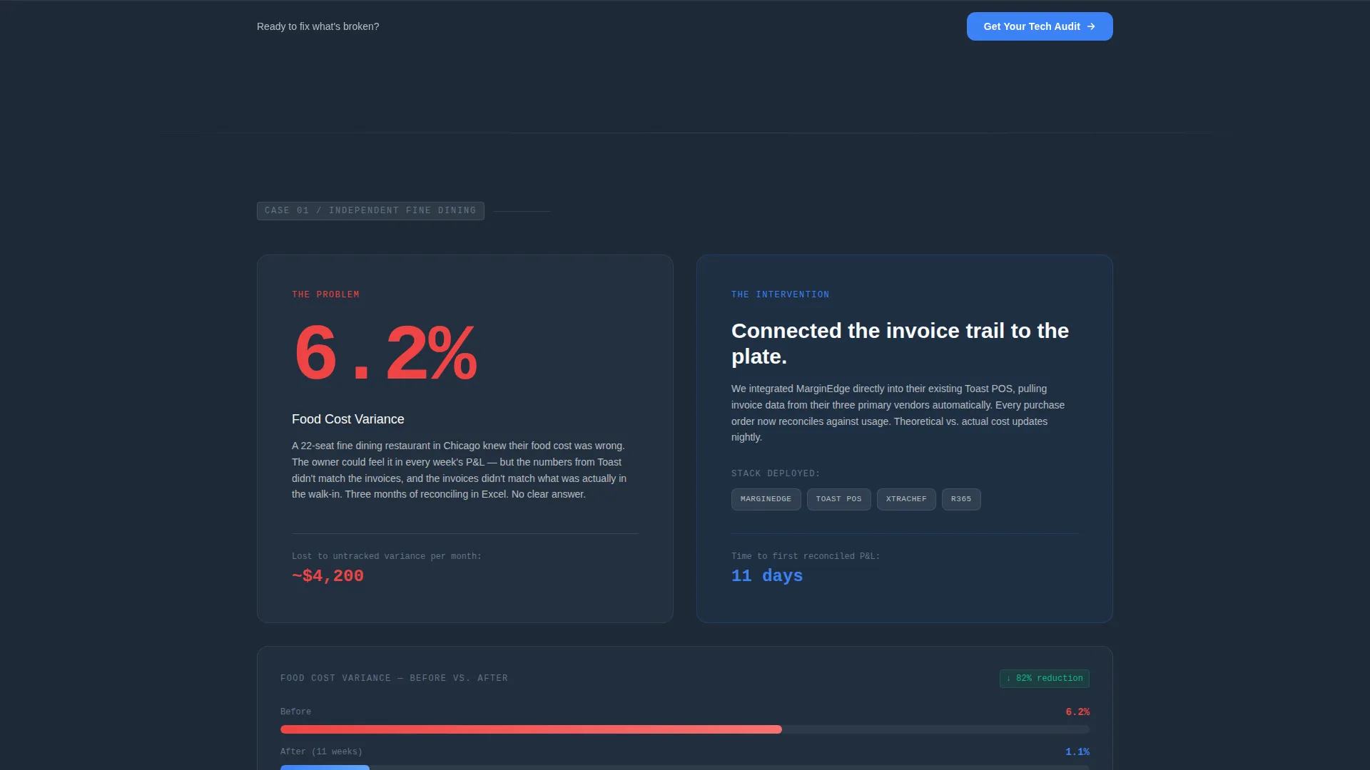
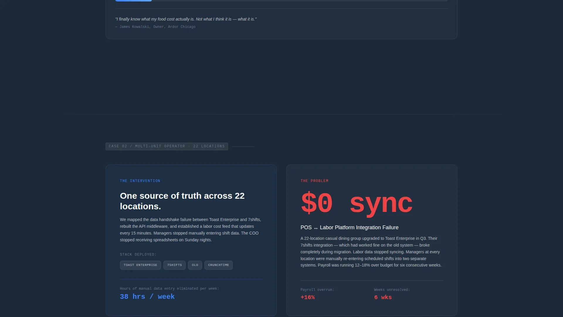
Each alternating section tells one client story in three beats: the broken system, the intervention, and the outcome. The scroll escalates in complexity, so by the fourth section a visitor is mentally mapping their own operation onto the narrative.
Pinned Lead-Generation Form
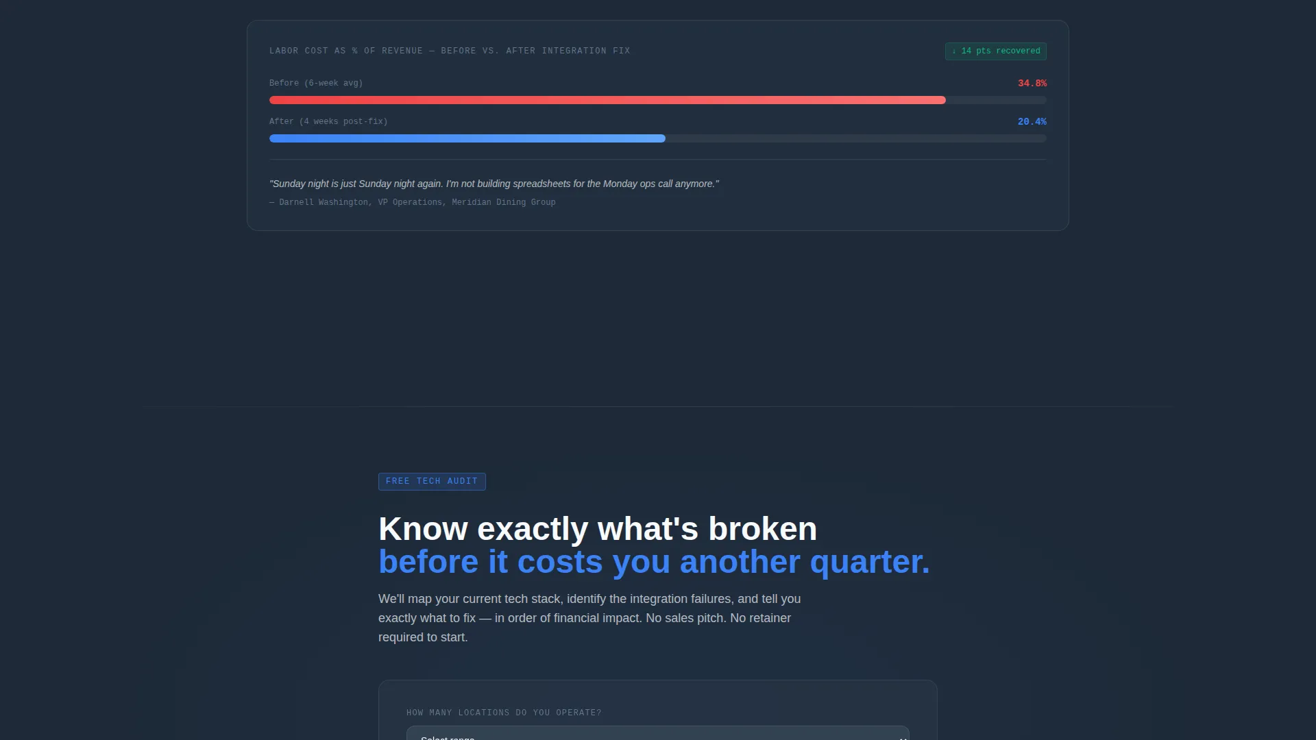
After the second case study, the primary call-to-action form pins to the bottom of the viewport for the rest of the scroll. It asks three fields in sequence: number of locations, current point-of-sale system, and biggest operational frustration.
Header Testimonial Card
The page opens with an oversized testimonial card floated against a deep slate background. It features a named operator, a specific measurable result, and a subtle sky-blue left border. A micro-animation draws the quote in line by line, like a receipt printing.
Animated Before-and-After Data Bars
Each case study closes with a full-width data bar showing before-and-after numbers. The bars animate on scroll, making the improvement visible and concrete rather than just stated.
Secondary PDF Lead Capture
A secondary conversion path offers a downloadable resource gated behind email only. This catches visitors who are actively researching but are not yet ready to book a call, keeping them in the funnel.
Dual Call-to-Action Architecture
The primary path drives visitors toward a tech audit inquiry. The secondary path offers a downloadable guide. Both paths are present throughout the page, so no visitor leaves without a clear next step.
Page sections overview
| Section | Purpose |
|---|---|
| Header Testimonial Card | Opens with a named operator result to establish immediate credibility |
| Case Study One | Single-unit turnaround story with broken system, intervention, and outcome |
| Case Study Two | Mid-size operator narrative; primary call to action form appears after this section |
| Case Study Three | Escalating complexity; franchise or multi-unit integration story |
| Case Study Four | Sixty-location rollout; the most complex result, hardest to dismiss |
| PDF Download Offer | Secondary lead path for visitors researching but not ready to call |
| Pinned Audit call to action | Sticky bottom form persists for the remainder of the scroll |
Design & branding system
The visual identity follows a Corporate Precision theme. Every color and layout choice references the organized calm of a well-run expo line, not the chaos of a slammed service.
- Deep charcoal slate (#1E2A38) for primary backgrounds, brushed graphite (#4A5568) for secondary panels, open-sky blue (#3B82F6) for calls to action and data highlights, and clean plate white (#F8FAFC) for text and breathing room
- No stock photography anywhere on the page; credibility comes from named operators, specific numbers, and precise typography
- A faint sky-blue left border on the testimonial card and a receipt-print micro-animation reinforce the mechanical, data-driven tone of the brand
Mobile & speed optimization
The layout is built to remain readable and functional as a visitor moves through the scroll on any device. The pinned form and animated data bars are structured to work within the single-page flow without breaking the narrative.
- Zigzag panels reflow to a stacked single-column layout on smaller screens, keeping the three-beat case study structure intact
- The pinned bottom call to action remains accessible on mobile without obscuring the main content scroll
- Animated data bars trigger on scroll rather than on page load, so the effect lands at the right moment regardless of reading pace
How this template helps you convert
The page is engineered around a single goal: turning a skeptical multi-unit operator into a lead. Every structural choice serves that goal directly.
- The opening testimonial card with a specific, named result filters for the right visitor immediately and builds trust before a single service claim is made.
- The escalating case study narrative creates a progressive commitment loop, where each section makes it harder for the right prospect to scroll away without acting.
- The dual conversion path captures both ready buyers through the audit form and research-stage visitors through the PDF download, so the page works across the full decision timeline.
Other information about this template
This template is part of the Ticket brand family of restaurant technology consulting assets. It is designed for professional services operators in the restaurant consulting space who need a page that reflects the same precision they sell.
- The template supports a restaurant tech stack narrative that can reference platforms like Toast, MarginEdge, 7shifts, and Olo within the case study intervention panels
- The downloadable asset is framed as "The 2024 Restaurant Tech Stack Guide," making it relevant for operators actively evaluating their current setup
- The Corporate Precision theme and slate-and-sky color system are purpose-built for this niche, distinguishing the page from generic agency or SaaS templates
Theme
Legal Shield
Creative direction
Logo Wall Authority
Color system
Cloud Canvas
Style
Comparison Table
Direction
Booking/Scheduling
Page Sections
Zigzag Case Study Narrative Layout
Pinned Viewport Audit Form
Header Testimonial Card with Micro-animation
Scroll-triggered Before-and-after Data Bars
Secondary PDF Lead Capture Path
Related questions
Can I customize the case study content to reflect my own client results?
What happens to the pinned call to action form on mobile devices?
Do I need four case studies to use this template effectively?
Who is this landing page designed to attract?
Is the PDF download section connected to an email platform?



