Specialty Consulting Directory Website Template
Resettle is an editorial-style landing page template built for expat life coaching practices that serve corporate relocation clients. It leads with verified outcome data, builds the cost-of-failure case across three data-driven sections, and funnels HR directors and talent mobility managers toward a "Request a Mobility Audit" form. The design system feels like a premium airline magazine: calm, authoritative, and immediately trustworthy.
by Rocket studio
Quick summary
Resettle is a single-page, editorial-style landing page template designed for professional expat coaching practices. It opens with a Fortune 500 testimonial card, escalates through industry statistics and outcome data, and closes with a B2B-focused audit request form. Every design decision supports one goal: convincing HR and talent mobility decision-makers to start a conversation.
Who this template is for
This template is built for coaching practices whose clients are corporate buyers, not individuals browsing social media. If your revenue depends on partnership deals with large employers, this page speaks their language.
- HR directors at multinational companies managing engineer or specialist relocations
- Talent mobility managers at consulting firms cycling professionals through cities like Singapore or São Paulo
- Global staffing agencies whose six-month attrition numbers are climbing and need a structured intervention partner
What problem this template solves
Most coaching websites talk about transformation in vague, personal terms. Corporate buyers need numbers, context, and a clear business case before they will schedule a call. This template solves the trust gap between a coaching practice and a procurement-minded HR audience.
- It presents industry failure-rate statistics before asking for anything, building credibility before the pitch
- It translates soft coaching outcomes into hard retention and productivity metrics that HR directors can defend internally
- It offers a low-commitment secondary path for buyers who need more time to build an internal case
What you get with this template
You get a fully structured, conversion-ready landing page with every section already sequenced for a B2B buyer journey. The editorial visual system is pre-configured, and the copy architecture guides visitors from problem awareness to action.
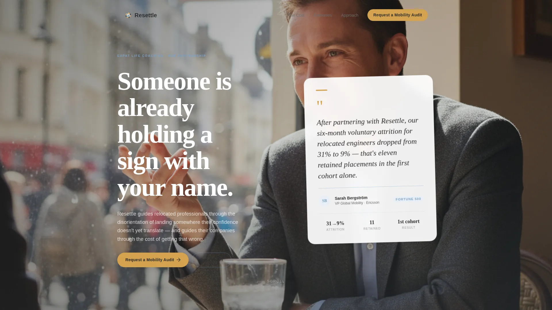
- A testimonial-led hero header with a soft-focus editorial photograph and an oversized magazine-style pull-quote card
- Three escalating data sections that move from industry-wide statistics to practice-specific outcome benchmarks
- A primary "Request a Mobility Audit" form and a gated secondary PDF download, each targeting a different stage of buyer readiness
Feature list
This template combines editorial design with a deliberate B2B sales structure. Every feature below comes directly from the template brief.
Stats-First Hero Header
The page opens with a single oversized testimonial card floating above a soft-focus editorial photograph. The quote comes from an HR director at a named Fortune 500 company and references a specific, measurable retention result. This framing signals authority before the visitor reads a single body paragraph.
Escalating Data Architecture
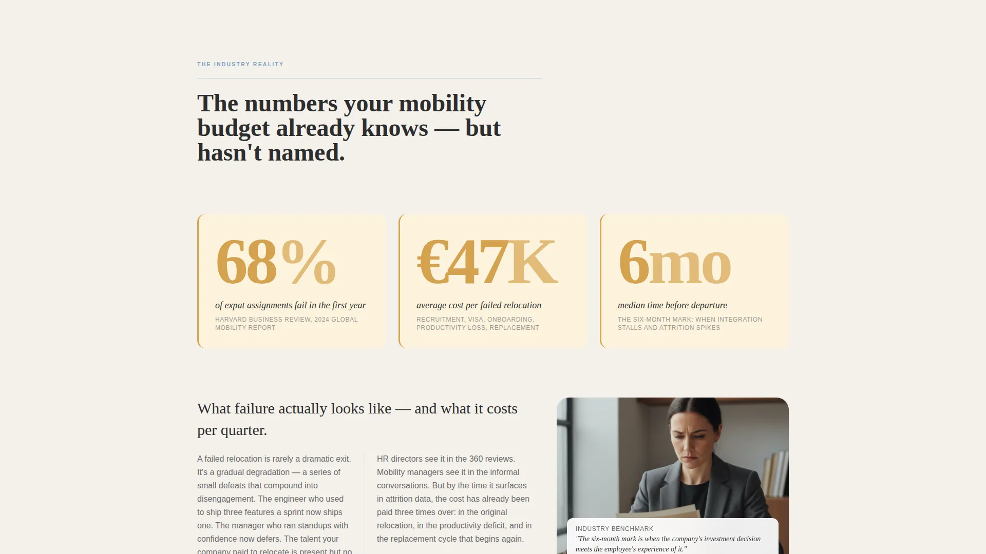
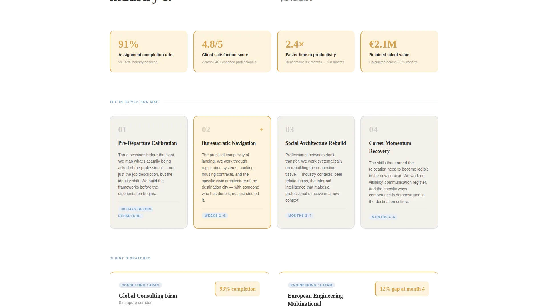
Each scroll section leads with a bold statistic in oversized amber typography before unpacking the story beneath it. The sequence moves from broad industry data (such as the 68% first-year expat assignment failure rate) to the practice's own completion rates, satisfaction scores, and time-to-productivity benchmarks.
Embedded Case Study Columns
Short case studies are formatted as magazine-style editorial columns inside the data sections. They give human context to the numbers without breaking the authoritative tone of the page.
Primary Audit Request Form
After the third data section, the "Request a Mobility Audit" call-to-action form appears. It collects company name, average annual relocations, top destination countries via multi-select, and a verified work email. Personal email addresses such as Gmail are not accepted by the form design.
Gated PDF Lead Capture
A secondary conversion path offers a downloadable resource titled "The Hidden Cost of Unsupported Relocation." Visitors access it by entering their work email and job title. This path nurtures buyers who are not yet ready to request an audit but are building an internal business case.
Cloud Canvas Color System
The palette uses soft overcast white, passport-stamp charcoal, boarding-pass blue, and warm departure-lounge amber. Amber is reserved for calls-to-action and pull-quote borders. Blue rules divide sections. The result is a design that feels like a premium airline magazine: muted, confident, and unmistakably professional.
Page sections overview
| Section | Purpose |
|---|---|
| Testimonial Hero Card | Opens with a Fortune 500 pull-quote floating above an editorial café photograph |
| First Data Section | Presents the 68% first-year failure statistic in oversized amber typography |
| Failure Cost Breakdown | Unpacks what assignment failure costs per employee with editorial body copy |
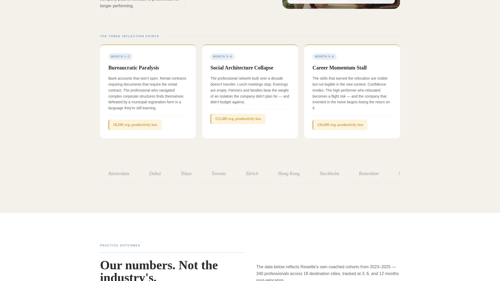
| Coaching Intervention Points | Maps structured coaching to each relocation inflection point |
| Practice Outcome Data | Presents the practice's own completion rates and satisfaction scores |
| Case Study Columns | Short magazine-column case studies give human context to outcome numbers |
| Mobility Audit Form | Primary B2B call-to-action collecting company details and work email |
| PDF Gated Download | Secondary path offering "The Hidden Cost of Unsupported Relocation" resource |
Design & branding system
The visual identity follows a Service Utility theme built on the Cloud Canvas color system. Every color choice carries a deliberate association with professional travel and corporate confidence.
- Soft overcast white (#F4F1EB) for backgrounds, passport-stamp charcoal (#2D2D2D) for body text, boarding-pass blue (#7CA1C4) for section dividers and structural accents
- Warm departure-lounge amber (#D4A24E) reserved exclusively for calls-to-action, pull-quote borders, and data callout backgrounds that glow like gate numbers on a terminal board
- Typography is set in a magazine editorial style: oversized display numbers, pull-quote cards with subtle shadows, and body text in charcoal on warm white for sustained readability
Mobile & speed optimization
The template is structured so that its editorial hierarchy reads cleanly on smaller screens. Oversized statistics and floating card elements are designed to adapt without losing their visual impact.
- The testimonial card and editorial photograph scale responsively so the floating-object effect remains legible on mobile viewports
- Data callout sections with amber backgrounds maintain their visual weight and readability as column layouts collapse to single-stack on narrow screens
How this template helps you convert
The page is engineered as a B2B sales argument, not a general marketing page. Each section earns the next one before asking for commitment.
- The testimonial header establishes immediate credibility with a named, verifiable source, so HR decision-makers feel they are in the right place before scrolling.
- The three-phase data escalation builds a cost-of-failure case that gives internal champions the numbers they need to justify a budget conversation with their own leadership.
- The dual call-to-action structure captures buyers at two different stages of readiness, improving total lead volume without diluting the quality of audit requests.
Other information about this template
This template is part of an editorial-meets-utility design category suited for specialty consulting and professional services niches where trust is the primary conversion lever. A few additional details worth knowing:
- The template style is Editorial/Magazine, which means layout choices prioritize scannability and credibility over decorative flair
- The header concept is a Testimonial Card, a deliberate choice to lead with social proof rather than a product headline
- The landing page direction is Partnership/B2B throughout, meaning every section is written and structured for an organizational buyer, not an individual consumer
- The theme is Service Utility, which balances visual polish with functional clarity so the page never sacrifices usefulness for aesthetics
- The creative direction is Stats-First Impact, a format where data points arrive before their explanatory narrative, rewarding attentive readers and building the business case incrementally
Theme
Service Utility
Creative direction
Stats-First Impact
Color system
Cloud Canvas
Style
Editorial/Magazine
Direction
Partnership/B2B
Page Sections
Stats-first Editorial Header
Escalating Data Section Architecture
Magazine-style Case Study Columns
Primary Mobility Audit Form
Gated PDF Lead Capture Path
Cloud Canvas Branding System
Related questions
Who is this landing page template designed for?
What makes the header stand out from a standard hero section?
What information does the Mobility Audit form collect?
Does the template include more than one conversion path?
What design style does this template follow?



