Local Brick & Mortar Business Booking Website Template
Clarity is a Neo-Retro hearing aid center landing page built for audiology clinics that want to turn website visitors into booked appointments. It pairs a warm Citrus Burst color system with an interactive Before/After audio gallery, a scroll-animated device mockup, and a five-step inline hearing assessment. The result is a landing page that feels personal, private, and emotionally honest from the first scroll.
by Rocket studio
Quick summary
Clarity is a gallery-plus-detail landing page designed for hearing aid fitting centers. It uses a Neo-Retro Citrus Burst design system, a scroll-linked device mockup hero, an interactive Before/After audio scenario gallery, vintage-style technology diagrams, named patient testimonials, and a five-step inline hearing quiz that gates a personalized Hearing Profile behind a name and phone number. Every section works toward one goal: giving people the clarity to take that first, private step toward better hearing.
Who this template is for
This landing page is built for audiology clinics and hearing aid fitting centers that serve adult patients and their families. It works especially well for practices that want to reduce the stigma of walking into a clinic by letting the first step happen online, at the visitor's own pace.
- Independent audiologists and hearing aid centers targeting adults aged 55 to 75 who are experiencing gradual hearing loss and are not yet ready to book in person.
- Practice managers and clinic marketers who want a landing page that doubles as a digital front door, empathizing with patient struggles before asking for a commitment.
- Adult children searching on behalf of resistant parents who insist the television is not that loud and need a low-pressure, private way to start the process.
What problem this template solves
Hearing loss is quiet in a very specific way. People do not notice it all at once. They realize it one muffled conversation at a time, one grandchild's recital they could not fully follow, one phone call they had to ask someone to repeat. By the time they search for help, many people feel embarrassed, overwhelmed, or simply unsure where to start. A generic clinic website does not solve that. It just lists prices and addresses and hopes visitors figure out the rest.
- Most clinic websites treat hearing loss as a product problem. This landing page treats it as a life experience, meeting visitors exactly where they are emotionally before introducing any device or price point.
- The inline quiz removes the risk of the first step. Visitors can assess their hearing privately at home, on their couch, before they ever have to walk through a clinic door.
- The Before/After audio gallery makes the difference tangible in a way that text and static images cannot. Visitors hear the world as it is and the world as it could be, which builds the kind of hope that moves people to act.
What you get with this template
You get a fully designed, ready-to-customize landing page that covers every stage of the patient journey, from emotional recognition of hearing loss to a booked fitting appointment. The design is warm, analog-optimistic, and built to feel comfortable to an audience that may be skeptical of overly clinical or overly digital experiences.
- A five-section landing page with a hero, audio gallery, technology explainer, testimonials section, and a five-step inline quiz, plus a linear single-row footer.
- A complete Neo-Retro Citrus Burst design system using tangerine, grapefruit, creamy vanilla, and charcoal, with DM Sans body text and Fraunces serif display headings.
- High interactivity components including a scroll-linked rotating device mockup, a draggable Before/After audio slider on each gallery card detail panel, a fixed bottom call-to-action bar, and animated five-step quiz transitions.
Feature list
This landing page is built around real interaction, not decorative motion. Every feature serves a clear conversion or trust purpose. Here is what the template delivers based on its design brief.
Scroll-Linked Device Mockup Hero
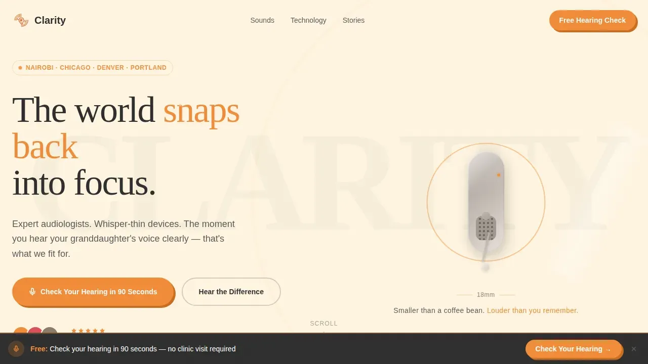
The hero opens with a hyper-detailed behind-the-ear hearing aid rendered at hero scale on a creamy vanilla background. The device floats at a three-quarter angle so light catches the brushed titanium casing and the micro-perforated speaker grille. As visitors scroll, the device rotates slowly to reveal its impossibly small profile. Concentric tangerine sound waves radiate outward around it in a vintage hi-fi style. The headline below the device reads: "Smaller than a coffee bean. Louder than you remember." This opening visual communicates everything the design needs to say before a single word of body text is read. The hero establishes that small, elegant, effective devices exist, and it does so in a way that feels warm and approachable rather than clinical.
Before/After Audio Scenario Gallery
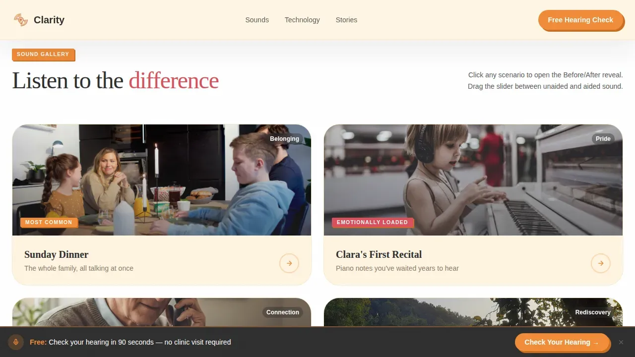
The gallery presents four listening scenario cards arranged in a grid. Each card represents a real-life moment: a dinner party, a grandchild's recital, a phone call, and wind through trees. Clicking any card opens a full detail panel where an interactive audio slider lets visitors drag between two states. On the left, the sound is muffled, tinny, and hollow, representing unaided hearing. On the right, the sound is crisp, layered, and full, representing aided hearing. As visitors scroll down the gallery, the scenarios escalate from quiet intimate moments to complex layered soundscapes. Each reveal is more emotionally loaded than the last. This design approach makes the value of hearing aids tangible and personal in a way that static copy and product photos simply cannot achieve.
Neo-Retro Technology Diagram Section
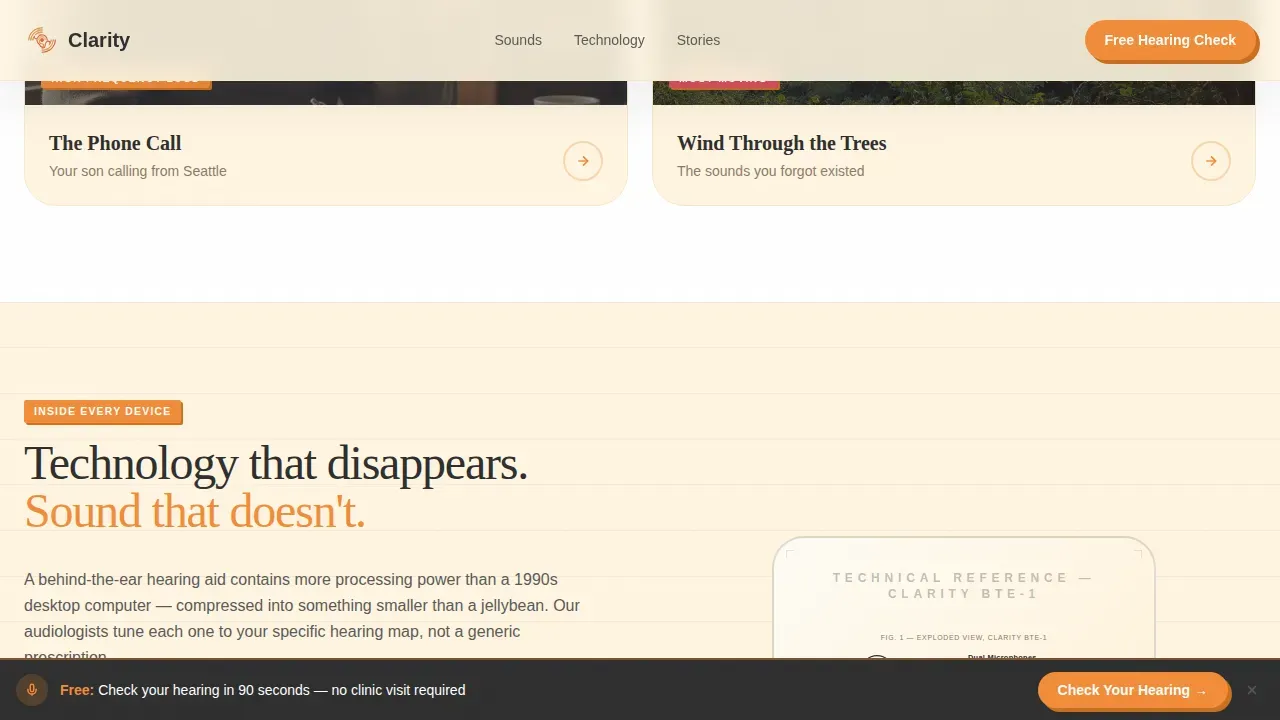
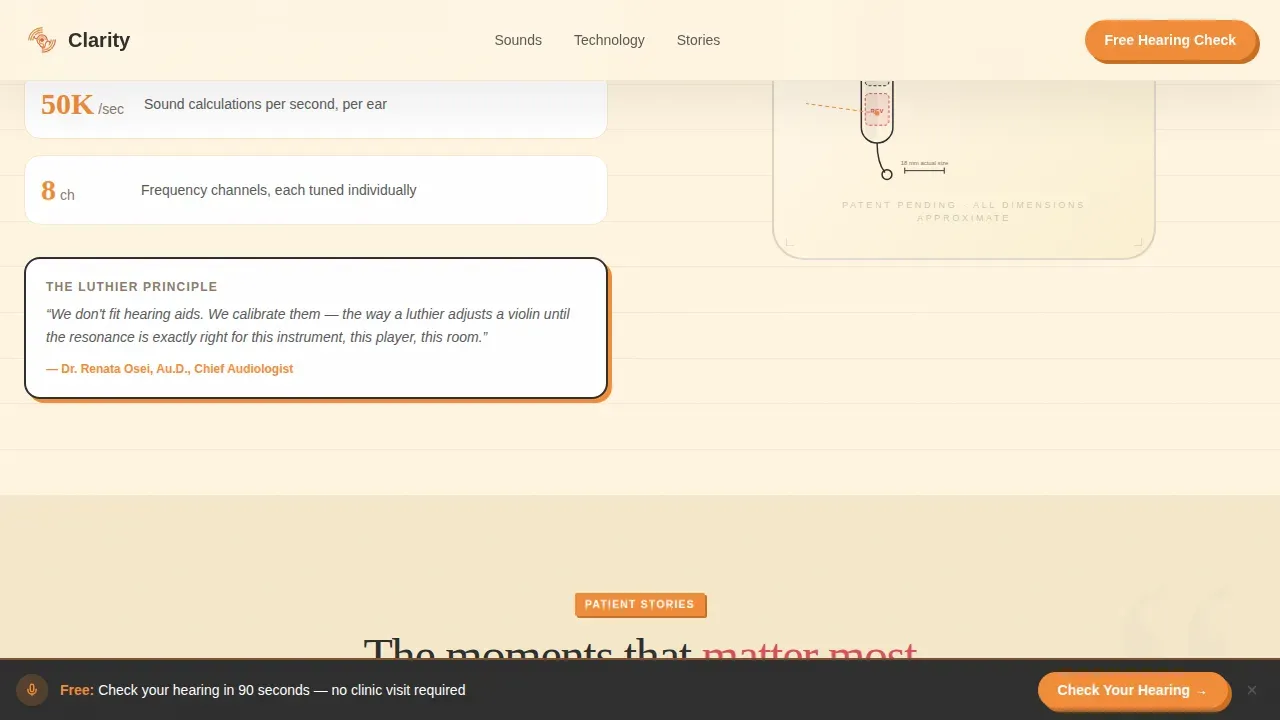
Between gallery rows, vintage technical-drawing style cross-sections of hearing aid devices appear. These are exploded diagrams rendered in the Neo-Retro aesthetic, with tangerine callout lines labeling individual components. The visual language borrows from mid-century instruction manuals and hi-fi equipment guides, making modern digital hearing aid technology feel approachable rather than intimidating. The development of today's hearing aids has produced rechargeable batteries, advanced noise management, and Bluetooth connectivity allowing users to connect devices directly to smartphones and other audio sources. The diagram section translates that development into something a first-time buyer can actually understand. It reduces anxiety by showing that the technology inside these small devices is precise, purposeful, and intelligently designed.
Named Patient Testimonials Section
The testimonials section contains three patient stories, each written with specific emotional outcomes rather than generic praise. Testimonials reference real scenarios: a grandchild's name, how many years hearing loss went unaddressed, the exact moment something changed. This specificity is intentional. Vague social proof does not work for a category where trust is the primary barrier. Effective landing pages for hearing care use compelling, named reviews from satisfied patients to establish credibility and reduce the risk perception that stops people from acting. The design places testimonials with high-contrast text against the vanilla background, keeping them readable and emotionally present without visual clutter.
Five-Step Inline Hearing Assessment Quiz
The primary conversion tool on this landing page is a five-step inline quiz launched from a fixed bottom call-to-action bar that appears after the first scroll. The quiz asks: how often the visitor asks people to repeat themselves (a slider from rarely to constantly), which environments are hardest to hear in (illustrated checkbox icons for restaurants, phone calls, and group conversations), how long they have noticed changes, whether they have worn hearing aids before, and finally their zip code to match a local audiologist. Results are gated behind a name and phone number, then delivered as a personalized Hearing Profile with a recommended device tier and a one-tap "Book a Free Fitting" button. Interactive tools like this hearing quiz engage visitors and pre-qualify leads before any phone call or clinic visit happens. The quiz makes the first step private, comfortable, and low-pressure.
Fixed Bottom Call-to-Action Bar
A persistent call-to-action bar appears fixed at the bottom of the screen after the visitor scrolls past the hero. It carries the primary prompt: "Check Your Hearing in 90 Seconds." This bar stays visible throughout the entire page experience so that no matter when a visitor decides they are ready, the entry point is always one tap away. Landing pages that focus on a single call-to-action and eliminate distractions consistently achieve higher conversion rates. This design applies that principle by making the quiz the one unmissable action on the page, without hiding it behind navigation menus or cluttered layouts.
Page sections overview
| Section | Purpose |
|---|---|
| Hero Device Mockup | Introduces the device with scroll-linked rotation and the emotional headline |
| Before/After Gallery | Four audio scenario cards with draggable unaided-to-aided sound sliders |
| Technology Diagram | Neo-Retro exploded cross-sections explaining device components |
| Patient Testimonials | Three named stories with specific emotional outcomes and audiologist credentials |
| Hearing Quiz Assessment | Five-step inline quiz leading to a gated personalized Hearing Profile |
| Fixed Bottom Bar | Persistent "Check Your Hearing in 90 Seconds" call-to-action |
| Linear Footer | Single-row footer with contact details and clinic information |
Design & branding system
The design language for this landing page is Neo-Retro: warm, analog-optimistic, and mid-century tactile. It evokes a 1962 transistor radio sitting on a sun-drenched kitchen counter. Everything feels optimistic and human, even when the underlying technology is thoroughly modern. The palette and typography work together to make the page feel comfortable for an audience that may be wary of overly clinical digital experiences. High-contrast text and buttons are central to the design system, ensuring readability for older visitors who may also have visual sensitivities.
- Citrus Burst color system: warm tangerine (#F28C38) for buttons and interactive elements, deep grapefruit (#D94F5C) for active states and highlights, creamy vanilla (#FFF5E1) for backgrounds, and charcoal (#2E2E2E) for body text.
- Typography: DM Sans for body text, giving the page a friendly and modern legibility; Fraunces for display headings, adding a warmth and editorial character that aligns with the Neo-Retro visual identity.
- Visual elements: hero-scale device rendering, concentric tangerine sound wave graphics, vintage exploded technical diagrams with tangerine callout lines, and illustrated checkbox icons in the quiz section all contribute to a design language that feels tactile and trustworthy.
Mobile & speed optimization
This landing page is built desktop-first but carries full mobile support across every section. The quiz in particular is designed for couch use: a real person lying on the sofa in the evening, finally deciding to do something about the hearing loss they have been putting off for years. That use case drives every mobile layout decision. Mobile-responsive design matters especially here because the majority of people searching for local health services, including hearing care, do so on a smartphone. Mobile-responsive design ensures the page is easily navigable for the 63% of users who search on mobile devices.
- The five-step quiz flows smoothly on mobile with large tap targets, clear progress indicators, and step-to-step transitions that work as well on a small screen as on a desktop.
- Static content sections such as the hero, testimonials, and footer use server-side components to keep the page fast, while the quiz and interactive gallery panels use client-side components for the interactive experience.
- The fixed bottom call-to-action bar is particularly effective on mobile, where it sits just above the device keyboard area and stays accessible throughout the entire scroll without interrupting the reading experience.
How this template helps you convert
This landing page is structured as a single-action funnel. Every design and content decision supports one outcome: getting a visitor to complete the hearing quiz and book a free fitting. Higher conversion rates happen when a landing page eliminates distractions and focuses entirely on a single call-to-action. This template applies that principle from the first scroll to the final quiz result screen.
- The emotional design does the heavy lifting first. Before asking for anything, the page helps visitors recognize their own struggle in the gallery scenarios and testimonials. When people finally see their experience reflected back at them, they are far more ready to act. Benefit-driven headlines and emotionally grounded testimonials build the trust that makes the quiz feel safe to complete.
- The quiz lowers the barrier to entry significantly. Instead of asking visitors to call a clinic or walk through a door, it gives them a private, guided, five-step process that ends with a personalized result. That result feels like a reward, not a sales pitch. The Hearing Profile with a recommended device tier and a one-tap booking button converts a passive reader into an active, pre-qualified lead without any pressure.
Other information about this template
This section covers additional context about the design decisions, the broader hearing care landscape, and the brand references embedded in the Surfer keyword targets for this template. Clarity as a design concept appears throughout the landing page in every layer, from the crisp sound of the aided audio slider to the sharp edges of the device diagram callout lines.
- The landing page concept draws on the documented effectiveness of hearing aids for improving social communication. Research and user surveys indicate that the majority of people who try hearing devices report improved hearing in multi-person conversations. Studies suggest that 90% of users hear better in group conversations, 84% hear the television or radio more clearly at normal volume, and 87% gain confidence in social situations after using effective hearing devices. These outcomes are the real world the landing page is promising to restore.
- Affordable hearing devices carry documented health benefits beyond sound quality. Untreated hearing loss is associated with an increased risk of cognitive decline, including dementia. A landing page that helps more people take the first step toward treatment is doing genuine health work, not just marketing. The quiz and booking flow are designed with that understanding in mind, giving people hope and a clear path forward without pressure.
- The concept of a 45-day money-back guarantee appears in the Surfer keyword targets for this template category, reflecting a common conversion-driving offer in the hearing aid market. Practices using this landing page may consider featuring a satisfaction guarantee and transparent price information prominently in the testimonials or quiz result sections to reduce perceived risk further.
- ClarityAids is a brand referenced in the Surfer keyword research for this template category. Over 300,000 customers have reported satisfaction with hearing devices in this market segment. ClarityAids provides rechargeable devices with a variety of ear tips to customize fit, and the brand was founded specifically to address the affordability gap in hearing care. These product and brand details are relevant context for practices that want to position their own offerings against the broader over-the-counter (OTC) hearing aid trend.
- The Neo-Retro design language is not merely aesthetic. It is strategic. Older adults and their adult children respond more warmly to design that feels human, tactile, and optimistic. A mid-century visual identity signals craft and care, not a corporate medical machine. Effective user interface and experience design for health applications must be designed with the end user in mind, prioritizing accessibility, large readable text, clear navigation, and intuitive interactions. This landing page applies those principles without making the experience feel clinical or cold.
- This template is pre-structured to support local search visibility. Prominent contact details, clinic name, and zip-code-based audiologist matching within the quiz all align with search behavior around local queries. The design is also intentionally free of distracting top navigation menus, keeping the page focused and fast. A single-action landing page with no navigation distractions consistently achieves over 8% conversion rates in healthcare contexts.
- All interactive components, including the gallery audio sliders, the quiz steps, the rotating hero device, and the fixed bottom bar, are designed to feel rewarding to use rather than effortful. The page design philosophy is that every interaction should give the visitor something: a new understanding, a moment of recognition, a small step of hope. That philosophy is what makes Clarity a landing page worth building on.
Theme
Neo-Retro
Creative direction
Before/After Reveal
Color system
Citrus Burst
Style
Gallery + Detail
Direction
Quiz/Assessment
Page Sections
Scroll-linked Rotating Device Hero
Before/after Audio Scenario Gallery
Neo-retro Technology Diagram
Named Emotional Testimonials Section
Five-step Inline Hearing Quiz
Fixed Persistent Call-to-action Bar
Related questions
Can I customize the quiz questions and result copy?
Does the Before/After audio slider require real audio files?
Is this landing page suitable for a multi-location clinic?
How does the fixed bottom call-to-action bar work on mobile?
What makes this different from a standard clinic website?



