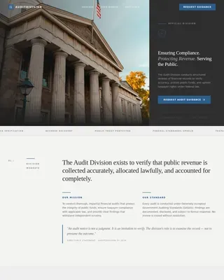
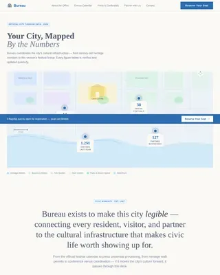
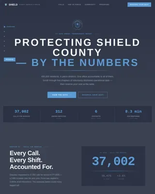
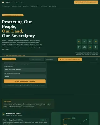
Advanced Emergency Management Government Professional Website Template
Prepared is a federal disaster response donation landing page template built for emergency management agencies and government-aligned relief programs. It pairs a Stats-First Impact layout with a split-screen design, animated live counters, and a progressive disclosure donation form. The result is an authoritative, conversion-ready page that moves donors from national-scale data to a single human story in one scroll.
by Rocket studio
Quick summary
Prepared is a single-page donation landing page template designed for federal emergency management agencies. It opens with institutional authority, agency seals, declared disaster counts, and dollar amounts deployed, then narrows the scale to one person's story. Every section earns the donor's trust before asking for the click.
Who this template is for
This template is built for organizations that coordinate disaster response at a federal or large-scale government level. It suits teams that need to convert site visitors into donors quickly, without sacrificing credibility.
- Federal and state emergency management agencies running public fundraising campaigns
- Nonprofit disaster relief organizations that operate alongside government programs
- Corporate social responsibility managers seeking a credible, data-backed donation channel during active disaster seasons
What problem this template solves
Most government and relief donation pages feel either too clinical or too emotionally manipulative. They either bury the donor in bureaucratic text or lead with raw grief and no proof of impact. Prepared solves both problems at once.
- Donors arrive skeptical and need proof of scale before they give; the animated counters and declared disaster statistics provide that proof immediately
- Visitors from affected communities need to feel that help is organized and already moving; the command-center visual tone communicates exactly that
- Organizations need a donation flow that does not overwhelm first-time givers; the progressive disclosure form reveals fields gradually to reduce drop-off
What you get with this template
You get a fully structured, single-page layout with seven distinct sections, each designed for a specific persuasive purpose. The template is production-ready and built around a clear visual hierarchy that prioritizes trust, then action.
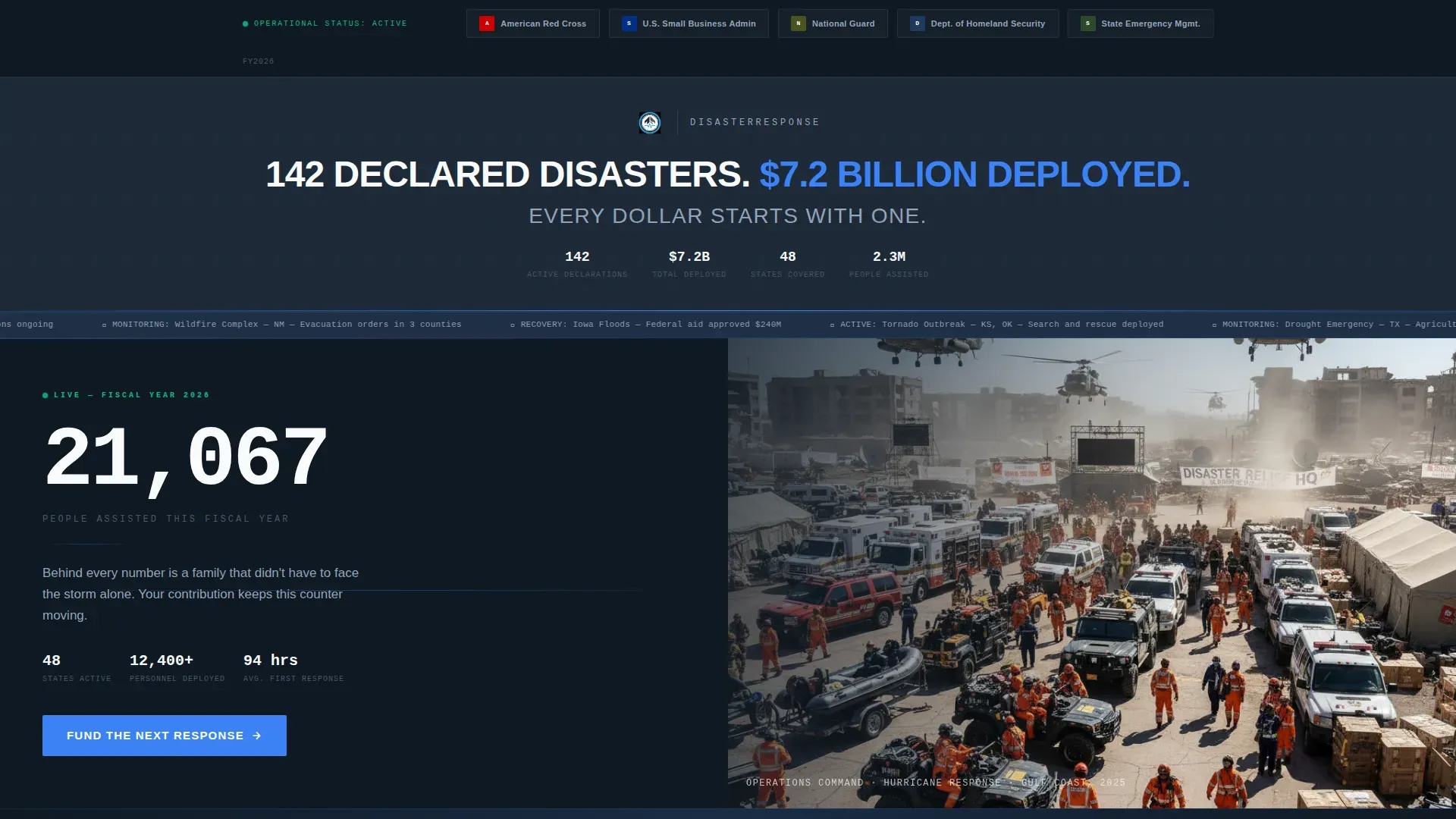
- A logo bar header displaying agency seals and partner organization marks above a condensed, all-caps headline
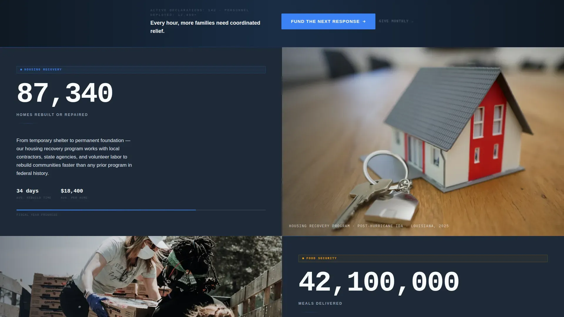
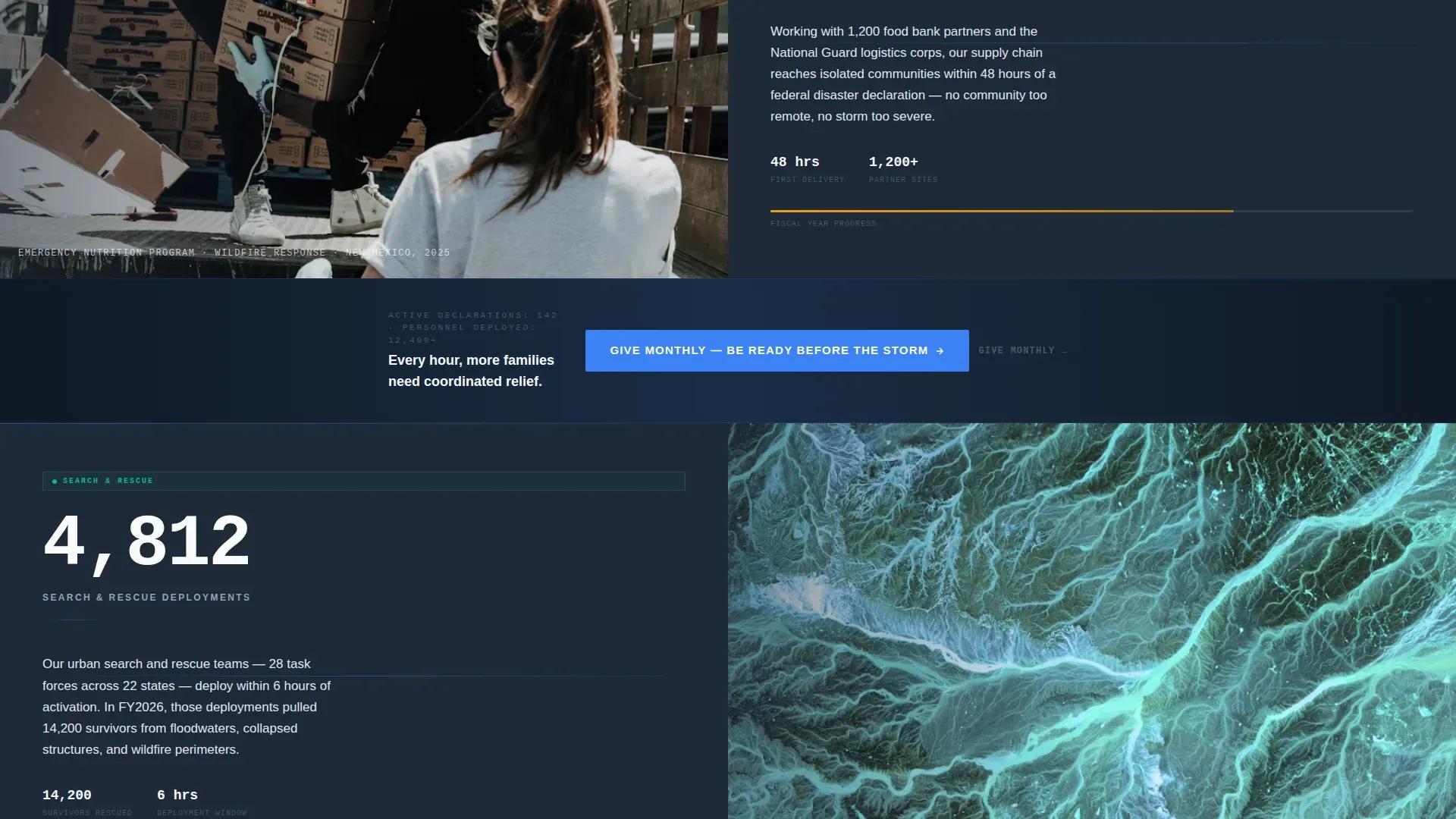
- Three 50/50 split-screen sections pairing a single large statistic with a documentary-grade photograph
- A progressive disclosure donation form with preset amounts and an expandable secondary field set for name, email, and payment details
Feature list
A paragraph overview of the feature set: Prepared is built around a tight set of purposeful components. Each one serves the single goal of moving a skeptical visitor toward a confident donation.
Animated Live Counters
The page opens with a large, scroll-triggered counter showing lives assisted in the current fiscal year. Additional counters track homes rebuilt, meals delivered, and search-and-rescue deployments. The numbers tick upward in real time, establishing scale before any copy asks for money.
Split-Screen Stat and Story Layout
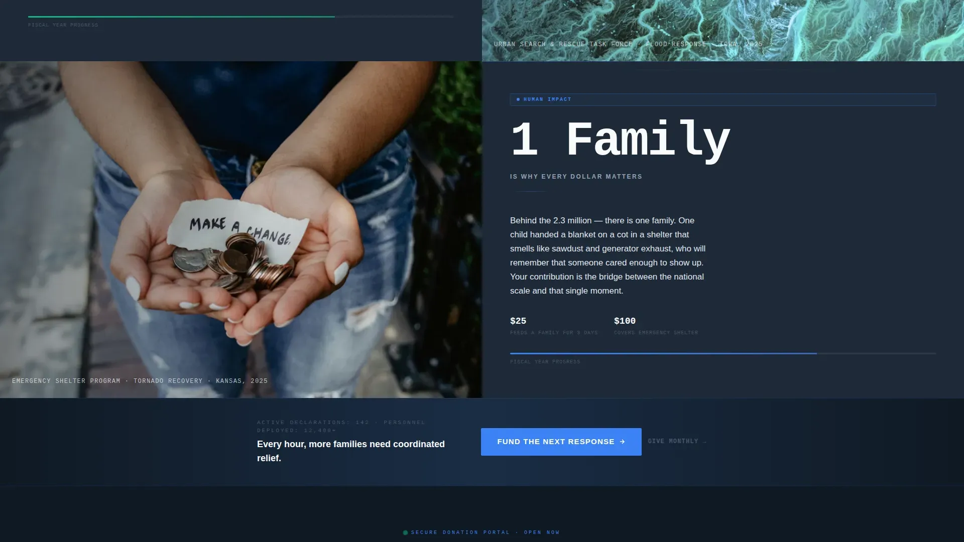
Each of the three core content sections divides the viewport into two equal panels. The left panel holds one stark number set in condensed typography. The right panel shows a single documentary-grade photograph. The pairing moves donors from data to empathy in one visual beat.
Progressive Disclosure Donation Form
The donation form starts with a single row of preset amounts: $25, $50, $100, $250, and an open field for other amounts. Selecting any amount expands the form to reveal name, email, and payment fields. No more than three fields are visible at any one time, keeping the experience focused.
Pinned Mobile Call to Action
The primary call to action, labeled "Fund the Next Response," is pinned to the bottom of the viewport on mobile devices. On desktop, it repeats after every third section. The placement ensures the donation path is never more than one scroll away.
Recurring Donor Secondary Path
A secondary call to action reads "Give Monthly, Be Ready Before the Storm." It gives repeat donors a clear path without competing with the primary donation button. This supports both one-time and sustained giving within a single page layout.
Institutional Logo Bar Header
The header is a clean horizontal band of agency seals and partner organization marks. It sits above a single centered headline in condensed, all-caps sans-serif type. The restraint communicates authority without relying on imagery or video.
Page sections overview
| Section | Purpose |
|---|---|
| Agency Logo Bar | Establish credibility via partner seals and condensed headline |
| Hero Split Screen | Animated lives-assisted counter paired with documentary photo |
| Homes Rebuilt Split | Single homes-rebuilt stat paired with a family photograph |
| Meals Delivered Split | Meals-delivered count paired with an individual story photo |
| Search and Rescue Split | Rescue deployments stat paired with a child and blanket photo |
| Donation Form Block | Progressive disclosure form with preset amounts and recurring option |
| Footer Row | Linear single-row footer pattern |
Design & branding system
The visual identity follows a Corporate Precision theme built around the Slate and Sky color system. The palette is designed to feel like a disaster-zone staging area looking up at the first clear sky after a storm: heavy ground, limitless overhead, and one sharp signal cutting through.
- Deep operations-room charcoal (#1E2A38) anchors backgrounds and structural elements; reinforced concrete gray (#4A5568) handles secondary text and borders
- Open-sky blue (#3B82F6) is reserved exclusively for interactive elements, live data accents, and call-to-action buttons
- Cloud-ceiling white (#F8FAFC) covers content area backgrounds; DM Sans handles condensed headlines and JetBrains Mono renders live numeric data
Mobile & speed optimization
The template is built desktop-first to match the command-center aesthetic of the brief, with deliberate mobile adaptations for the donation flow and navigation. The pinned call-to-action bar on mobile ensures the donation entry point is always reachable.
- The split-screen sections stack vertically on smaller viewports, keeping photographs and statistics readable without horizontal scrolling
- The progressive disclosure donation form is touch-friendly; preset amount buttons are large enough for confident tap selection on mobile screens
How this template helps you convert
The conversion strategy moves donors through a specific emotional and logical sequence. It does not ask for money until it has earned the right to ask.
- Animated counters open the page with proof of impact at national scale, giving skeptical donors an immediate reason to keep reading rather than bouncing.
- Each split-screen section narrows the scale progressively, moving from infrastructure statistics to individual family stories and finally to a single child's hand holding a donated blanket, making the donor feel that their contribution is the bridge between a large number and one real person.
- The progressive disclosure donation form removes friction at the final step, showing only preset amounts first and expanding gradually so the donor never feels overwhelmed before completing the gift.
Other information about this template
Prepared is designed specifically for the United States context. All currency references use USD with a dollar sign, and date formatting follows the MM/DD/YYYY standard. The declared disaster count and dollar-amount-deployed headline figures shown in the template are placeholder copy intended to be replaced with current, verified data from the deploying agency.
- The template style is Split Screen (50/50), a layout well suited to pairing quantitative proof with human-interest photography across desktop viewports
- Scroll-triggered reveals and split-screen transitions are specified as high-animation features; actual animation behavior depends on the build environment used to implement the template
- The footer uses a Pattern 1 Linear Single-Row layout, keeping the page close without adding navigational complexity
Theme
Corporate Precision
Creative direction
Stats-First Impact
Color system
Slate & Sky
Style
Split Screen (50/50)
Direction
Donation/Fundraising
Page Sections
Animated Live Response Counters
50/50 Split-screen Stat and Story Sections
Progressive Disclosure Donation Form
Pinned Mobile Call-to-action Bar
Institutional Agency Logo Bar
Recurring Donor Secondary Path
Related questions
Who is this donation landing page template designed for?
Can the preset donation amounts be customized?
Does the template support both one-time and recurring donations?
What happens when a visitor selects a donation amount?
Is this template suited for use during an active disaster event?