Luxe Office Supplies Subscription Box Landing Page
Restock is a luxe minimal landing page template built for office supplies subscription box brands. It combines a masonry photo wall header, a sunset gradient color system, and urgency-driven scroll sections to move visitors from curiosity to checkout. The template is designed to upsell existing subscribers and capture new gift buyers in a single, editorial-quality page flow.
by Rocket studio
Quick summary
Restock is a single-page landing page template for a quarterly office supplies subscription box. It opens with a living mosaic of subscriber photos, builds urgency through a countdown timer and scarcity messaging, then drives visitors toward either upgrading their current plan or gifting the box to someone else. Every section is designed to feel intentional, warm, and worth the click.
Who this template is for
This template is built for subscription box brands in the premium office and stationery space. It suits teams who already have an audience and want a dedicated page to drive upgrades, gifting, or limited-edition sales.
- Design-conscious office managers outfitting creative agencies with thoughtful supplies
- Remote workers building home offices that double as personal sanctuaries
- Executive assistants and gifting buyers who value beautifully curated stationery
What problem this template solves
Most subscription box pages feel transactional and flat. They list products without creating desire, and they miss the moment when a visitor is ready to spend more. This template closes that gap.
- Existing subscribers have no easy path to upgrade from a standard to a premium tier
- New gift buyers need a warm, trust-building experience before they enter a recipient's details
- Limited-edition drops lose urgency without visible timers, scarcity lines, and scroll-driven reveals
What you get with this template
You get a fully structured landing page built around a masonry layout and a curated editorial flow. Each section serves a specific job in the buyer journey, from first impression to final form submission.
- A staggered UGC photo wall header with editorial serif headline overlay
- A countdown timer bar, product masonry tiles with hover expansion, and a tier comparison grid
- Two conversion paths: an upgrade flow for existing subscribers and a gift purchase form for new buyers
Feature list
A brief overview of the template's built-in capabilities follows. Each feature is drawn directly from the page structure and design direction described in the brief.
UGC Photo Wall Header
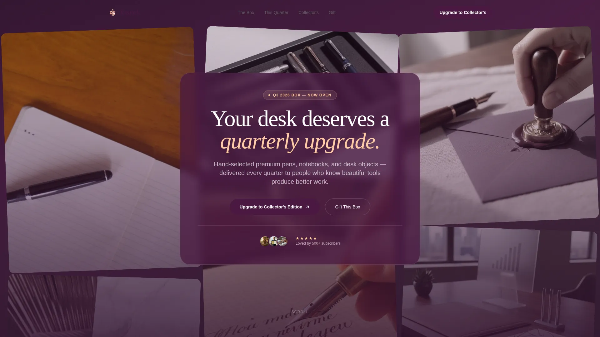
A masonry mosaic of real subscriber photos fills the header. Tiles are staggered at varied crops and angles, some slightly desaturated and others warmed with sunset tones. A single editorial serif headline floats over the center. Tiles shift gently on load to suggest freshness and community.
Sunset Gradient Color System
The page uses warm ivory as the dominant background, with a gradient that moves from soft peach through dusty rose into deep plum on accent cards and hover states. Gradient washes bleed subtly behind masonry tiles and intensify as visitors scroll deeper, mimicking the pace of golden hour light.
Countdown Timer and Scarcity Bar
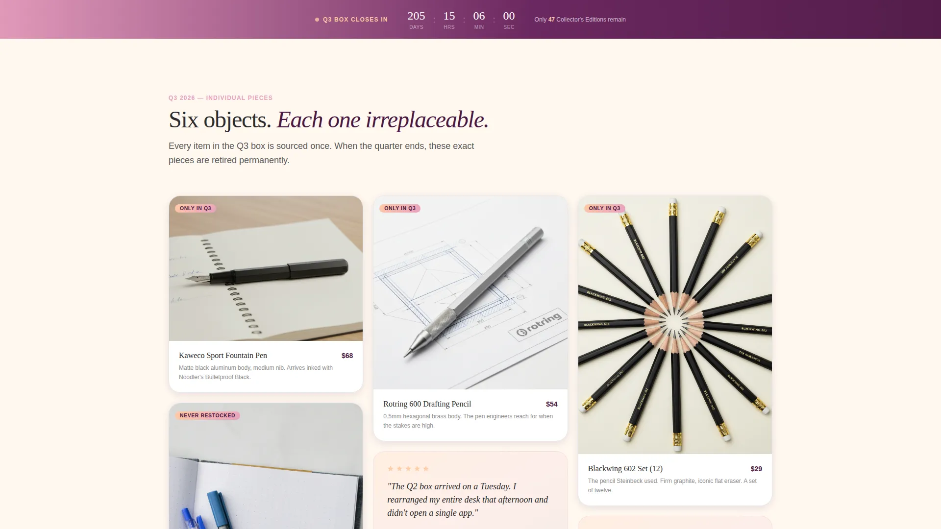
A plum gradient bar near the top of the page embeds a live countdown timer for the current quarter's drop. A scarcity line reading "only 200 Collector's Editions per quarter" reinforces urgency before the visitor reaches the upgrade form.
Masonry Product Tiles with Hover Expansion
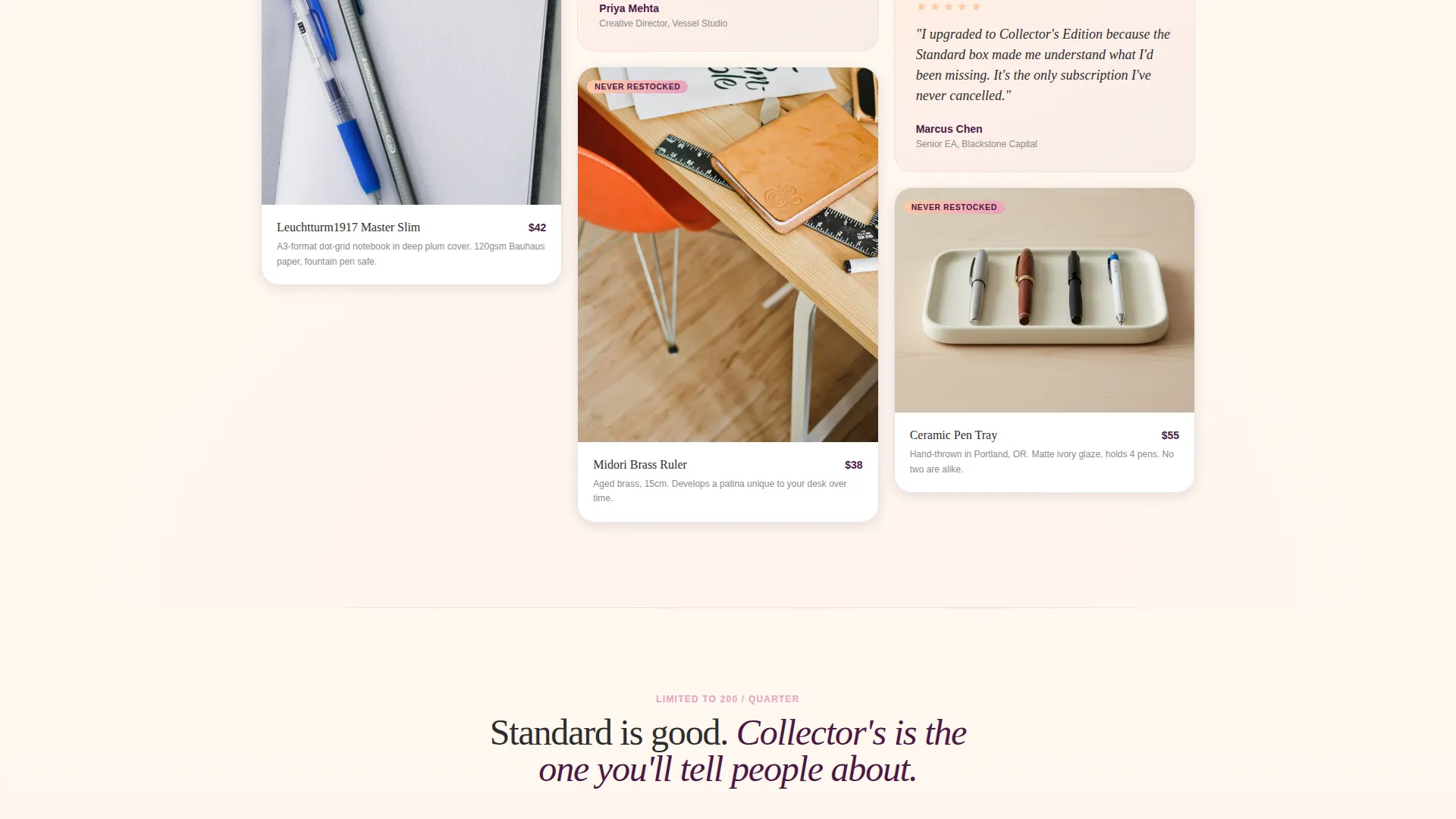
Individual product tiles are arranged in a Pinterest-style masonry grid. Each tile expands on hover to reveal product details and is tagged with labels such as "Only in Q3" or "Never Restocked," creating a sample-sale sense of scarcity and discovery.
Tier Comparison Grid
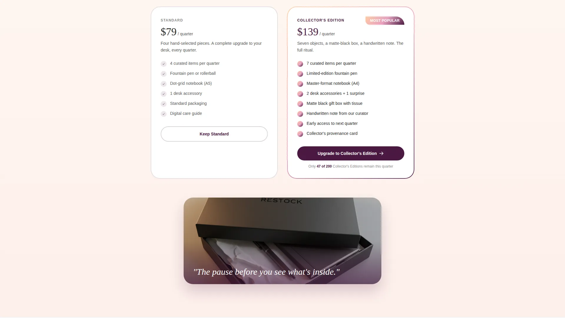
A structured grid compares the Standard box against the Collector's Edition. The premium tier is visually distinguished with a peach-to-plum gradient border. This section positions the upgrade as an obvious, desirable choice before the primary call to action appears.
Dual Conversion Path Forms
The primary call-to-action button reads "Upgrade to Collector's Edition" in a plum button with a peach hover glow. A secondary path labeled "Gift This Box" collects a recipient name, shipping address, and a handwritten note field. On mobile, the upgrade button repeats as a sticky bottom bar.
Page sections overview
| Section | Purpose |
|---|---|
| UGC Photo Wall | Opens page with subscriber community mosaic and editorial headline |
| Countdown Timer Bar | Builds immediate urgency around the current quarter's limited drop |
| Current Quarter Box | Reveals this quarter's curated product selection with scarcity tags |
| Product Masonry Grid | Expands on hover to show individual item details and edition labels |
| Subscriber Pull Quotes | Layers handwritten-style testimonials between product cards |
| Tier Comparison Grid | Contrasts Standard and Collector's Edition boxes side by side |
| Upgrade Call to Action | Primary plum button driving subscribers to the premium tier |
| Gift Purchase Form | Secondary path for new buyers with recipient and note fields |
| Sticky Mobile Bar | Repeats upgrade call to action as a persistent bottom bar on mobile |
Design & branding system
The visual identity follows a Luxe Minimal theme that feels editorial and warm without being loud. Every color and typographic choice is deliberate, evoking the last fifteen minutes of golden hour falling across a clean white desk.
- Color palette: warm ivory (#FFF8F0) background, peach (#FFCBA4) through dusty rose (#E8A0BF) into deep plum (#4A1942) for accents and hover states, charcoal (#2D2D2D) for body text
- Typography: editorial serif for the hero headline and pull quotes, paired with clean body type for product descriptions and form labels
- Gradient behavior: sunset washes bleed behind masonry tiles and intensify with scroll depth, so the page feels like a living, shifting atmosphere rather than a static layout
Mobile & speed optimization
The template is structured to keep the mobile experience as intentional as the desktop version. The layout adapts the masonry grid and comparison sections for smaller screens without losing the editorial feel.
- Masonry tiles restack cleanly on mobile so product details and scarcity tags remain legible
- The sticky upgrade button appears as a fixed bottom bar on mobile, keeping the primary call to action visible at every scroll depth
- The gift form fields, including recipient name, shipping address, and handwritten note input, are sized and spaced for comfortable mobile entry
How this template helps you convert
The page is built around a clear commercial goal: move visitors to upgrade or buy. Every section earns trust or builds desire before the form appears.
- The countdown timer and scarcity line do the persuasion work early, so visitors arrive at the upgrade button already primed to act rather than still weighing the decision.
- The tier comparison grid makes the Collector's Edition feel like the obvious choice by placing both options side by side with clear visual hierarchy and a glowing gradient border on the premium tier.
- The dual conversion path serves two distinct buyer types in the same page flow, so no visitor leaves without a relevant next step, whether they are upgrading their own subscription or buying the box as a gift.
Other information about this template
This template was designed specifically for the office supplies subscription box niche within retail and e-commerce. It is built on a Masonry and Pinterest-style layout direction and fits brands that already have a subscriber base and want a dedicated page for quarterly drop campaigns.
- Template style: Masonry and Pinterest layout
- Theme: Luxe Minimal
- Creative direction: Limited Time urgency
- Header concept: UGC Photo Wall
- Landing page direction: Upsell and Upgrade flow
- Color system: Sunset Gradient
- Category fit: Retail and E-Commerce, Office Supplies E-Commerce subcategory
- Best used for: quarterly limited-edition drops, subscriber upgrade campaigns, and premium gift purchase flows
Theme
Luxe Minimal
Creative direction
Limited Time
Color system
Sunset Gradient
Style
Masonry/Pinterest
Direction
Upsell/Upgrade
Page Sections
UGC Photo Wall Header
Sunset Gradient Color System
Countdown Timer and Scarcity Messaging
Masonry Product Tiles with Hover Expansion
Tier Comparison Grid
Dual Conversion Path Forms
Related questions
Who is this landing page template designed for?
Can I use this template to attract brand-new customers?
How does the urgency system work in this template?
What does the tier comparison grid include?
Is this template suitable for a mobile audience?



