Occupational Therapist Booking Website Template
A warm, unhurried occupational therapist appointment booking landing page built around an empathy-first inline assessment quiz. The zigzag layout guides visitors from recognizing their struggles to booking a first session, all without a phone call. Designed for post-stroke patients, caregivers, parents, and office workers, the page earns trust before it ever asks for a commitment.
by Rocket studio
Quick summary
This occupational therapist appointment booking landing page uses a zigzag layout to walk visitors through three clear stages: identifying their struggle, understanding what is happening in their body, and seeing a real path forward. A five-step inline assessment quiz sits at the center of the conversion flow, making every visitor feel understood before a session is ever booked.
Who this template is for
This landing page is built for occupational therapy practices that serve a wide range of patients. It works especially well for solo practitioners and small clinics whose clients arrive anxious, uncertain, and in need of reassurance before committing to an appointment.
- Post-stroke patients and injury recovery adults researching options from a hospital or home
- Parents of children with fine motor or developmental challenges who need clear, gentle guidance
- Office workers with repetitive strain and aging adults whose families are weighing independent living support
What problem this template solves
Many occupational therapy practices lose prospective patients at the first contact point. The page either feels too clinical, asks for a phone call too soon, or fails to name the visitor's specific struggle. This template solves that gap by building trust through education before it asks for a booking.
- Visitors leave because nothing on the page mirrors what they are actually feeling or experiencing
- Generic booking forms create friction for patients who do not yet know how to describe their condition
- A cold call-to-action placed too early pushes uncertain visitors away before they feel ready
What you get with this template
You get a fully structured single-page layout that moves visitors from emotional recognition to confident booking. Every section has a clear job, and the inline quiz ties the whole experience together without sending the visitor to a separate page.
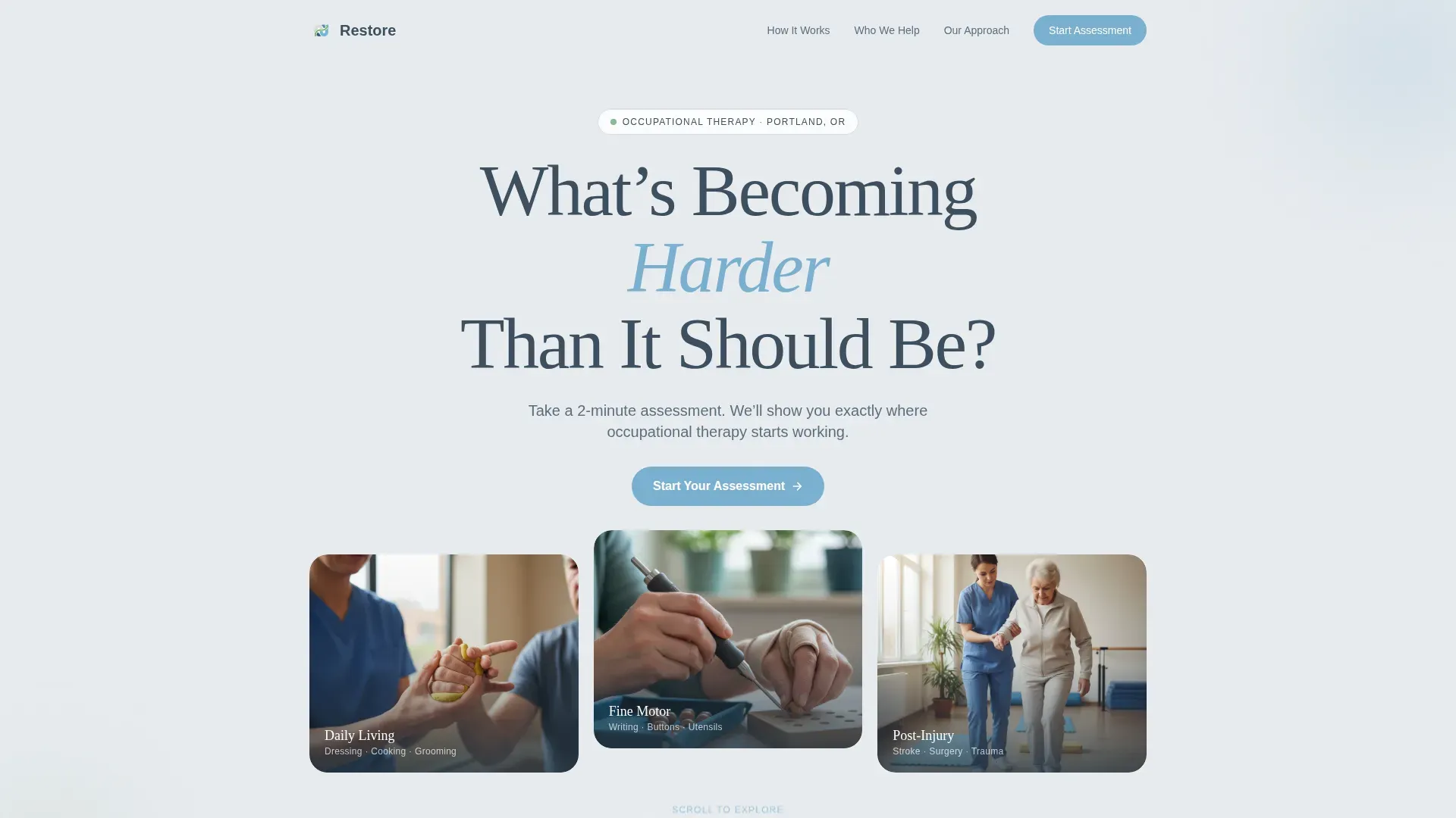
- A hero section with a large centered serif headline, a subline, and a primary assessment call-to-action
- Four zigzag content sections covering Identify, Understand, and See the Path stages, plus the inline five-step quiz
- A footer using a split layout with logo and tagline on the left and navigation links on the right
Feature list
This landing page template includes the following built-in features, each designed to reduce friction and build confidence at every scroll depth.
Giant Centered Hero Headline
The hero opens with a warm serif headline set at large scale on a cloud-gray field. Generous whitespace and a single supporting subline create immediate emotional resonance without visual clutter.
Zigzag Alternating Section Layout
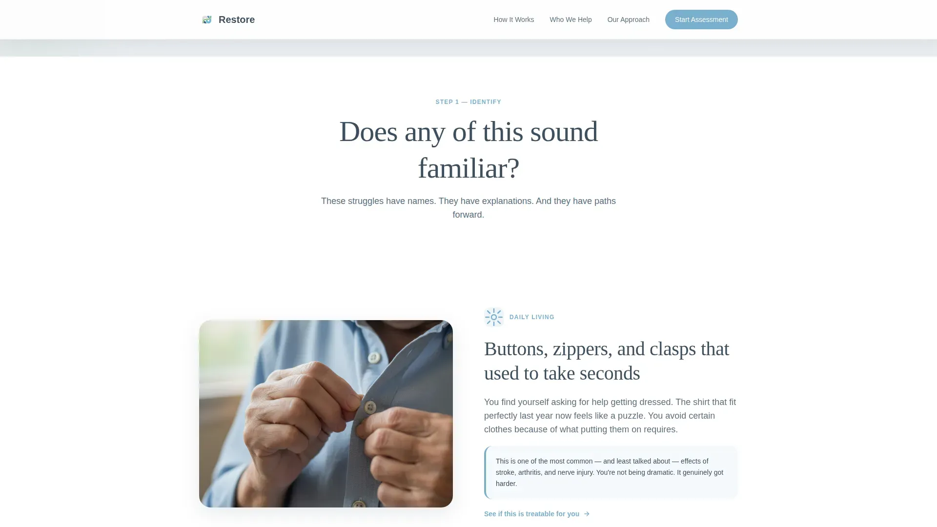
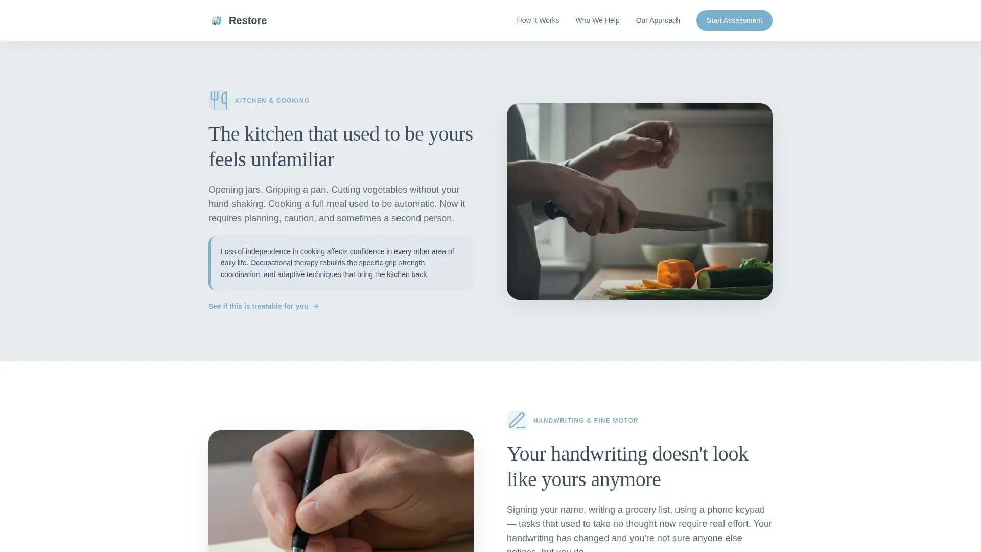
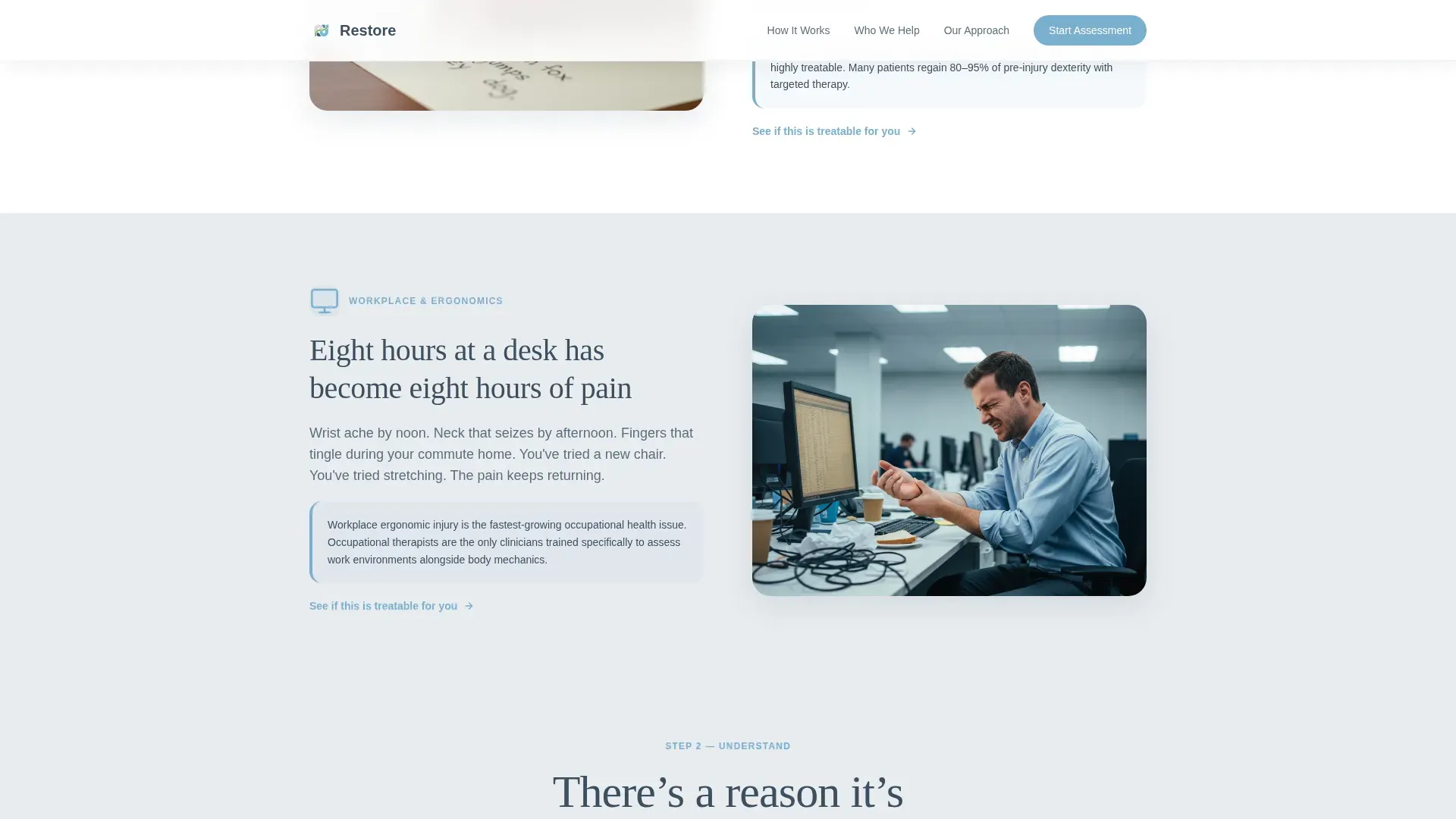
Content alternates left and right through the Identify, Understand, and See the Path stages. Line drawings appear in the Identify sections; natural-light photography of hands working with adaptive tools fills the Understand and See the Path sections.
Inline Five-Step Assessment Quiz
The quiz opens directly on the page without redirecting the visitor. Five progressive questions cover area of difficulty, duration of challenge, current pain level, priority goal, and insurance type. A living-green progress bar advances with each answered question.
Personalized Results and Calendar Booking
After the final quiz question, the page delivers a tailored summary based on the visitor's answers. A calendar embed follows immediately, paired with a secondary call-to-action to book a first session.
Persistent Secondary Call-to-Action
A booking button reappears after the second scroll section, keeping the conversion option visible as visitors read deeper into the page without feeling pressured too early.
Social Proof Integration
The template includes dedicated space for specific patient outcome metrics and named testimonials with disclosed conditions, giving prospective patients real evidence rather than generic five-star ratings.
Page sections overview
| Section | Purpose |
|---|---|
| Hero Headline | Opens with empathy; presents the assessment call-to-action |
| Identify Zigzag | Mirrors common struggles with alternating line-drawing illustrations |
| Understand Zigzag | Explains what is happening in the body using therapy photography |
| See the Path | Shows real techniques and adaptive tools in natural-light images |
| Inline Assessment Quiz | Five-step quiz with progress bar leading to personalized results |
| Results and Booking | Delivers a tailored summary and embeds a session calendar |
| Page Footer | Splits logo and tagline left, navigation links right |
Design & branding system
The visual identity follows an Organic Flow theme. The palette draws from the feeling of a courtyard garden beside a clinic: stone underfoot, open sky overhead, and new growth coming through the gaps. Every color has a specific role and stays in its lane.
- Deep therapeutic slate (#3D4F5F) carries all body text; open-sky blue (#7AAFCF) marks interactive elements and section transitions; cloud gray (#E8ECF0) and white alternate as section backgrounds
- Living green (#88B892) appears only on the progress bar and active states, functioning as a reward color that responds to visitor action
- Typography pairs Fraunces serif for headlines with DM Sans for body text, creating warmth at large scale and clarity at reading size
Mobile & speed optimization
The template is built mobile-first, reflecting the reality that many patients search and research from hospital beds or small screens during difficult moments. The layout prioritizes readability and tap targets at every breakpoint.
- Images use lazy loading to keep the initial page load light, even on mobile connections
- Scroll-linked reveal animations and staggered fades are applied at medium intensity to stay engaging without draining device performance
- The inline quiz uses CSS scroll-behavior for smooth transitions between steps without requiring a page reload
How this template helps you convert
The conversion strategy is built around earning the booking rather than demanding it. Every design and content decision reduces resistance and increases the visitor's confidence that this practice understands their specific situation.
- The assessment quiz captures intent early by asking the right questions in the right order, so the personalized result feels genuinely relevant rather than generic, making the calendar step a natural next action.
- The persistent call-to-action button reappears at a second scroll depth, catching visitors who needed more information before feeling ready, without repeating the same pressure at every section.
Other information about this template
This template is designed specifically for occupational therapy practices operating in the United States, with English-language copy, USD pricing context, and an insurance-type field included in the quiz. It is a strong fit for practices that want to present a warm, professional online presence without a complex multi-page website build.
- The footer follows a split layout pattern with the logo and tagline anchored on the left and supporting navigation links on the right
- Social proof sections support specific outcome metrics and named patient testimonials, which are more persuasive than anonymous reviews in a healthcare context
- The template is well-suited for practices offering services across daily living support, fine motor rehabilitation, workplace ergonomics, pediatric development, and post-injury recovery
Theme
Organic Flow
Creative direction
Step-by-Step Guide
Color system
Slate & Sky
Style
Zigzag/Alternating
Direction
Quiz/Assessment
Page Sections
Giant Centered Hero Headline
Zigzag Alternating Section Layout
Inline Five-step Assessment Quiz
Personalized Results with Calendar Booking
Persistent Call-to-action Button
Named Testimonials and Outcome Metrics
Related questions
Who is this landing page template designed for?
Does the quiz send visitors to a separate page?
Can I use this template for a pediatric occupational therapy practice?
What does the personalized quiz result show the visitor?
How many sections does this landing page include?



