Certified Physical Therapy Landing Page Template
Mend is a sidebar companion landing page built for physical therapy clinics that lead with patient proof. It surfaces condition-tagged video testimonials, a transparent first-visit walkthrough, and a real-time review filter alongside a downloadable first-visit guide. The result is a page that feels like honest advice from a trusted source, not a sales pitch.
by Rocket studio
Quick summary
Mend is a single-page, sidebar companion landing page designed to turn patient skepticism into confident bookings. It organizes real testimonials, press recognition, and a transparent care process into one clean, scrollable experience. Visitors arrive unsure and leave informed. Every section answers the next logical doubt before the reader has to ask.
Who this template is for
This template is built for physical therapy clinics that want their reputation to do the heavy lifting. If your practice has real patient outcomes and honest stories, this page gives them the right structure to land.
- Post-surgical patients researching clinics from home or a hospital bed
- Weekend athletes with a general practitioner referral who need to compare options quickly
- Office workers whose neck or back pain has moved from a mild annoyance to a daily alarm
What problem this template solves
Most physical therapy clinic pages lead with stock photography and generic service lists. Visitors who are already in pain have no time for that. They need to see real people, real conditions, and real outcomes before they trust a clinic with their recovery.
- Unfiltered patient language gets buried or skipped entirely on standard clinic websites
- Prospective patients cannot find reviews for their specific condition without digging through unstructured text
- Common objections around insurance, first-visit experience, and therapist credentials go unanswered until it is too late
What you get with this template
You get a fully structured landing page that leads with social proof and follows it with process transparency. The layout is designed for desktop-first display, with a fixed sidebar filter that lets visitors narrow testimonials by condition, therapist, or recovery stage in real time.
- A press mentions bar, video testimonial grid with condition tags, and a minute-by-minute first-visit walkthrough
- A persistent sidebar filter anchoring the primary call to action: "Find Reviews for Your Condition"
- A secondary conversion path with a PDF download ("Your First Visit: What to Expect") gated behind a single email field and an optional injury-type checkbox
Feature list
This template includes the following built-in features, each grounded in the layout and interaction design described in the source brief.
Press Mentions Header Bar
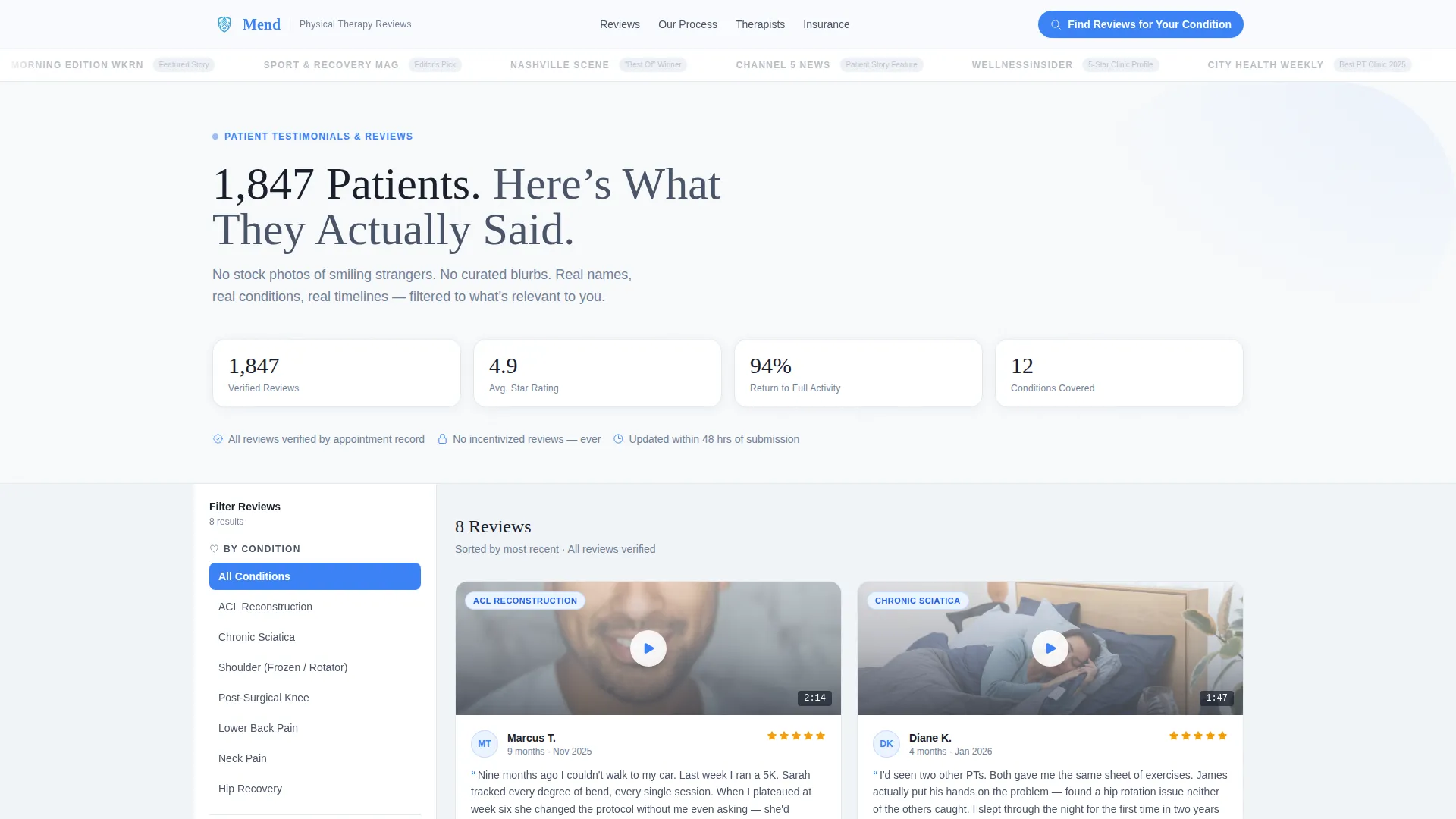
A horizontal strip of desaturated press logos sits above the hero headline. Local news stations, health publications, and city award marks are rendered in clinical slate, each linking to its original mention. The restraint communicates credibility without decoration.
Condition-Tagged Video Testimonial Grid
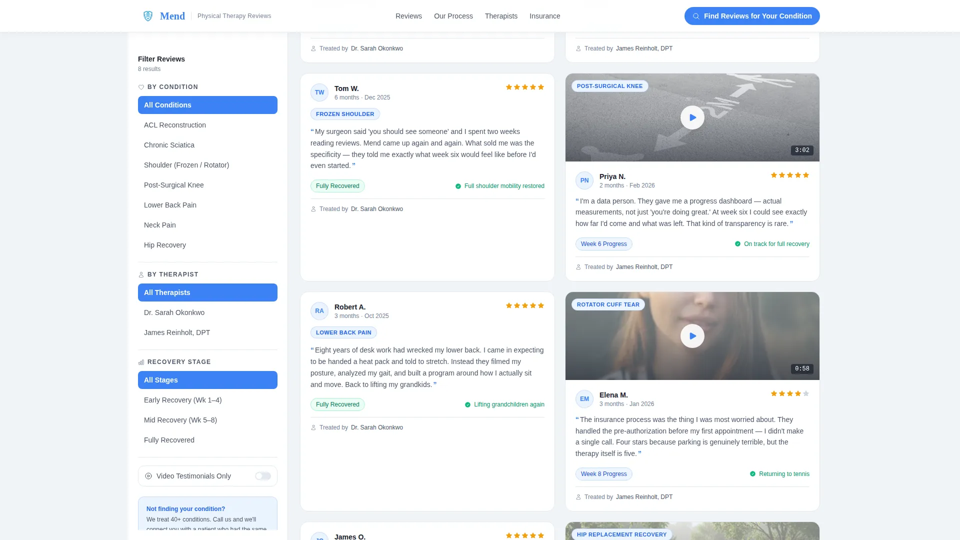
Patient testimonials are displayed as video cards carrying condition tags such as ACL reconstruction, chronic sciatica, and frozen shoulder. Each card includes a timestamp and a direct patient quote with a first name and months of treatment noted. Visitors can scan by condition rather than reading every entry.
Real-Time Sidebar Filter
The sidebar stays fixed as the visitor scrolls. It lets them narrow the testimonial grid by condition, therapist name, or recovery stage without reloading the page. The primary call-to-action button anchors directly inside this sidebar.
Transparent First-Visit Walkthrough
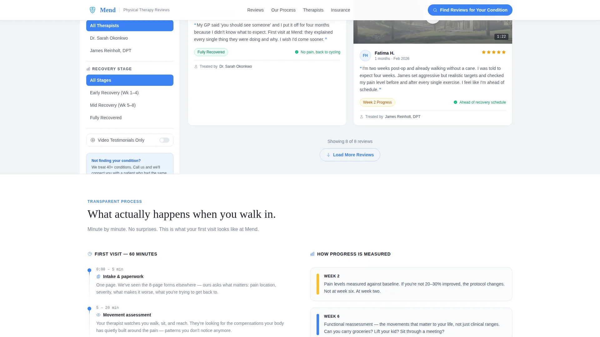
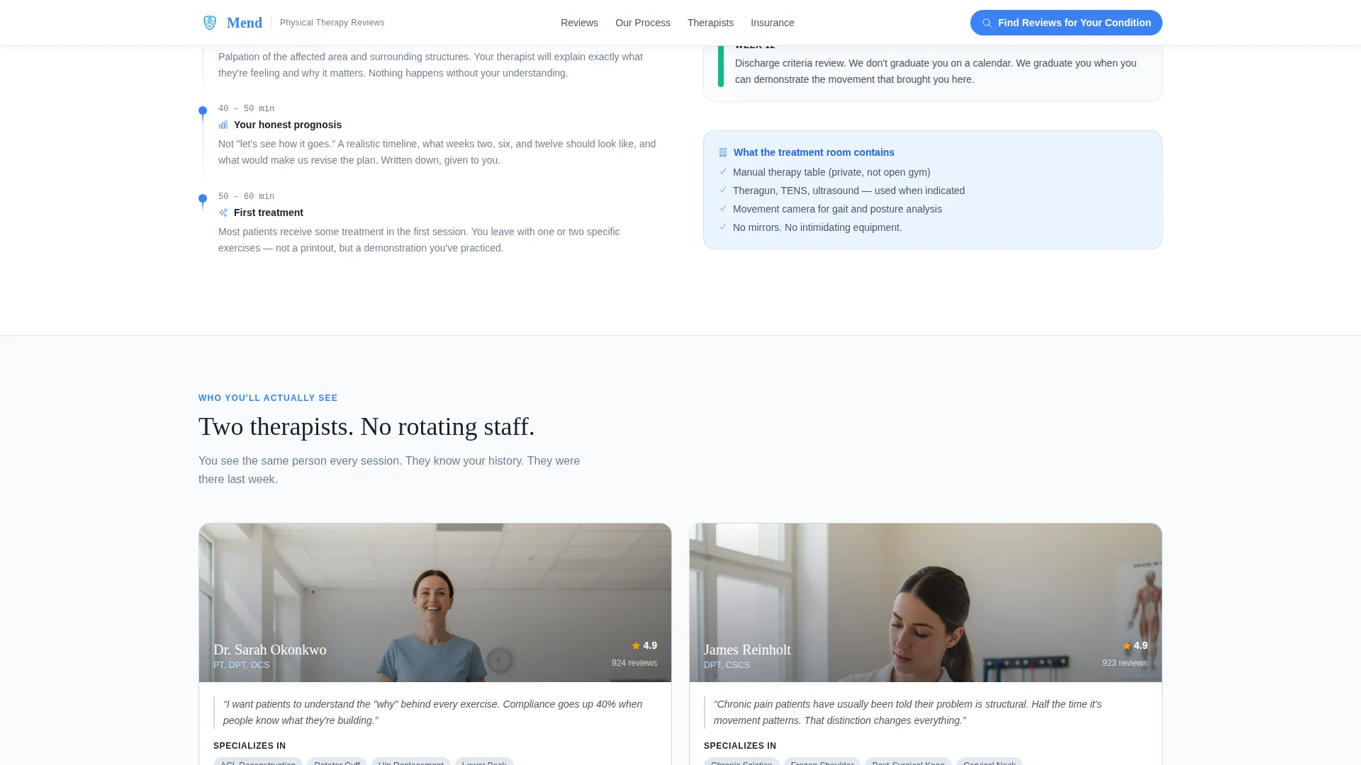
A dedicated scroll section breaks down the first appointment minute by minute. It shows what the treatment room contains and how patient progress is measured at weeks two, six, and twelve. This section turns an unfamiliar process into a familiar one.
Preemptive Insurance and Logistics Section
Insurance and logistics questions appear in the page flow exactly when a reader would think to ask them. Accepted plans and practical logistics are addressed directly, reducing friction before the visitor reaches the call to action.
PDF Download Conversion Path
A secondary conversion path offers a downloadable guide titled "Your First Visit: What to Expect." It is gated behind a single email field and an optional injury-type checkbox, keeping the ask light while capturing meaningful lead data.
Page sections overview
| Section | Purpose |
|---|---|
| Hero + Press Bar | Anchors credibility with press logos and the patient-count headline |
| Video Testimonials Grid | Displays condition-tagged, timestamped patient video reviews |
| Fixed Sidebar Filter | Lets visitors narrow reviews by condition, therapist, or stage |
| Transparent Process | Walks through the first visit minute by minute |
| Progress Milestone Markers | Shows measurable outcomes at weeks two, six, and twelve |
| Therapist Profiles | Introduces the clinicians with credentials and specialties |
| Insurance & Logistics | Answers accepted plans and common logistics questions |
| Call to Action + PDF | Closes with the primary filter call to action and downloadable first-visit guide |
| Footer | Single-row linear footer with practice contact and links |
Design & branding system
The visual identity follows a Service Utility theme built on clinical restraint. The palette feels like a clean intake room with afternoon light coming through one tall window. No decoration competes with the information a visitor came to find.
- Clinical slate (#4A5568) for body text, soft storm gray (#E2E8F0) for section backgrounds, and open sky blue (#3B82F6) for interactive highlights and trust indicators
- Cloud white (#F8FAFC) as the reading surface, keeping every content block breathable and easy to scan
- DM Sans handles body utility text while Fraunces supplies editorial serif headlines, creating a clear typographic hierarchy between information and emphasis
Mobile & speed optimization
The template is designed desktop-first, driven by the fixed sidebar filter that requires a wider layout to function as intended. On smaller screens, the sidebar stacks responsively below the main content so the filter remains accessible.
- Scroll-linked sidebar behavior is handled through intersection observer logic, keeping the desktop experience smooth and position-aware
- Static page sections use server components while the filter, sidebar, and video testimonial cards rely on client-side interactivity for real-time response
- Staggered reveal animations are set to a medium intensity so the page feels alive without distracting a visitor who is already in pain and looking for answers
How this template helps you convert
The conversion strategy is built on earning trust before asking for anything. Every scroll section front-loads proof and answers a doubt before presenting a call to action.
- The press mentions bar and patient-count headline establish credibility in the first three seconds, before the visitor has read a single word of body copy.
- The condition-tagged testimonial grid with the real-time sidebar filter gives visitors a personal reason to engage. Filtering by their own condition makes the proof feel directly relevant rather than generic.
- The PDF download path offers a low-commitment secondary conversion. A single email field and an optional injury checkbox keep the ask small, so visitors who are not ready to book can still enter the pipeline.
Other information about this template
This template is part of a broader design system built for professional services businesses that rely on trust rather than transaction. It is particularly well suited to practices where the decision to book requires research, comparison, and reassurance.
- The sidebar companion layout is a deliberate structural choice: it keeps the filter persistent so visitors never lose their place while scrolling through long testimonial lists
- Typography pairing of DM Sans and Fraunces creates a balance between clinical utility and human warmth, matching the tone of a practice that is professional but approachable
- The page earns its call to action by front-loading unfiltered patient language and star ratings, so the visitor arrives at the primary button feeling informed rather than sold
Theme
Service Utility
Creative direction
Transparent Process
Color system
Slate & Sky
Style
Sidebar Companion
Direction
Content/Resource
Page Sections
Press Mentions Header Bar
Condition-tagged Video Testimonial Grid
Real-time Sidebar Filter
Transparent First-visit Walkthrough
Preemptive Insurance and Logistics Section
PDF Download Conversion Path
Related questions
Can I customize the condition tags in the testimonial filter?
Does the sidebar filter work on mobile devices?
How does the PDF download gate work?
Can I add my own therapist profiles and credentials?
Is this template suitable for a multi-location practice?



