Precision Hand Surgery Landing Page Template
Mend is a precision hand surgery comparison landing page built for hand and upper extremity practices. It opens with a three-step self-diagnosis form, walks visitors through the patient journey, and delivers non-surgical versus surgical comparison tables per condition. The result is a landing page that converts anxious symptom-searchers into booked consultations through clinical clarity and calm, deliberate design.
by Rocket studio
Quick summary
Mend is a single-page landing page template designed for hand and upper extremity surgery practices. It guides symptomatic visitors through a self-diagnosis flow, names their likely condition, then presents honest side-by-side treatment comparison tables. By the time a visitor reaches the call-to-action button, they already understand their options and their expected recovery timeline.
Who this template is for
This landing page is built for specialist practices that need to convert website visitors into booked appointments without heavy sales pressure. It works equally well for solo hand surgeons and multi-provider orthopedic groups seeking to attract new patients from organic search and paid campaigns.
- Hand and upper extremity surgery clinics serving adults with finger, wrist, and elbow conditions
- Orthopedic and plastic surgery practices that treat carpal tunnel, trigger finger, tendon injuries, and small-bone fractures
- Practices wanting a patient-facing landing page that doubles as a referral resource for general practitioners and emergency room physicians
What problem this template solves
Most medical landing page designs ask visitors to trust a clinic before giving them any reason to. Patients searching for hand pain treatment at midnight are anxious, not ready to commit. They need clinical information before they feel ready to book. Vague content, generic headlines, and buried contact details cost practices real appointments every day.
- Symptomatic visitors land on a page that immediately names their area of pain and describes what they likely feel, reducing uncertainty before a single word of sales copy appears
- Prospective patients can compare non-surgical and surgical treatment paths side by side, with recovery timelines and success rates shown in honest columns
- The page removes the friction of uncertainty so that converting interest into a scheduled consultation feels like a logical next step, not a leap of faith
What you get with this template
This template delivers a fully structured, single-focus landing page built around a clear patient journey. Every section answers the question the previous section raised. Nothing on the page competes for attention because the landing page has one purpose and one primary call-to-action.
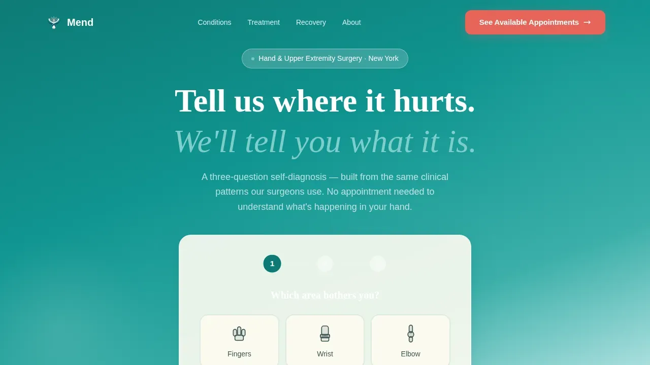
- A three-step interactive self-diagnosis form in the hero section, with illustrated icons for hand, wrist, and elbow selection
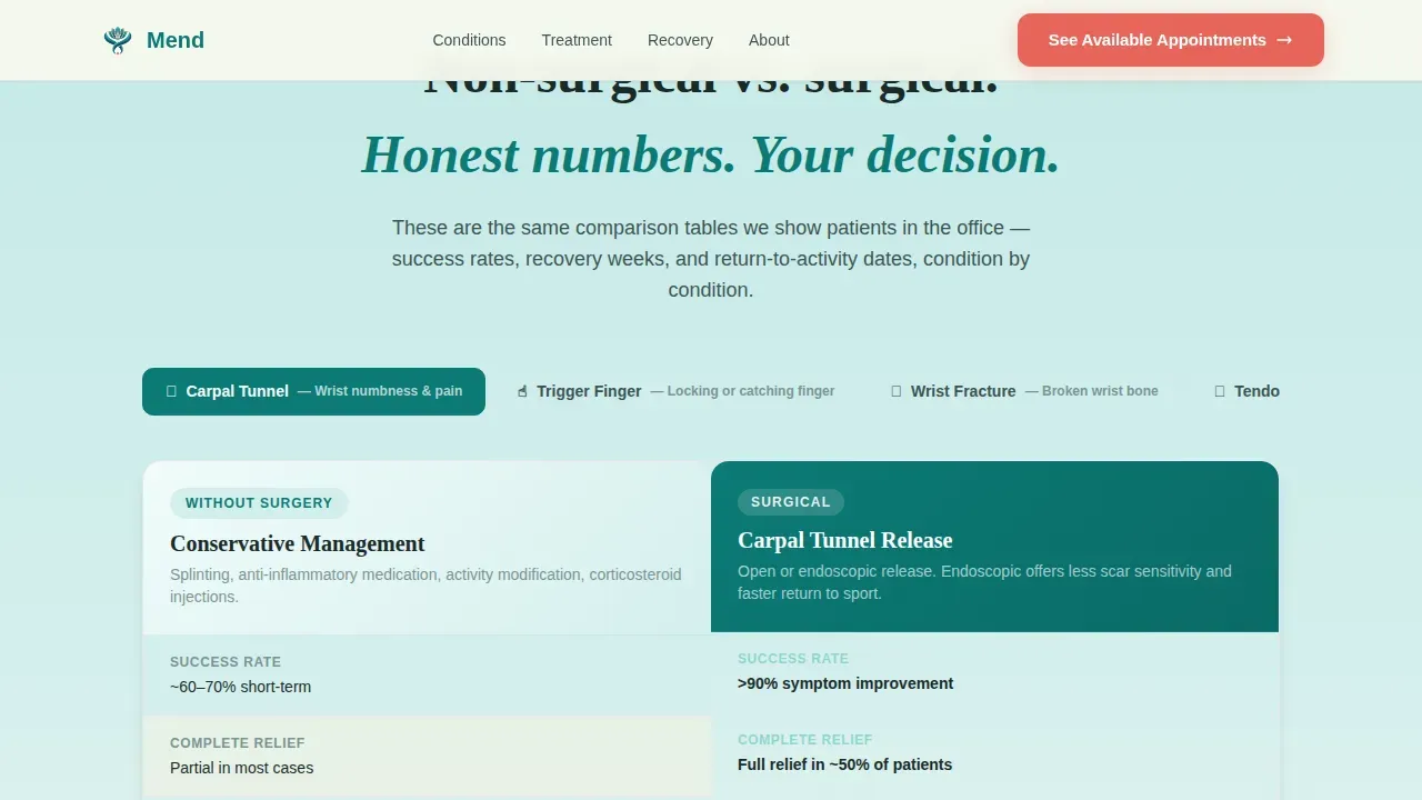
- Side-by-side comparison tables for non-surgical versus surgical treatment paths, including recovery timelines and clinical success rates per condition
- A persistent coral call-to-action bar on mobile and a secondary lead-capture path that lets visitors email their self-diagnosis results directly to the practice
Feature list
This landing page template ships with the components described below. Each one is prompt-grounded and serves the patient acquisition goal directly.
Three-Step Self-Diagnosis Hero Form
The hero section floats a clean, three-step form over a deep teal-to-bone-white gradient. Step one lets visitors tap an illustrated icon for hand, wrist, or elbow. Step two presents symptom options including numbness, sharp pain, weakness, locking, and swelling. Step three shows a simple timeline selector for duration. After all three steps, a single line reads: "Here's what that pattern usually means," pulling visitors directly into the diagnostic content below. This design mirrors the landing page headline to the visitor's own symptom, a proven strategy for keeping prospective patients engaged past the first scroll.
Condition-Specific Comparison Tables
The treatment options phase contains tabbed comparison tables that place non-surgical and surgical paths side by side for each condition. Each table column includes recovery timelines, published success rates, and activity-return dates in clear, honest rows. Patients can see at a glance what splinting or physical therapy involves versus what an endoscopic or WALANT (wide-awake local anesthesia no tourniquet) procedure involves. This educational content supports the decision making process without overpromising outcomes, helping prospective patients arrive at consultations already informed.
Step-by-Step Patient Journey Sections
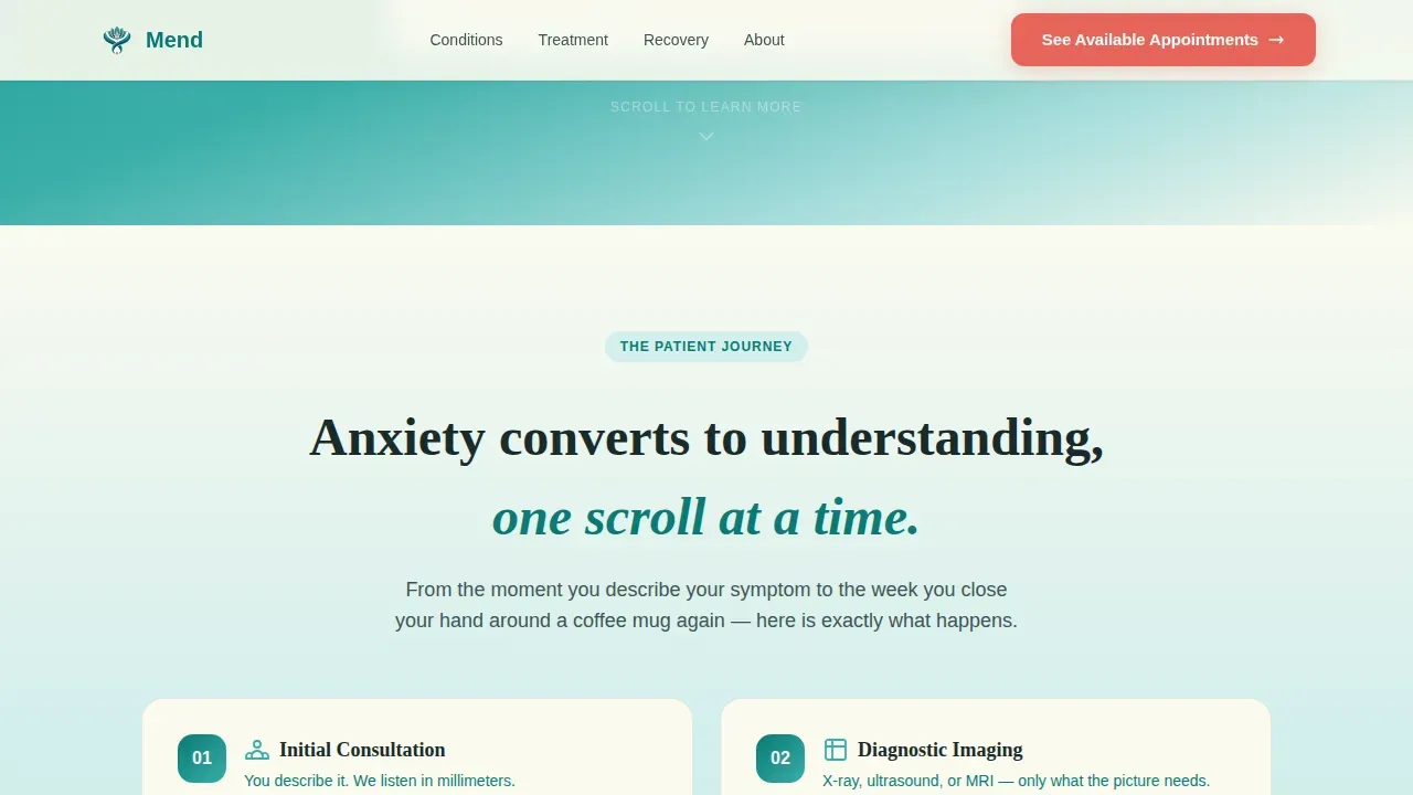
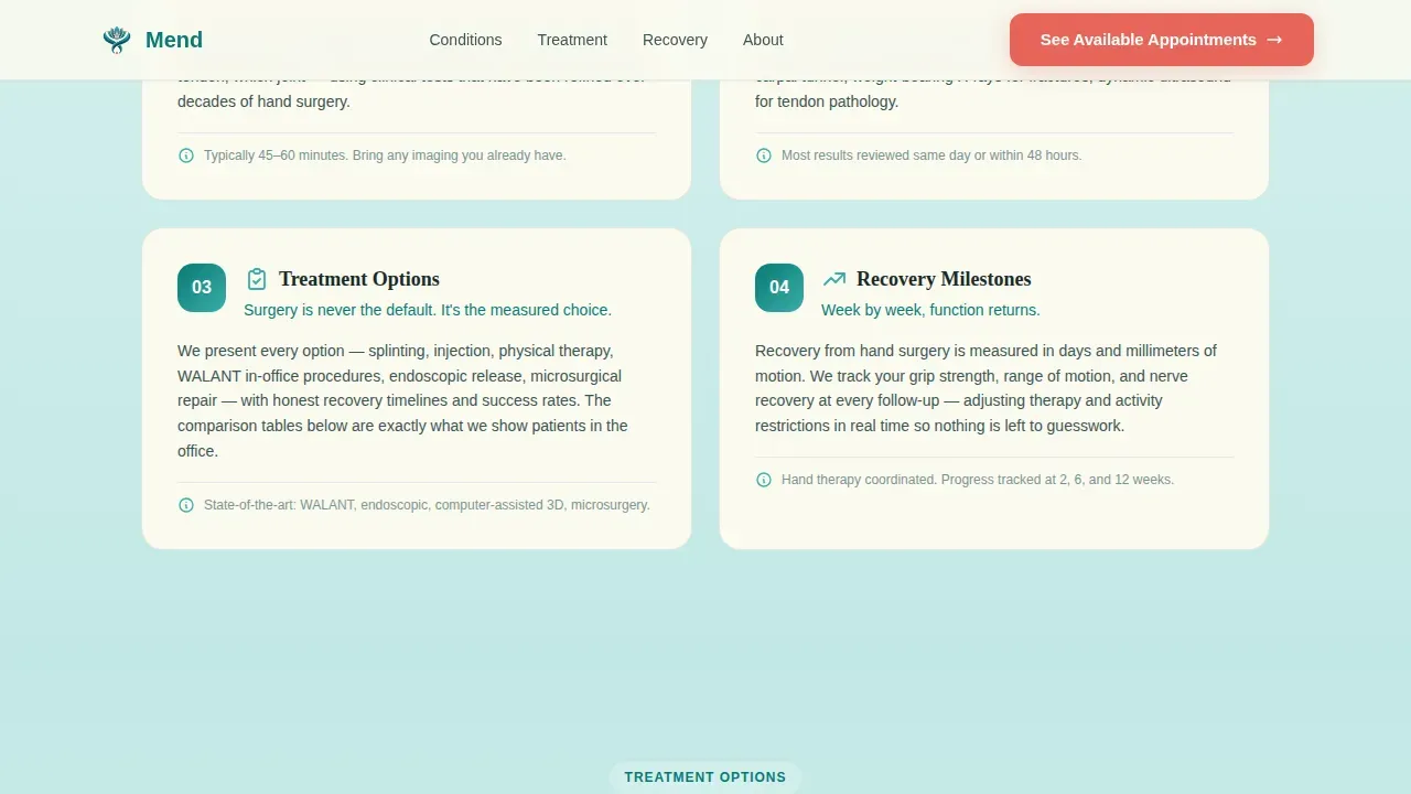
After the hero diagnosis, the page scrolls through four sequential phases: initial consultation, diagnostic imaging, treatment options, and recovery milestones. Each phase is its own section, and each section answers exactly the question the previous one raised. This structure mirrors how a surgeon would walk a patient through their care plan. The result is a landing page that feels like a guided conversation, not a brochure.
Dual Call-to-Action Conversion System
The primary call-to-action, "See Available Appointments," appears first below the comparison tables and again as a persistent bottom bar on mobile devices. The coral button color breaks the teal calm deliberately, drawing the eye with urgency. A secondary path, "Send My Results to the Doctor," captures leads who are not yet ready to book by letting them email their self-diagnosis responses directly to the practice. This two-path system protects the practice's lead pipeline from visitors at every stage of the decision making process.
Trust and Credentials Section
A dedicated section presents the techniques and technology that make the practice different. Published success rates for carpal tunnel release and trigger finger correction, along with microsurgery and endoscopic procedure credentials, are displayed here. Social proof in the form of patient testimonials reinforces the clinical claims. Search engines reward landing pages and websites that demonstrate credibility through detailed provider bios and patient testimonials, so this section serves both visitors and visibility.
Mobile-First Persistent call to action Bar
The landing page is designed mobile-first. Since 63% of healthcare searches occur on mobile devices, the template includes a persistent call-to-action bar fixed to the bottom of the screen on smaller screens. Visitors searching symptoms at 2 a.m. on their phones can access the scheduling path without scrolling back to the top of the page. This keeps the conversion path open regardless of where a visitor stops reading.
Page sections overview
| Section | Purpose |
|---|---|
| Hero Diagnosis Form | Three-step symptom selector launches the self-diagnosis flow |
| Consultation Phase | Explains what happens at the initial visit |
| Diagnostic Imaging Phase | Describes imaging options and what they reveal |
| Treatment Comparison Tables | Non-surgical versus. surgical paths side by side per condition |
| Recovery Milestones Phase | Outlines expected recovery weeks and activity-return dates |
| Trust and Credentials | Technique credibility, success rates, and provider details |
| Call-to-Action Section | Primary appointment booking button below comparison tables |
| Secondary Lead Capture | Email form for visitors not ready to book |
| Mobile call to action Bar | Persistent bottom bar for mobile scheduling access |
| Footer | Linear single-row footer with contact details and navigation |
Design & branding system
The visual identity follows a Soft Gradient theme built on the Teal Catalyst color system. The palette feels like the cool, deliberate calm of a pre-operative room where every instrument is already laid out. Gradients dissolve from deep surgical teal to bone white, evoking the sensation of feeling slowly returning to numb fingertips.
- Colors: deep surgical teal (#0B7A75) anchors headers and interactive elements; healing teal (#3AAFA9) washes across gradient section backgrounds; warm bone white (#FAFAF0) surfaces cards and open space; precise coral (#E8655A) marks every call-to-action button and urgency indicator
- Typography: DM Sans handles body text and interface labels for clean readability; Fraunces provides serif display headings that add clinical authority without coldness
- White space is used deliberately throughout the page to protect the scan path, keeping each section's content easy to read without visual clutter competing for attention
Mobile & speed optimization
Mobile-first design is essential for this template because most symptomatic patients search for care on mobile devices, often late at night. The landing page is structured with a static-first approach, keeping interactive components such as the multi-step form and comparison table tabs as lightweight client-side elements only where necessary.
- The persistent mobile call-to-action bar keeps the "See Available Appointments" button visible at all times, so visitors on smaller screens never lose easy access to the booking path
- Fast load times are a priority in the page architecture; pages that load in under 2 seconds reduce bounce rates and keep more patients in the conversion flow
- The layout uses clear navigation cues and easy navigation between patient journey phases, so users can quickly find the section most relevant to their symptom
How this template helps you convert
A properly optimized landing page can triple your conversion rate overnight. This template is built around that principle. Every design and content decision on this landing page exists to move a symptomatic visitor toward booking an appointment with the practice.
- The self-diagnosis form creates immediate relevance by mirroring the visitor's own symptom back to them, which is the same principle as matching headline copy to the source that brought visitors to the landing page. Prospective patients feel seen before they read a single sentence of clinical content, making them far more likely to continue scrolling.
- The comparison tables deliver the clinical clarity needed for informed decisions before any commitment is requested. By the time a visitor reaches the coral "See Available Appointments" button, they know their condition's name, their treatment options, and a realistic recovery window. This reduces hesitation and makes the click feel like a confident, logical choice rather than a gamble.
- Social proof placed inside the Trust and Credentials section reinforces the clinical claims that prospective patients have already absorbed. Patient testimonials and published success rates build trust at exactly the right moment in the scroll, just before the final call-to-action. Research shows that including patient testimonials and social proof on landing pages can significantly enhance trust and conversion rates, guiding patients from symptom-search to scheduled visit.
Other information about this template
This section covers additional context useful for practices evaluating the Mend precision hand surgery comparison landing page template for their patient acquisition strategy.
- Search engine optimization matters for hand surgery practices. Search engines reward websites that show detailed provider bios, patient testimonials, and clear contact information. Local SEO strategies such as mentioning the service city in headers help capture local leads. Long tail keywords tied to specific conditions, for example "carpal tunnel treatment without surgery," help reach the right audience searching for precise answers.
- Local SEO integration is supported by the template's structured content layout. The footer and credentials section are natural placements for location references and provider details, which improves local SEO visibility and helps search engines index the practice accurately.
- Google Analytics and other tracking tools can be connected to the landing page to monitor visitor behavior and measure which sections drive the most engagement. Google Analytics event tracking on the self-diagnosis form steps and call to action buttons can reveal where users drop off, supporting measurable growth in the practice's digital acquisition strategy.
- The secondary lead capture form, "Send My Results to the Doctor," is a lower-friction path for prospective clients who are researching but not yet ready to book. Keeping form fields minimal is important since every additional form field can reduce conversions by 10 to 15 percent.
- Social media platforms can drive qualified traffic directly to this landing page. Educational content shared on social media platforms about carpal tunnel, trigger finger, or tendon repair conditions links naturally back to a landing page that immediately answers those specific symptom questions. Engaging content on social media builds patient trust before prospective patients ever arrive on the page.
- The template's structure also supports practices that offer related services beyond hand surgery. For example, a practice that also performs reconstructive plastic surgery procedures can adapt the comparison table format for those conditions. High-converting landing pages in the healthcare industry often blend elements of orthopedics and plastic surgery, focusing on both functional restoration and aesthetic outcomes. Practices that also perform breast augmentation or other reconstructive procedures may recognize this template's underlying conversion logic as applicable across multiple service landing pages.
- Provider credentials displayed in the Trust section help potential patients feel confident about their choice. Board certifications, technique training, and published outcomes are the informative content that search engines and patients alike use to evaluate a practice. A well-structured page that clearly presents provider credentials helps new patients feel confident before they pick up the phone.
- Patient reviews and the ability to leave reviews are connected to the practice's long-term reputation. The landing page's trust section creates a natural extension point for patient reviews gathered from other platforms, displaying social proof in the same visual language as the rest of the site.
- The healthcare industry is increasingly competitive online. A strong digital presence has become essential to practice growth. This landing page template is built to support that growth by creating a focused, high-trust patient acquisition page that handles the education, comparison, and conversion steps in a single scroll. For practices tracking practice growth with tools like Google Analytics, the template's clearly segmented sections make it straightforward to assign conversion events to each phase.
- Artificial intelligence tools are increasingly used by patients to search for symptom information. Structured, clearly labeled content on this landing page helps with artificial intelligence readability, ensuring the page content can be cited accurately when patients use AI assistants to research their condition. AI readiness through structured data is important for surgical websites that want to appear in AI-generated search results.
- Data collected through the self-diagnosis form and the secondary email capture form should be handled in compliance with HIPAA requirements. Any data collection methods on medical landing pages must meet applicable healthcare privacy standards. Practices should ensure their hosting and form submission infrastructure supports the required protections for patient well being and data security.
- Special offers such as a free initial consultation or a limited-time second-opinion appointment can be placed in the urgency indicator positions marked by the coral color system. Creating a sense of urgency can motivate visitors to take action, and the template's design already reserves the coral accent for exactly this kind of high-attention placement.
- Patient outcomes data, such as 90-plus percent success rates for carpal tunnel and trigger finger procedures, are referenced in the Trust and Credentials section. These figures support patient needs for reassurance and help the page deliver on its promise of clinical clarity before commitment.
- The patient experience designed into this landing page reflects a core truth about hand surgery patients: they are not passive. They are office workers who cannot grip a coffee mug, climbers with torn pulleys, and musicians with locking fingers. They arrive on the page mid-anxiety and leave, if the page works, with a clear plan and a scheduled appointment. This template is built to earn that transition every time.
Theme
Soft Gradient
Creative direction
Step-by-Step Guide
Color system
Teal Catalyst
Style
Comparison Table
Direction
Click-Through
Page Sections
Three-step Self-diagnosis Hero Form
Condition Comparison Tables
Sequential Patient Journey Layout
Dual Call-to-action Conversion Path
Trust and Credentials Section
Teal Catalyst Visual Identity System
Related questions
Can this landing page template be adapted for conditions beyond carpal tunnel?
How does the template capture leads from visitors who are not ready to book?
Is this template suitable for a practice that also offers plastic surgery services?
What makes this a landing page rather than a standard website page?
Can the page support local search visibility for hand surgery practices?



