Treatment Center Landing page Template
A fibromyalgia treatment center landing page built for lead generation. It opens with an interactive symptom-impact calculator, then walks visitors through three FAQ-driven comparison tables that contrast conventional care with an integrated myofascial and neuroscience protocol. The goal is a booked "Start With a Listening Appointment", earned question by question, before a word is spoken aloud.
by Rocket studio
Quick summary
This is a single-page, comparison table landing page for a fibromyalgia treatment center. It pairs an interactive symptom-impact calculator with three FAQ-anchored comparison tables to build trust gradually. Every section is designed to lower a wall the visitor brought with them. The primary conversion goal is a booked Listening Appointment.
Who this template is for
This template is built for fibromyalgia treatment clinics that use an integrated, neuroscience-informed protocol. It suits practices where the care team wants the website to do the emotional heavy lifting before the first phone call happens.
- Clinics offering myofascial release, dry needling, graded motor imagery, or vagus nerve stimulation as part of a structured treatment plan
- Practitioners whose patients arrive with years of inconclusive tests and a deep distrust of waiting rooms
- Health and medical providers in the pain management space who need a lead generation page that feels personal, not transactional
What problem this template solves
Fibromyalgia patients rarely convert from a generic clinic homepage. They need proof that a practice truly understands their experience before they will fill out a form or pick up the phone.
- Standard medical websites feel cold and dismissive to people who have already been dismissed
- Visitors with chronic pain need to see their own questions reflected back at them before they trust any call to action
- Without a structured way to compare protocols, patients cannot tell how this clinic differs from the physical therapy they already tried
What you get with this template
You get a fully structured, single-page lead generation layout with five distinct content zones and two conversion paths. Every section is purpose-built for the fibromyalgia care audience.
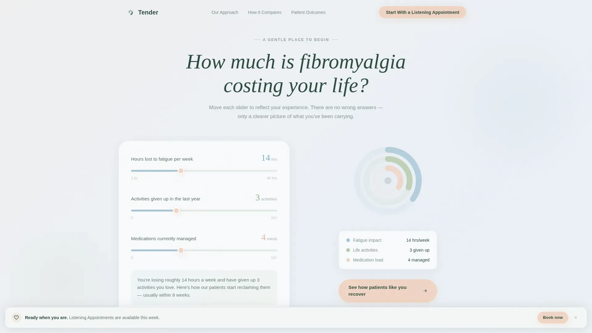
- A hero section with a three-slider symptom-impact calculator that produces a personalized real-time summary and radial chart visualization
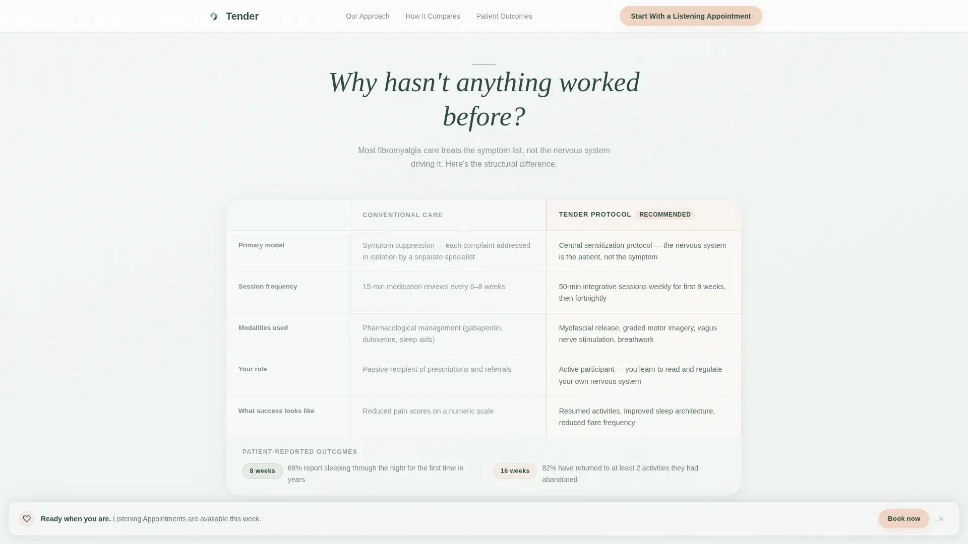
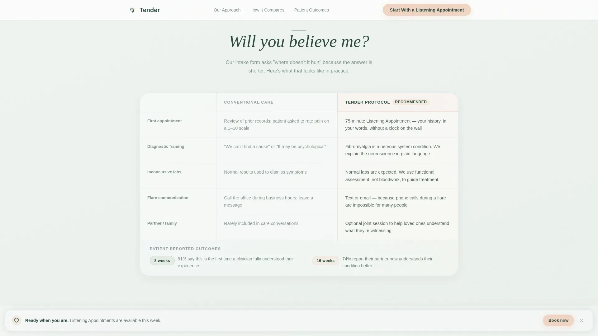
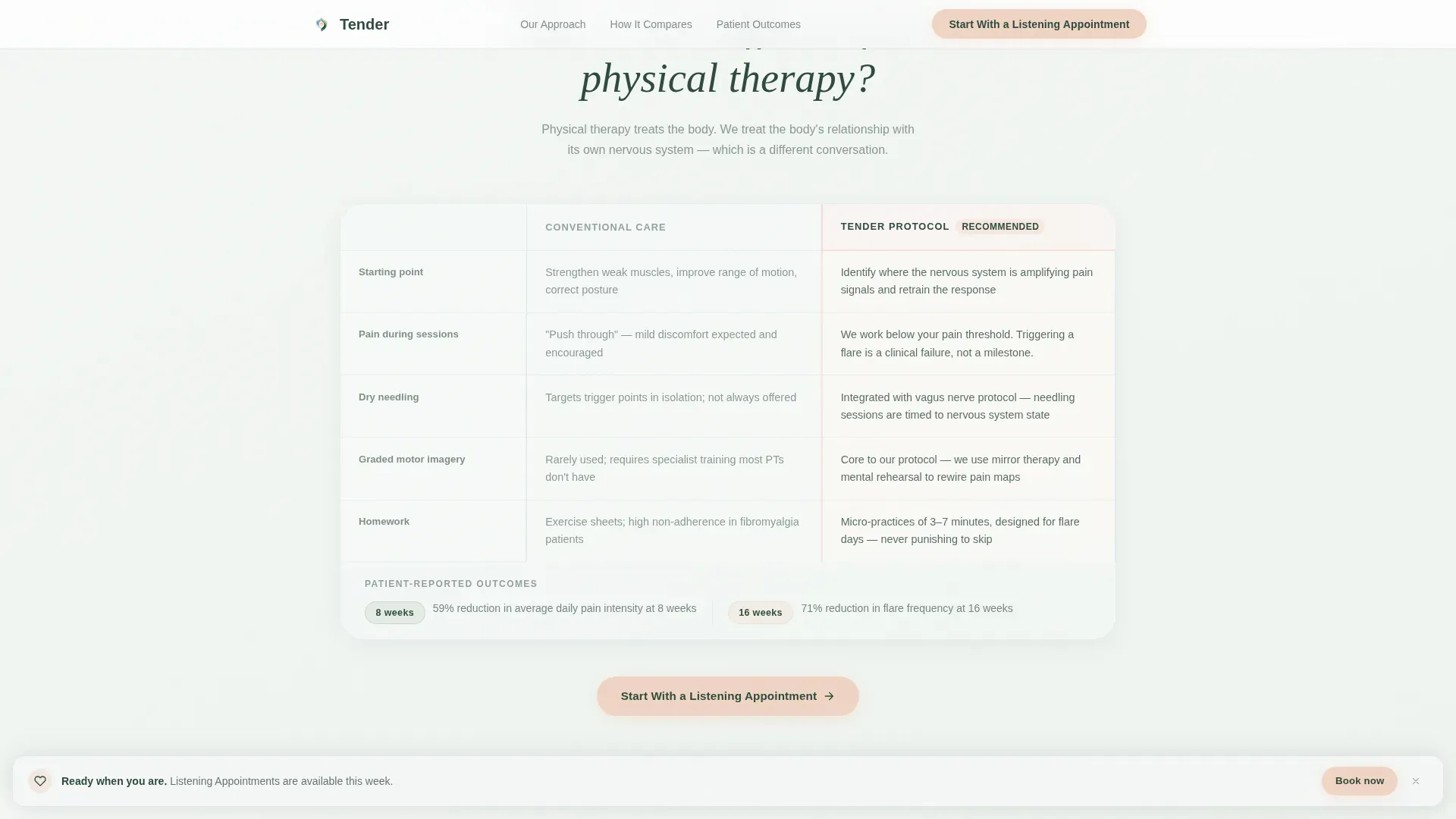
- Three FAQ-anchored comparison table sections, each addressing a specific patient objection and contrasting conventional treatment with the clinic's integrated protocol
- A dual conversion system: a primary "Start With a Listening Appointment" form and a secondary "Download Our Flare-Day Toolkit" email capture for visitors not yet ready to book
Feature list
This template is built around a set of functional components that work together to move a hesitant, pain-experienced visitor toward a first conversation.
Symptom Impact Calculator
Three soft sliders let visitors estimate hours lost to fatigue per week, activities abandoned in the last year, and medications currently managed. As each slider moves, a radial chart fills in real time using glacier blue and sage tones. A personalized sentence appears below the chart, naming their specific numbers back to them without clinical coldness or guilt.
FAQ-Driven Comparison Tables
Each of the three scroll sections opens with a real patient question set in large deep pine type. The answer unfolds as a side-by-side comparison table: conventional treatment approach on the left, the clinic's integrated protocol on the right. Specific details covered include session frequency, modalities used, and patient-reported outcomes at 8 and 16 weeks.
Dual Conversion Paths
The primary call to action, "Start With a Listening Appointment," appears after the third comparison table, again at page bottom, and as a gentle sticky bar that fades in only after 60 percent scroll depth. A secondary path offers a free Flare-Day Toolkit PDF in exchange for an email address, serving visitors who need more time before booking.
Flare-Day Friendly Intake Form
The appointment form asks for first name, preferred contact method (phone, text, or email), primary concern in the visitor's own words via a single open text field, and the best time of day to reach them. Offering a text or email contact option directly acknowledges that phone calls during a flare are not always possible.
Social Proof Section
A dedicated patient outcomes section presents outcome percentages at 8 and 16 weeks alongside named testimonials. This zone anchors the bottom of the page before the final call to action, giving the visitor one last reason to trust before they commit.
Page sections overview
| Section | Purpose |
|---|---|
| Hero + Calculator | Opens the page with the "How Much Is Fibromyalgia Costing Your Life?" slider tool and radial chart visualization |
| FAQ + Table 1 | Addresses "Why hasn't anything worked before?" with a side-by-side protocol comparison |
| FAQ + Table 2 | Addresses "Will you believe me?" with transparency about the intake and care philosophy |
| FAQ + Table 3 | Addresses "How is this different from physical therapy?" with modality-level detail |
| Outcomes + Call to Action | Presents patient outcome data, testimonials, the appointment form, and the toolkit download |
| Footer | Single linear row with essential links and contact information |
Design & branding system
The visual identity follows a Soft Gradient theme built on the Alpine Fresh color system. Every color arrives quietly. Nothing competes for attention. The palette feels like standing barefoot on cool alpine grass at dawn, with fog still in the valley.
- Core colors: morning mist white (#F4F7F5) for backgrounds, glacier stream blue (#A8C5D6) for table borders and chart fills, meadow sage (#B5C9A8) for gradient layers, deep pine (#2D4A3E) for all body and heading text, and gentle sunrise peach (#F0D5C4) reserved for call-to-action buttons and interactive highlights
- Typography uses DM Sans for body text and Fraunces serif for headings, giving the page warmth and readability without clinical stiffness
- Hover states soften rather than brighten; comparison table recommended columns are peach-highlighted; backgrounds drift between mist white and palest sage in slow gradients
Mobile & speed optimization
This template is built mobile-first. The core audience often visits during a flare, lying in bed with a phone. Every interaction is designed to feel effortless on a small screen.
- The three-slider calculator and radial chart are touch-friendly and respond smoothly on mobile viewports
- Animations use CSS-preferred scroll reveals and slider interactions to keep initial load fast without heavy JavaScript dependencies
- The sticky appointment bar fades in only after 60 percent scroll depth, so it never obstructs reading on smaller screens
How this template helps you convert
The page builds trust incrementally, answering the exact questions a fibromyalgia patient carries before asking anything in return.
- The symptom calculator opens a personal conversation immediately by reflecting the visitor's own numbers back to them, creating relevance and emotional recognition before the first comparison table appears.
- Each FAQ-driven comparison table dismantles a specific objection, lack of results elsewhere, fear of not being believed, confusion about how this differs from standard physical therapy, using specific protocol details and measurable outcomes rather than generic reassurance.
- The dual conversion system meets visitors where they are: those ready to book see a low-friction appointment form, while those still cautious can take the free Flare-Day Toolkit and return later when the timing feels right.
Other information about this template
This template is categorized under Health and Medical, with a specific focus on pain management and fibromyalgia treatment. A few additional details are worth knowing before you build with it.
- The page layout follows a linear, single-row footer pattern consistent with clean, distraction-free lead generation pages
- Scroll reveal animations and the sticky bar interaction are set to medium intensity, keeping the experience calm rather than busy
- The template is designed for English-language, United States-based clinics using USD pricing and local appointment booking
- Because the page is section-led and single-flow, it functions as a landing page rather than a multi-page website
- The comparison table style makes the protocol differences immediately visible, which is especially useful for patients who have researched many options and need a clear reason to choose differently this time
Theme
Soft Gradient
Creative direction
FAQ-Driven
Color system
Alpine Fresh
Style
Comparison Table
Direction
Lead Generation
Page Sections
Symptom Impact Calculator with Real-time Visualization
Faq-driven Comparison Tables
Dual Lead Capture System
Flare-day Friendly Appointment Form
Sticky Conversion Bar
Related questions
Can I customize the slider questions in the symptom calculator?
Does the comparison table layout work on mobile devices?
What are the two conversion paths included in this template?
How many comparison tables does the template include?
Is this template suitable if my clinic only offers some of the listed modalities?



