Restoration Franchise Landing Page Template
Restore is a single-page landing page template built for restoration franchise networks. It serves two audiences at once: panicking homeowners who need emergency help fast, and prospective franchisees who want to claim territory. A seasonal masonry grid, dual conversion paths, and a device mockup header deliver calm authority in the middle of chaos.
by Rocket studio
Quick summary
Restore is a restoration franchise landing page template designed for dual-audience conversion. Homeowners find emergency service contacts immediately, while franchise prospects explore territory opportunities through seasonal revenue cards. The layout feels like a well-organized field manual: structured, fast to scan, and built for people under pressure who need answers right now.
Who this template is for
This template is built for franchise networks in the property restoration industry. It works equally well for established franchise operators expanding their digital presence and for founders ready to launch a new territory network.
- Restoration franchise owners looking to attract both emergency service clients and new franchisee investors
- Property managers and insurance adjusters who need a trusted vendor with clear credentials and response proof
- Prospective franchisees evaluating territory availability and revenue potential before booking a discovery call
What problem this template solves
Running a restoration franchise means serving two very different people with one page. Homeowners at 2 a.m. with a burst pipe need speed and reassurance. Franchise prospects browsing at noon need evidence and opportunity. Most templates force you to choose one audience, or bury one story under the other.
- A single page trying to serve both homeowners and investors often feels cluttered or confusing
- Emergency service visitors leave if they cannot find a local contact or response time proof quickly
- Franchise prospects disengage when revenue data and territory availability are hidden deep in the scroll
What you get with this template
This template delivers a fully structured landing page with every section pre-built for the restoration franchise use case. The layout interleaves both audience stories without asking either visitor to wait through irrelevant content.
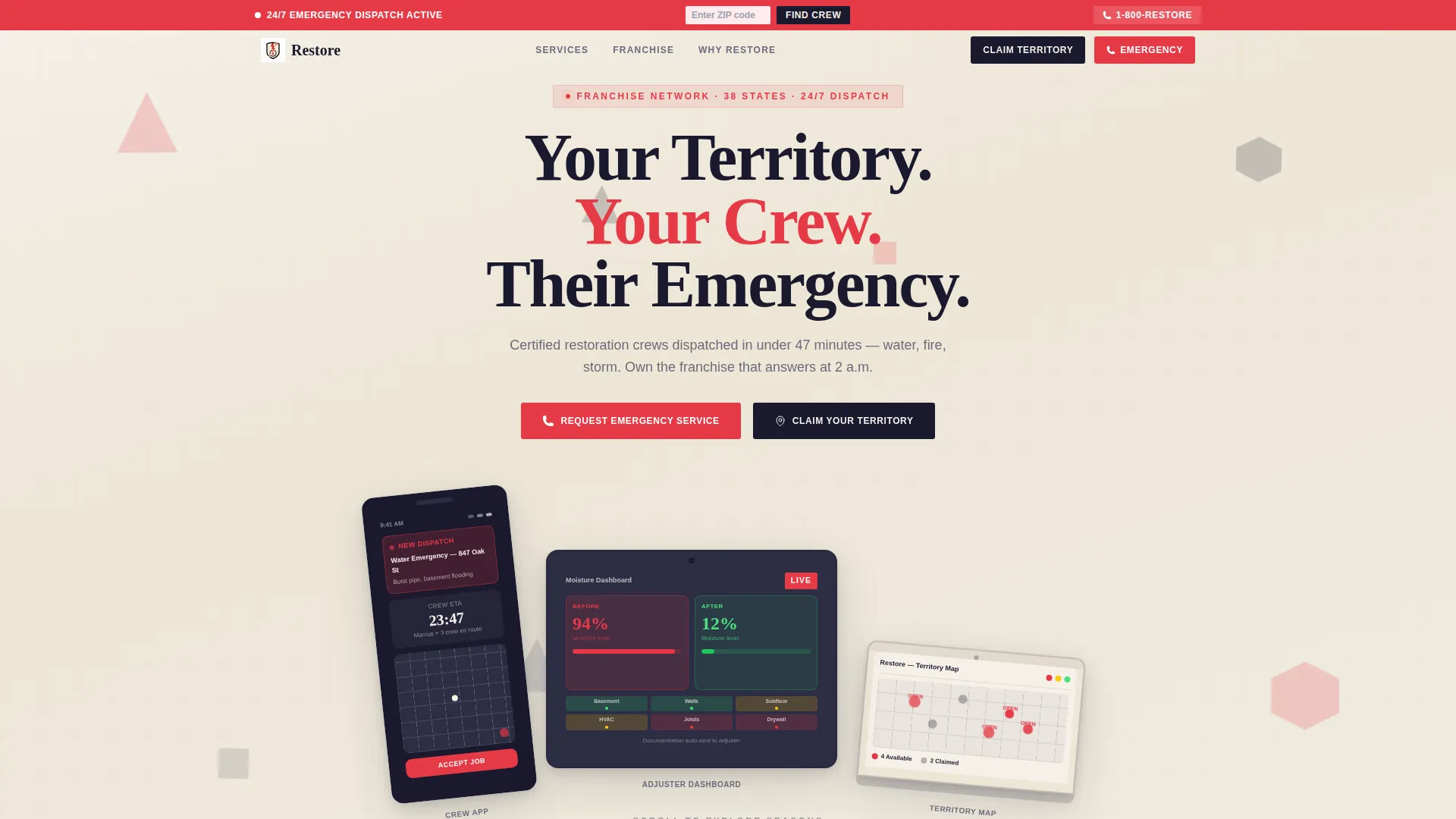
- A staggered device mockup header showing a dispatch notification, a moisture reading dashboard, and a territory map
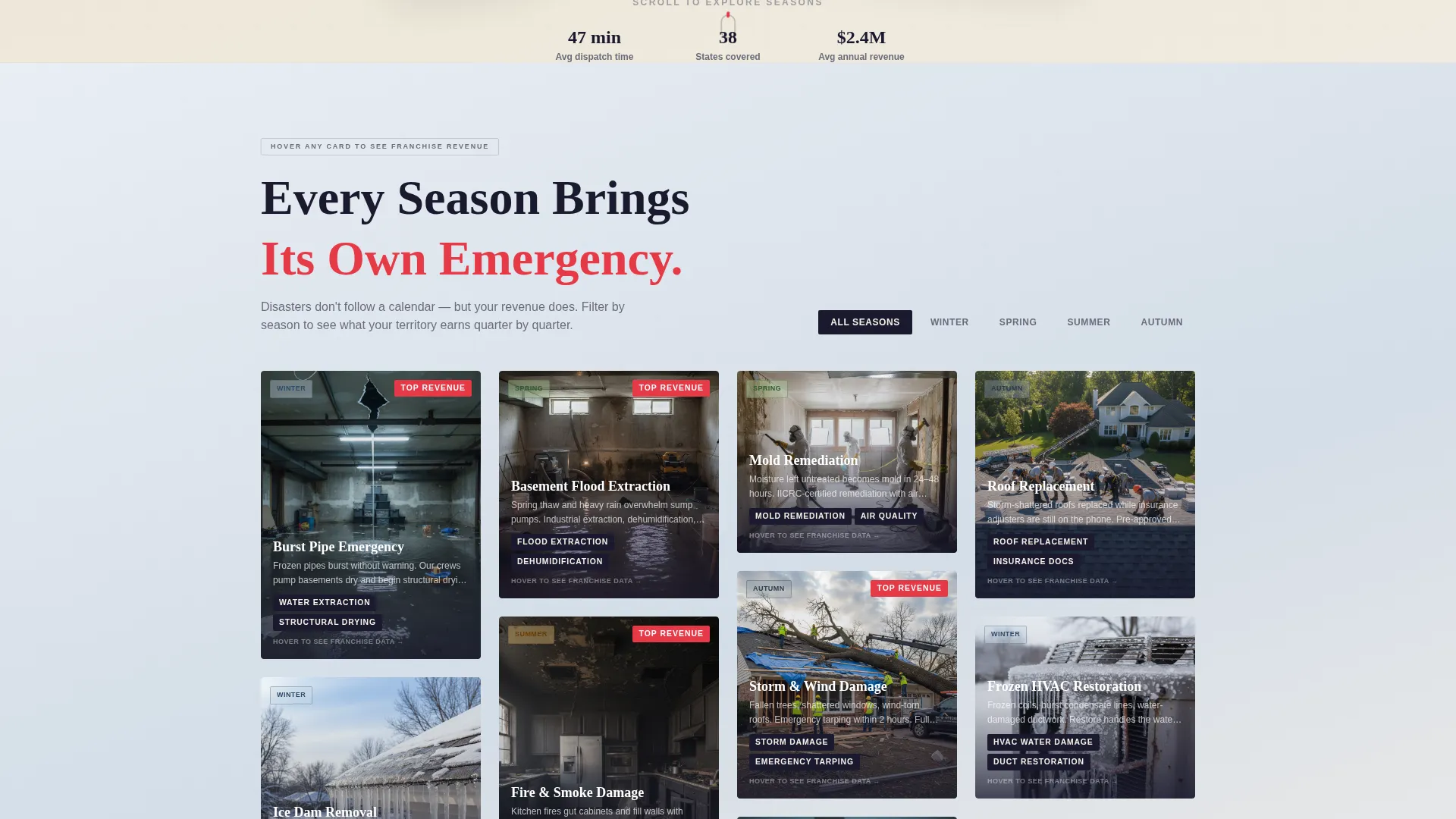
- A seasonal masonry grid with hover-flip cards that shift from disaster imagery to franchise revenue data
- Dual conversion paths: a zip-code lookup for homeowners and a three-step progressive form for franchisee prospects
Feature list
This template's standout capabilities are built directly into the page structure. Each feature solves a specific problem the brief identifies, from split-second emergency routing to franchise territory qualification.
Seasonal Masonry Grid Layout
The masonry grid reorganizes content around the disasters each season brings. Winter shows burst pipes, spring covers flood extraction, summer features fire and smoke damage, and autumn highlights storm repair. As the visitor scrolls, the background gradient shifts from cool blue-gray through warm amber to smoky charcoal to storm slate, marking each seasonal passage visually.
Hover-Flip Revenue Cards
Each seasonal card flips on hover to reveal franchise revenue data for that service category in that quarter. The flip mechanic turns emotional disaster imagery into rational business opportunity, helping franchise prospects see the financial case without leaving the page.
Dual-Path Conversion Design
Homeowners and franchisee prospects are served through separate, clearly signposted conversion paths. Neither audience waits through the other's content. The masonry layout interleaves both stories like shuffled cards from the same deck.
Persistent Emergency Top Bar
A fixed top bar carries a "Find Your Local Crew" prompt at all times. Visitors can enter a zip code to return the nearest franchise with live availability and a one-tap call button, keeping the emergency path accessible at every scroll depth.
Three-Step Franchise Inquiry Form
Prospective franchisees move through a progressive form: name and zip code on step one, investment range and timeline on step two, and a calendar embed to book a franchise discovery call on step three. The staged format reduces friction and qualifies leads gradually.
Device Mockup Header Section
The header presents a phone, tablet, and laptop at staggered angles on a parchment-textured background. Each screen shows a different moment in the franchise app experience, grounding the product in real operational context before the visitor reads a single line of body copy.
Page sections overview
| Section | Purpose |
|---|---|
| Device Mockup Header | Introduces the franchise concept with staggered device screens and a fading headline |
| Persistent Top Bar | Keeps the homeowner emergency path visible at every scroll position |
| Seasonal Masonry Grid | Organizes service categories by season with hover-flip revenue cards |
| Zip-Code Lookup Panel | Routes homeowners to the nearest franchise with availability and a call button |
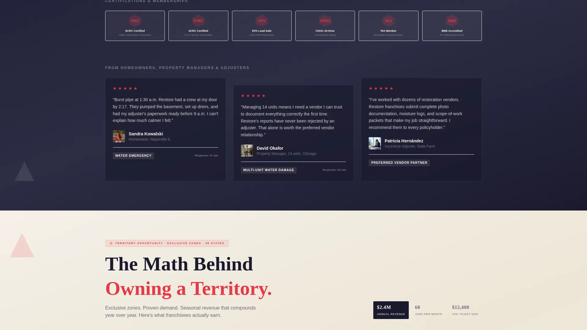
| Franchise Revenue Cards | Surfaces average ticket size and jobs-per-month data for prospective franchisees |
| Territory Claim Form | Walks franchise prospects through a three-step progressive inquiry and calendar booking |
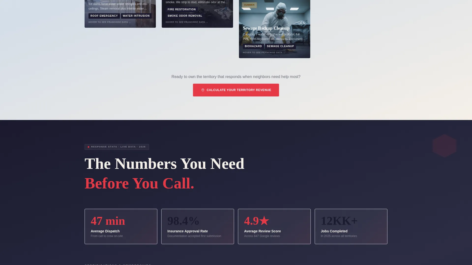
| Response Time Stats | Provides homeowners with proof of speed and territory-level review scores |
| Territory Map Section | Shows available franchise locations pulsing in signal red for prospective owners |
Design & branding system
The visual identity follows a Playful Geometric theme using an Ink and Paper color palette. Deep manuscript black, warm parchment, graphite sketch gray, and a confident signal red create the feel of a freshly printed field manual: authoritative, approachable, and legible under pressure.
- Colors: deep manuscript black (#1A1A2E), warm parchment (#F5F0E8), graphite sketch gray (#6B6B7B), and signal red (#E63946) reserved for calls to action, emergency badges, and hover states
- Shapes: triangles, hexagons, and clean-cornered cards tile across the layout like restoration zones on a project map, giving structure a sense of play without undermining urgency
- Geometric blueprint fragments float behind the device mockup header, reinforcing the playful-structural tension central to the creative direction
Mobile & speed optimization
The template is structured to remain usable and navigable on any screen size. The masonry grid, device mockup header, and progressive form are all designed with vertical stacking and touch-friendly tap targets in mind.
- The persistent top bar and one-tap emergency call button are sized for fast mobile interaction
- The seasonal masonry grid reflows cleanly on smaller screens so card content remains readable without horizontal scrolling
- The three-step franchise form breaks complex qualification into short, focused steps that feel manageable on a phone screen
How this template helps you convert
Every layout decision in Restore is built around moving the right visitor toward the right action. The dual-path structure means neither audience is distracted by content meant for the other.
- The persistent top bar keeps the homeowner emergency path visible at all times, reducing the number of steps between arrival and a service request.
- The seasonal revenue cards use a hover-flip mechanic to shift franchise prospects from emotional engagement to rational investment analysis, building conviction before the territory claim form appears.
- The three-step progressive form reduces commitment friction for franchise prospects by asking for small pieces of information one at a time, ending on a calendar booking that confirms intent.
Other information about this template
Restore sits within the Franchise Business subcategory under Retail and Commerce, making it a practical fit for any multi-location service brand that needs to recruit franchisees and serve end customers through a single page.
- The template style follows an Overlap and Layered approach, where content cards and device screens sit at intentional depths to create visual hierarchy without heavy decoration
- The creative direction is rooted in a Comparison Journey, letting visitors move from problem awareness through evidence to action as they scroll
- The header concept uses a Device Mockup approach rather than a traditional hero photograph, keeping the focus on operational credibility and franchise app functionality
- The landing page direction is Click-Through, meaning each section is designed to push visitors toward a single next action rather than overwhelming them with options at once
- The Neo-Retro theme influence is visible in the field-manual typography feel and geometric tiling, blending nostalgic print aesthetics with modern layout confidence
Theme
Neo-Retro
Creative direction
Comparison Journey
Color system
Ink & Paper
Style
Overlap/Layered
Direction
Click-Through
Page Sections
Seasonal Masonry Grid with Hover-flip Cards
Dual-path Conversion Layout
Persistent Emergency Top Bar
Three-step Progressive Franchise Form
Staggered Device Mockup Header
Territory Map with Signal Red Indicators
Related questions
Can this template serve two different audiences on one page?
What does the seasonal masonry grid show?
How does the zip-code lookup work for homeowners?
What creative style does this template use?
Is this template suitable for a franchise looking to expand into new territories?



