Dynamic Kettlebell Fitness Landing Page Template
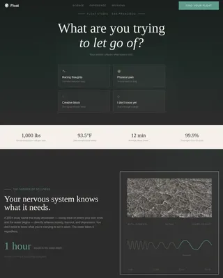
Swing is a full-width immersive landing page template for kettlebell gym studios that lead with community and healing. It pairs a botanical animated hero with full-bleed member portraits, a color-coded weekly schedule grid, and a minimal three-step booking flow. No account creation required. Built for fitness professionals who want visitors to feel welcomed before they commit.
by Rocket studio
Quick summary
Swing is a full-width immersive landing page template designed for kettlebell gym studios, healing movement spaces, and community-driven fitness businesses. It opens with an animated botanical illustration, moves through real member portraits and philosophy passages, and closes with a clickable weekly schedule grid anchored to a direct booking flow. The template earns the session before it asks for one.
Who this template is for
This template speaks directly to studio owners, independent trainers, and fitness professionals who run small-group or community-based kettlebell gym programs. It is built for spaces where the goal is restoration as much as performance, and where the community is the product as much as the workout.
- Kettlebell gym owners who want a landing page that leads with human stories rather than equipment lists
- Independent personal trainer operators and small-group trainers running community-style sessions
- Wellness and movement studio founders serving burned-out professionals, new parents, or retirees returning to physical activity
What problem this template solves
So many people searching for a gym landing page end up with templates that feel cold, corporate, or built for high-volume box gyms. They feature stock photography of shirtless guys lifting dumbbells, generic headline copy, and cluttered navigation that sends visitors away before a single class is booked. That mismatch kills trust before the page has a chance to work.
This landing page template solves a very specific problem: how do you make a visitor feel known before you ask them to commit? The Swing template answers that by showing faces before features, philosophy before pricing, and community before conversion. Fitness businesses that rely on word-of-mouth and local reputation need a gym landing page that reflects that warmth from the very first scroll.
- Visitors leave generic gym pages because nothing on the page reflects their actual life or struggle
- Cluttered navigation and too many outbound links pull attention away from the one action that matters: booking a session
- Potential members cannot determine whether a studio is right for them without seeing real people and real class detail
What you get with this template
You get a carefully structured, single-focus landing page built around six content sections that move a visitor from curiosity to commitment. Every section has a defined role, and nothing exists on this page without purpose. The layout is full-width and immersive, with generous spacing so the page breathes even when the content is rich.
- An animated botanical hero section with a staggered headline and a floating call-to-action button
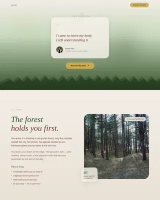
- A Community Gallery with full-bleed member portraits, single-sentence quotes, and philosophy passages arranged in a person-to-principle rhythm
- A color-coded weekly schedule grid with clickable class slots and an anchored booking call to action
- A three-step booking modal (choose a day, choose a time, enter name and phone) with no account creation required
- A low-commitment email capture section for visitors who are not ready to book but want to stay connected
- A minimal footer following a horizontal flow layout
Feature list
This landing page template is built with intention. Every feature below comes directly from the template design brief and serves a specific conversion or community-building role.
Animated Botanical Hero Section
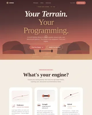
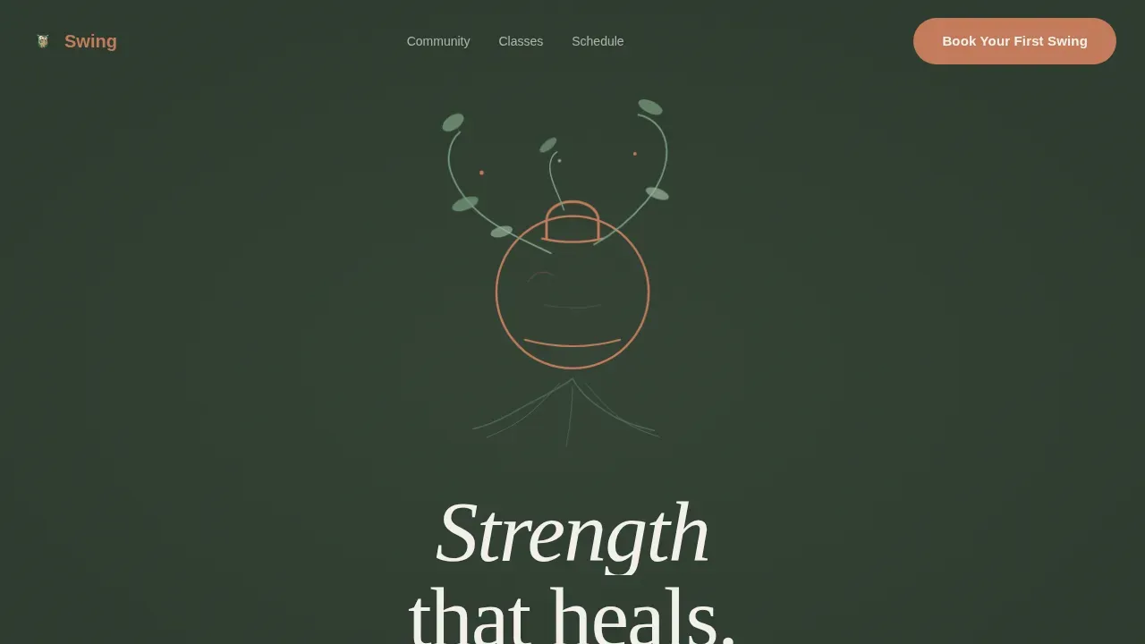
The hero opens with a hand-drawn SVG illustration of a kettlebell sprouting vines and roots, animating in a slow looping growth cycle rendered in moss and terracotta tones against linen white. The animation sequences element by element, as if the kettlebell is literally growing from the earth. A headline fades in beneath: Strength that heals. This above-the-fold section captures user attention immediately on arrival and sets a tone no stock gym photo could replicate.
Community Gallery with Member Portraits
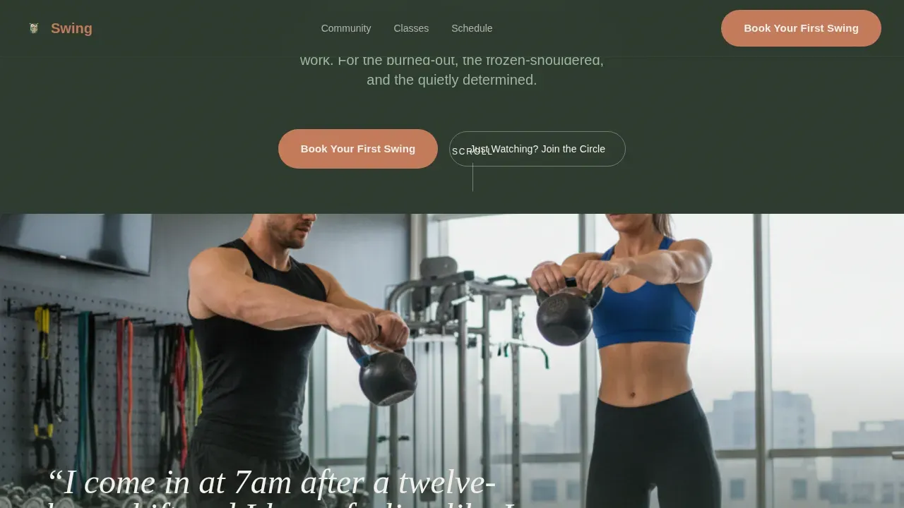
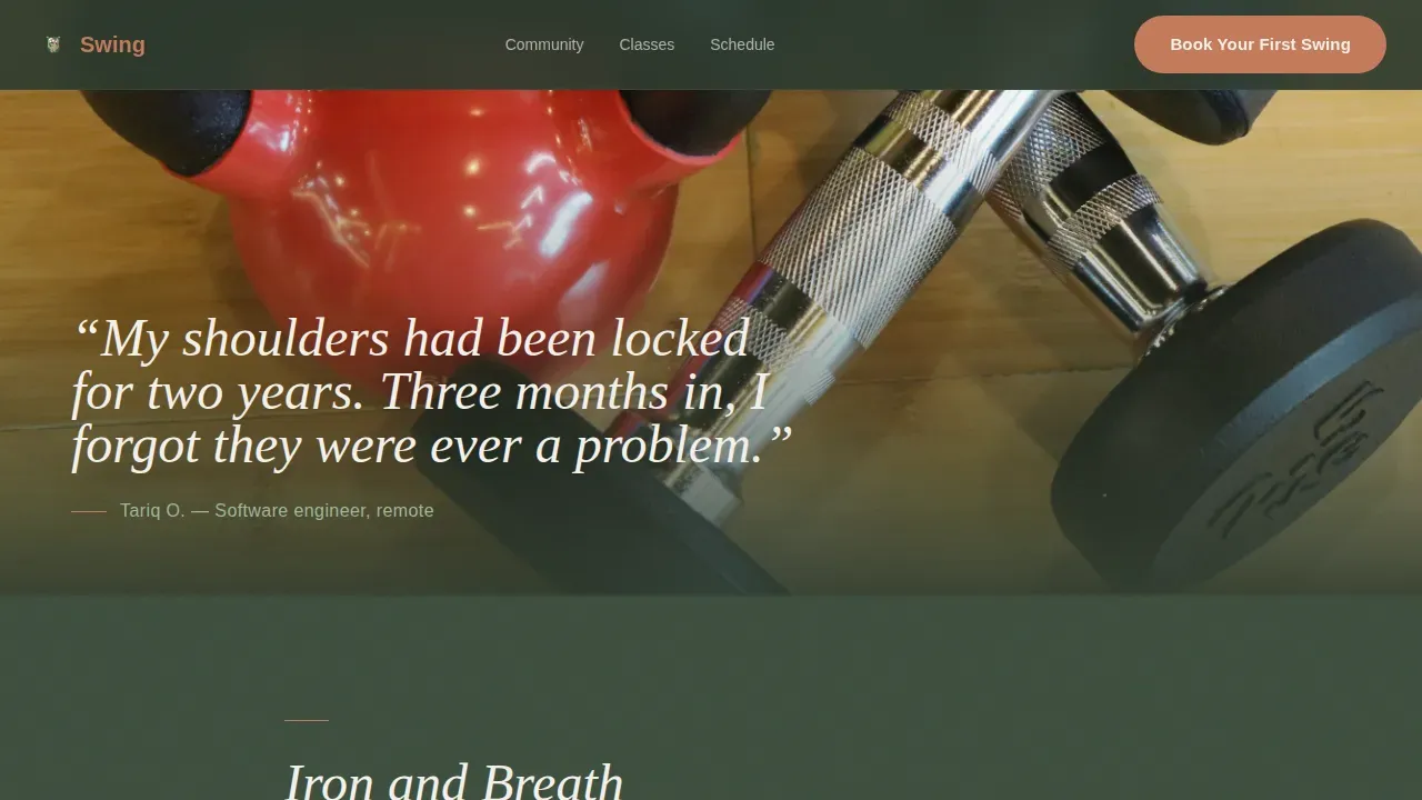
The gallery is the emotional core of this gym landing page. Full-bleed member portraits bleed edge to edge, each paired with a single sentence in that member's own words. The rhythm alternates between person and principle: a portrait, then a short passage about class format or philosophy, then another face, another voice. This approach gives visitors a sense of belonging before they have ever attended a session. It is interesting, human, and structurally unlike anything a standard fitness landing page delivers.
Color-Coded Weekly Schedule Grid
The schedule grid is alive and interactive. Every class slot is color-coded by intensity level and clickable. Visitors can scan the full week at a glance and understand at once what is available, what fits their life, and what level of workout they are ready to perform. Including a clear schedule on a landing page helps potential members feel informed before they commit, and this grid delivers that detail without overwhelming the page.
Three-Step Booking Modal
Clicking any booking call to action opens a minimal modal with three steps: pick a day, pick a class time, enter your name and phone number. No account creation, no credit card, no friction. This focused flow keeps the user moving toward the one goal the page exists to achieve. Landing pages that maintain emphasis on a single conversion action consistently outperform cluttered alternatives, and this booking flow is designed with that idea in mind.
Newsletter Circle Email Capture
Not every visitor is ready to book on the first visit. The secondary conversion path, labeled "Just Watching? Join the Circle," captures an email address for a weekly community newsletter. This low-commitment entry point lets the page serve visitors at different stages of readiness. A simple lead capture form like this can help build an email list and engage potential members effectively over time.
Class Philosophy Bento Layout
A dedicated section presents class format descriptions with intensity indicators arranged in a bento-style grid layout. This section gives visitors detailed information about what to expect in a session, covering the range of exercises, the teaching approach, and the pacing. It answers the questions a cautious new member would have before ever reaching out, reducing hesitation and increasing trust.
Page sections overview
| Section | Purpose |
|---|---|
| Animated Hero | Opens with botanical SVG illustration and headline |
| Floating call to action Button | Appears after hero animation settles |
| Community Gallery | Full-bleed portraits paired with member quotes |
| Philosophy Passages | Alternating principle blocks between portraits |
| Class Philosophy Bento | Format descriptions with intensity indicators |
| Weekly Schedule Grid | Color-coded, clickable class time slots |
| Anchored Booking call to action | Second booking trigger at the schedule section |
| Booking Modal Flow | Three-step pick-day, pick-time, enter-details modal |
| Newsletter Circle | Email capture for non-ready visitors |
| Minimal Footer | Horizontal flow layout, clean and uncluttered |
Design & branding system
The visual identity follows a Healing Space theme expressed through a Botanical color system. The palette feels like a greenhouse built inside a converted warehouse, where iron and plant life share the same air. Typography pairs Fraunces as the serif display face with DM Sans for all body copy, creating a warm editorial feel that stands apart from the hard-edged aesthetic most gym landing pages default to.
- Forest floor (#2D3A2E) anchors all backgrounds, terracotta (#C47A5A) marks every interactive element and call-to-action button, living moss (#7A9E7E) softens section transitions and secondary text, and soft linen white (#F4F1EB) opens hero spaces and card surfaces
- The header uses a hand-drawn botanical illustration style, with no photography and no gym-bro energy, just delicate line work animating in sequence
- High-quality visuals and a clean design layout are essential for engaging fitness landing pages, and every design choice here serves that standard
Mobile & speed optimization
The Swing template is built mobile-first, with good reason. Its target audience includes nurses checking a page after a night shift, parents browsing with one hand, and professionals who access this kind of content entirely on their phones. The layout adapts to small screens without losing the immersive full-width feeling that makes it distinctive.
- Scroll reveal animations are powered by Intersection Observer, using CSS transforms only, so the page performs smoothly across devices
- Full-bleed portrait sections and the schedule grid reflow cleanly for narrow viewports, keeping the experience legible and touch-friendly
- The three-step booking modal is designed for thumb-first navigation, with large tap targets and a minimal input count
How this template helps you convert
A gym landing page converts when it earns trust before asking for commitment. The Swing template is structured so that every section does one specific job, and together they move a visitor through a deliberate emotional and informational arc that ends at the booking button.
- The animated hero and member gallery establish belonging and trust before any services, pricing, or programs are mentioned, so visitors feel welcomed rather than sold to
- The schedule grid and booking modal remove friction at the exact moment a visitor is ready to act, with clear calls to action and a focused three-step flow that requires no account and no payment upfront
Other information about this template
This template sits inside the Wellness and Fitness category, under the CrossFit and Functional Training subcategory, with a niche focus on kettlebell gym studios. It is one of the more interesting gym landing page ideas in the marketplace because it inverts the standard conversion funnel, leading with inspiration and community rather than a hard pitch. This approach works especially well for fitness businesses where the personal trainer or studio owner is the brand, and trust is the product.
Kettlebells have a fascinating background. They originated in the 1800s as counterweights used by farmers for weighing dry goods, and Vladislav Krajewski is considered the father of modern kettlebell training, popularizing their use for strength and conditioning. Today, kettlebell training can improve strength, power, and cardiovascular fitness all in a single session. The kettlebell's unique design gives it a different center of mass compared to dumbbells, which affects how exercises like the kettlebell snatch, the deadlift, the squat, and foundational movements like push ups are performed and felt in the body.
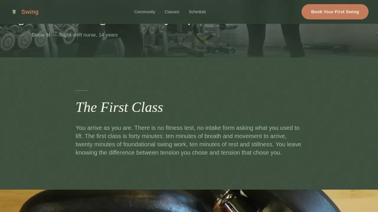
The "Swing Healing" method uses controlled, rhythmic movements to build a resilient lower back and a stronger, pain-free body. Classes are structured to fix posture, reduce lower back pain, and build functional strength in 20 to 30 minutes. A well-run group kettlebell class includes a warm-up, teaching progressions, and a workout segment, and instructors adapt the session for mixed ability groups, so a beginner working with a two kilo or four kilo bell can train alongside someone performing a kettlebell snatch at full weight. The teaching progression focuses on fundamental movements: swings, goblet squats, and push ups, with trainers offering progressions so everyone can participate and improve at their own pace.
The unique value proposition of this gym is the combination of the therapeutic kettlebell swing with a strong, supportive community. The page earns the booking by showing faces before features and making every visitor feel like a real person, not a lead. Visitors who are not ready to book can still join the Circle, a newsletter that keeps the gym in someone's life until they are ready. Using this landing page template can streamline the process of building an effective, conversion-ready gym landing page without starting from a blank canvas.
- This template supports a single-goal, standalone fitness landing page structure focused on booking, not a multi-page website
- The landing page does not require accounts, credit cards, or complicated forms, keeping the conversion path clean for all users
- Trainers and studio owners can adapt placeholder content to reflect their own community, class format, and brand voice
- The gym landing page is localized for the United States market, with English-language copy and United States dollar pricing in mind
- Dynamic content ideas, such as personalizing the user experience based on class type or visitor source, can be layered into this template structure
- The landing page design follows the principle that landing pages should be uncluttered and focused, minimizing distractions to guide visitors toward the desired action
- Displaying certification logos in the footer or trust section can help establish professional standards for the gym
- This template can support a range of wellness and fitness studios beyond kettlebell gyms, including any community-driven sports or movement practice that values healing over hustle
Theme
Healing Space
Creative direction
Community Gallery
Color system
Botanical
Style
Full-Width Immersive
Direction
Booking/Scheduling
Page Sections
Animated Botanical Hero with Staggered Headline
Full-bleed Community Gallery
Color-coded Interactive Schedule Grid
Minimal Three-step Booking Modal
Newsletter Circle Email Capture
Class Philosophy Bento Layout
Related questions
Do I need coding experience to use this template?
Can I update the class schedule and pricing on this landing page?
Is this template only suitable for kettlebell gyms?
What does the booking flow look like for visitors?
Can I use this template to build an email list even if visitors do not book right away?