Smart Cardiac Health Landing Page Template
The Pulse real time cardiac monitoring landing page template is a single-page, zigzag-layout design built for heart disease wearable monitor products. It combines an animated ECG hero, alternating audit-style sections, and coral-accented call-to-action buttons to guide patients and healthcare professionals toward a product and pricing page with calm, clinical confidence.
by Rocket studio
Quick summary
Pulse is a click-through landing page template for a cardiac heart rate monitor wearable. It opens with a live ECG waveform dashboard, then walks visitors through four alternating audit sections that each reveal a heart health blind spot and resolve it with device data. The design delivers trust and warmth in equal measure, moving patients and medical professionals toward one clear next step.
Who this template is for
This template is crafted for health-tech brands, medical device startups, and cardiac care teams that need to present a wearable heart rate monitor to real patients and professionals. The layout speaks directly to people with a genuine stake in continuous heart monitoring.
- Post-stent patients and adults with a family history of cardiac events who want to stay informed about their heart rate data around the clock
- Remote heart-failure patients and the nurses and doctors who monitor their vital signs from a distance
- Healthcare professionals and health-tech marketing teams who need to display clinical-grade data clearly to a non-clinical audience
What problem this template solves
Selling a medical device to anxious patients is a real challenge. Most health-tech landing pages either overwhelm visitors with complex information or strip out so much detail that trust collapses. This template solves both problems at once.
- Patients arrive uncertain about what their heart is doing between doctor visits; the template shows them exactly what a heart rate monitor catches, section by section
- Healthcare professionals need a presentation that earns clinical credibility fast; the audit-style structure and data visualization panels deliver that without a wall of text
- Generic medical templates fail to keep an audience engaged; the zigzag rhythm and escalating audit narrative maintain attention from the hero metric cards to the final call-to-action block
What you get with this template
You get a complete, single-page layout structured to educate, reassure, and convert. Every section has a clear job. The design elements, visuals, and copy structure are all drawn from the source brief so nothing feels improvised.
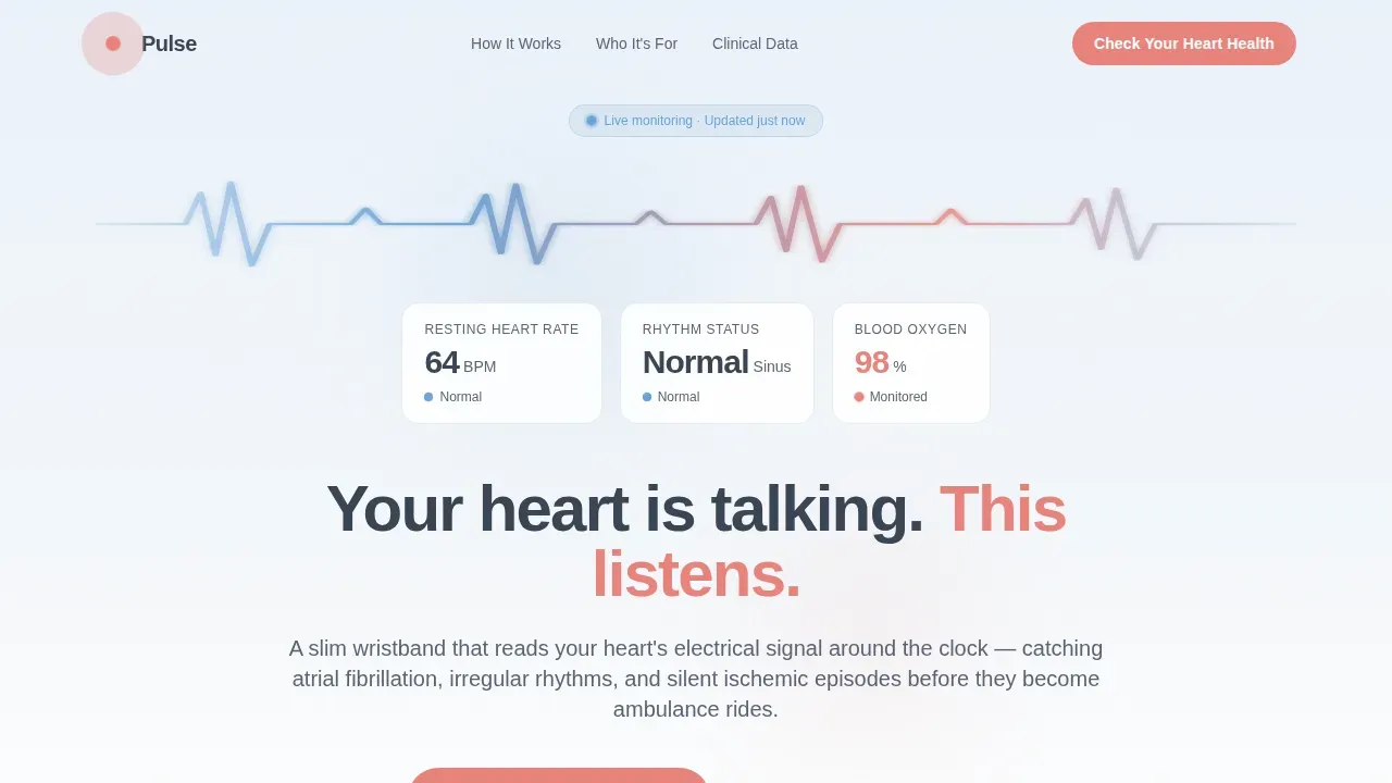
- An animated ECG hero with three floating vital signs metric cards showing heart rate, rhythm status, and blood oxygen at a glance
- Four zigzag content sections, each pairing a patient audit question with a device-data answer covering atrial fibrillation detection, silent ischemic episodes, remote patient monitoring, and sleep rhythm analysis
- A final full-width call-to-action block, a linear single-row footer, and coral-accented primary buttons that repeat at each section junction to guide every user naturally toward the next step
Feature list
This template includes six purpose-built features. Each one is grounded in the source brief and designed to deliver measurable value for healthcare brands.
Animated ECG Waveform Hero
The header displays a smooth, oversized electrocardiogram waveform tracing across the full viewport width. Three staggered metric cards appear alongside it, presenting resting heart rate, rhythm status, and blood oxygen as calm, large-format numbers. The effect proves the medical device works before a single feature is described.
Zigzag Audit Section Layout
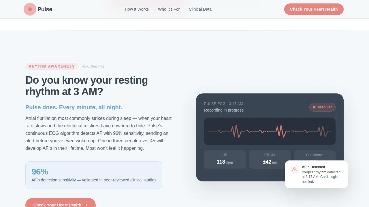
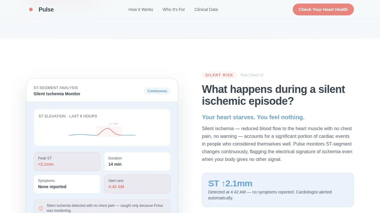
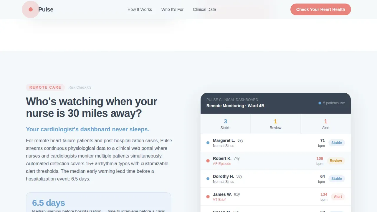
Four alternating content sections each open with a personal audit question aimed at the visitor, then answer it with a specific reading, an app alert visual, or a physician dashboard view. This structure lets the page illustrate one cardiac risk factor at a time without overwhelming patients with complex information all at once.
Coral Coral Call-to-Action System
The primary button, styled in gentle heartbeat coral, repeats at every zigzag junction and in the final full-width block. The secondary text link, "See What Your Cardiologist Sees," appears alongside it to support medically literate visitors who want clinical detail before committing. This dual call-to-action approach keeps both patient and professional audiences moving forward.
Clinical Data Visualization Panels
Each alternating section pairs its audit question with a data panel: a heart rate monitor reading, an atrial fibrillation alert screenshot, a remote dashboard view, or a sleep rhythm chart. These visuals enhance understanding by transforming heart rate data into clear, readable displays rather than raw numbers.
Cloud Canvas Color and Typography System
The design applies a carefully layered palette. Backgrounds breathe in soft atmospheric white and calming mist gray. Text sits in quiet charcoal for clarity. The coral accent appears only where something living needs attention, maintaining visual discipline across every slide-style section of the page.
Scroll-Triggered Reveal Animations
Section content enters through scroll-triggered reveals and staggered entries, creating a sense of rhythm that mirrors a steady heart beat. This animation approach keeps each audit moment feeling deliberate and unhurried, enhancing the overall sense of calm the Healing Space theme is designed to deliver.
Page sections overview
| Section | Purpose |
|---|---|
| ECG Waveform Hero | Display real-time heart rate metrics and fade-in headline to establish immediate trust |
| Zigzag Section One | Audit question on resting rhythm; answer with atrial fibrillation detection data |
| Zigzag Section Two | Audit question on silent episodes; answer with ST-segment ischemia analysis |
| Zigzag Section Three | Audit question on remote care; answer with physician dashboard and patient monitoring view |
| Zigzag Section Four | Audit question on sleep; answer with overnight heart rate data and rhythm summary |
| Full-Width call to action Block | Final conversion moment with primary coral button and secondary clinical-specs link |
| Linear Footer Row | Single-row footer delivering essential links and brand closure |
Design & branding system
The Healing Space theme runs through every design decision in this template. The Cloud Canvas color system is the foundation: soft atmospheric white at #F4F7FA forms the background, calming mist gray at #D6DFE8 separates content zones, and reassuring sky blue at #6BA3D6 anchors medical graphics. Charcoal at #3A4553 keeps text grounded, while heartbeat coral at #E8837C appears sparingly for call-to-action elements and key metric highlights.
- Typography uses Plus Jakarta Sans for headings and DM Sans for body text, giving the page a modern clinical warmth that professionals and patients both find readable
- High quality images and illustrations are positioned at alternating sides of each content section; medical graphics maintain a consistent background tone so visuals never compete with data
- Design elements like floating metric cards, pulse animations, and waveform graphics are built into the layout to enhance visual hierarchy and keep each section scannable at a glance
Mobile & speed optimization
The template is built desktop-first with strong mobile adaptation baked into the layout. Large tap targets, readable type sizes, and stacked zigzag sections ensure that patients checking heart rate data on a phone have the same clear, calm experience as desktop visitors.
- Interactive elements including the animated ECG waveform and metric card reveals are handled with performance in mind, so the page loads quickly and stays responsive on smaller screens
- Static sections use server-rendered components while the animated hero uses a client component, keeping the overall page structure efficient and accessible for a wide range of devices
How this template helps you convert
A high-converting landing page for a real-time pulse monitoring product must establish immediate trust and demonstrate clinical accuracy. This template does both through a deliberate, section-by-section structure that earns the click rather than demanding it.
- The ECG waveform hero and floating vital signs cards create an instant first impression of a functioning medical device, reducing visitor anxiety before any feature is explained
- Each zigzag audit section escalates the stakes gently, from everyday heart rate awareness to emergency detection, so that by the final call-to-action block the visitor has seen six specific problems the device catches and clicking feels like informed self-care rather than a purchase
Other information about this template
This template is tailored for the cardiac health and heart health wearable market, but its structure adapts naturally to any patient monitoring or medical device presentation context. The audit-style narrative can support a cardiologist clinic, a hospital remote monitoring program, or a consumer heart rate monitor brand with equal effectiveness.
- The layout is well suited to inspire presentation design for healthcare professionals who need to display vital signs, blood pressure trends, and heart beat data to non-clinical audiences; the zigzag format keeps an audience engaged across every content block
- Professionals creating medical education materials can use the section structure as a reference for training slides and Google Slides decks; the data visualization approach and illustration style translate effectively to a PowerPoint template or a Google Slides presentation format
- Key points about the color system, waveform graphics, and medical illustrations in this template can help teams building a heartbeat monitor PowerPoint template or adapting the design for training and exercise health programs
- The template supports content that includes disclaimers about data sources, trust indicators, and transparent pricing tiers, all of which are essential for maintaining credibility in a healthcare marketing context
- Icons, infographics, and high quality images within the layout follow medical presentation best practices: clinical blues and whites, professional mist grays, and coral accents that mirror standard medical equipment color conventions
- The page structure, with its clear call-to-action rhythm and key messages delivered one section at a time, reflects effective design principles for health-tech landing pages where clarity and workflow simplicity protect visitor trust
- Teams can customize section content, swap illustrations, and navigate the layout to fit a range of cardiac health product use cases without altering the core visual identity
Theme
Healing Space
Creative direction
Checklist & Audit
Color system
Cloud Canvas
Style
Zigzag/Alternating
Direction
Click-Through
Page Sections
Animated ECG Waveform Hero Display
Zigzag Audit Section Structure
Dual Call-to-action System
Clinical Data Visualization Panels
Cloud Canvas Color and Type System
Scroll-triggered Reveal Animations
Related questions
Who is this landing page template designed for?
What sections are included in this template?
Can the colors and typography be customized?
What call-to-action structure does this template use?
Is this template suitable for medical education or training inspiration?



