Wearable Stress Monitoring Landing Page Template
The Pulse Corporate Precision Anxiety Wearable Monitor landing page template is a sidebar companion layout built for enterprise health-tech. It guides occupational health directors, HR leads, and clinical psychologists from the financial cost of unmanaged workplace stress through clinical evidence to a pilot program booking. The design follows a Corporate Precision theme with a Teal Catalyst color system.
by Rocket studio
Quick summary
This template presents the Pulse anxiety wearable monitor using a Problem→Solution Arc. It opens with the hidden cost of workplace stress, builds clinical credibility through biometric data and sensor diagrams, and closes with an embedded booking form. The fixed sidebar carries a persistent call to action and a live scroll-progress indicator that shifts from teal to coral.
Who this template is for
This page is built for B2B health-tech teams marketing precision wearable devices to enterprise buyers. It speaks directly to professionals who need clinical evidence before committing budget or calendar time.
- Occupational health directors rolling out resilience programs across large workforces
- HR leads at law firms and trading floors managing burnout and talent retention
- Clinical psychologists who need ambulatory biometric data between patient sessions
What problem this template solves
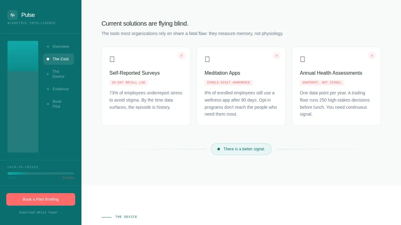
Enterprise wellness programs struggle to prove ROI because their tools produce data too slowly. Self-reported surveys have a thirty-day lag. Meditation apps show single-digit adherence. Neither tool can identify stress as it occurs or support timely intervention. Decision-makers need a page that front-loads the financial cost of inaction before asking for a meeting.
- No existing template addresses the Problem→Solution Arc for clinical wearable technology at enterprise scale
- Most health-tech pages bury the evidence and lead with the product, losing busy occupational health buyers early
- The sidebar companion layout keeps the booking call to action visible without interrupting the clinical argument
What you get with this template
This template delivers a fully structured single-page layout with seven defined content sections, a persistent fixed sidebar, and all interactive components pre-wired for a desktop-first audience. Every design decision reinforces the feeling of a vitals monitor in a private hospital suite.
- Half-Page Photo+Text hero with headline, clinical stat, and coral primary button
- Animated cost-of-inaction section with a live productivity-loss counter and current-solutions comparison
- Exploded-view device diagram, clinical validation section, integration logos, embedded scheduler, and white paper email capture
Feature list
This template ships with purpose-built components that serve enterprise health-tech conversion goals. Each section is designed to build trust systematically, moving the visitor from awareness of stress levels to commitment to a pilot briefing.
Half-Page Hero with Clinical Stat
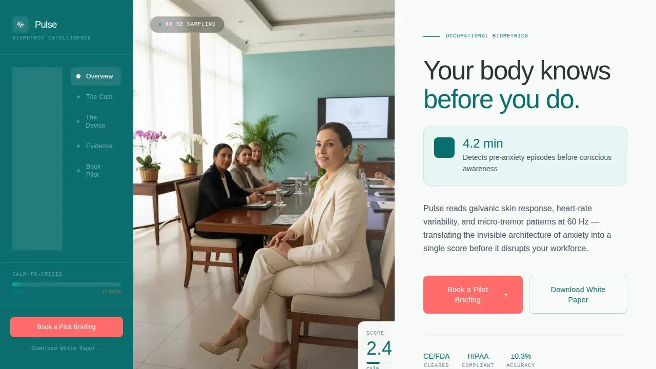
The hero splits the screen between a shallow-focus wrist photograph and a headline set in a thin clinical sans-serif. A single stat anchors the value: the device detects pre-anxiety episodes 4.2 minutes before conscious awareness. The coral booking button sits immediately below, reducing delay between first impression and first action.
Live Cost-of-Inaction Counter
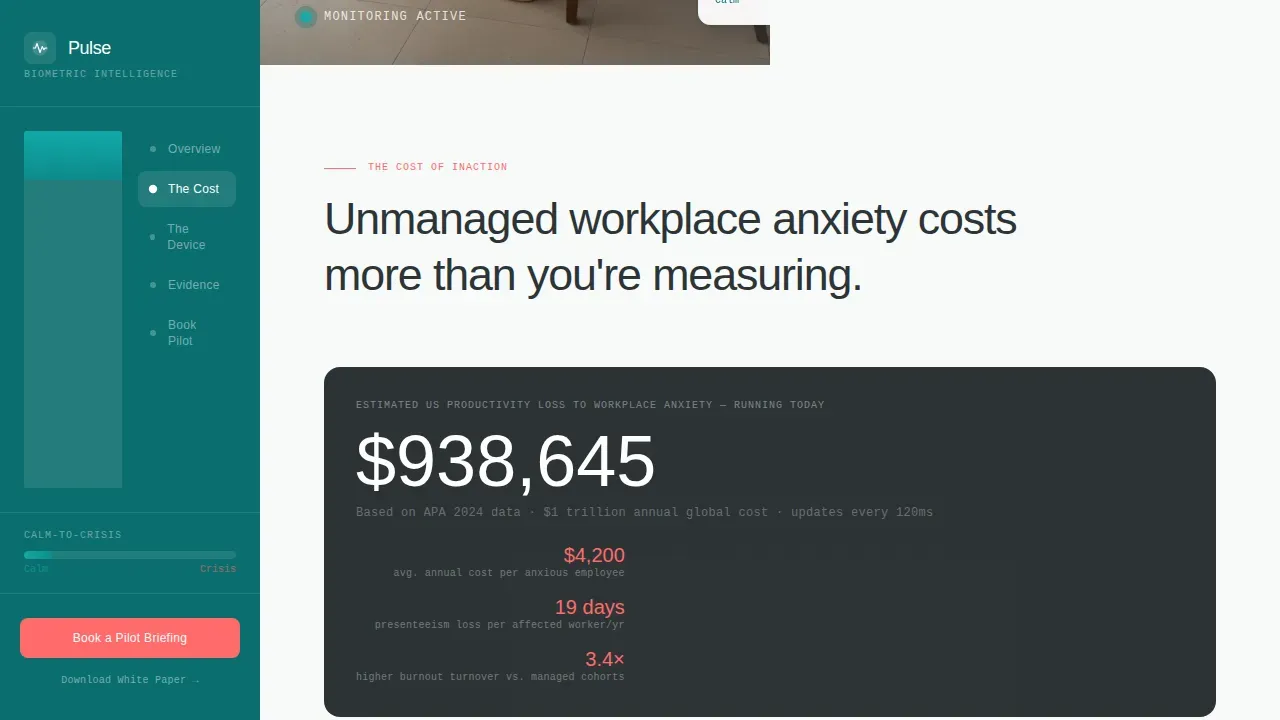
An animated counter estimates productivity dollars lost to unmanaged workplace anxiety in real time. This section also surfaces absenteeism and presenteeism data alongside a side-by-side comparison showing current tools failing. The counter uses client-side rendering so the number keeps moving while the visitor reads, creating genuine urgency without fabricated claims.
Sensor Diagram with Animated Data Streams
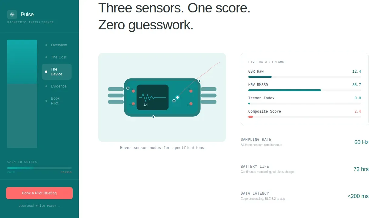
An exploded-view diagram labels each sensor on the device: galvanic skin response, heart rate variability (HRV), and micro-tremor detection. Animated data streams connect sensor outputs to the companion app dashboard. Heart rate variability is widely recognized as a reliable physiological indicator of stress, and the diagram makes that credibility visible.
Clinical Validation and Pilot Case Study
This section presents study data alongside anonymized biometric curves from a pilot program. A higher HRV score indicates better resilience and adaptability, while a lower score can signal elevated stress. The curves give clinical psychologists and occupational health directors the research-grade evidence they need before committing to a deployment.
Fixed Sidebar with Scroll-Progress Indicator
The sidebar stays anchored throughout the full scroll journey. It carries a persistent mini call-to-action and a scroll-progress bar that mirrors the device's own calm-to-crisis gradient, shifting from clinical deep teal to catalyst coral as the visitor moves deeper into the evidence. This system keeps the booking path visible without interrupting reading flow.
Embedded Scheduler and White Paper Capture
The booking section embeds a Calendly-style scheduler filtered to thirty-minute slots with a clinical deployment specialist. The intake form captures company name, workforce size band, and primary use case. A secondary email capture offers the validation white paper for prospects not yet ready to commit calendar time.
Page sections overview
| Section | Purpose |
|---|---|
| Hero photo split | Introduce device and headline stat |
| Cost of inaction | Quantify unmanaged stress impact |
| Current solutions failing | Show gap in existing health tools |
| Device sensor diagram | Explain biometric data capture |
| Clinical validation study | Build evidence-based trust |
| Pilot case study | Show real anonymized performance |
| Integrations and booking | Convert interest into scheduled meeting |
Design & branding system
The visual identity follows a Corporate Precision theme. Every color in the Teal Catalyst system exists because it means something: nothing decorates. The palette feels like a vitals monitor in a private hospital suite, calm and certain.
- Clinical deep teal (#0B6E6E) anchors the fixed sidebar; sterile instrument white (#F7FAFA) fills content panels; graphite data-ink (#2D3436) carries body text
- Catalyst coral (#FF6B6B) is reserved exclusively for alert states and primary buttons, including the main booking call to action
- Typography uses Plus Jakarta Sans for interface elements and DM Sans for body copy, both set thin and precise to reinforce the clinical tone
Mobile & speed optimization
This template is desktop-first by design. The sidebar companion layout and embedded scheduler require the screen real estate that occupational health directors and HR leads have at their desks. Animations are structured using server components for static content and client components for interactive elements.
- Scroll-triggered reveals and animated counters use client-side rendering to stay smooth without blocking static content load
- The scroll-progress sidebar gradient and live cost counter are isolated as client components, keeping the rest of the page lightweight
- Section structure keeps each content block focused and scannable, reducing cognitive load for busy enterprise users
How this template helps you convert
This page earns the booking click by building a clinical argument across every scroll. It does not ask for a meeting before proving why one is worth having.
- The hero leads with a single measurable claim and puts the coral booking button in the first viewport, so users who are already convinced can act immediately without waiting through sections they do not need.
- The Problem→Solution Arc systematically removes objections: the cost-of-inaction counter addresses ROI skepticism; the sensor diagram addresses technical credibility; the clinical validation section addresses research-grade accuracy concerns; and the integration logos address enterprise system compatibility before the scheduler appears.
- The dual conversion path captures both ready buyers through the embedded calendar and interested-but-not-ready prospects through the white paper email form, so no qualified visitor leaves the page without giving a contact point.
Other information about this template
This template is designed to address a gap in the health-tech industry where most landing page designs do not scale to the complexity of enterprise biometric deployments. Several additional details are worth noting for teams evaluating this layout.
- The Pulse Corporate Precision Anxiety Wearable Monitor Landing Page Template is built as a sidebar companion, distinguishing it from standard full-width health-tech pages
- User ownership of data is reflected in the template's privacy framing: employer views are shown as anonymized and aggregated, supporting compliance with HIPAA, GDPR, and EEOC guidance
- The device is presented as lightweight, hypoallergenic, and suitable for all-day wear, with aesthetics designed to blend with professional attire using surgical-grade materials
- The app interprets biometric data using artificial intelligence to provide actionable advice, including suggesting a breathing exercise when stress levels rise
- Wearable devices in this category can also track metrics relevant to broader health monitoring, including sleep quality, fitness trends, and continuous glucose monitoring contexts, making this template adaptable to adjacent health and wellness programs
- The template's design language draws contrast with consumer wearable devices such as the Apple Watch by emphasizing clinical precision over general fitness tracking
- The system supports integration logos for enterprise software platforms, reinforcing that the page speaks to digital health buyers who manage large-scale deployments across multiple computers and internet-connected systems
- The website layout verifies trust at each scroll stage: each section verifies a new layer of clinical credibility before the next one loads, mirroring how a security service verifies a connection before granting access, building confidence rather than waiting for the visitor to simply believe
- Teams interested in deploying this template should note that the scroll-progress indicator functions as a visual guide, much like a verification successful signal, confirming the visitor has moved through the evidence and is ready to act
- The fixed sidebar acts as a persistent security checkpoint of sorts: it protect the booking conversion by keeping the call to action in view even as users explore deep content sections, ensuring no qualified lead is lost to navigation friction
- From a broader healthcare perspective, wearable technology has the potential to positively impact mental health outcomes, and this template is designed to communicate that benefit clearly to patient-focused buyers and clinical teams alike
Theme
Corporate Precision
Creative direction
Problem→Solution Arc
Color system
Teal Catalyst
Direction
Booking/Scheduling
Page Sections
Half-page Hero with Booking Call to Action
Live Cost-of-inaction Counter
Sensor Diagram with Data Streams
Clinical Validation Section
Fixed Sidebar with Progress Gradient
Dual Conversion Path
Related questions
What type of business is this template designed for?
Can I adapt the booking form for a different scheduling tool?
Does the template include the animated cost counter out of the box?
How does the sidebar scroll-progress indicator work?
Is this template suitable for clinical psychologists presenting the device to patients?



