A-Frame House Real Estate Booking Website Template
Ridgeline is a dark, immersive landing page template built for A-frame cabin property managers. It pairs a dramatic Before/After slider header with a modular card grid that turns real pain points into visible managed outcomes. The warm stone color system, sticky booking bar, and mobile-friendly text-in call to action make it easy for cabin owners to trust the service and take the next step.
by Rocket studio
Quick summary
Ridgeline is a single-page landing page template designed for A-frame cabin property management companies. It opens with an interactive Before/After slider, then walks visitors through a card grid that escalates from cosmetic fixes to deep operational wins. The warm stone palette, sticky booking bar, and dual conversion paths give second-home owners and short-term rental investors every reason to book a free property review.
Who this template is for
This template was built for property managers who specialize in A-frame and mountain cabin rentals. It speaks directly to owners who live far from their property and need a trustworthy local operator.
- Second-home owners who live out of state and want their cabin earning income while they are away
- Short-term rental investors managing portfolios of six to twenty doors in mountain or lake destinations
- Couples who inherited a family cabin and are weighing whether to list it, hold it, or sell it
What problem this template solves
Managing a remote A-frame cabin is harder than it looks from three states away. Owners face missed bookings, maintenance surprises, low-quality listing photos, and shoulder-season revenue gaps. This template gives property managers a focused page that names every one of those frustrations and shows the managed alternative.
- Owners scroll past pain they recognize and immediately see the solution side of each card
- The escalating card grid builds trust from simple staging wins up to permit compliance and annual revenue projections
- Two low-friction conversion paths reduce drop-off for both desktop and on-the-go mobile visitors
What you get with this template
The template delivers a complete, section-led landing page ready to represent an A-frame cabin property management service. Every visual detail and interactive element is included out of the box.
- An interactive Before/After slider header with a reveal headline that types out only after the visitor drags past center
- A modular card grid with flip-or-slide hover states pairing real pain-point images with managed-outcome results
- A sticky bottom booking bar with a structured form and a secondary mobile text-in path for low-friction lead capture
Feature list
This template is built around interactive storytelling and practical conversion design. Each feature below is drawn directly from the brief.
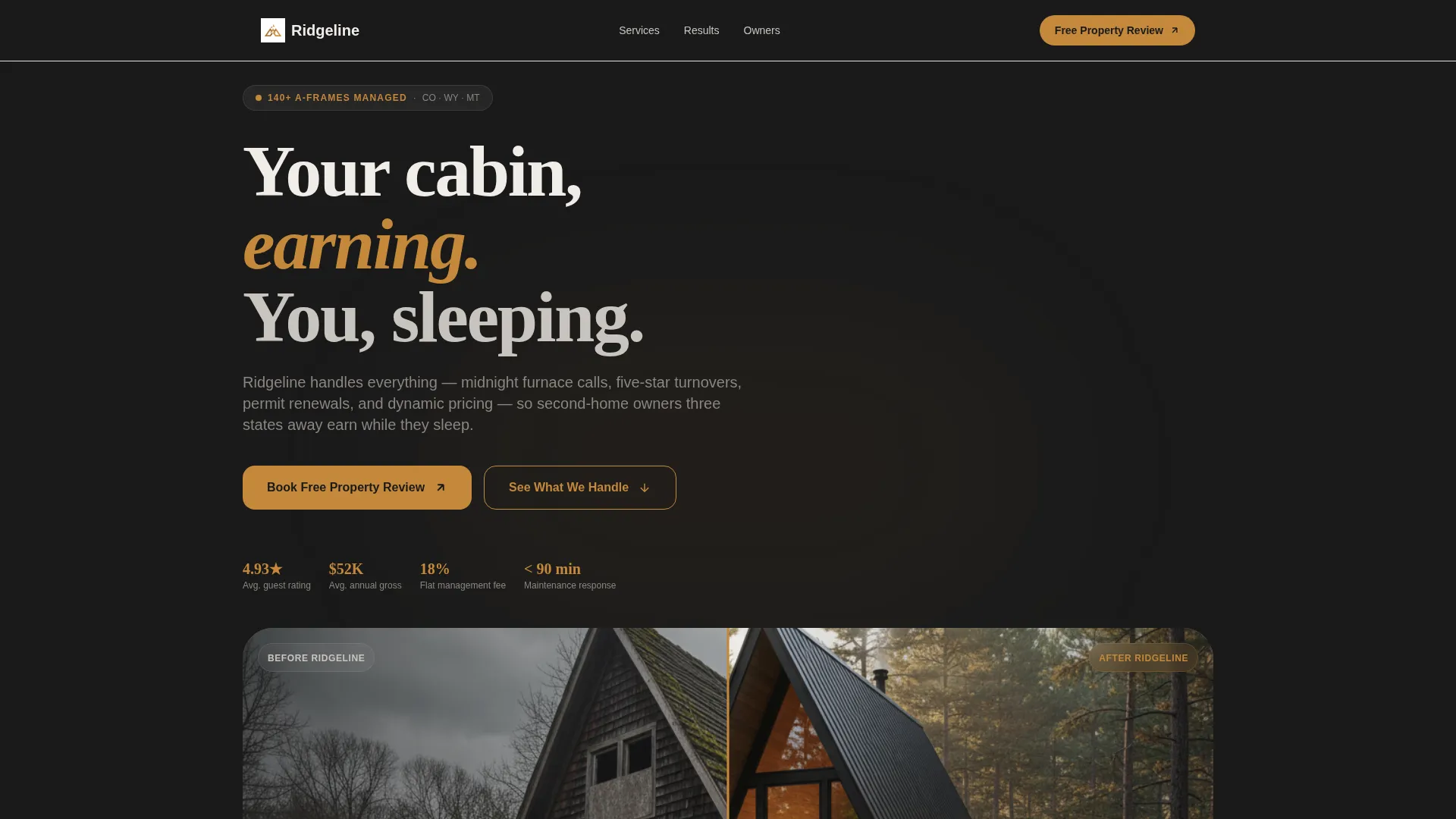
Before/After Slider Header
The header shows a neglected A-frame on the left and the same cabin professionally staged on the right. The visitor drags the divider themselves. A typewriter headline appears only after the slider crosses center, reading "Same cabin. Different revenue." The interaction sets the emotional tone before a single word of body copy is read.
Modular Pain-to-Outcome Card Grid
Each card pairs a real problem image with its managed counterpart. Visuals include a one-star review screenshot, a clogged hot tub filter photo, and a flatlining revenue chart. Cards flip or slide on hover, and the grid escalates in depth from staging and listing photos through pricing optimization, permit compliance, and annual revenue projections.
Sticky Booking Bar with Structured Form
After the visitor scrolls past the third card row, a sticky bar anchors to the bottom of the screen. The primary call to action is "Book a Free Property Review." The form collects property location by zip code, number of A-frames managed, current listing status, and a preferred call window.
Mobile Text-In Secondary Path
A secondary conversion option lets mobile visitors text a photo of their cabin directly from their phone. The prompt reads "Text Us Your A-Frame." This path is designed for owners standing in the driveway, reducing friction to near zero for an impulse inquiry.
Dark Immersive Warm Stone Palette
The color system uses deep charcoal as the dominant background, snowfield white for floating card surfaces, hearthstone amber for all interactive elements and hover states, and weathered cedar for secondary text and divider lines. The palette evokes a cabin at dusk with amber firelight catching pine walls.
Escalating Scroll Narrative
The page is structured so visitor trust builds with every scroll row. The narrative moves from cosmetic improvements like staging and photography through operational depth including pricing strategy, permit compliance, and projected annual revenue. By the final card row, visitors understand the full scope of what a professional manager handles.
Page sections overview
| Section | Purpose |
|---|---|
| Before/After Slider | Opens with interactive cabin transformation and reveal headline |
| Pain-Point Cards Row 1 | Addresses cosmetic issues like staging and listing photography |
| Pain-Point Cards Row 2 | Covers operational gaps like hot tub maintenance and reviews |
| Pain-Point Cards Row 3 | Shows pricing optimization and shoulder-season revenue recovery |
| Deep Operations Row | Presents permit compliance and annual revenue projection outcomes |
| Sticky Booking Bar | Captures leads with a structured form anchored to the screen bottom |
| Mobile Text-In Path | Offers a secondary low-friction inquiry option for on-the-go owners |
Design & branding system
The design follows a Dark Immersive theme anchored by a Warm Stone color system. Every visual choice reinforces the feeling of arriving at a well-managed mountain cabin after dark.
- Deep charcoal (#1A1A1A) fills the page background; snowfield white (#F0EDE8) card surfaces appear to glow against it like lit windows in the tree line
- Hearthstone amber (#C4883A) marks every button, interactive element, and hover state, while weathered cedar (#6B4F3A) is reserved for secondary text and divider lines
- The overall visual rhythm is warm, unhurried, and confident, matching the tone a property owner needs before handing over their most valuable asset
Mobile & speed optimization
The landing page is structured for mobile visitors who may be standing at the property itself when they first encounter the service. Both conversion paths are designed to work smoothly on a small screen.
- The card grid is modular, allowing each row to reflow cleanly on narrow viewports without losing the pain-to-outcome pairing
- The sticky booking bar remains accessible at the bottom of the screen on mobile, keeping the primary call to action within thumb reach at all times
- The mobile text-in path eliminates form friction entirely, letting owners send a cabin photo with a single tap rather than filling out fields on a small keyboard
How this template helps you convert
The page is engineered to move a skeptical cabin owner from curiosity to a booked call. Each structural decision lowers the barrier to taking action.
- The Before/After slider creates an emotional before-and-after moment before any claims are made in text, building belief through direct interaction rather than persuasion copy.
- The escalating card grid maps every problem the visitor already feels to a visible managed outcome, so by the time the sticky booking bar appears, the case has already been made through images and real results.
- Two parallel conversion paths, a structured scheduling form and a one-tap text option, ensure that both deliberate desktop visitors and impulsive mobile visitors have a natural next step that matches how they arrived.
Other information about this template
This template is built as a single-page landing page using a card grid modular layout. It is categorized under Real Estate and Property, with a focus on A-frame house real estate and short-term rental management services.
- The template style is Card Grid (Modular), and the landing-page direction is Direct Sales, meaning every design and copy decision points toward a booked consultation
- The creative direction is Interactive Explorer, reflected in the draggable slider, hover-state card reveals, and the staged scroll narrative that rewards engagement
- The header concept is a live interactive element rather than a static hero, making the first impression memorable and participatory rather than passive


Theme
Corporate Precision
Creative direction
Interactive Explorer
Color system
Dark Emerald
Style
Card Grid (Modular)
Direction
Direct Sales
Page Sections
Before/after Slider Header
Modular Pain-to-outcome Card Grid
Hover-state Card Reveals
Sticky Bottom Booking Bar
Mobile Text-in Conversion Path
Dark Immersive Warm Stone Design System
Related questions
Who is this landing page template built for?
What makes the header different from a standard hero image?
Can the template support two different types of leads at the same time?
What does the card grid actually show?
Is this template suitable for a company managing multiple properties?


