Complete Hobby & Passion Supplies Professional Website Template
Riff is a modular card-grid landing page built for a cappella group supply stores. It guides shoppers through curated product clusters, a five-question kit-builder quiz, and a bundle deal header. The Neo-Retro design uses a warm Ink and Paper palette to make every card feel like a page from a vintage rehearsal binder, freshly typeset and ready to browse.
by Rocket studio
Quick summary
Riff is a single-page, card-grid layout designed for a cappella supply retailers. It opens with a Bundle Deal spotlight, moves into need-based product clusters, and anchors the experience around an interactive kit-builder quiz. The Neo-Retro visual identity makes browsing feel tactile and purposeful, like flipping through a well-organized rehearsal binder.
Who this template is for
This template is built for specialty retailers who sell performance and rehearsal supplies to vocal groups. It suits operators who want a browsing experience that feels curated and personal rather than generic.
- College a cappella directors shopping for competition-ready attire and materials in one visit
- High school choral coaches ordering rehearsal packets and pitch tools in bulk
- Barbershop quartet members who know their gear and want quick access to a full catalog
What problem this template solves
Most hobby supply stores present products in flat category grids that do not speak to the buyer's actual need. A cappella groups do not shop by SKU. They shop by situation: semifinals next weekend, new semester starting, gig night tomorrow.
- Generic category pages waste browsing time for buyers who already know what occasion they are preparing for
- No guided path means first-time buyers leave without a clear recommendation
- Mismatched product presentation makes the store feel like a general retailer instead of a specialist
What you get with this template
You get a complete, single-page layout that covers every stage of the buyer journey, from first impression to personalized recommendation. Every section is purposeful and modular, so the page flows naturally without feeling cluttered.
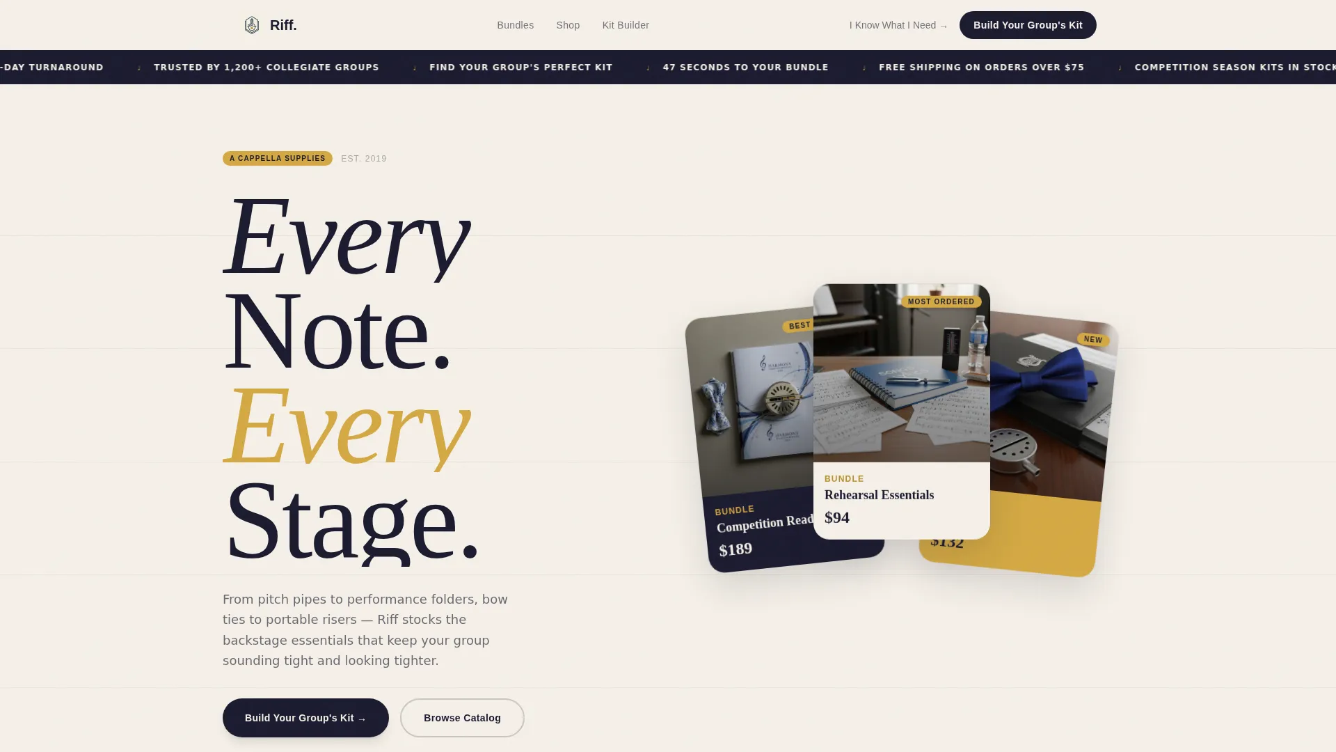
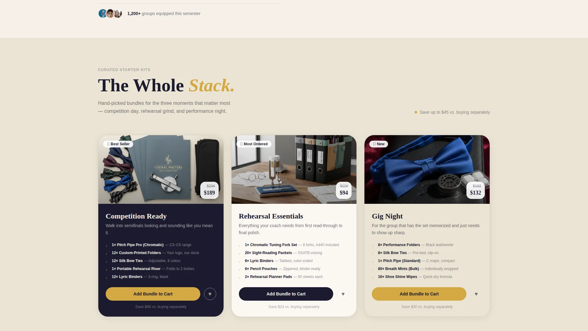
- A three-kit Bundle Deal header with flat-lay card styling and a rotating ticker
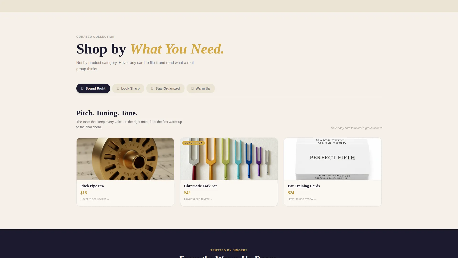
- Four modular product cluster sections organized by buyer need rather than product category
- A five-question kit-builder quiz with a comparison result card and a skip path for experienced buyers
Feature list
This template ships with six distinct features that work together to create a confident, conversion-friendly browsing experience.
Bundle Deal Header with Kit Cards
Three curated starter kits, Competition Ready, Rehearsal Essentials, and Gig Night, are displayed as oversized, fanned cards against a parchment background. Each card uses a flat-lay photograph with artfully overlapping items and brass foil accents for visual emphasis.
Rotating Announcement Ticker
A live-style ticker sits above the header and cycles through short, energetic copy. It creates immediate momentum and signals to visitors that something worth paying attention to is happening right now.
Need-Based Product Cluster Grid
Products are grouped into four browsable clusters: Sound Right, Look Sharp, Stay Organized, and Warm Up. Each cluster reads like a specialty shelf, making it easy for buyers to find exactly what their group is missing.
Flip Card Detail View
Every product card in the grid flips on interaction to show a detail shot and a single-line review from a real group. This adds social proof directly inside the browsing experience without requiring a separate page.
Five-Question Kit-Builder Quiz
The primary call to action launches a short diagnostic covering group size, competition level, vocal style, pain point, and budget. Results display a personalized bundle recommendation with a side-by-side comparison showing kit value versus buying items individually.
Veteran Skip Path
A secondary call-to-action link, labeled "I Know What I Need," lets experienced buyers bypass the quiz and go straight to the full catalog. This keeps the page useful for repeat customers without slowing them down.
Page sections overview
| Section | Purpose |
|---|---|
| Rotating announcement ticker | Sets energy and urgency above the fold |
| Bundle Deal header | Showcases the three curated starter kits |
| Sound Right cluster | Groups pitch and tuning products by need |
| Look Sharp cluster | Surfaces performance attire and accessories |
| Stay Organized cluster | Highlights folders, binders, and printed materials |
| Warm Up cluster | Features rehearsal tools and warm-up aids |
| Kit-builder quiz | Guides buyers to a personalized recommendation |
| Quiz results card | Compares bundle value to individual item pricing |
| Veteran catalog path | Offers a direct skip to the full product catalog |
Design & branding system
The Riff template uses a Neo-Retro visual identity built on an Ink and Paper color system. Every design choice reinforces the feeling of a vintage songbook reprinted on heavy stock, with modern precision underneath the warm surface.
- Core palette: warm parchment cream for backgrounds, deep manuscript ink for text, staff-line gray for borders and dividers, and pitch-pipe brass reserved for hover states, badges, and call-to-action elements
- Typography carries typeset charm with clean modern crispness, making cards feel like engraved notes on a ruled staff
- Flat-lay card photography and brass foil accent treatments give the header a tactile, editorial quality that sets the store apart from commodity retail pages
Mobile & speed optimization
The modular card grid is structured to reflow cleanly across screen sizes, keeping the browsing experience readable on both desktop and mobile without sacrificing the visual rhythm of the layout.
- Card clusters stack into single-column views on smaller screens, preserving the shelf-browsing feel without horizontal overflow
- The quiz flow is designed as a step-by-step sequence that works naturally as a vertical tap-through on mobile devices
- Lightweight flat-lay image treatment and contained card components keep the layout focused and structurally efficient
How this template helps you convert
The page is built around one central idea: meet buyers where their actual need is, not where a generic category tree puts them. Every layout decision supports that goal.
- The kit-builder quiz replaces guesswork with a personalized recommendation, reducing the decision fatigue that causes cart abandonment on specialty retail pages
- The need-based cluster grid and flip card reviews give browsers a reason to slow down and explore, which builds confidence before they reach a buy decision
- The veteran skip path keeps repeat buyers moving fast, so experienced customers are never slowed down by a flow designed for newcomers
Other information about this template
Riff was designed specifically for the a cappella supply niche, where buyers range from first-time coaches to seasoned competitors who know their gear inside out. The template handles both audiences on the same page without compromise.
- The Curated Collection creative direction means the page feels like a specialty shop, not a warehouse storefront
- The Card Grid (Modular) template style makes it straightforward to add, remove, or reorder product clusters as inventory changes
- The Neo-Retro theme and Ink and Paper palette are distinctive enough to stand out in a hobby and passion supplies category where most stores default to plain white product grids

Theme
Neo-Retro
Creative direction
Curated Collection
Color system
Ink & Paper
Style
Card Grid (Modular)
Direction
Quiz/Assessment
Page Sections
Bundle Deal Header with Kit Cards
Rotating Announcement Ticker
Need-based Product Cluster Grid
Flip Card Detail and Review
Five-question Kit-builder Quiz
Veteran Catalog Skip Path
Related questions
Can I customize the product clusters to match my actual inventory?
Does the kit-builder quiz work for stores with a small product range?
Is the flip card interaction limited to product reviews?
Who is the veteran skip path designed for?
What makes this template suitable for a specialty hobby supply store?



