Off-Road Accessories Gallery & Detail Landing Page Template
Rig is a Gallery + Detail landing page template built for off-road accessory retailers. It opens with a synchronized split-video header comparing a stock truck against a fully kitted build on the same trail. A scroll-driven Comparison Journey walks visitors through protection, lighting, suspension, and recovery upgrades, then pushes them toward a filtered product catalog with a bold amber "Build Your Rig" call to action.
by Rocket studio
Quick summary
Rig is a single-page, click-through landing page template designed for off-road parts retailers. It pairs a cinematic split-video header with a scroll-driven upgrade journey, walking visitors from stock limitations to aftermarket solutions across four core categories. The visual identity uses deep charcoal backgrounds and trail-marker amber accents, so product photography and calls to action always stand out.
Who this template is for
This template is built for businesses and builders who sell or buy serious off-road equipment. It speaks directly to the people spending time in the garage before sunrise, not casual browsers.
- Weekend overlanders planning full 4Runner builds and speccing individual components with care
- Fleet managers equipping work trucks for demanding access roads on job sites
- Off-road performance shops and retailers selling bull bars, skid plates, LED pods, and recovery kits
What problem this template solves
Most product pages show parts in isolation. Buyers cannot visualize how an upgrade changes real-world performance, so they stall, research elsewhere, and never return. Rig closes that gap.
- Visitors see a direct before-and-after comparison of the same truck on the same trail, removing doubt about product impact
- The scroll journey builds upgrade logic step by step, so buyers understand why each part matters before they click through to the catalog
- A secondary email capture path retains researchers who need more time, so no traffic is wasted
What you get with this template
You get a fully structured, section-led landing page that guides every visitor type toward a clear next step. The layout is dense with visual proof and light on unnecessary friction.
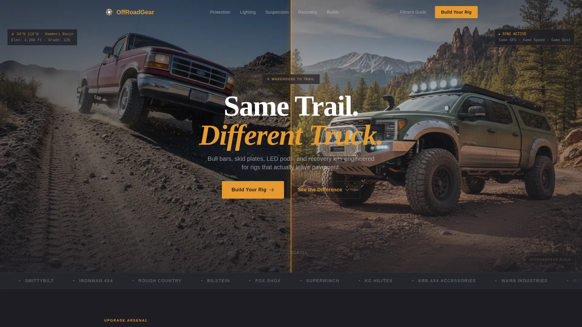
- A synchronized split-video header section with an amber divider and centered headline overlay
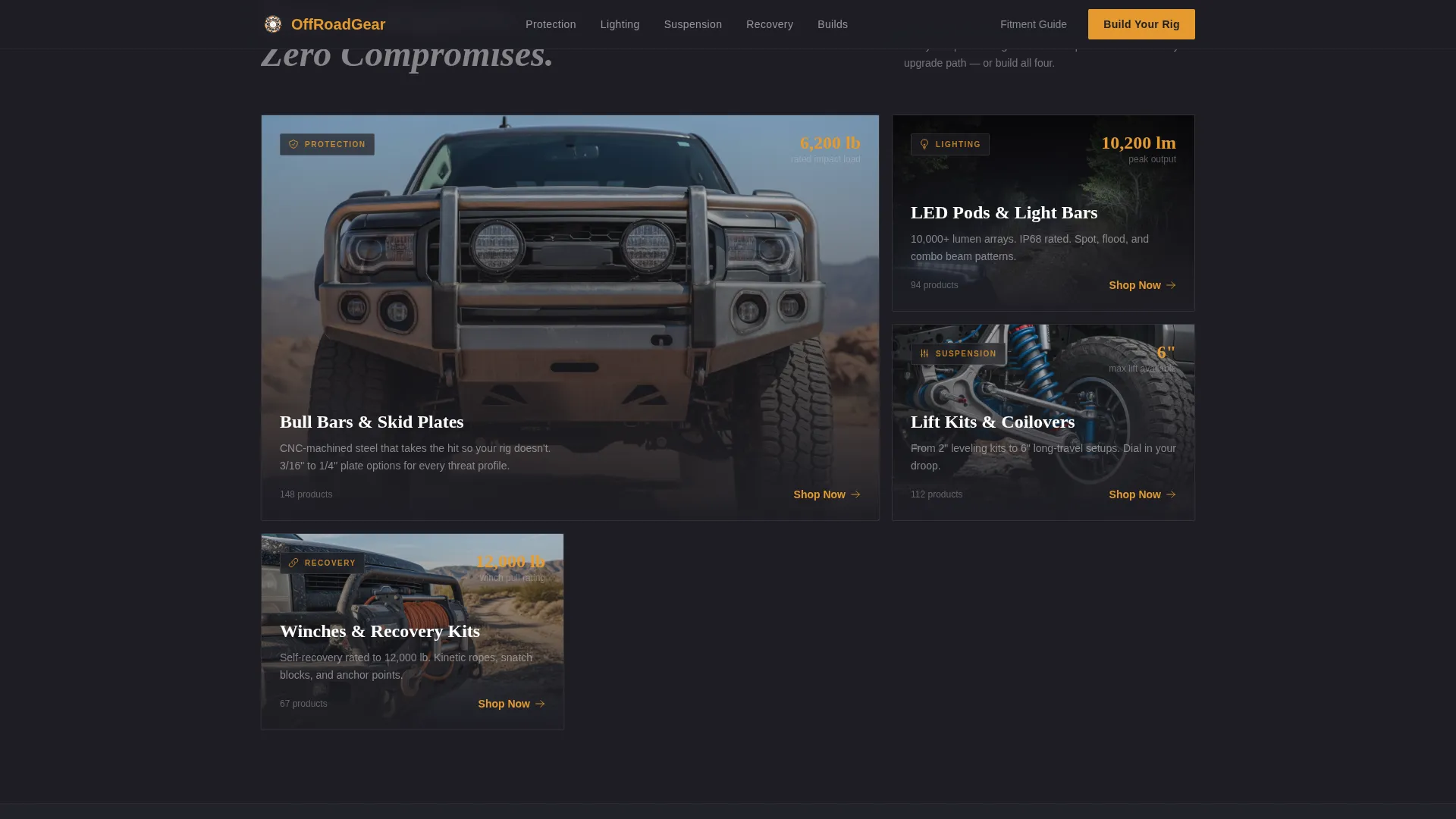
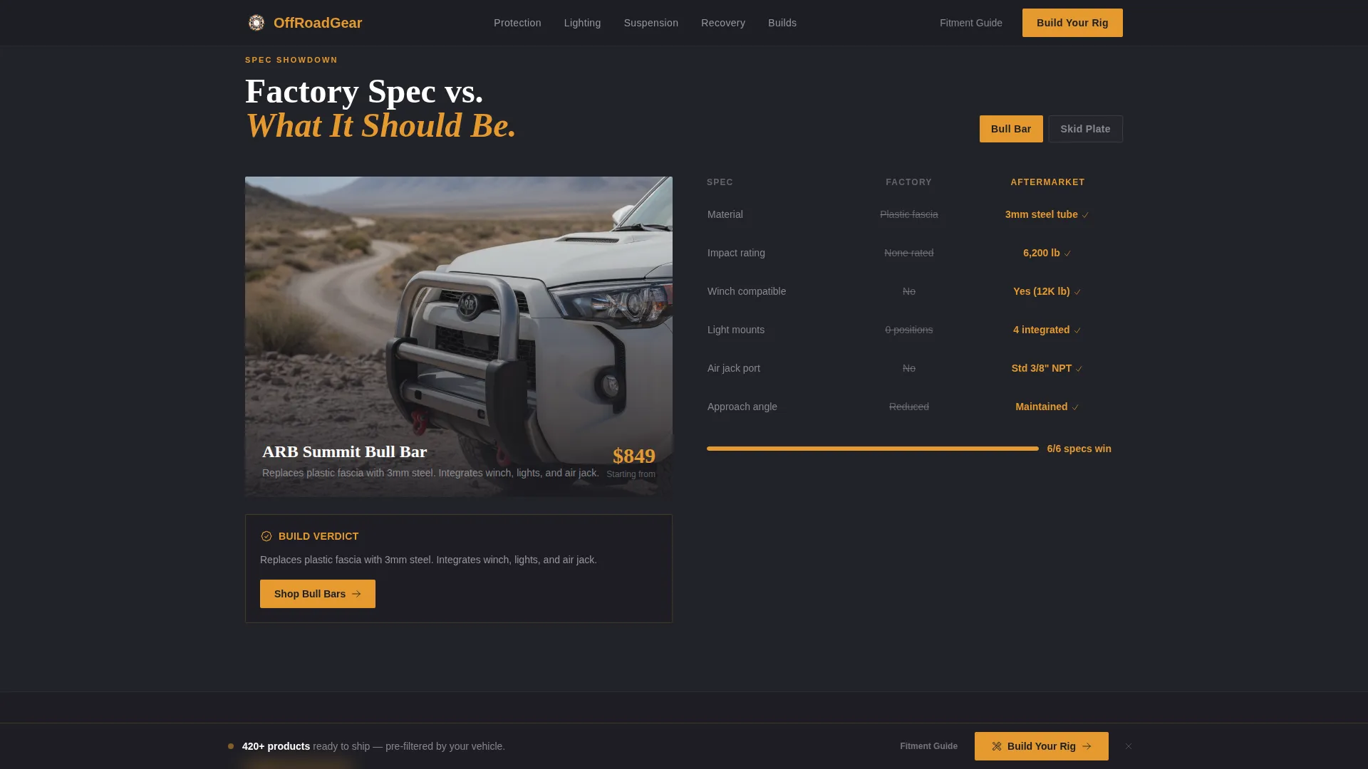
- Four scroll-driven upgrade sections covering protection, lighting, suspension, and recovery, each with spec tables, stress-test footage areas, and fitment gallery grids
- A sticky bottom call-to-action bar and primary "Build Your Rig" button that push visitors into a pre-filtered product catalog
Feature list
This template delivers a focused set of layout and interaction features drawn directly from the brief. Each one serves a specific purpose in the conversion flow.
Split-Video Compare Header
The viewport splits clean down the center. The left side shows a stock truck navigating washboard terrain. The right side shows the same truck, same trail, fully upgraded. Both clips run synchronized, and a pulsing amber divider line separates them. The headline "Same Trail. Different Truck." fades in over the center.
Scroll-Driven Comparison Journey
Each scroll section isolates one upgrade category: protection, lighting, suspension, and recovery. Every section pairs a factory-spec limitation against the aftermarket solution using side-by-side spec tables, slow-motion footage areas, and fitment gallery grids. The structure escalates logically from cosmetic accessories to mission-critical armor.
Expandable Fitment Gallery Grids
Product photography is arranged in gallery grids that expand into 360-degree detail views on click. This lets buyers inspect parts from every angle before committing to a catalog visit, reducing hesitation without requiring a cart on this page.
Sticky Call-to-Action Bar
After the second scroll section, a sticky bottom bar appears with the primary "Build Your Rig" call to action in trail-marker amber. It stays visible as the visitor scrolls, maintaining a constant path back to the filtered catalog without interrupting the content experience.
Email Capture for Fitment Guide
A secondary conversion path offers a downloadable fitment guide in exchange for an email address. This captures researchers who are speccing a build but are not yet ready to purchase, keeping them in the pipeline for follow-up.
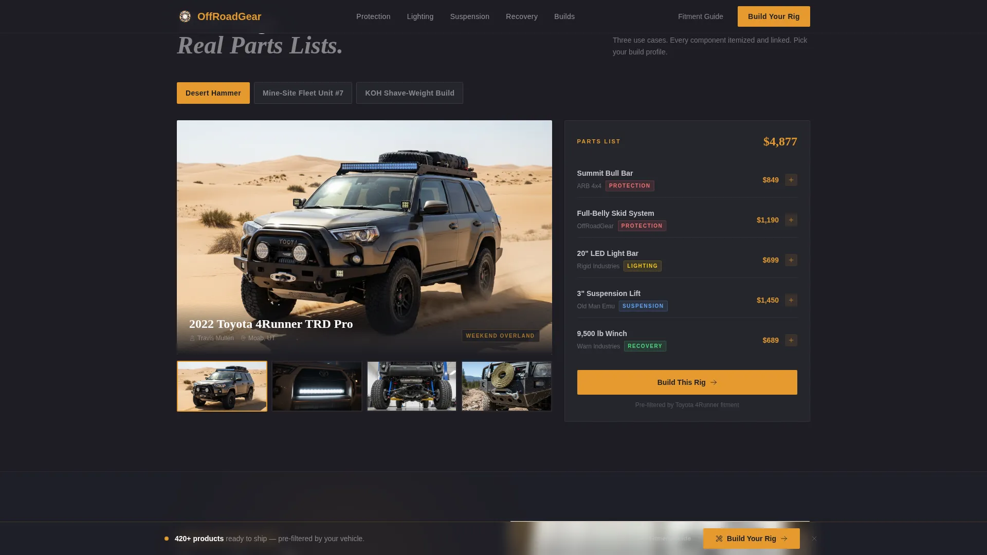
Full Build Gallery with Part Lists
The final section displays completed rig galleries with itemized part lists alongside each build. By this point, visitors have mentally assembled their own truck and can see a finished reference build that mirrors their intended configuration.
Page sections overview
| Section | Purpose |
|---|---|
| Split-Video Header | Compare stock versus. kitted truck in real time |
| Primary call to action Block | Introduce "Build Your Rig" button below header |
| Protection Upgrade Section | Pair factory limits against bull bars and skid plates |
| Lighting Upgrade Section | Show LED pod performance against stock lighting |
| Suspension Upgrade Section | Contrast stock body roll with upgraded setup |
| Recovery Upgrade Section | Present recovery kit solutions for trail situations |
| Sticky call to action Bar | Persistent catalog entry point after second section |
| Fitment Guide Capture | Collect emails from research-phase visitors |
| Full Build Galleries | Showcase completed rigs with itemized part lists |
Design & branding system
The Corporate Precision theme gives this template a machined, deliberate look. Every color decision serves a role: backgrounds recede so product photography dominates, and amber appears only where action is needed.
- Color system uses deep asphalt (#1E1E24) for backgrounds, brushed gunmetal (#3A3A42) for secondary surfaces, dust-cloud silver (#C8C8CE) for card surfaces and dividers, and trail-marker amber (#E59A2F) exclusively for calls to action, price callouts, and hover states
- Amber never touches body text, keeping the eye trained to respond to it only as a signal to tap or click
- The overall feel references a machined billet part fresh off a CNC: anodized dark surfaces with chamfered edges catching a single warm shop light
Mobile & speed optimization
The template is structured for visitors who are browsing on a phone in a parking lot, a campsite, or a shop floor. The layout prioritizes fast comprehension over decorative complexity.
- Sticky call to action bar and large tap targets keep the "Build Your Rig" path accessible on small screens throughout the scroll journey
- Gallery grids and spec table layouts are designed to reflow cleanly for single-column mobile viewing
- Video sections and expandable gallery interactions are built into the template structure to load and respond efficiently on mobile connections
How this template helps you convert
Rig earns the click before it asks for one. The entire page is structured around proof first, then action. Visitors are never pushed toward a decision before the case has been made visually.
- The split-video header creates an immediate emotional hook by showing a real performance difference in the first seconds of the visit, establishing credibility before any product claim appears in text.
- The scroll-driven upgrade journey builds cumulative purchase intent across four categories, so by the final build gallery section, the visitor has mentally committed to a configuration and the "Build Your Rig" call to action feels like a natural next step rather than a hard sell.
Other information about this template
This template sits at the intersection of gallery-driven retail presentation and high-intent click-through funnels. It is built specifically for the off-road accessories niche within the broader automotive and transport category.
- Template style is Gallery + Detail, combining large-format visual proof with structured specification content in a single scroll
- The landing page direction is Click-Through, meaning no cart or checkout lives on this page; the goal is a qualified handoff to a filtered product catalog
- The header concept is Split-Video Compare, a layout pattern that works especially well for before-and-after product categories where performance difference is the primary sales argument
- The creative direction follows the Comparison Journey pattern, a scroll structure proven in high-consideration purchase categories where buyers need to justify each upgrade decision
- This template is suited for retailers stocking parts across multiple upgrade categories who want a single high-impact entry point rather than a generic homepage
Theme
Corporate Precision
Creative direction
Comparison Journey
Color system
Charcoal & Amber
Style
Gallery + Detail
Direction
Click-Through
Page Sections
Split-video Compare Header
Scroll-driven Upgrade Journey
Expandable 360-degree Gallery
Sticky Bottom Call to Action Bar
Email Capture for Fitment Guide
Full Build Gallery with Part Lists
Related questions
Does this template include a shopping cart or checkout flow?
Can I use this template if I only sell one upgrade category?
What type of video works best in the split-video header?
How does the email capture path work on this landing page?
Is this template suitable for commercial fleet buyers as well as off-road enthusiasts?