Truck Driver Careers Website Template
Rigreviews is a single-page trucking carrier review landing page built for CDL holders who need straight answers before making their next career move. It surfaces structured carrier comparison tables, driver testimonial cards, and two clear conversion paths, a free carrier match call and a downloadable rankings PDF, all wrapped in a cinematic dark dashboard aesthetic.
by Rocket studio
Quick summary
Rigreviews is a landing page template designed for a truck driver reviews and ratings platform. It presents carrier comparison data, pay-per-mile tables, and real driver testimonials in a scrolling single-page layout. The design feels like a late-night dashboard glow, authoritative, easy on tired eyes, and built to move CDL holders from curious to committed.
Who this template is for
This template is built for operators running a trucking industry review or carrier comparison platform. It speaks directly to the working drivers who visit that platform every day.
- CDL holders evaluating pay, home time, and equipment across multiple carriers
- Rookie drivers finishing orientation who need unfiltered peer context
- Owner-operators comparing lease-purchase terms and researching dispatcher honesty
What problem this template solves
Most carrier information online reads like a recruiting brochure. Drivers need peer-sourced, structured data they can actually trust when weighing a job change.
- Generic job boards do not show pay-per-mile breakdowns or home-time honesty scores side by side
- New drivers have no single page that escalates from broad rankings into granular, experience-backed detail
- Platforms without a clear conversion path lose visitors who feel informed but are unsure what to do next
What you get with this template
The template delivers a full single-page layout structured around layered carrier data and two distinct conversion actions. Every section is purposeful and sequenced to build trust before asking for anything.
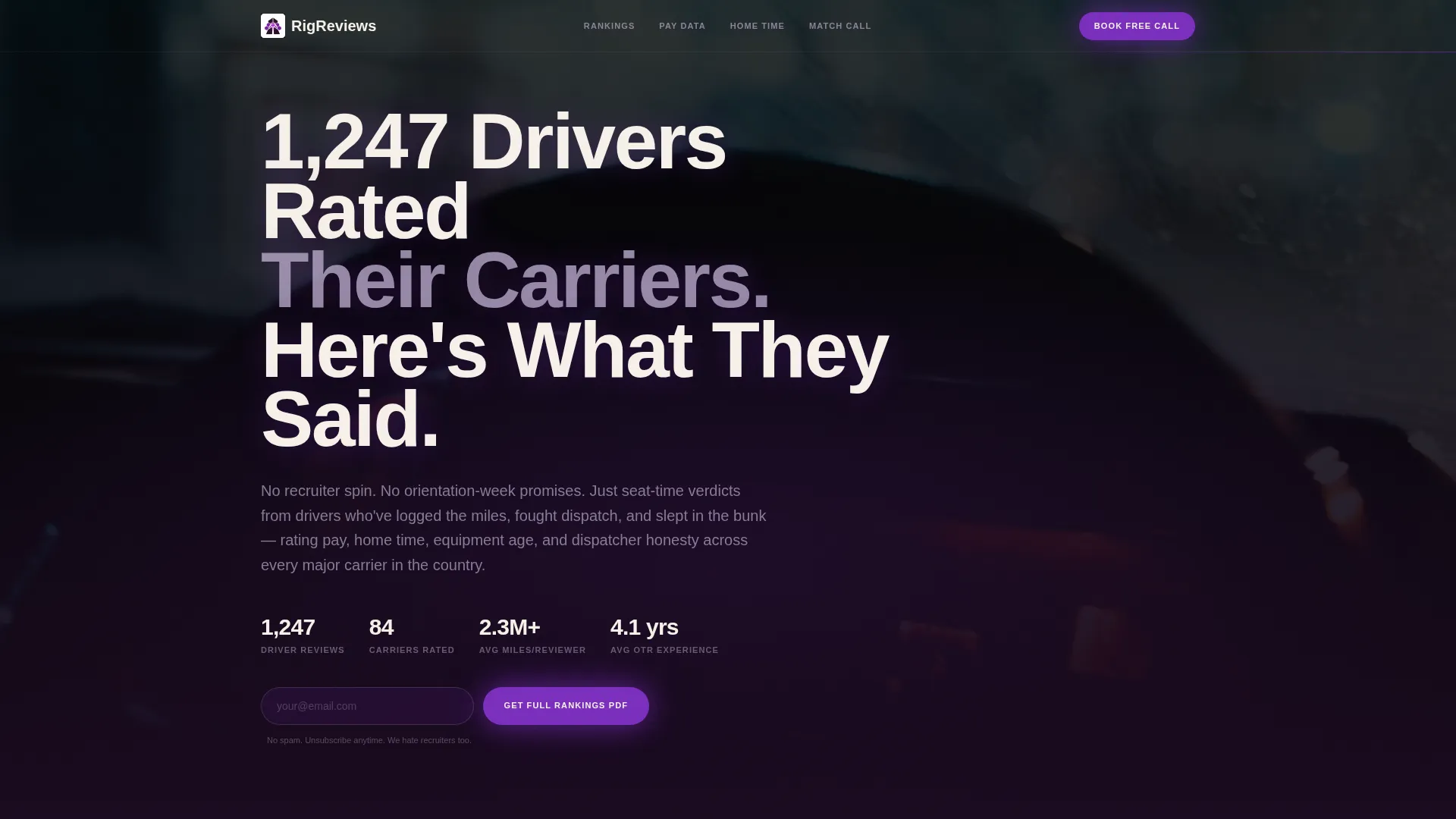
- A cinematic dark full-bleed header with a headline overlay and a radial glow effect
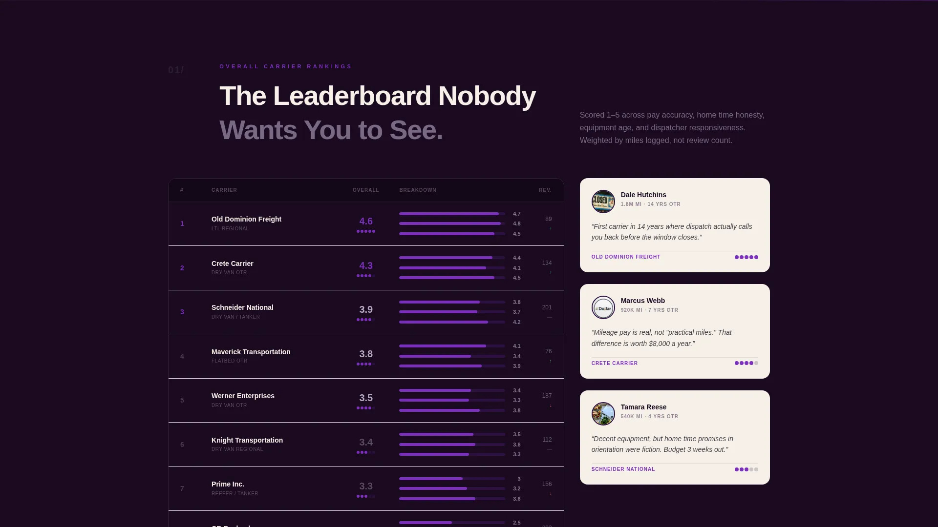
- Multiple scrolling carrier comparison table sections flanked by named driver testimonial cards
- Two conversion components: a booking form for a 15-minute carrier match call and an email capture for a full rankings PDF download
Feature list
This template packs a focused set of components that work together to inform, engage, and convert trucking professionals.
Cinematic Dark Header with Headline Overlay
The header uses a full-bleed night-highway scene viewed through a Peterbilt windshield. A radial center glow and a fade-in headline set the tone immediately. No stock smiles, just road authority.
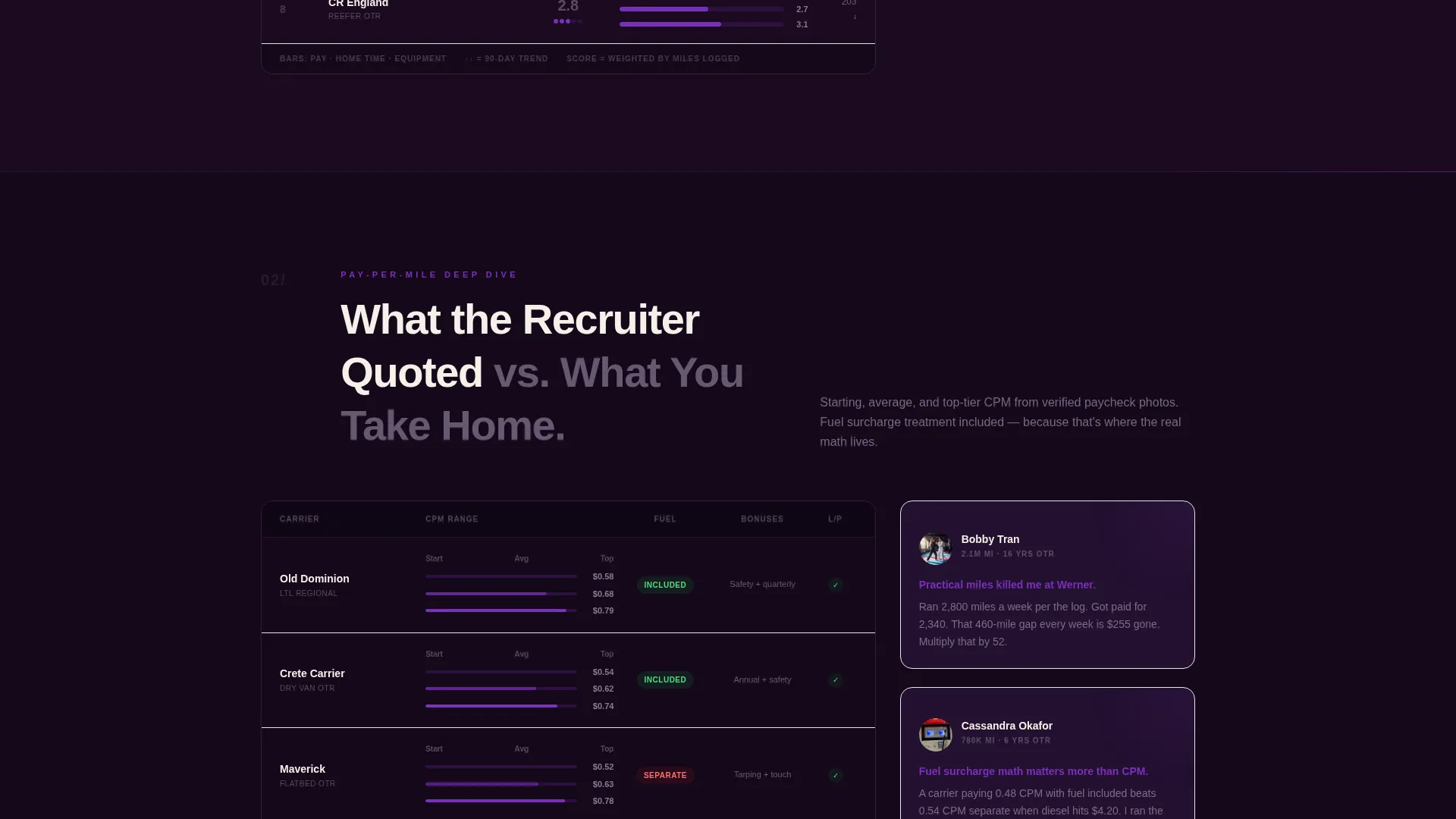
Layered Carrier Comparison Tables
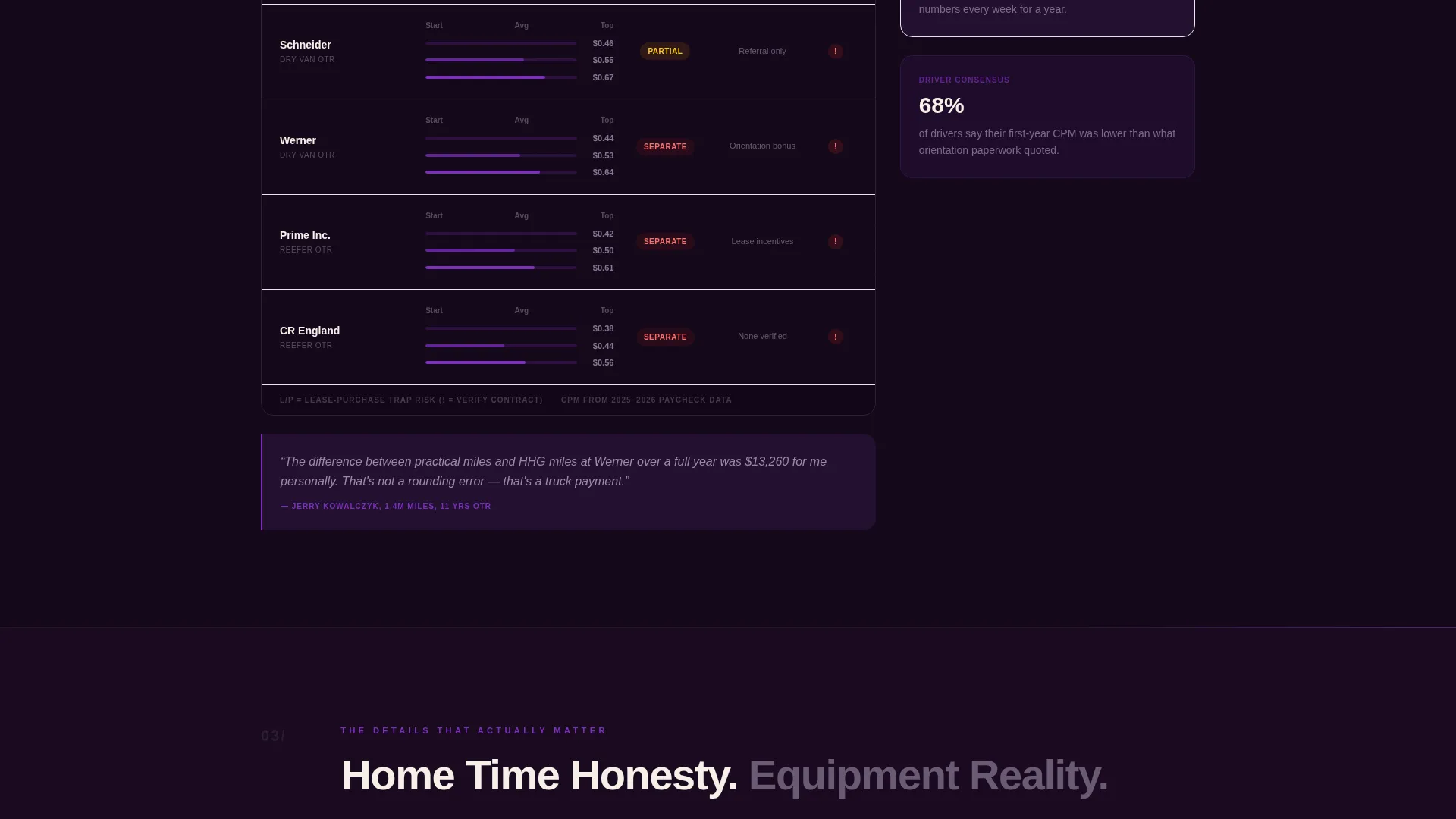
Multiple comparison table sections escalate through the page. Pay-per-mile figures, home-time honesty scores, equipment age averages, and dispatcher responsiveness ratings are each presented in their own structured breakdown.
Named Driver Testimonial Cards
Each table section is flanked by testimonial cards showing real driver names, miles logged, years of over-the-road experience, and a one-sentence carrier verdict. The format builds credibility through specificity.
Primary Booking Conversion Form
After the third comparison table, a booking form captures CDL class, current carrier, preferred region, and a calendar slot for a free 15-minute carrier match call. It appears once visitors have absorbed enough data to feel both informed and ready for guidance.
Secondary Email Capture for PDF
An earlier-scroll email capture offers a full carrier rankings PDF download. This secondary path converts visitors who are not yet ready to book a call but want to take the data with them.
Expert Panel Driver Profiles
Named reviewers appear throughout the scroll with contextual credentials. Miles logged and years of over-the-road experience give each opinion a clear source, reinforcing the platform's authority over anonymous review aggregators.
Page sections overview
| Section | Purpose |
|---|---|
| Full-bleed header | Sets cinematic tone and surfaces headline data point |
| Broad carrier rankings | Gives visitors an immediate high-level comparison |
| Pay-per-mile tables | Breaks down compensation data by carrier |
| Home-time honesty scores | Compares advertised versus actual home-time claims |
| Equipment age averages | Shows fleet age data across reviewed carriers |
| Dispatcher responsiveness ratings | Surfaces driver-reported dispatch quality scores |
| Driver testimonial cards | Adds named, credentialed peer voices to each table |
| Email capture block | Converts early-scroll visitors with the PDF offer |
| Carrier match booking form | Converts informed visitors into scheduled calls |
Design & branding system
The visual identity follows an Educational Guide theme built around a Plum Executive color system. The palette evokes a truck cab dashboard at night on an empty interstate: dark enough to rest tired eyes, just bright enough to signal where to click.
- Deep plum-black (#1A0A1F) as the primary background, muted silver-lavender (#B8A9C9) for secondary text and table borders, and warm cream (#F5F0E8) for content cards and pull-quote blocks
- Electric violet (#7B2FBE) activates on hover states, rating bars, and call-to-action buttons to guide the eye without visual noise
- The overall tone is authoritative without being corporate, matching the frank voice of experienced drivers sharing hard-won opinions
Mobile & speed optimization
The layout is structured for comfortable reading across screen sizes, which matters for a truck driver audience that frequently browses from a cab or a truck stop parking lot.
- Single-column scroll flow ensures comparison tables and testimonial cards remain readable on smaller screens
- Dark background with high-contrast text reduces eye strain during late-night browsing sessions typical of the target audience
How this template helps you convert
The page is engineered to warm visitors through layers of data before presenting any ask. This sequence respects the skeptical, experienced driver mindset.
- The PDF email capture appears early in the scroll and captures visitors who are still in research mode, before they feel ready to commit to a conversation.
- The booking form for a free 15-minute carrier match call lands after the third comparison table, at the precise moment visitors feel informed enough to want personalized guidance.
Other information about this template
This template is a strong fit for any platform that aggregates peer-sourced trucking industry knowledge and positions itself as the trusted alternative to carrier recruiting content. A few additional points worth noting:
- The zigzag alternating layout style keeps long scrolls visually dynamic by alternating table and testimonial card positions
- The template style and sequencing make it adaptable for trucking niche platforms that want to present structured driver feedback in a credible, editorial format
- The page design intentionally avoids anything that reads like a recruiting pitch, which aligns with the editorial trust-first approach common to driver review communities
- Platforms such as those covering CDL job boards, carrier rating tools, or owner-operator resources would find this layout directly applicable to their audience
Theme
Educational Guide
Creative direction
Transparent Process
Color system
Arctic White
Style
Zigzag/Alternating
Direction
Lead Generation
Page Sections
Cinematic Dark Full-bleed Header
Layered Carrier Comparison Tables
Named Driver Testimonial Cards
Primary Carrier Match Booking Form
Early-scroll PDF Email Capture
Expert Panel Driver Profiles
Related questions
Who is this landing page template designed for?
Does the template include actual driver data or carrier ratings?
How do the two conversion paths work?
What makes the design feel appropriate for a trucking audience?
Can the comparison table sections be adapted for different carrier data points?



