Artisan Baking Discovery Landing Page Template
Crumb is a modular card-grid bakery landing page built for artisan bakery retail. It guides visitors through the baking process hour by hour, from pre-dawn shaping to the morning rush, while letting them build a custom pickup box. Slow-craft storytelling, earthy tones, and a persistent side-drawer cart make the landing page as considered as the bread itself.
by Rocket studio
Quick summary
Crumb is a single-page artisan bakery landing page designed to sell hand-laminated breads, pastries, and cookies through a narrative card-grid layout. The design walks visitors through a bakery's morning in real time, building appetite and trust before a single product card appears. By the time users reach checkout, the process has already sold the product.
Who this template is for
This bakery landing page speaks to three audiences at once, each finding their own entry point on the same page.
- Saturday morning regulars who want to browse products, build a custom pickup box, and choose a time slot that matches actual bake schedules.
- Café owners and wholesale buyers sourcing pain de campagne or bulk loaf quantities, drawn in by the bakery's visible craft and consistency.
- Office and event managers ordering large quantities of cookies, kouign-amann, or pastries for corporate breakfasts that need to say something without words.
What problem this template solves
Most bakery landing page designs ask customers to trust a price before explaining the process. Crumb reverses that. The page earns the click by making the making visible.
- Customers hesitate to pay artisan prices without context. This landing page delivers that context through a scrollable day-in-the-life layout, so the artisan crust and lamination speak before the price badge does.
- Wholesale buyers and event managers need more than a menu. The page surfaces a subscription banner and a clear inquiry path, so secondary conversions are never buried.
What you get with this template
This bakery landing page includes a full modular card-grid layout with high interactivity and strong visual storytelling. Every section is designed to serve a specific conversion goal, from first scroll to final checkout.
- A full section lineup covering the hero, three timed product rows, a subscription banner, and a persistent cart drawer with pickup scheduling.
- Scroll-driven narrative design using GSAP animations, staggered card entrances, hero name fade-in, and parallax on the hero image.
- Dual conversion paths for direct box builders and wholesale or subscription customers, each surfaced at the right moment in the scroll.
Feature list
This bakery landing page template includes the following built-in design and interaction features.
Macro Close-Up Hero Section
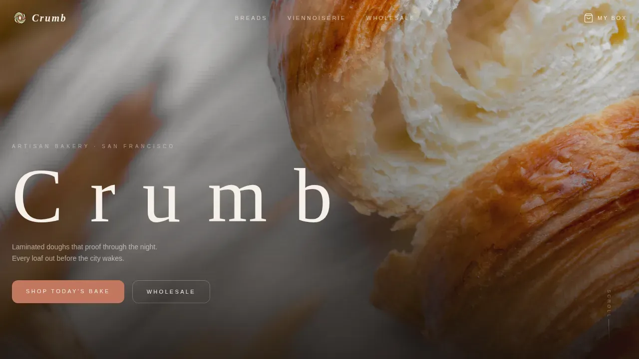
A full-viewport croissant cross-section photograph opens the page. Razor-thin depth of field keeps honeycomb lamination layers in sharp focus while the background dissolves into warm bokeh. The bakery name fades in over the open crumb after a deliberate held beat, setting a tone of restraint and quality.
Day-in-the-Life Card Row System
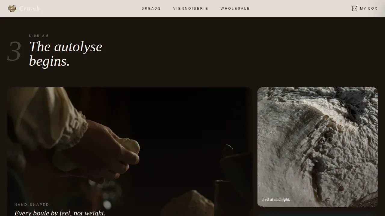
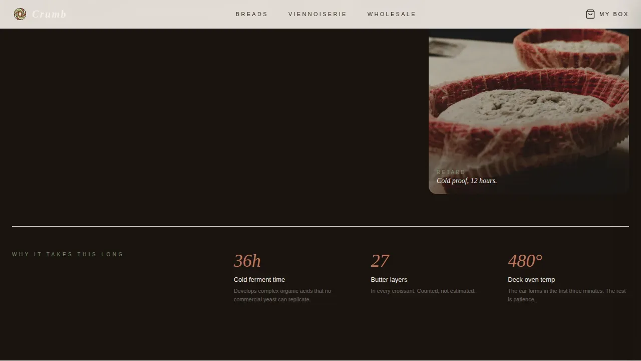
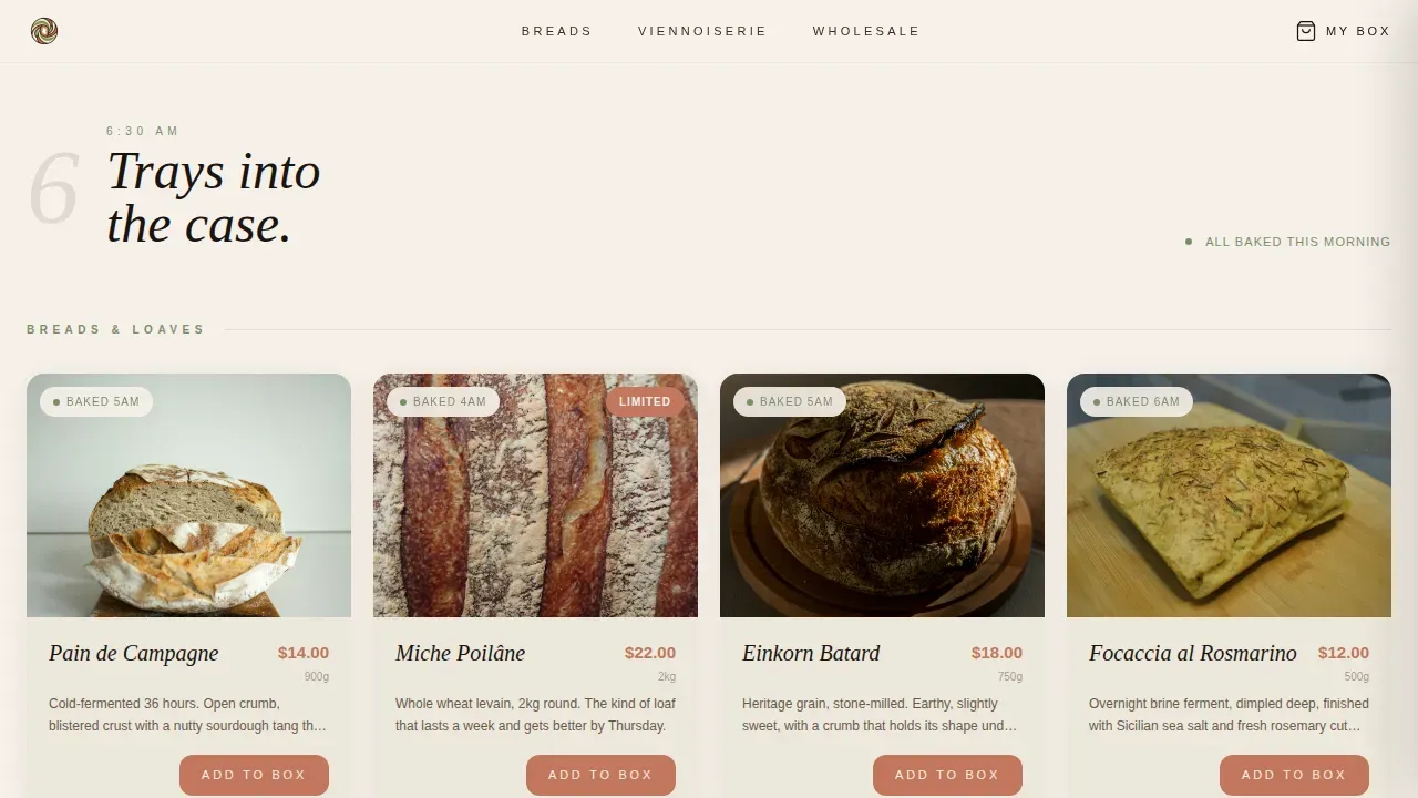
Three timed card rows structure the scroll like a clock. The first row showcases dark atmospheric shaping cards at 3 a.m. The second row reveals individual products with weights and prices as dawn breaks. The third row presents orderable items with quantity steppers and "Add to Box" buttons, so users move naturally from story to store.
Persistent Side-Drawer Cart
A slide-in cart drawer lets visitors add items without leaving the page. Each product card carries a terracotta "Add to Box" button. The drawer stays visible as users scroll, making it easy to build a custom assortment and save selections before reaching checkout.
Pickup Scheduler and Order Form
The checkout section includes a pickup-date selector, a time-slot grid aligned to real bake schedules, and a special instructions field. Localized to USA format with 12-hour time slots, it delivers a concrete, trustworthy order experience rather than a generic contact form.
Subscription and Wholesale Banner
A quiet "Start a Weekly Order" strip sits between the bread and viennoiserie rows. It surfaces the subscription path without interrupting the product browse, making it easy for café owners or regulars to sign up for recurring orders without searching for a separate page.
GSAP Scroll Animations
High-fidelity animations include staggered card entrances, hero parallax, and section reveal transitions. These interactive elements guide visitors through the page's narrative arc and reward attentive scrolling with a sense of craftsmanship that mirrors the bakery's own process.
Page sections overview
| Section | Purpose |
|---|---|
| Hero (Croissant) | Full-viewport macro photo with delayed serif name fade-in |
| 3 a.m. Shaping Row | Atmospheric cards highlighting flour-dusted hand-shaping and bakery origin story |
| Dawn Products Row | Individual product cards with weights, prices, and artisan crust detail |
| Subscription Banner | Quiet strip surfacing weekly order sign-up between bread and viennoiserie |
| Morning Rush Row | Orderable product cards with quantity steppers and Add to Box buttons |
| Checkout and Pickup | Pickup-date selector, time-slot grid, and special instructions field |
| Footer | Horizontal flow layout with essential bakery information |
Design & branding system
The design follows a Japanese Zen restraint system built on earthy tones that feel like a ceramic plate set on raw hinoki wood. Every color earns its place through contrast rather than volume.
- Color palette: Washi paper cream (#F5F0E8) for backgrounds, charred cedar black (#1A1410) for text, matcha glaze green (#7B8F6A) for freshness indicators and category dividers, and kiln-fired terracotta (#C2775E) reserved for pricing badges and calls to action.
- Typography: Fraunces display serif for headlines paired with DM Sans for body and user interface text, delivering readability and editorial personality in equal measure.
Mobile & speed optimization
The template is desktop-first by design, because box-building and the time-slot selector reward a wider layout. Responsive design ensures the landing page still reads cleanly on smaller screens, catering to customers browsing on their phones before the Saturday morning rush.
- Server Components handle static sections such as the hero, shaping rows, and subscription banner, keeping the page foundation light and fast.
- Client Components are scoped to the interactive cart drawer and orderable product cards, so interactivity loads only where the user actually needs it.
How this template helps you convert
Crumb earns trust before asking for a commitment. The page layout is designed so that every scroll step moves a visitor closer to placing an order, not just reading about one.
- The Day-in-the-Life card progression builds context and desire row by row, so by the time the "Add to Box" button appears, the visitor already understands the craft behind each loaf and each batch of cookies.
- The persistent side drawer and pickup scheduler remove friction at the decision moment, letting users save their selections, choose a time, and place an order without leaving the page or making a phone call.
Other information about this template
The Crumb Haute Craft Artisan Bakery landing page template is built for bakery retail outlets that want their web presence to reflect the same care they put into their products. It is listed in the Food and Beverage category under Grocery and Food Retail.
- The template supports the crumb haute craft artisan bakery landing page template use case, covering bakery shop landing flows for both direct consumers and wholesale buyers on a single page.
- Customer testimonials and social proof elements such as visible bake schedules and wholesale client references can be placed within the card rows to reinforce trust and feedback loops with returning buyers.
- The layout is easy to customize: bakery owners can update product content, swap photography, and adjust the color system to match their own personality and brand without rebuilding the page structure.
- Consistent photography with warm, natural lighting and a clear content hierarchy highlighting artisan processes is included in the design direction, making the bakery website inviting from the first scroll to the footer.
Theme
Haute Craft
Creative direction
Day-in-the-Life
Color system
Japanese Zen
Direction
Marketplace/Multi
Page Sections
Macro Close-up Hero with Fade-in
Day-in-the-life Card Row Layout
Persistent Side-drawer Cart
Pickup Scheduler with Time-slot Grid
Subscription and Wholesale Banner
GSAP Scroll Animations
Related questions
Who is this bakery landing page template best suited for?
Can the product cards and colors be customized?
Does this template support subscription and wholesale orders?
What makes the checkout experience different from a standard contact form?
Is this template suitable for a bakery selling cookies and viennoiserie alongside bread?



