Stair Builder Business Booking Website Template
Riser is a single-page landing page template built for stair builders who compete on transparency. It combines a cinematic photo-and-text hero, a detailed stair type comparison table, a five-step process timeline, social proof, and a sticky booking bar into one clean, specification-document layout designed to turn confused renovation prospects into booked site measures.
by Rocket studio
Quick summary
Riser is a landing page template for stair builder businesses that win clients through radical pricing transparency. It leads with a split-screen hero, walks visitors through a side-by-side stair comparison table, and closes with a sticky "Book Your Free Site Measure" call to action. Every section is designed to reduce quote anxiety and convert cautious visitors into confirmed appointments.
Who this template is for
This template is built for stair builders and related trades who want to stand out by showing their pricing before a prospect even picks up the phone. It suits businesses that serve multiple buyer types at once.
- Stair building workshops targeting homeowners mid-renovation who have received confusing, inconsistent quotes
- Independent stair builders or small teams pitching to architects specifying custom flights for open-plan conversions
- Stair subcontractors who need to qualify and convert contractor referrals without back-and-forth communication
What problem this template solves
Homeowners getting stair quotes often receive three wildly different numbers with no way to judge what is and is not included. That confusion stalls decisions and sends potential clients to whoever sounds most confident, not most trustworthy. This template solves that friction directly.
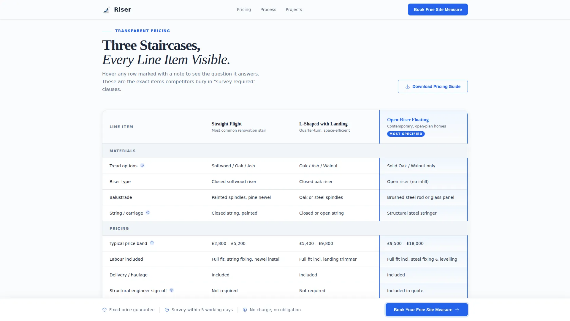
- Hides nothing: the comparison table puts materials, price bands, timelines, and inclusions side by side in plain view
- Removes the vague quote problem by walking visitors through a numbered, time-stamped build process before they book
- Offers a lower-commitment secondary path for visitors not yet ready to book, capturing email and stair type for follow-up
What you get with this template
You get a fully structured, single-page layout that functions like a well-drafted specification document. Every section earns trust by volunteering information that most competitors withhold.
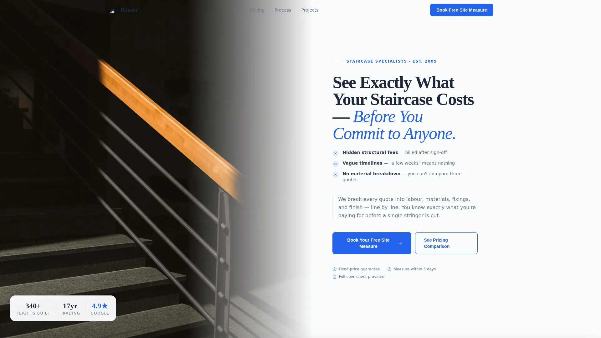
- A split hero section with a cinematic staircase photograph and a headline built around the three anxieties most buyers carry
- A three-column comparison table covering straight flights, L-shaped landings, and open-riser floating staircases with full line-item rows
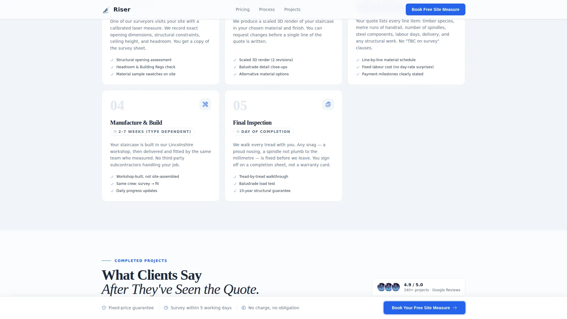
- A five-step bento-style process block, three client testimonials with project details, a pricing guide email capture section, and a linear footer
Feature list
This template includes the following built-in capabilities and structural components.
Split-Screen Hero with Staircase Photography
The header divides the viewport in half. The left side holds a close-up staircase photograph shot from the base looking upward, capturing timber grain, shadow lines beneath each riser, and a hand on a brushed-steel handrail. The right side carries a heavy serif headline and a two-line subhead naming the three specific things homeowners dislike about stair quotes: hidden structural fees, vague timelines, and missing material breakdowns.
Three-Column Stair Comparison Table
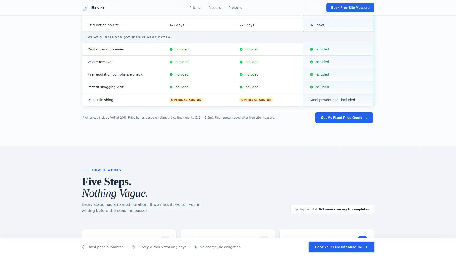
The core of the page is an interactive comparison table laying straight flights, L-shaped staircases with a landing, and open-riser floating designs side by side. Each row addresses one buyer anxiety, showing material options, typical price bands in GBP, build timelines, and what is included versus what competitors typically charge as extras. Rows support hover highlights for focused reading.
Sticky Booking Bar with Calendar Picker
A booking bar locks to the bottom of the viewport after the first scroll. It carries the primary call to action "Book Your Free Site Measure" and presents a short form asking for postcode, stair type pre-selected from the comparison table, and a preferred visit date via a calendar picker showing real availability.
Five-Step Numbered Process Block
Below the comparison table, a bento-style numbered block walks visitors through the full build journey: site measure, digital design preview, fixed-price quote, build, and final inspection. Each step carries an estimated duration so nothing feels vague or open-ended.
Secondary Email Capture for Pricing Guide
Visitors who are not ready to book can download a pricing guide instead. This secondary call to action collects an email address and stair type, allowing the business to follow up with a tailored estimate. It appears below the main comparison table as a low-pressure alternative path.
Client Testimonials with Project Context
Three testimonials appear with specific project type, location, and price paid rather than generic praise. This specificity helps prospects benchmark their own situation and builds the kind of trust that vague five-star ratings cannot.
Page sections overview
| Section | Purpose |
|---|---|
| Split hero header | Establishes trust with photography and a transparent headline |
| Stair comparison table | Addresses quote anxiety with full line-item pricing details |
| Five-step process | Removes timeline uncertainty with numbered, timed build stages |
| Client testimonials | Builds credibility through project-specific social proof |
| Pricing guide capture | Converts undecided visitors into warm leads via email |
| Linear footer | Closes the page with essential contact and business details |
| Sticky booking bar | Keeps the primary call to action visible throughout scrolling |
Design & branding system
The visual style follows a Legal Shield theme, deliberately evoking the look of a freshly printed specification document. Every design choice reinforces authority and readability rather than decoration.
- Color palette uses clinical white (#FAFBFC) for backgrounds, pale frost gray (#E2E8F0) for table borders and divider lines, charcoal graphite (#1E293B) for all body text, and blueprint blue (#2563EB) reserved exclusively for interactive elements and call-to-action buttons
- Typography pairs Fraunces serif headings with DM Sans body text, giving the layout the weight of a contractual document and the clarity of a modern web interface
- Animation is set to medium intensity, with scroll-reveal effects on section entry, a persistent sticky booking bar after first scroll, and hover micro-interactions on comparison table rows
Mobile & speed optimization
The template is built desktop-first to serve architects and contractors who review specifications on larger screens, while maintaining a strong mobile layout for homeowners browsing during renovation planning.
- The comparison table adapts for smaller viewports so key pricing rows remain readable without horizontal scrolling
- The sticky booking bar adjusts its layout on mobile so the postcode field and call-to-action button stay accessible and tappable without zooming
- Scroll-reveal animations are applied at medium intensity, keeping the page feeling responsive without sacrificing load clarity on slower connections
How this template helps you convert
Every section is sequenced to move a visitor from skepticism to commitment. The layout follows the logic of a well-structured estimate rather than a typical marketing page.
- The hero captures attention immediately by naming the exact frustrations the visitor already feels, establishing credibility before a single price is mentioned.
- The comparison table answers the most pressing buyer question, what will this actually cost and what is included, in a format that is impossible to misread.
- The sticky booking bar and secondary pricing guide capture ensure that whether a visitor is ready to commit or still comparing options, there is always a relevant, low-friction next step available on screen.
Other information about this template
This template is localised for the United Kingdom market. Pricing displays in GBP, dates follow the DD/MM/YYYY format, and the booking form uses UK postcode input as its first field. The calendar picker in the booking bar is designed to show real availability rather than a generic date selector. The page is a single-page layout, not a multi-page site, so all content flows in one continuous scroll from hero to footer. The template style is classified as a Comparison Table layout under the Professional Services category, specifically the Stair Builder Business subcategory. The creative direction is Transparent Process, meaning every design and copy decision is oriented toward volunteering information rather than withholding it.
- The template supports a B2C and B2B audience simultaneously, with copy and structure that speak to homeowners, architects, and contractor clients within the same page flow
- The header concept is a Half-Page Photo and Text split, a layout that balances visual impact with immediate headline readability on first load
- The Arctic White color system and Legal Shield theme together create a palette that reads as authoritative and precise, appropriate for a business quoting structural work on residential properties
Theme
Legal Shield
Creative direction
Transparent Process
Color system
Arctic White
Style
Comparison Table
Direction
Booking/Scheduling
Page Sections
Split-screen Hero with Photography
Three-column Stair Comparison Table
Sticky Booking Bar with Calendar Picker
Five-step Bento Process Block
Secondary Pricing Guide Email Capture
Project-specific Client Testimonials
Related questions
Who is this landing page template designed for?
Can I adapt the comparison table if I only offer one stair type?
Does the template include working form functionality?
Is the pricing guide email capture section required?
Is this a single-page layout or a multi-page site?



