Product Manager Profile Portfolio Website Template
Roadmap is a masonry-style landing page built for product managers who write about real strategy work. It combines a full-bleed editorial header, a Pinterest-style card grid of case studies, and a persistent email capture bar into one focused page. The Atelier Studio design keeps the tone sharp, dark, and credible, built to earn the click, not just ask for it.
by Rocket studio
Quick summary
Roadmap is a single-page masonry layout designed for a product manager career blog. It opens with a full-bleed desk photograph, flows into a grid of case study cards at varying heights, and closes with a floating email capture bar. Every section is built to pull mid-career product managers deeper into the content, and toward a subscription.
Who this template is for
This template is built for product managers who document real strategy decisions. It suits writers at the senior-to-director crossover who want their blog to reflect the weight and texture of actual product work.
- Mid-career product managers building a content presence around real case studies and frameworks
- Product management coaches or consultants sharing honest retrospectives and prioritization thinking
- Career-focused writers who want their landing page to feel like a curated portfolio, not a generic blog homepage
What problem this template solves
Most blog templates treat all posts equally. They present content as a flat list, and nothing signals depth, stakes, or expertise at a glance. For a product manager career blog, that sameness kills credibility.
- Flat grid layouts cannot show that one article is a deep-dive case study and another is a sharp one-paragraph opinion
- Generic blog designs do not create the progressive depth effect that draws readers from surface-level takes into senior-level strategy thinking
- Standard templates offer no built-in conversion moment that ties content value to a lead capture action on the same page
What you get with this template
This template delivers a complete, single-page layout built around the case study content format. Every element has a clear job: pull readers in, prove depth, and offer a reason to return.
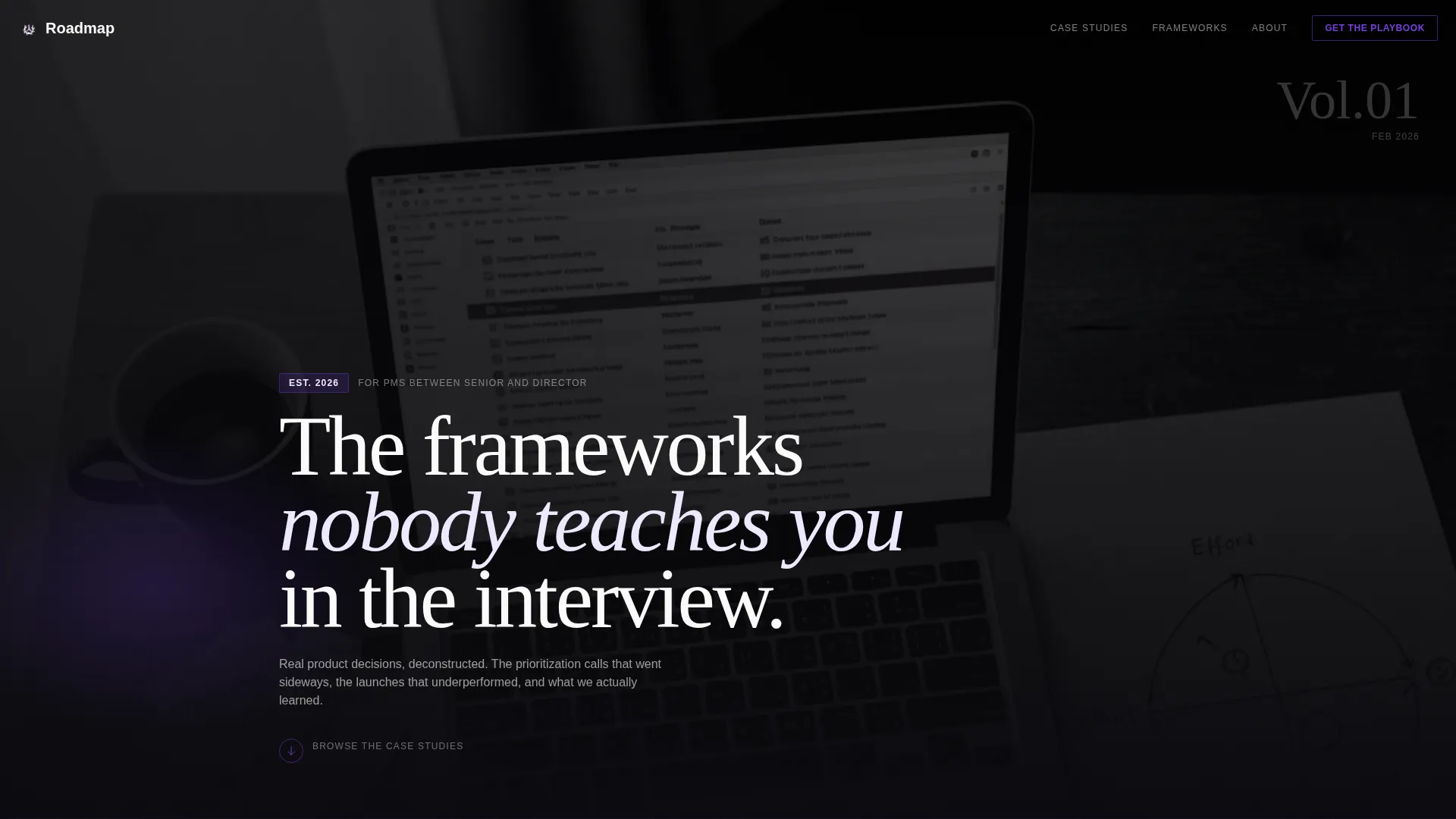
- A full-bleed editorial header with a styled desk photograph and a fade-in headline overlay
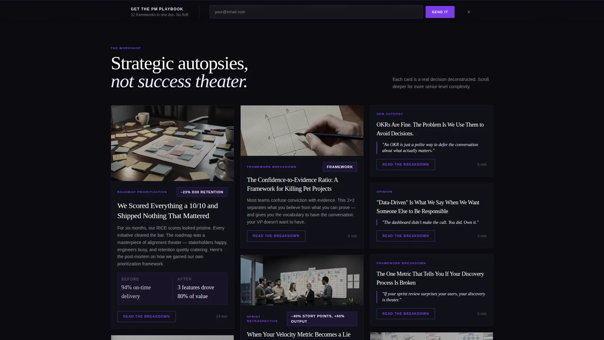
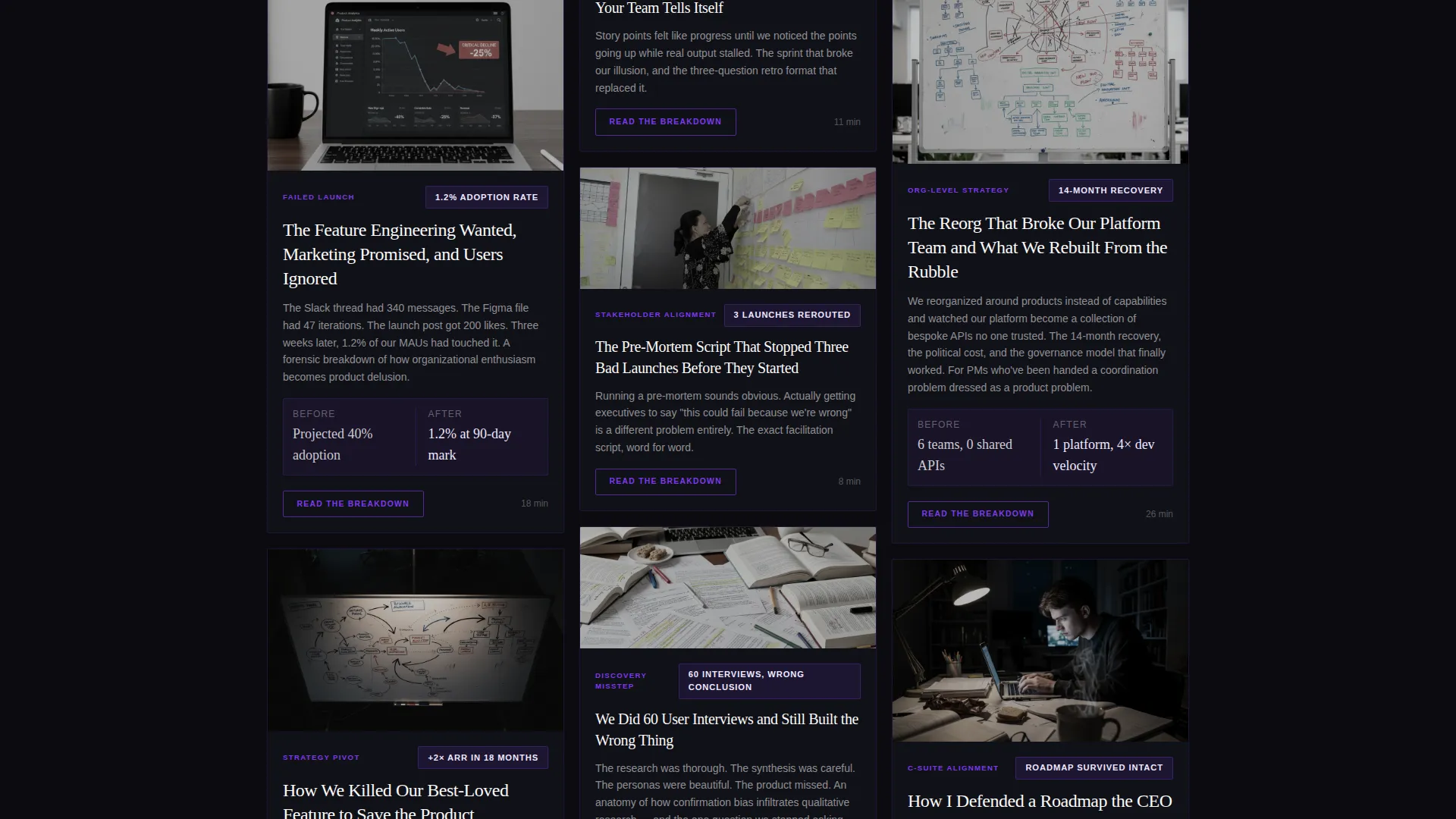
- A masonry card grid where card height signals content depth, from quick opinion pieces to long-form case study breakdowns
- A persistent floating email capture bar anchored at the bottom of the viewport with a single-field lead form and a submit action
Feature list
This template is built around a small number of deliberately chosen components that work together to move visitors from first glance to committed reader.
Full-Bleed Editorial Header
The header fills the entire viewport with an overhead desk photograph. The image is desaturated with violet tones pulled forward. A headline fades in over the image, setting the editorial tone before a single card loads.
Variable-Height Masonry Card Grid
Cards come in three heights: tall for deep-dive case studies, medium for framework breakdowns, and short for sharp opinion pieces. Each card shows the opening two paragraphs and a key metric, giving readers enough to judge the depth before clicking.
Per-Card Click-Through Action
Every masonry card carries its own primary call to action reading "Read the Breakdown." The button uses accent violet against void black. This turns each card into a self-contained conversion unit rather than a passive thumbnail.
Floating Email Capture Bar
A persistent bar sits at the bottom of the page throughout the scroll. It offers a named lead magnet, a single email input field, and a clear submit button. It stays available without interrupting the card browsing experience.
Progressive Complexity Scroll Flow
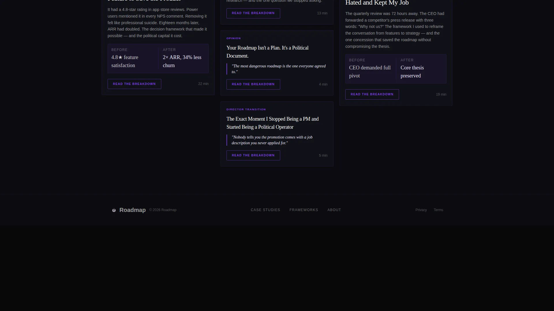
The card sequence is structured to escalate in strategic weight as the visitor scrolls down. Early cards cover feature prioritization. Later cards address org-level strategy pivots. The scroll feels intentional, not random.
Void and Violet Visual System
The entire page uses a four-color palette: absolute void black, deep iris, soft lavender wash, and chalk white. Accent violet activates hover states and pull-quote highlights. The result is a creative workspace aesthetic that signals seriousness and craft at the same time.
Page sections overview
| Section | Purpose |
|---|---|
| Full-bleed header | Sets editorial tone with styled desk photo and fade-in headline |
| Masonry card grid | Displays case studies, frameworks, and opinion pieces at varied heights |
| Card primary action | Drives click-through to full article from each individual card |
| Floating capture bar | Collects email leads via persistent bottom bar with lead magnet offer |
Design & branding system
The visual identity follows an Atelier Studio direction built around the Void and Violet color system. The palette creates a late-night creative workspace atmosphere that feels intentional rather than decorative.
- Four core colors: absolute void black (#0B0B0F) for backgrounds, deep iris (#5B21B6) for structural violet, soft lavender wash (#EDE9FE) for subtle tonal contrast, and chalk white (#FAFAF9) for card surfaces
- Accent violet (#7C3AED) activates hover states on cards and lights up pull-quotes against dark backgrounds
- The header photograph is desaturated with violet tones preserved, giving the image a studio-curated quality that reinforces the editorial brand before any text is read
Mobile & speed optimization
The masonry layout adapts gracefully across screen sizes without losing the sense of editorial hierarchy. Card height variation translates into a readable stacked flow on smaller viewports.
- Card grid reflows into a single or double column on mobile, preserving the tall-medium-short content hierarchy in vertical reading order
- The floating email bar remains accessible at the bottom of the viewport on mobile without obscuring card content during active scrolling
- The full-bleed header image scales to fill smaller screens with the headline overlay remaining legible across viewport widths
How this template helps you convert
Every design decision in this template points toward a specific action. The page does not ask for trust up front; it builds it through visible depth before presenting the ask.
- Each masonry card previews two paragraphs and a key metric, demonstrating real content quality before the visitor clicks through to the full article.
- The floating email capture bar stays present throughout the entire scroll without forcing a modal interruption, keeping the lead magnet offer available at the moment curiosity peaks.
Other information about this template
This template sits in the Personal and Resume category with a Product Manager Profile subcategory. It is purpose-built for the product manager career blog niche, where content credibility is the primary conversion driver.
- The template style is masonry or Pinterest grid layout, a format well suited to content collections where pieces vary significantly in depth and format
- The Atelier Studio theme and Case Study Narrative creative direction were matched specifically to the Click-Through landing page direction
- The template works equally well for a solo product manager building a personal brand and for a small editorial team publishing strategy content under a shared brand name
Theme
Atelier Studio
Creative direction
Case Study Narrative
Color system
Void & Violet
Style
Masonry/Pinterest
Direction
Click-Through
Page Sections
Full-bleed Editorial Header
Variable-height Masonry Card Grid
Per-card Click-through Action
Persistent Floating Email Bar
Progressive Complexity Scroll Structure
Void and Violet Color System
Related questions
Can I change the card colors and headline text to match my own brand?
Does the masonry grid support different content types, such as video or podcast links?
How does the floating email capture bar work?
Is this template usable if I only have a few published articles so far?
Can I update the lead magnet name and submit button text in the floating bar?



