Specialty Coffee Roaster Origin Story & Direct Sales Website Template
Roast is a neo-retro origin story specialty coffee landing page template built for artisan coffee roasters who want to earn the click before showing a price. A Pinterest-style masonry grid carries visitors from mountainside harvest to roasting drum to ceramic cup, while warm Sunset Mesa colors and a typewriter headline set the mood from the first scroll.
by Rocket studio
Quick summary
Roast is a single-page masonry coffee roaster template that tells the full farm-to-cup story through vivid origin cards, parallax roast journey sections, and two high-contrast call-to-action placements. The design follows a Neo-Retro editorial style rooted in the Sunset Mesa color system, making every scroll feel like a chapter in a warm travel journal.
Who this template is for
This template is built for specialty coffee roasters, corner-shop owners, and artisan café operators who want a landing page that does the storytelling work for them. It also suits freelance designers hired to build a coffee roaster website from scratch, without writing a single line of code.
- Specialty coffee shop owners launching or refreshing their online presence
- Coffee roaster brands wanting to highlight single-origin sourcing and roast profiles
- Designers building for a food and beverage client in the café or restaurant category
What problem this template solves
Most coffee roaster websites lead with a price list. Visitors leave before they understand what makes the coffee worth buying. This template flips that order. It builds desire through visual storytelling, then guides the visitor toward a purchase with clear, well-placed calls to action.
- Coffee roaster brands struggle to convey terroir, process, and commitment without a wall of text
- Generic layouts make it hard to stand out in a saturated specialty coffee market
- Building this kind of editorial, masonry design from scratch takes weeks and significant cost
What you get with this template
You get a complete, ready-to-customize landing page structured around the full roast journey. Every section is designed to grow trust and move visitors closer to the shop or online order. No blank canvas, no guesswork about layout choices.
- A cinematic hero with a typewriter headline effect and Ken Burns image animation
- A Pinterest-style masonry origin grid with scroll-reveal card animations and hover states
- A roast journey narrative section, a floating call-to-action button, a full-width banner, and a map card with shop details
Feature list
This template ships with a focused set of design and layout features drawn directly from the source brief. Each one is tested against the full page flow to ensure the visitor experience holds together.
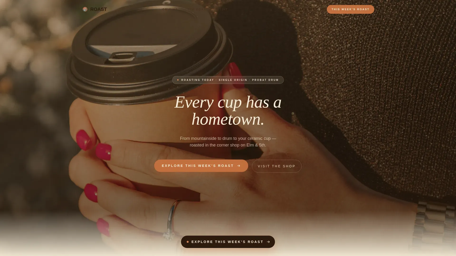
Typewriter Hero Section
The hero opens with a wide, warm-toned lifestyle photograph and a headline that types in character by character, like a manual typewriter. A Ken Burns slow-zoom keeps the background image alive while the headline lands. The amber color temperature and shallow depth of field set the coffee roaster mood immediately.
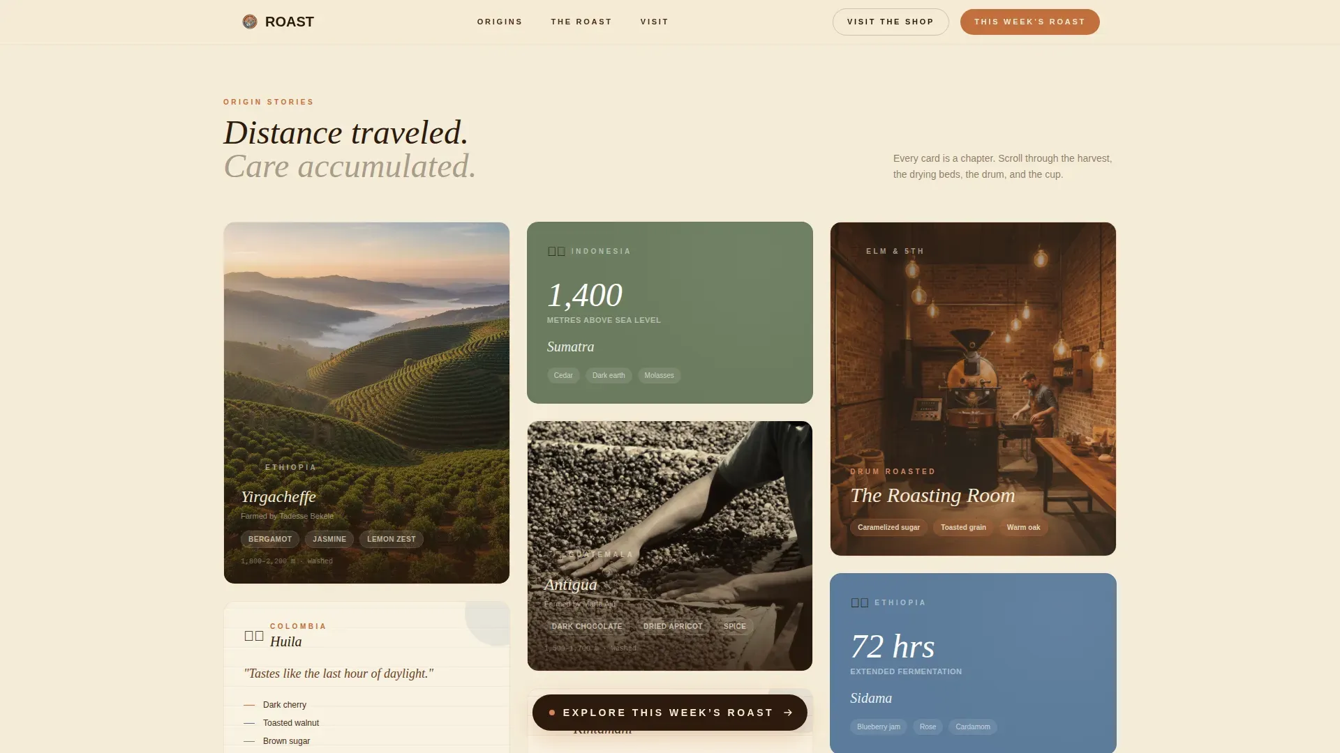
Masonry Origin Story Grid
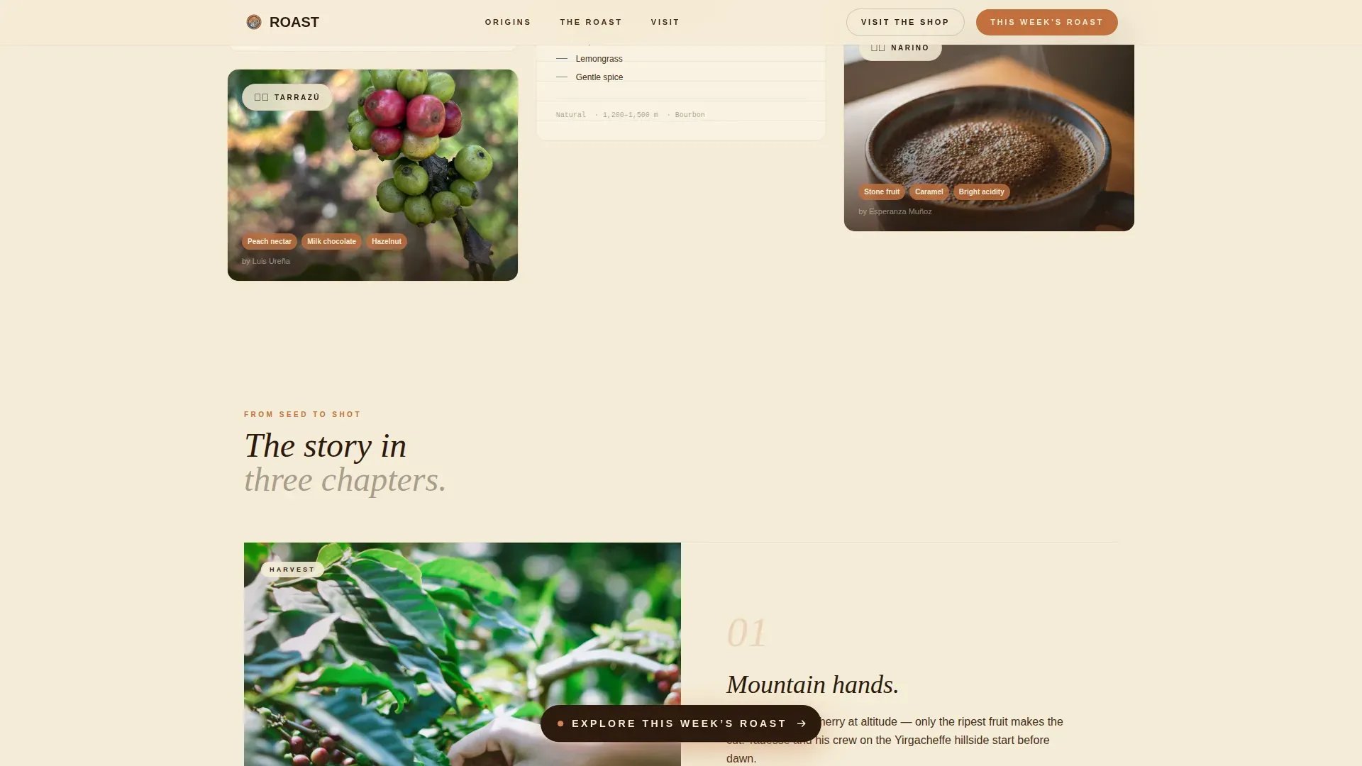
The masonry grid arranges origin cards in a Pinterest-style layout with varied heights and saturation levels. Cards move from sepia portraits of farmers to vivid shots of cherry-red coffee fruit, then to handwritten tasting notes on torn paper. Scroll-reveal animations and lift-plus-color-reveal hover states make the grid feel alive as visitors explore.
Floating and Banner Call-to-Action System
A floating "Explore This Week's Roast" button appears after the third masonry row, triggered by scroll position. A second full-width banner repeats the same call to action just before the footer. Both placements point to the featured single-origin page in the online shop, keeping the conversion path simple and direct.
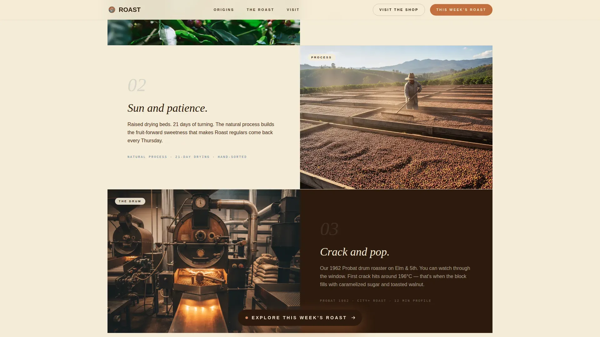
Roast Journey Narrative Section
This section moves the story from harvest through the drum roaster to the finished cup. Parallax layer effects give depth to the transition. The sequence helps visitors understand the care and craft behind each roast before they ever see a price.
Map Card and Shop Details
A secondary call to action, "Visit the Shop," opens a map card showing the address, opening hours, and a candid interior photograph. This works well for the neighborhood regulars and first-time visitors who want to confirm the shop is real and close.
Linear Footer Pattern
The footer uses a single-row linear layout that keeps the page clean and consistent with the warm editorial design. It anchors the page without adding visual noise after the call-to-action banner.
Page sections overview
| Section | Purpose |
|---|---|
| Cinematic Hero | Opens with lifestyle photo and typewriter headline |
| Masonry Origin Grid | Tells origin story through varied coffee cards |
| Floating Call to Action | Triggers "Explore This Week's Roast" after scroll |
| Roast Journey Parallax | Moves narrative from harvest to finished cup |
| Call-to-Action Banner | Full-width push to featured roast page |
| Map and Shop Card | Shares address, hours, and interior photo |
| Linear Footer | Closes page with clean single-row layout |
Design & branding system
The Neo-Retro visual identity draws from the Sunset Mesa color system, a palette that feels like a polaroid left on a dashboard in New Mexico. Warm, faded at the edges, golden at the center. The design uses bold, nostalgic serif headlines and clean sans-serif body text to ensure readability at every scroll depth.
- Terracotta (#C2703E) dominates card borders and hover states; aged cream paper (#F5ECD7) washes every background; deep espresso (#2C1A0E) grounds all body typography
- Fraunces serif handles display headlines while Manrope handles body text, a pairing that blends nostalgic weight with modern scannability
- Film-grain textures and analog paper overlays give the layout a tactile, handcrafted feel consistent with neo-retro design values
Mobile & speed optimization
The template is built desktop-first with a graceful masonry collapse for smaller screens. Layout reflows naturally on mobile without losing the editorial warmth of the original design. Animations rely on GPU-accelerated transforms and IntersectionObserver-based scroll reveals to keep the experience smooth across devices.
- Masonry grid collapses to a single-column stack on mobile, preserving card hierarchy and image quality
- CSS scroll-behavior and IntersectionObserver handle reveal timing without heavy JavaScript overhead
- The floating call-to-action button adapts its trigger position for each device viewport to stay visible without blocking content
How this template helps you convert
A good coffee roaster landing page earns the click before asking for the sale. This template is structured to build desire in layers and then remove friction at exactly the right moment.
- The masonry origin grid builds emotional investment before any price or product appears, so visitors arrive at the call-to-action already curious and warm
- Two strategically placed calls to action, one floating mid-scroll and one full-width before the footer, ensure visitors always have a clear next step no matter how deep they scroll
Other information about this template
This template was designed to work for the kind of coffee roaster business that takes its identity seriously and wants a website that reflects that commitment. The design system is fully documented, so any designer can make changes to colors, typography, and layout without starting from scratch. No-code tools allow users to build and customize websites like this without traditional programming skills, making it practical to get started quickly and grow the page over time.
- The logo placement is designed to protect brand identity from the first view; a memorable coffee roaster logo set in a bold serif or retro script communicates the neo-retro tone immediately
- Exploring dozens of coffee roaster logo ideas alongside this template can help determine the right visual identity before going live; professional designers and AI tools alike can help refine logo options at low cost
- The template supports a subscribe path and can be adapted to include a subscription toggle for one-time purchases versus recurring coffee subscriptions, sharing the load of repeat-purchase conversion
- Visitors from south america and other origin regions featured in the masonry grid add authenticity and world-spanning credibility to the coffee roaster story; the history of cast-iron Probat drum roasters, machines that have been produced since the late 1800s, fits naturally into the roast journey narrative
- The Roast Neo Retro Origin Story Specialty Coffee Landing Page Template is tested against the full desktop-to-mobile flow and is proud to deliver a good editorial experience across every checked viewport
Theme
Neo-Retro
Creative direction
Origin Story
Color system
Sunset Mesa
Style
Masonry/Pinterest
Direction
Click-Through
Page Sections
Typewriter Hero with Ken Burns Effect
Pinterest-style Masonry Origin Grid
Dual Call-to-action Conversion Path
Parallax Roast Journey Narrative
Map Card with Shop Details
Neo-retro Branding System Built in
Related questions
Can I customize the colors and typography in this template?
Does the template include the masonry card animations out of the box?
Is this template suitable for a coffee roaster with an online shop?
Can this template work for a café or restaurant without an online shop?
How do I get started with this template?



