Bold Fitness Subscription Box Landing Page Template
Ropebox is a bold, masonry-style fitness landing page built for a jump rope and accessories subscription box. It pairs a Neo-Retro visual identity with a quiz-driven conversion flow, seasonal masonry cards, and a full-bleed unboxing header. The page is designed to pull in garage-gym athletes, CrossFit regulars, and boxing-curious beginners and guide them toward their perfect monthly box.
by Rocket studio
Quick summary
Ropebox is a single-page fitness subscription landing page built around a masonry grid layout and a personalized quiz conversion flow. The Neo-Retro design uses a Citrus Burst color palette to give the page energy without chaos. Every section is built to move a scroll-happy visitor toward one action: finding their box and locking it in.
Who this template is for
This template fits subscription box brands in the fitness accessories space. It works especially well for sellers who ship curated gear to committed athletes and want their page to feel like a product drop, not a form.
- Garage-gym operators and CrossFit brands launching a monthly rope and accessories box
- Fitness accessory sellers who want a quiz-based path to personalized checkout
- Direct-to-consumer brands targeting athletes who train consistently and burn through gear fast
What problem this template solves
Most fitness subscription pages feel generic. They list SKUs and call it a hero section. Ropebox is built around the feeling of opening a box, not just ordering one. The template replaces flat product listings with seasonal stories and a guided quiz that helps visitors feel seen before they subscribe.
- Visitors leave product pages when they cannot picture what they are buying; the unboxing header and masonry cards fix that immediately
- Subscription brands lose sign-ups when the path to checkout is unclear; the pinned "Find Your Box" quiz removes that friction
- Seasonal box themes get buried in copy when there is no visual structure; the staggered masonry grid gives each drop its own identity
What you get with this template
You get a fully structured, single-page layout with every section pre-built and ready to customize. The design system, quiz overlay, masonry grid, and conversion elements are all included as part of the template.
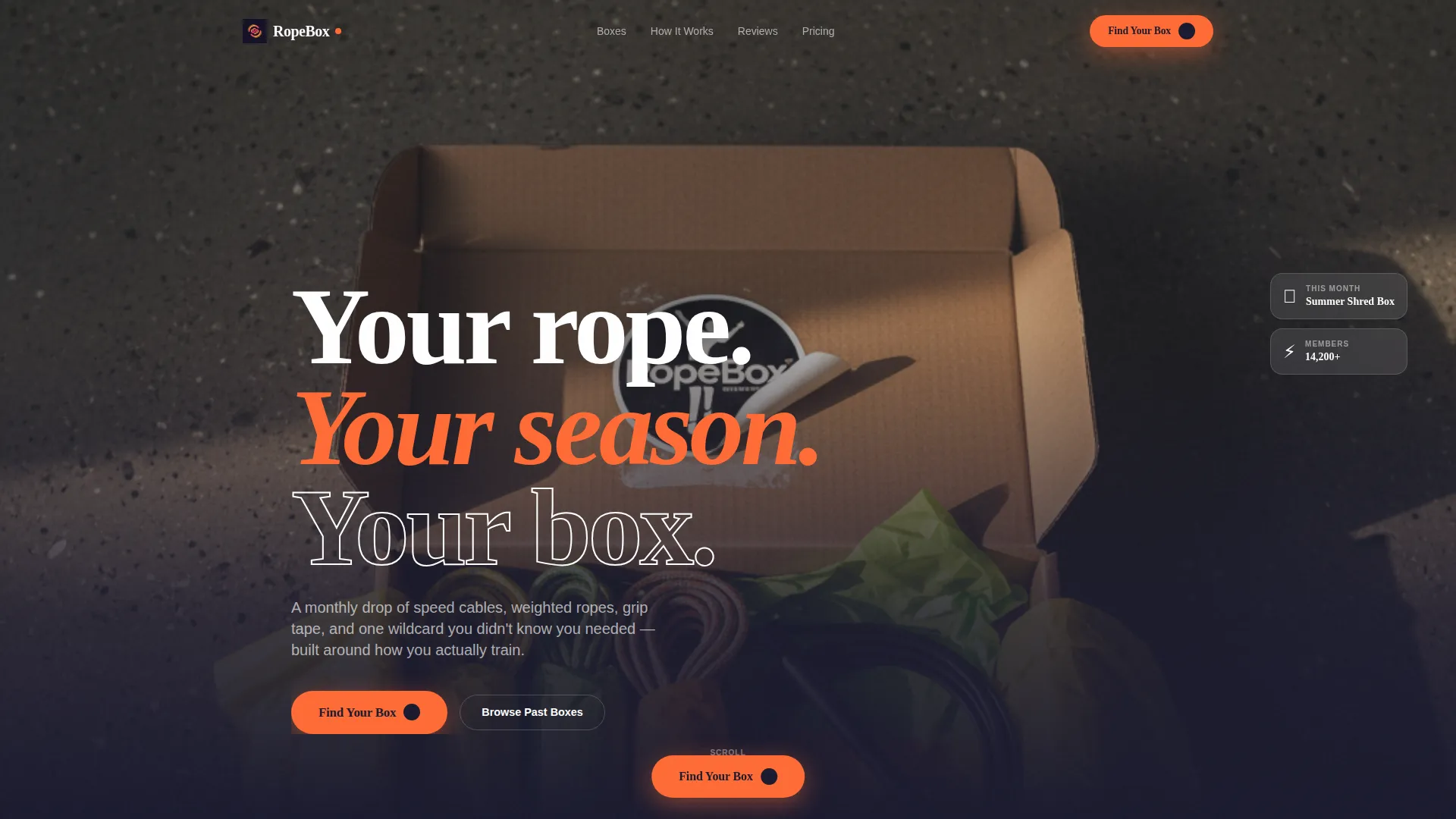
- Full-bleed overhead photo header with retro-serif headline and primary call-to-action placement
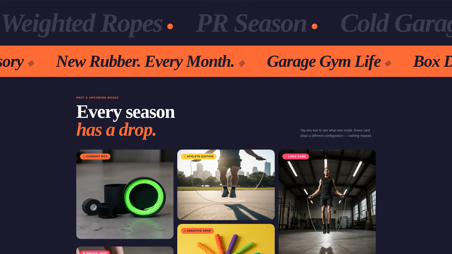
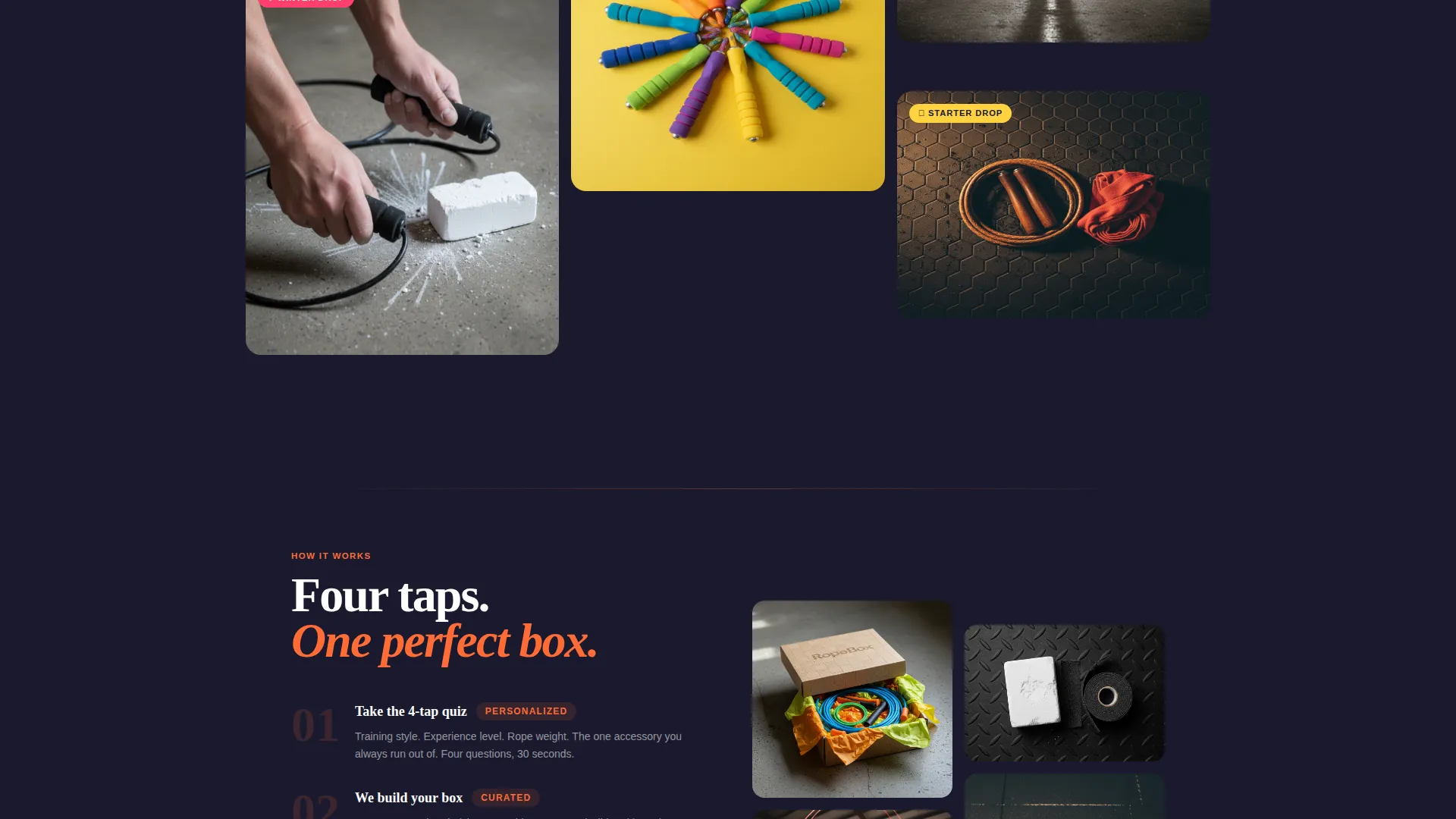
- Masonry grid section with seasonal box cards mixing product close-ups, action shots, and short looping video clips
- Four-step quiz overlay that collects training style, experience level, rope weight preference, and accessory priority, then delivers a personalized box recommendation with a discounted checkout path
Feature list
This template includes a focused set of conversion-ready features. Each one is built directly from the brief and designed to support a subscription box brand that sells fitness accessories.
Full-Bleed Unboxing Header
The header is a top-down flat-lay photo of a just-opened subscription box on a concrete floor. Citrus tissue paper, a matte-black speed cable, a half-peeled branded sticker, and chalk-dusted fingertips at the frame edge create a lifestyle-real composition. Bold retro-serif type enters after the first visual beat with the line "Your rope. Your season. Your box."
Masonry Grid with Seasonal Cards
The scrollable masonry section presents past and upcoming box themes as staggered cards at varying heights. Each card carries a seasonal identity such as "Summer Shred," "Cold Garage SZN," or "Competition Prep." Cards blend product close-ups, mid-air action shots, and looping video clips of ropes whipping concrete.
Pinned Quiz Conversion Flow
A "Find Your Box" call-to-action button pins to the page after the first scroll fold. Tapping it opens a full-screen overlay quiz covering training style, experience level, rope weight, and accessory need. Results surface a named seasonal box recommendation, a three-item preview, and a "Lock In This Box" button leading to a discounted first-month checkout.
Detail Drawer for Past Boxes
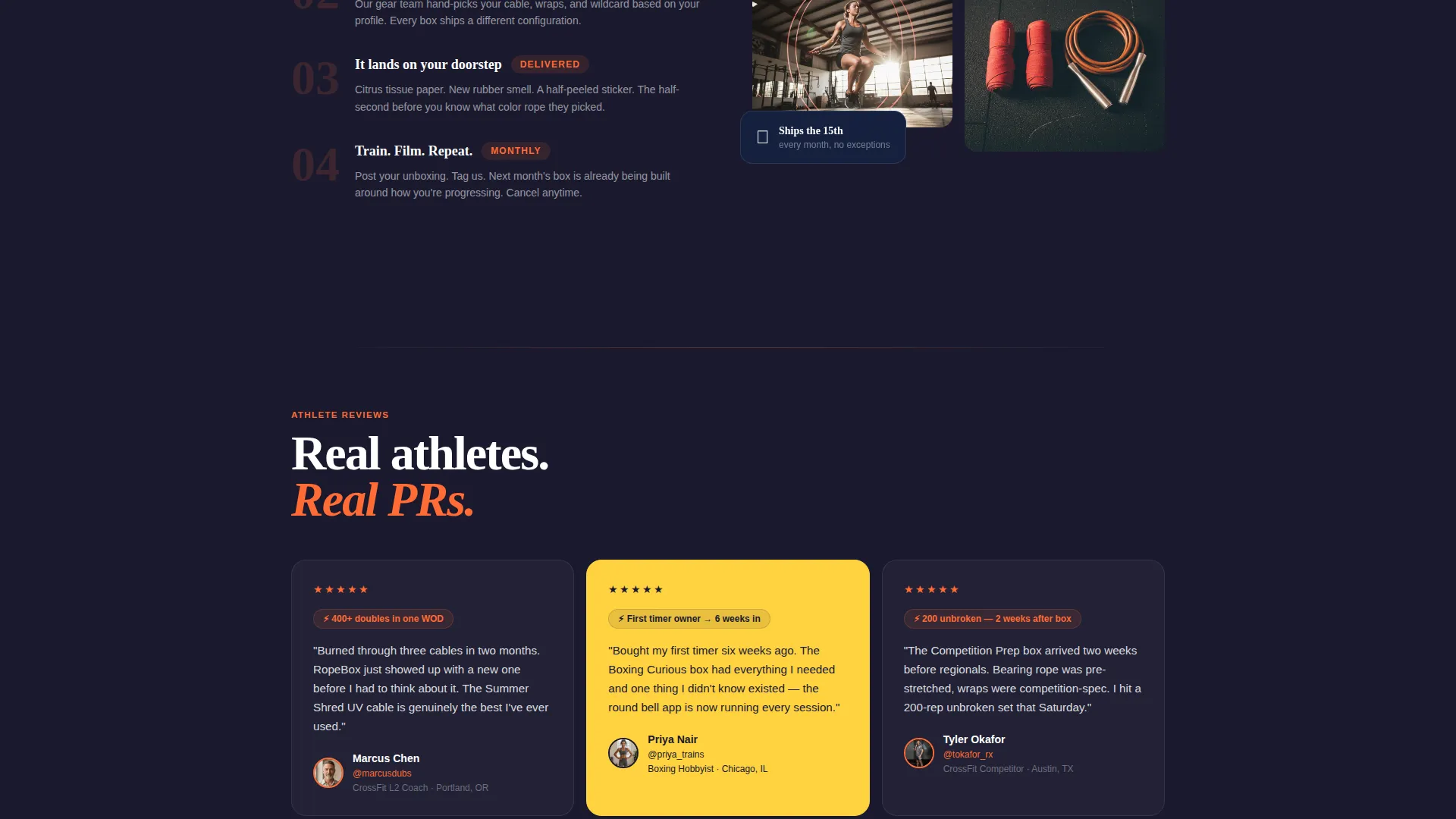
Every masonry card links to a slide-in detail drawer. The drawer shows the full contents of that seasonal box and includes customer reviews. Visitors who skip the quiz can browse past boxes here and still find a path to subscribe.
Neo-Retro Citrus Burst Design System
The visual identity uses electric tangerine for primary calls to action, grapefruit pink on hover states and seasonal badges, lemon zest as a background wash on alternating cards, and deep asphalt grounding the typography. The palette reads like a neon sign in a 1980s gym.
Scroll-Reveal Progressive Layout
The page uses a scroll-reveal structure where content layers in as the visitor moves down. The deeper a visitor scrolls, the more seasonal box personalities they encounter. This pacing mirrors the feeling of flipping through a calendar of training obsessions.
Page sections overview
| Section | Purpose |
|---|---|
| Full-Bleed Header | Opens with unboxing flat-lay and retro headline |
| Pinned Quiz call to action | Keeps "Find Your Box" button visible after first fold |
| Masonry Grid | Displays seasonal box cards at staggered heights |
| Quiz Overlay | Four-step full-screen personalization and recommendation |
| Box Result Card | Shows named theme, three items, and checkout button |
| Past Box Drawers | Slide-in detail view with contents and reviews |
| Seasonal Badge Row | Highlights upcoming and featured box drops |
Design & branding system
The template follows a Neo-Retro visual theme grounded in the Citrus Burst color system. Every color has a defined role, and the typography leans on bold retro-serif faces to reinforce the gym-culture energy.
- Color roles: electric tangerine (#FF6B35) for primary calls to action, grapefruit pink (#FF3F6C) for hover states and seasonal badges, lemon zest (#FFD23F) as an alternating card background wash, and deep asphalt (#1A1A2E) for typography and negative space
- Typography: bold retro-serif headlines paired with clean body text to balance impact with readability
- Visual tone: lifestyle-real photography over polished studio shots, with deliberate messiness in the header composition to feel authentic and scroll-stopping
Mobile & speed optimization
The masonry layout and full-screen quiz overlay are both structured to work cleanly on smaller screens. Staggered card heights adapt to single-column mobile stacking without losing the seasonal card personality.
- The pinned quiz call-to-action button stays accessible on mobile throughout the scroll without covering key content
- Looping video clips in masonry cards are used selectively to keep the visual load manageable on mobile connections
- The full-screen quiz overlay is tap-friendly, with four quick steps designed for one-handed use on a phone
How this template helps you convert
Every structural decision in this template serves one goal: moving a visitor from curious browser to active subscriber. The quiz path and masonry grid work together to reduce hesitation and create momentum.
- The pinned "Find Your Box" button stays visible after the first scroll fold, reducing the chance that a visitor loses the conversion path while browsing seasonal cards
- The quiz overlay replaces a generic product page with a personalized recommendation, making the subscriber feel the box was chosen for them before they ever enter payment details
- The detail drawer lets quiz-skeptical visitors explore past box contents and reviews at their own pace, giving them a low-pressure way to build confidence before subscribing
Other information about this template
This template is built specifically for the fitness accessories subscription box format. It is a strong fit for brands in the jump ropes and fitness accessories retail category who want a page that does more than list products.
- The template style is Scroll Reveal (Progressive), meaning content enters as the visitor scrolls rather than loading all at once
- The header concept is built around a lifestyle flat-lay rather than a staged studio shot, aligning with the UGC-adjacent aesthetic common in fitness subscription marketing
- The lp direction supports an upsell and upgrade path, with the quiz result screen positioned to present the best-fit box as a premium, discounted first-month offer
- The seasonal creative direction means the template is built to be refreshed with new box themes over time without redesigning the page structure
- The masonry layout is well suited to a brand that accumulates a growing archive of past boxes, since new cards slot naturally into the existing grid
Theme
Neo-Retro
Creative direction
Seasonal/Moment
Color system
Lavender Dream
Style
Scroll Reveal (Progressive)
Direction
Upsell/Upgrade
Page Sections
Full-bleed Unboxing Header
Masonry Grid with Seasonal Cards
Pinned Quiz Conversion Flow
Slide-in Box Detail Drawer
Scroll-reveal Progressive Layout
Related questions
Can I update the seasonal box cards as new drops launch?
Does the quiz overlay work on the same page or does it open a new page?
Can visitors skip the quiz and still find a way to subscribe?
Is the template suitable for a brand launching its first seasonal box?
Can the Citrus Burst color system be swapped for a different brand palette?



