Digital Business Card Professional Website Template
Roster is a corporate team landing page template built for companies that want their people to feel as polished as their product. It uses layered, overlapping card layouts with a Tech Glass visual identity, case-study-driven scroll sections, and a click-through funnel that guides visitors from curiosity to a live demo without a single form field.
by Rocket studio
Quick summary
Roster transforms a static team page into an interactive showcase. The template uses a monochrome steel palette, animated card assembly in the header, and a case-study narrative scroll to prove value at every stage. The call-to-action funnel is frictionless: one click routes visitors to a live demo, with no form fields on the landing page itself.
Who this template is for
This template is built for teams where people are part of the product story. It suits organizations that need their team page to do real persuasion work, not just list names and titles.
- People Operations leads at Series B startups rebuilding their About pages
- Enterprise brand managers unifying headshots and profiles across multiple offices
- Recruitment marketers who need a compelling team page to accelerate hiring decisions
What problem this template solves
Most team pages are flat directories. They show a photo, a name, and a title, then stop. That design fails to communicate culture, depth, or scale. Roster's template fixes each part of that problem with structured visual storytelling.
- Static org charts make every employee look interchangeable, weakening employer brand
- Disconnected profile formats create visual inconsistency at scale across large organizations
- Bland team pages lose candidate interest before a recruiter ever makes contact
What you get with this template
You get a single-page, overlap-layered landing page that combines an animated header, narrative scroll sections, and a two-stage call-to-action funnel. Every element is purposeful and connected.
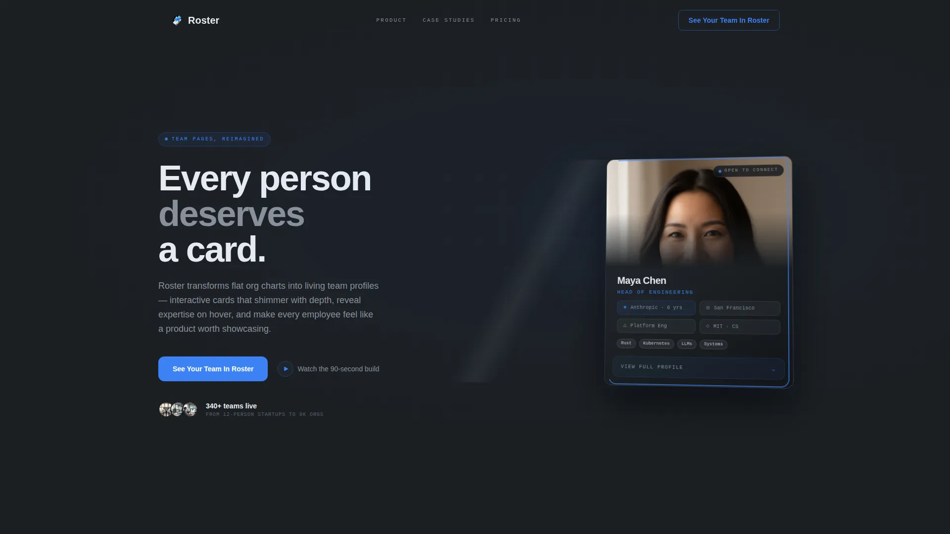
- An animated team card header that assembles in four seconds, ending with a subtle 3D tilt
- Three or more case study scroll sections, each showing a before-and-after transformation with a measurable metric
- A click-through funnel with a ghost button call to action that solidifies into a filled electric-blue button after the second case study
Feature list
This section highlights the core built-in capabilities delivered by the template.
Animated Card Assembly Header
The header opens with a real-time card-building animation. A silhouette outline sketches in with thin blue strokes, a photo fades into the frame, and metadata tiles for role, department, location, and skills snap into place like magnetic components. The sequence runs for four seconds and ends with the card tilting in 3D space.
Overlap and Layered Card Layout
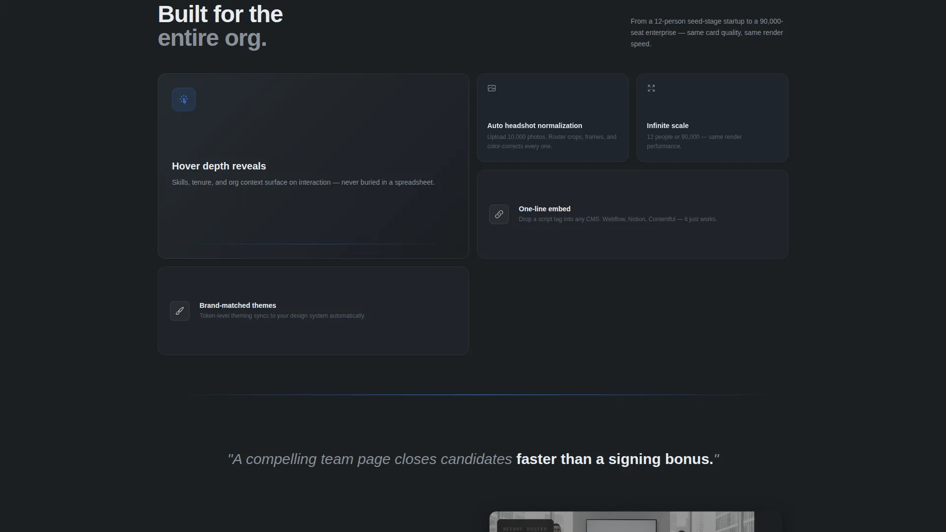
Cards float above background surfaces with soft shadows, creating a sense of physical depth. The overlap and layered template style makes the page feel three-dimensional without relying on complex interactions. Each profile card is designed to shimmer with depth and reveal expertise details on hover.
Case Study Narrative Scroll
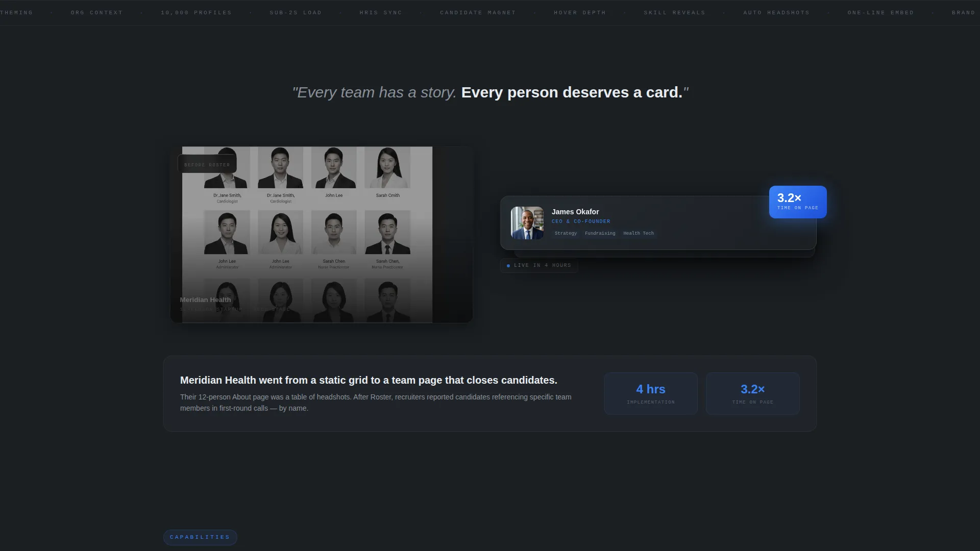
Each scroll section presents a before-and-after story. The old team page appears as a flat screenshot behind frosted glass, then the Roster-powered version slides forward with parallax depth. Copy alongside each case study includes company size, implementation time, and a single outcome metric.
Two-Stage Click-Through Funnel
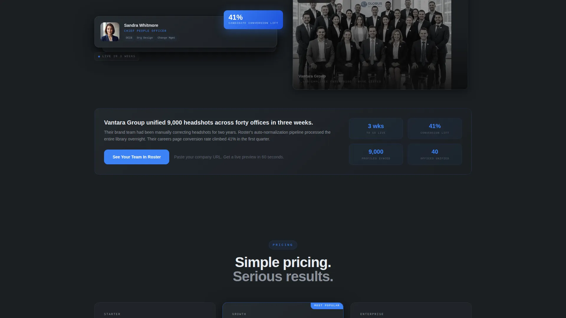
The primary call-to-action starts as a ghost button in the header and transitions to a filled electric-blue button after the second case study. A secondary text link opens a lightbox video for visitors who want to see the product in motion before committing. No form fields appear on the landing page.
Interstitial Product Mantras
Short copy lines appear between case study sections as pacing breaks. Lines like "Every team has a story. Every person deserves a card." reinforce the brand voice and keep scroll momentum high without adding visual clutter.
Tech Glass Visual System
Translucent panel backgrounds with subtle blur, frosted glass overlays, and medium-weight sans-serif typography create a flagship-device aesthetic. The design language is consistent from header to footer, making every section feel intentional and engineered.
Page sections overview
| Section | Purpose |
|---|---|
| Animated Card Header | Hooks visitors with a four-second team card assembly animation |
| Ghost Button call to action | Opens the funnel with a low-commitment click prompt |
| Case Study One | Shows before-and-after for a 12-person startup with a metric |
| Interstitial Mantra | Resets pacing and reinforces brand voice between cases |
| Case Study Two | Escalates proof with a mid-size company transformation |
| Filled call to action Button | Converts intent after value has been demonstrated |
| Case Study Three | Closes narrative at enterprise scale, 9,000 employees |
| Lightbox Video Link | Offers a 90-second motion preview for hesitant visitors |
| Final call to action Section | Drives the primary demo click with full visual weight |
Design & branding system
The template uses a Monochrome Steel color system that feels like a high-end device unboxing. Every color decision is intentional, and the accent is used sparingly to preserve its impact.
- Deep gunmetal (#1B1F23) for backgrounds, polished chrome (#C9CED6) for secondary surfaces, and frosted glass white (#E8ECF1) for panel overlays
- Electric blue (#3B82F6) reserved exclusively for interactive states, hover effects, and call-to-action pulses
- Medium-weight sans-serif typography that reads like system user interface, paired with translucent blurred panels and soft card shadows
Mobile & speed optimization
The template is designed so its layered visuals translate cleanly to smaller screens. The overlap structure and card animations are built to remain readable and intentional at any viewport width.
- Card layouts restack gracefully so overlapping elements stay legible on mobile screens
- Animation sequences are scoped to the header section, keeping the rest of the page lightweight and fast to scroll through
- The lightbox video and click-through funnel require no form rendering, which keeps the page interaction simple on touch devices
How this template helps you convert
The template is engineered as a Click-Through funnel, meaning conversion happens through a single decisive click rather than a form submission. Every design and copy decision supports that path.
- The animated header earns attention in the first four seconds, setting a high-quality first impression before any copy is read
- The escalating case study narrative builds trust progressively, moving from a 12-person startup to a 9,000-employee enterprise to prove the platform works at any scale
- The call to action evolves from a ghost button to a filled electric-blue button only after value has been shown, making the final click feel earned rather than forced
Other information about this template
This template sits at the intersection of the Personal and Resume category and the Digital Business Card subcategory, applied specifically to the Corporate Team Cards niche. That positioning means it borrows the personal polish of a premium digital business card and scales it across an entire organization.
- The template style is Overlap and Layered, which is a deliberate structural choice rather than a decorative one, depth communicates quality
- The Creative Direction is Case Study Narrative, meaning the page tells a story with evidence rather than relying on feature lists alone
- The Header Concept is Animated Illustration, grounding the product promise in a visible, memorable demonstration before the visitor reads a single word
- The page type is a landing page with a single-page, section-led flow designed for one primary action: clicking through to the interactive demo
Theme
Tech Glass
Creative direction
Case Study Narrative
Color system
Monochrome Steel
Style
Overlap/Layered
Direction
Click-Through
Page Sections
Animated Card Assembly Header
Overlap and Layered Card Layout
Case Study Narrative Scroll
Two-stage Click-through Funnel
Interstitial Brand Mantras
Tech Glass Visual System
Related questions
Does this template require any form fields on the landing page?
How does the animated card header work?
Can this template support both small startups and large enterprise teams?
What is the secondary conversion option for visitors who are not ready to click?
What does the Monochrome Steel color system look like in practice?



