Hospital & Health System Professional Website Template
Rounds is a sidebar companion landing page template built for single-specialty joint replacement hospitals. It leads with three bold outcome metrics, guides visitors through procedure and recovery data, and converts research-phase patients into resource downloads. The Arctic White palette and data-first layout build clinical trust before a single word of narrative appears.
by Rocket studio
Quick summary
Rounds is a single-page, sidebar companion template designed for joint replacement hospitals. It opens with a Stats/Metrics wall of three sequential typographic numbers, then walks visitors through procedures, recovery timelines, and benchmarked outcomes. Every section opens with a data point before the explanation. The primary conversion goal is a Pre-Surgery Planner download.
Who this template is for
This template is built for single-specialty hospitals and orthopedic practices that perform joint replacement at high volume. It suits teams who want to lead with transparent outcomes data rather than stock photography or generic trust badges.
- Orthopedic and joint replacement hospital marketing teams
- Healthcare web designers building patient acquisition landing pages
- Adult children or caregivers researching surgical options on behalf of a parent
What problem this template solves
Patients researching joint replacement face a wall of vague reassurances and stock imagery. They need hard numbers, clear recovery timelines, and a simple way to take the next step. Most hospital pages bury the most compelling data or never show it at all.
- Visitors leave without trusting the facility because outcomes data is hidden or absent
- Research-phase patients have no clear path from reading to taking action
- Generic hospital pages fail to differentiate a high-volume specialist from a general provider
What you get with this template
You get a fully structured, desktop-first sidebar companion landing page with five core content sections and a persistent navigation column. Every layout decision reinforces the data-first messaging strategy described in the brief.
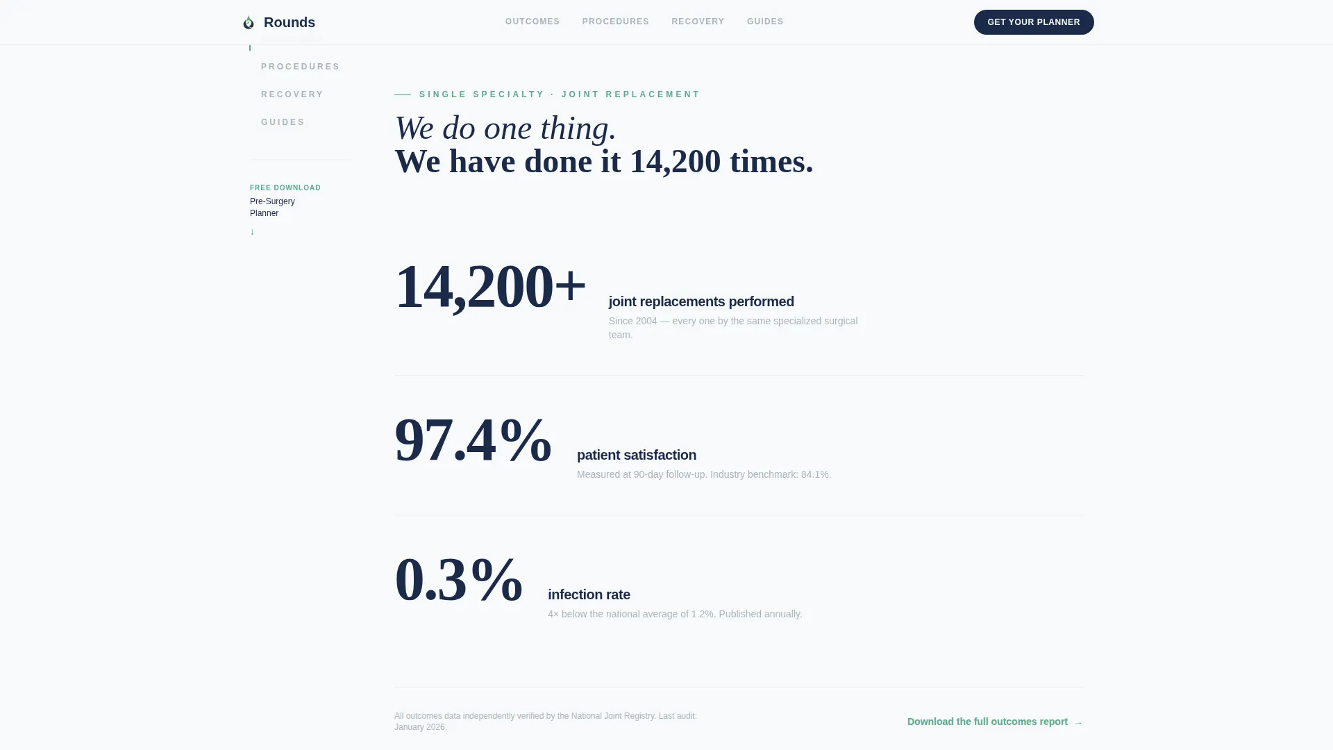
- A Stats/Metrics header wall with three sequential fade-in typographic numbers
- A sticky sidebar with scroll-position tracking across Outcomes, Procedures, Recovery, and Guides
- A resource download form with a radio field asking visitors to select their joint of interest
Feature list
This template includes the following built-in features, each grounded in the project brief.
Sequential Stats Header
Three large typographic numbers fade in one after another against arctic white. Each number is set in deep sterile navy at display scale, with a single line of gray context text beneath. There is no hero image. The data is the design.
Scroll-Linked Sidebar Navigation
A persistent left-column navigation tracks the visitor's scroll position through the page. The active section highlights as the reader moves through Outcomes, Procedures, Recovery, and Guides. This keeps orientation effortless on a long, data-rich page.
Data-First Section Structure
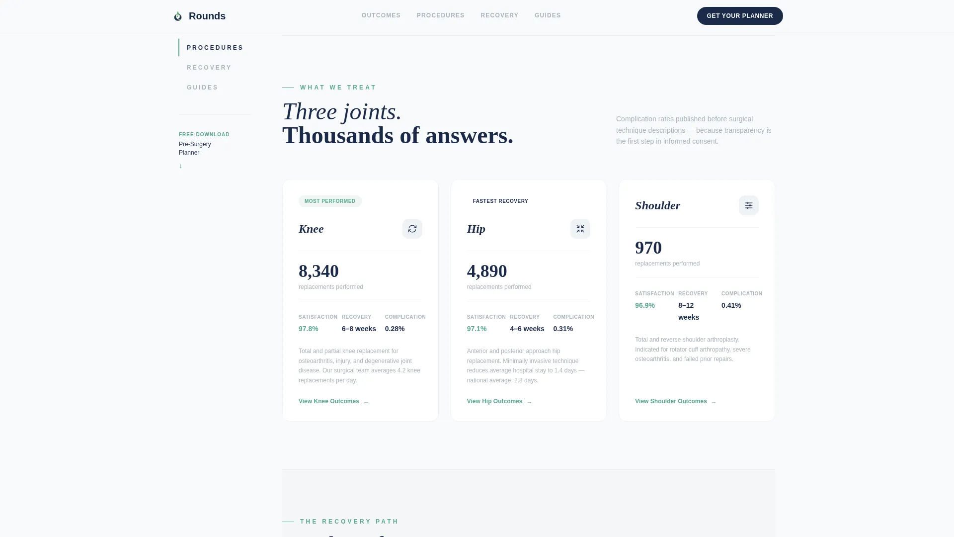
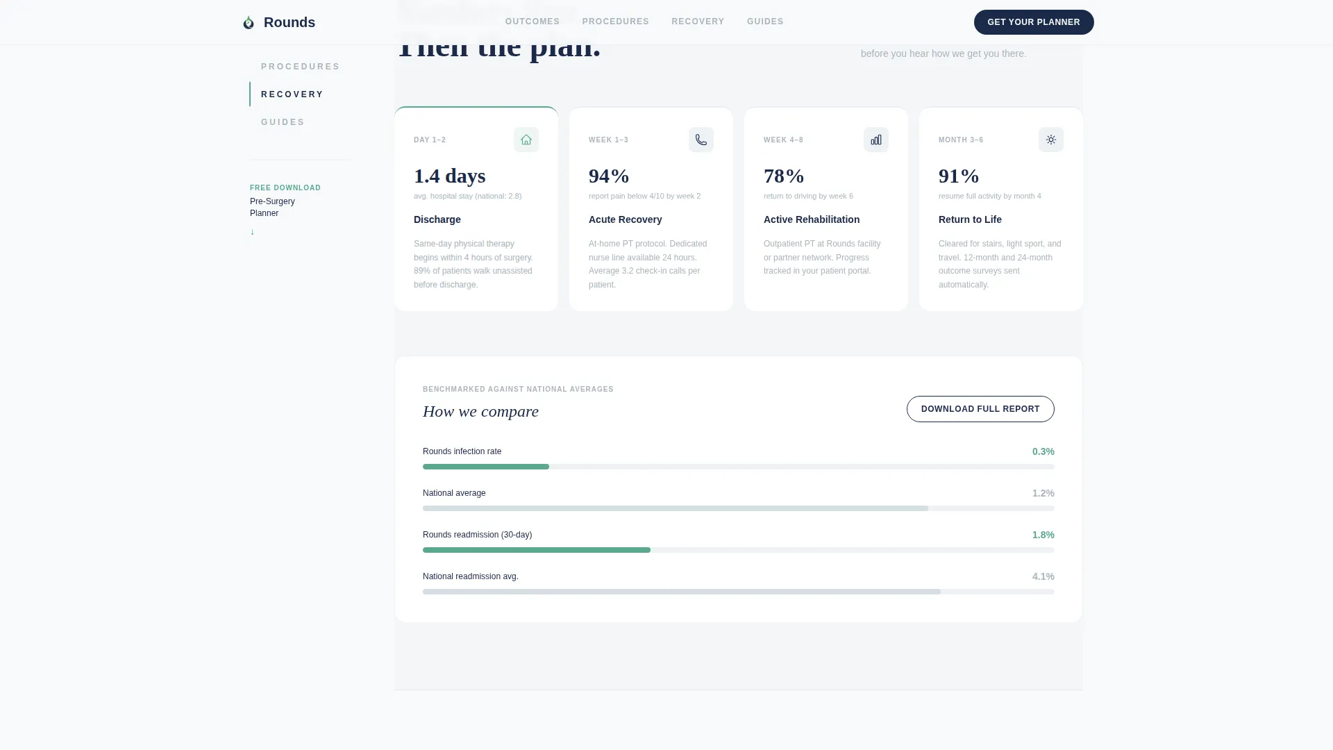
Every content section opens with a bold metric before any narrative. Complication rates appear before technique descriptions. Recovery timelines appear before protocol cards. This ordering trains the visitor to trust numbers first and story second.
Pre-Surgery Planner Download Form
A focused form captures first name, email, and a single radio selection for joint type: hip, knee, or shoulder. It appears both inside the sticky sidebar and after the recovery statistics section, giving two natural conversion moments.
Compare Outcomes Secondary Path
A secondary call to action offers a downloadable PDF that benchmarks the hospital's complication and satisfaction rates against national averages. This gives data-driven visitors a second reason to convert without a hard sell.
Resource Library Section
The page closes with a resource library that positions the Pre-Surgery Planner as the natural next step. By this point, the visitor has moved through enough transparent data that downloading the guide feels like finishing a chapter, not making a commitment.
Page sections overview
| Section | Purpose |
|---|---|
| Stats Metrics Wall | Open with three bold outcome numbers to establish immediate clinical trust |
| Procedures Overview | Present hip, knee, and shoulder procedures with per-procedure outcome metrics |
| Recovery Timeline | Show data-first recovery protocol cards with average timelines before narrative |
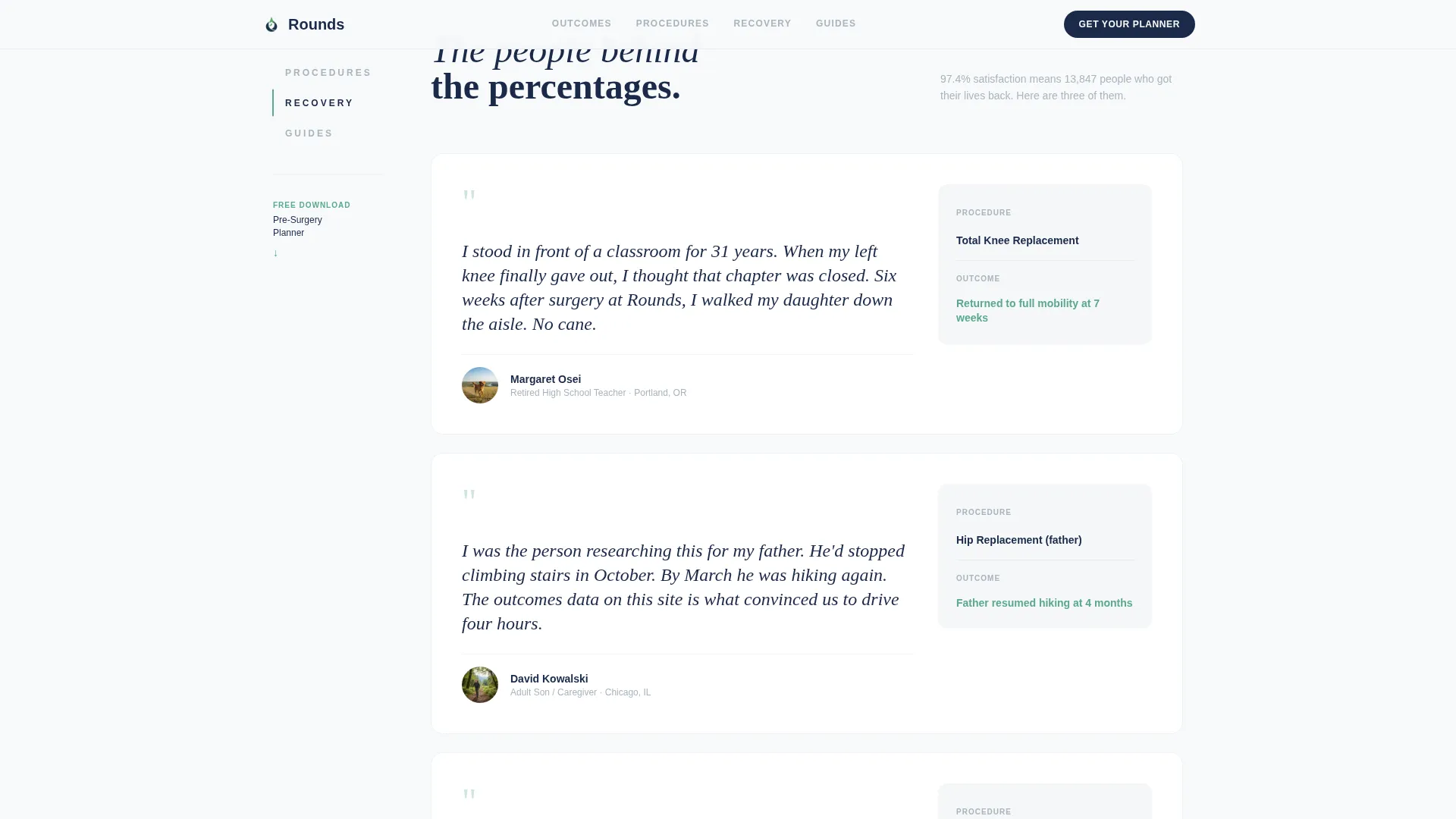
| Outcomes and Testimonials | Combine patient satisfaction scores with benchmarked national comparison data |
| Resource Download | Host the Pre-Surgery Planner form and Compare Outcomes secondary call to action |
Design & branding system
The visual identity follows a Healing Space theme built on an Arctic White color system. The palette feels clinical and unhurried, with a single warm accent reserved for progress and positive outcomes.
- Arctic White (#F8FAFB) as the primary background, Soft Surgical Gray (#D6DDE3) for supporting text, Deep Sterile Navy (#1B2A4A) for display numbers and headings, and Recovery Green (#5BA88D) for calls to action, progress indicators, and positive data points
- DM Sans for body text and Fraunces for display numbers and serif headlines
- Clinical minimalism with stagger-reveal animations and scroll-linked sidebar interactivity
Mobile & speed optimization
The template is designed desktop-first to support the sidebar companion layout. On smaller screens, the sidebar collapses into a responsive mobile flow so no content is lost.
- Desktop-first layout with a persistent left sidebar that collapses cleanly on mobile
- Server Components handle static content sections; Client Components power the sidebar tracker and download form
- Medium animation intensity with sequential fade-ins on stats and stagger reveals on scroll
How this template helps you convert
The conversion strategy is built into the page architecture itself. Visitors are never asked to trust before they are shown evidence.
- The Stats/Metrics wall front-loads the three most persuasive numbers before any explanation, so trust begins at the first scroll stop.
- The data-first section order means every claim is proven before it is framed, making the resource download feel like a logical conclusion rather than a marketing ask.
- The dual conversion paths, the Pre-Surgery Planner and the Compare Outcomes PDF, capture both action-ready visitors and those who need one more layer of evidence.
Other information about this template
This template is part of the Rounds project concept, a focused design direction for single-specialty healthcare providers who compete on measurable outcomes rather than brand recognition alone.
- The footer uses a Vercel Horizontal Flow pattern (Pattern 3) for a clean, structured close
- Localization is set for English language, United States date format, and USD currency references
- The template is a starting point for customization; all metrics, copy, and form fields are editable to match your facility's actual data
- The Healing Space theme and Arctic White color system can be adapted to other high-trust clinical contexts such as surgical centers or specialty clinics
Theme
Healing Space
Creative direction
Stats-First Impact
Color system
Arctic White
Style
Sidebar Companion
Direction
Content/Resource
Page Sections
Sequential Stats Metrics Header
Scroll-linked Sidebar Navigation
Data-first Section Order
Pre-surgery Planner Form
Compare Outcomes Secondary Call to Action
Resource Library Close
Related questions
What type of hospital is this template designed for?
Can I change the statistics shown in the header section?
What information does the download form collect from visitors?
Does the sidebar navigation work on mobile devices?
Is there a secondary conversion option for visitors who are not ready to download?



