Hospitalist Physician Group B2B Website Template
Rounds is a hub-and-spoke landing page template built for hospitalist physician groups targeting hospital CMOs, rural health system CEOs, and practice managers. It uses a Testimonial Mosaic creative direction, a Soft Mist color palette, and a persistent anchor navigation system to build cumulative institutional credibility and drive visitors toward a partnership consultation click-through.
by Rocket studio
Quick summary
Rounds is a single-page, anchor-nav landing page template designed for hospitalist physician groups. It speaks directly to hospital administrators who need dependable inpatient coverage. The page opens with an oversized CEO testimonial card, then builds evidence section by section through voices from across the hospital org chart, ending with a clear, repeated call to action that earns the click.
Who this template is for
This template is built for hospitalist physician groups that sell embedded inpatient coverage services to hospitals and health systems. The target audience includes decision-makers who control staffing budgets and service-line quality.
- Hospital Chief Medical Officers and Chief Executive Officers managing coverage gaps and locum tenens costs
- Rural health system leaders looking to replace expensive temporary staffing with a reliable partner
- Practice managers and Chief Nursing Officers responsible for scheduling, care coordination, and quality outcomes
What problem this template solves
Hospital administrators face a specific problem: they need to evaluate a hospitalist partner quickly, and most hospitalist websites give them walls of text and no peer validation. An effective landing page must bridge the gap between high-level executive needs and clinical trust. This template solves that by structuring the page around voices the visitor already respects.
- Coverage gaps, budget pressure from locum tenens spend, and scheduling complexity all demand clear, confident answers up front
- Most pages overwhelm visitors with too much information before earning any trust
- Without social proof from familiar stakeholder types, administrators hesitate to request a consultation
What you get with this template
You get a complete, professionally structured medical landing page built around a hub-and-spoke anchor navigation layout. Every section is purposefully sequenced to guide visitors from skepticism to confidence without requiring a form submission on this page.
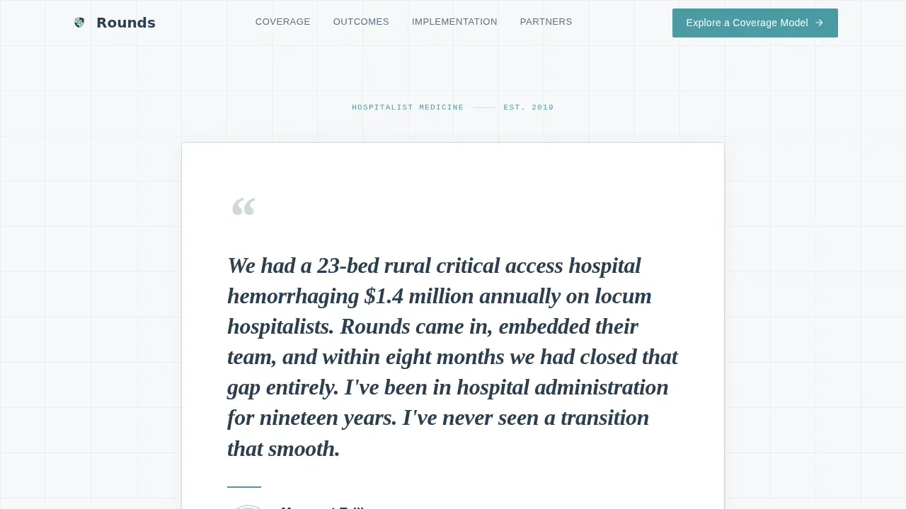
- A hero section anchored by an oversized testimonial card featuring a hospital CEO quote, circular portrait, and a thin teal rule
- Four spoke sections covering Coverage Models, Outcomes Data, Implementation, and Partner Hospitals, each opening with a unique stakeholder testimonial
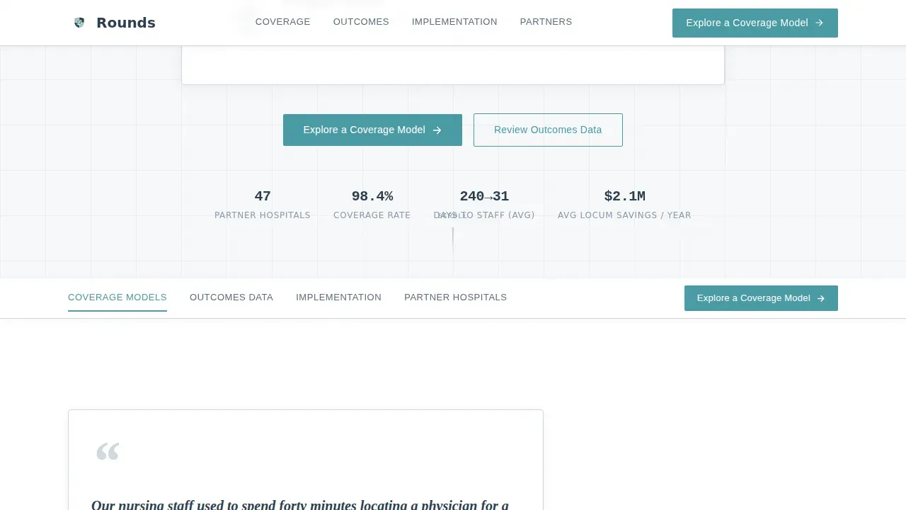
- A persistent anchor nav with active-state teal highlights, contextual micro-calls to action in each section, and a single primary call to action repeated throughout
Feature list
This landing page template includes several carefully designed components. Each one supports the goal of building credibility and moving hospital administrators toward a consultation click.
Testimonial Mosaic Layout
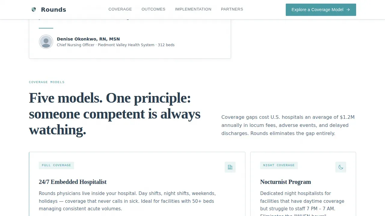
Each of the four main spoke sections opens with a testimonial from a different stakeholder: a Chief Nursing Officer, a Chief Financial Officer, a referring specialist, and a patient. By the bottom of the page, visitors have heard from an entire hospital org chart. This cumulative social proof makes the evidence feel institutional rather than anecdotal.
Oversized Hero Testimonial Card
The header features a single centered testimonial card set in weight-heavy serif type against the mist-white background. It carries a three-line CEO quote, the speaker's name, title, facility size, and a small circular portrait. No hero image of a stethoscope or blue-gloved hands. Just one human vouching for another, which is one of the most effective trust signals a hospitalist landing page can deploy.
Persistent Anchor Navigation with Active States
The anchor nav sits at the top of the page and highlights the active section in restrained teal as visitors scroll. The primary call to action, "Explore a Coverage Model," lives in the nav as a persistent button so it is always visible. This keeps the page action oriented without interrupting the reading flow.
Contextual Micro-calls to action Per Section
Every spoke section ends with a unique, contextual micro-call to action. Examples include "See How Rural Systems Staff Nights" and "Review Our Readmission Data." Each one routes to the same consultation page. This approach lets the page encourage visitors to click at the exact moment they feel most persuaded, rather than forcing them to scroll to a footer form.
Corporate Precision Typography System
Headlines use a weight-heavy serif typeface for authority. Body copy uses a clean sans-serif for readability. Data and metrics use a monospaced typeface to reinforce clinical precision. The combination gives every section a freshly printed lab report feel, which aligns with the trust expectations of healthcare professionals reviewing the page on a desktop workstation.
Hub-and-Spoke Section Architecture
The template is organized as a hub with four clearly labeled spokes, each accessible from the anchor nav. This structure lets users jump directly to the section most relevant to their role. A CFO can go straight to Outcomes Data. A practice manager can skip to Implementation. The layout serves the full buying committee without overwhelming visitors who only need one answer.
Page sections overview
| Section | Purpose |
|---|---|
| Hero Testimonial Card | Opens with CEO peer validation and primary call to action |
| Anchor Navigation Bar | Persistent navigation with active teal highlights |
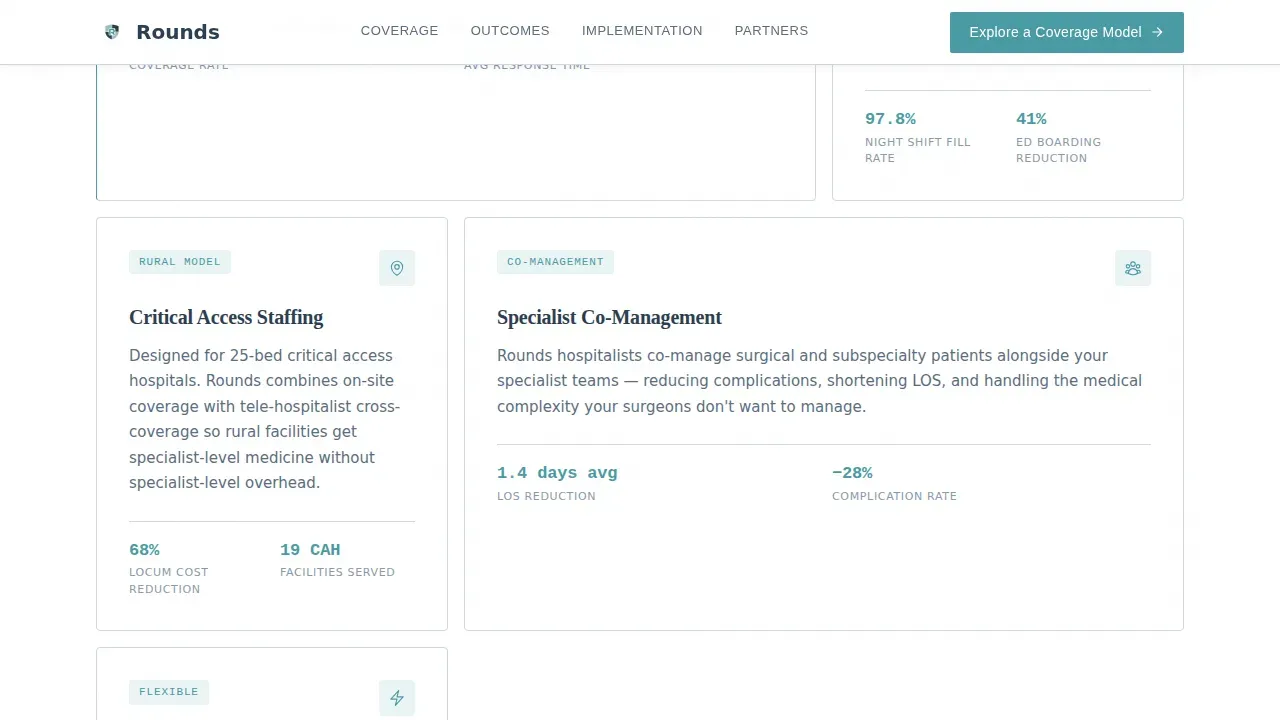
| Coverage Models | CNO testimonial plus bento-style coverage option cards |
| Outcomes Data | CFO testimonial plus readmission and length-of-stay metrics |
| Implementation | Specialist testimonial plus onboarding timeline visual |
| Partner Hospitals | Patient testimonial plus hospital type cards |
| Footer | Single-row linear footer with final call to action and support links |
Design & branding system
The visual identity follows a Corporate Precision theme built on the Soft Mist color system. Every design decision prioritizes legibility and earned trust over decoration. The visual elements work together to feel like a clinical document rather than a marketing brochure.
- Colors: clinical white (#F7F8FA) for backgrounds, quiet gray-blue (#D0D8E1) for dividers and cards, deep charcoal (#2C3E50) for body text, and restrained teal (#4A9BA5) reserved exclusively for interactive elements and anchor nav highlights
- Typography: weight-heavy serif for headlines to project authority, clean sans-serif for body paragraphs, and monospaced typeface for data displays and metrics dashboards
- White space is used deliberately throughout the layout to prevent visual clutter and keep the page focused on the content that builds credibility
Mobile & speed optimization
Although this template is designed desktop-first for hospital administrators reviewing it on workstations, it includes full mobile support. Over 60% of web traffic now comes from mobile devices, making mobile optimization essential for any landing page, including those targeting healthcare professionals. Mobile users who access the page on smaller screens should have an equally professional experience.
- The layout is fully responsive, so the page displays properly on all devices and screen sizes without breaking the anchor navigation or card components
- Buttons are designed to be large enough to tap easily on mobile screens, and the page is structured to load quickly to minimize bounce rates
- The template supports video incorporation to increase engagement and showcase the physician group's approach to care across both desktop and mobile contexts
How this template helps you convert
This template is built as a click-through landing page, meaning there is no form on this page. Instead, it earns the consultation click through cumulative peer validation. Companies using landing pages well generate significantly more leads than those relying on general website pages alone.
- The Testimonial Mosaic builds layered social proof across five stakeholder voices, so by the time visitors reach the bottom, declining to click feels like ignoring a peer recommendation from their own hospital org chart
- The persistent anchor nav and repeated primary call to action keep the next step visible at all times without overwhelming visitors with multiple competing conversion paths
- Each contextual micro-call to action meets visitors at their highest moment of persuasion, which improves conversion rates by triggering the click when intent is strongest
Other information about this template
This template is part of a Health and Medical category, specifically built for the hospitalist niche under the Doctor and Physician Practice subcategory. It is a great example of how a specialized medical landing page can outperform a generic healthcare website by focusing every element on a single, well-defined audience. The following details are useful for anyone evaluating this template for their campaigns or comparing it against other insurance landing page and healthcare landing options.
- The Rounds trusted hospitalist coverage landing page template is optimized for the hospitalist-to-hospital-administrator sales context, which is different from a standard health insurance landing page or insurance business context
- Unlike an insurance landing page built for individual consumers comparing insurance options or insurance products like auto insurance or travel insurance, this page targets institutional buyers making coverage partnership decisions for entire hospitals
- The template does not require advanced coding skills to customize; it is built to work within no-code or low-code environments where drag-and-drop tools let users get started quickly without technical barriers
- No-code landing page builders allow users to customize this template and launch campaigns without writing a single line of code, which speeds up time to deployment
- The page layout uses bullet points, text boxes, and ample white space to keep the content scannable for busy administrators who will not read dense paragraphs
- Trust signals are embedded throughout: testimonials from an entire hospital org chart, metrics-driven outcomes data, and a design system that signals clinical competence before a single word is read
- The page is built to help unique visitors arriving from search or referral traffic quickly find the important details that matter to their specific role
- The faq section included in the page template helps address common questions from potential customers before they reach the consultation page
- Providers featured in the template context should be board-certified and experienced in high-acuity, fast-paced environments, giving hospitals assurance of provider qualification
- The template supports highlighting administrative support services including licensing, credentialing, and scheduling, which are among the most important details for hospital operations leaders
- Quality metrics such as reducing Length of Stay and improving patient satisfaction scores can be displayed in the Outcomes Data section using the monospaced data typography
- For insurance company contexts, this template can be adapted to similar B2B healthcare services, though its primary design intent is hospitalist group-to-hospital marketing
- Industry awards and accreditation badges, such as Joint Commission recognition, can be placed as additional trust signals within the Partner Hospitals section
- The page supports customized staffing solutions messaging for locum tenens, temporary, or permanent coverage needs, giving the copy flexibility across different hospital types
- Security and compliance messaging, including references to HIPAA adherence, can be incorporated into the Implementation section to reassure facilities about data standards
- The page is designed to generate more leads by removing friction: no form on this page means visitors are never stopped before reaching the consultation page
Theme
Corporate Precision
Creative direction
Testimonial Mosaic
Color system
Soft Mist
Style
Hub & Spoke (Anchor Nav)
Direction
Click-Through
Page Sections
Testimonial Mosaic Section Architecture
Oversized Hero Testimonial Card
Persistent Anchor Navigation Bar
Contextual Micro-ctas Per Spoke
Clinical Data Metrics Dashboard
Corporate Precision Typography and Color System
Related questions
Who is this landing page template designed for?
Does this template include a contact form?
Can I customize this template without coding skills?
How does the Testimonial Mosaic build credibility with hospital administrators?
Is this template responsive for mobile users?



