Teaching Hospital Specialist Booking Landing Page
Rounds is a teaching hospital landing page template built around a specialty comparison table. It guides patients, referring physicians, and benefits coordinators from symptom to booked appointment in one scroll. A live availability display, expandable specialty rows, and a two-step booking form work together to move every visitor toward a confirmed slot before they leave the page.
by Rocket studio
Quick summary
Rounds is a single-page booking template for teaching hospitals with broad specialty rosters. It opens with an award badge header, flows through a symptom-to-department finder, centers on a ranked specialty comparison table with live availability indicators, and closes with a two-step progressive booking form. The result is a page that earns trust and captures appointments without friction.
Who this template is for
This template is built for teaching hospitals and academic medical centers that need to present multiple specialties clearly and convert three very different types of visitors in one page experience.
- Patients who just received a difficult diagnosis and need a specialist appointment quickly
- Primary-care physicians referring a complex case and looking for a direct referral path
- Human resources benefits coordinators routing employees toward in-network specialist care
What problem this template solves
Most hospital web pages force visitors to search across disconnected department pages, guess at wait times, and fill out a form before seeing a single available slot. That friction drives people away at exactly the moment they need reassurance.
- Visitors cannot compare specialties, wait times, and outcomes side by side in one view
- Patients and referring doctors have no clear call to action tied to real-time availability
- HR coordinators have no efficient way to evaluate a hospital's breadth and book on behalf of employees
What you get with this template
You get a fully structured, single-page layout that moves visitors from uncertainty to a confirmed booking slot. Every section is designed to answer a specific question before the visitor has to ask it.
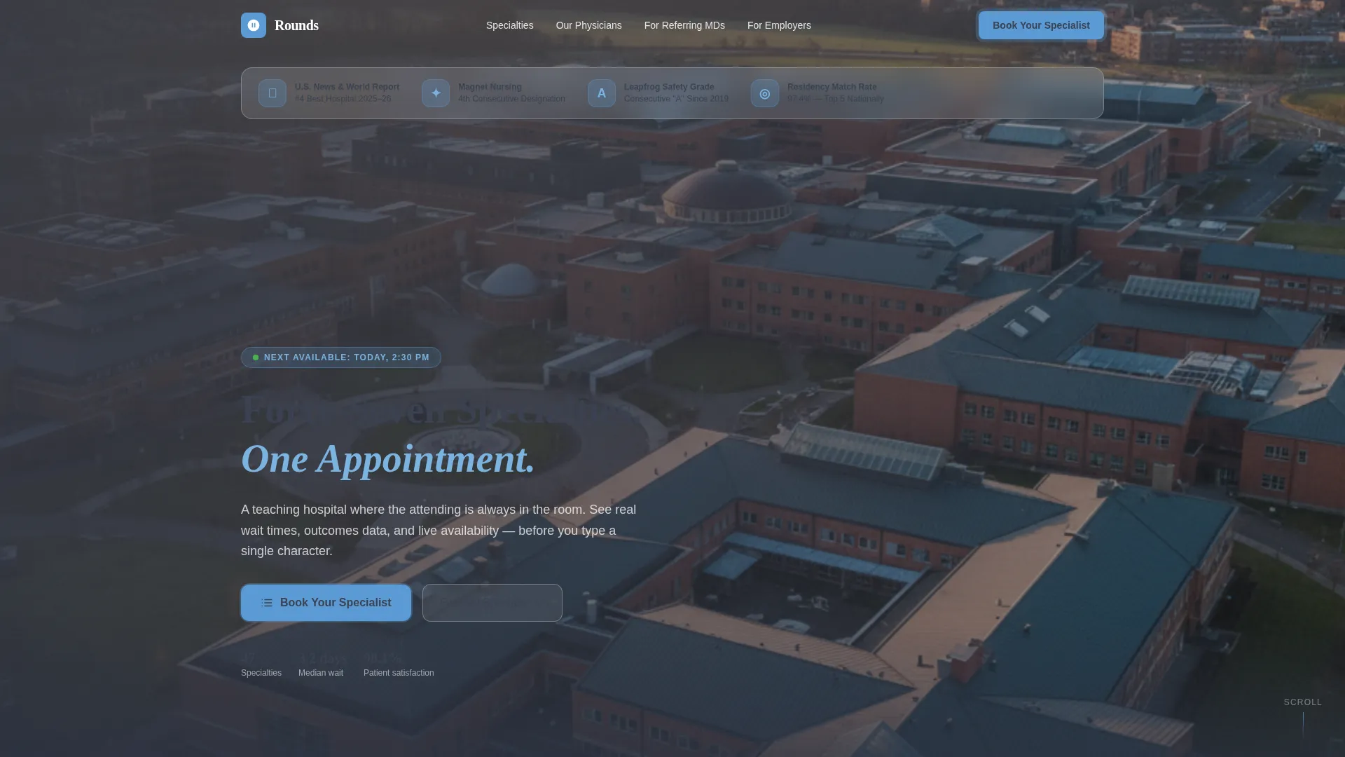
- A hero section with an award badge ribbon, a campus aerial background, and a pulsing booking button
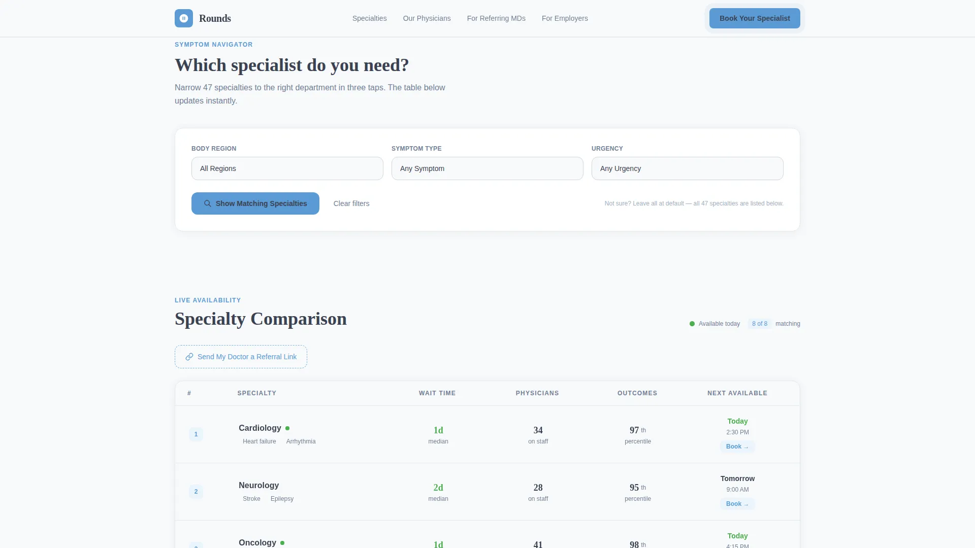
- A symptom-to-department finder with three dropdown filters feeding directly into the comparison table
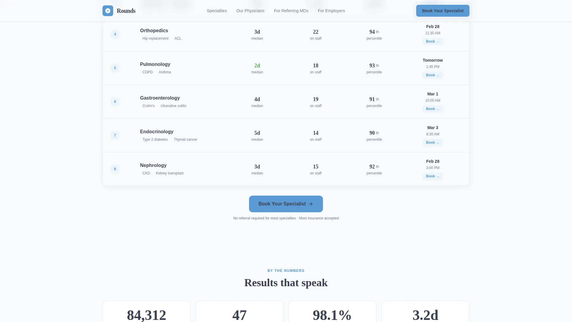
- A specialty comparison table with expandable rows, live green availability slots, and outcome data columns
- A two-step progressive booking form with insurance autocomplete and real appointment slot display
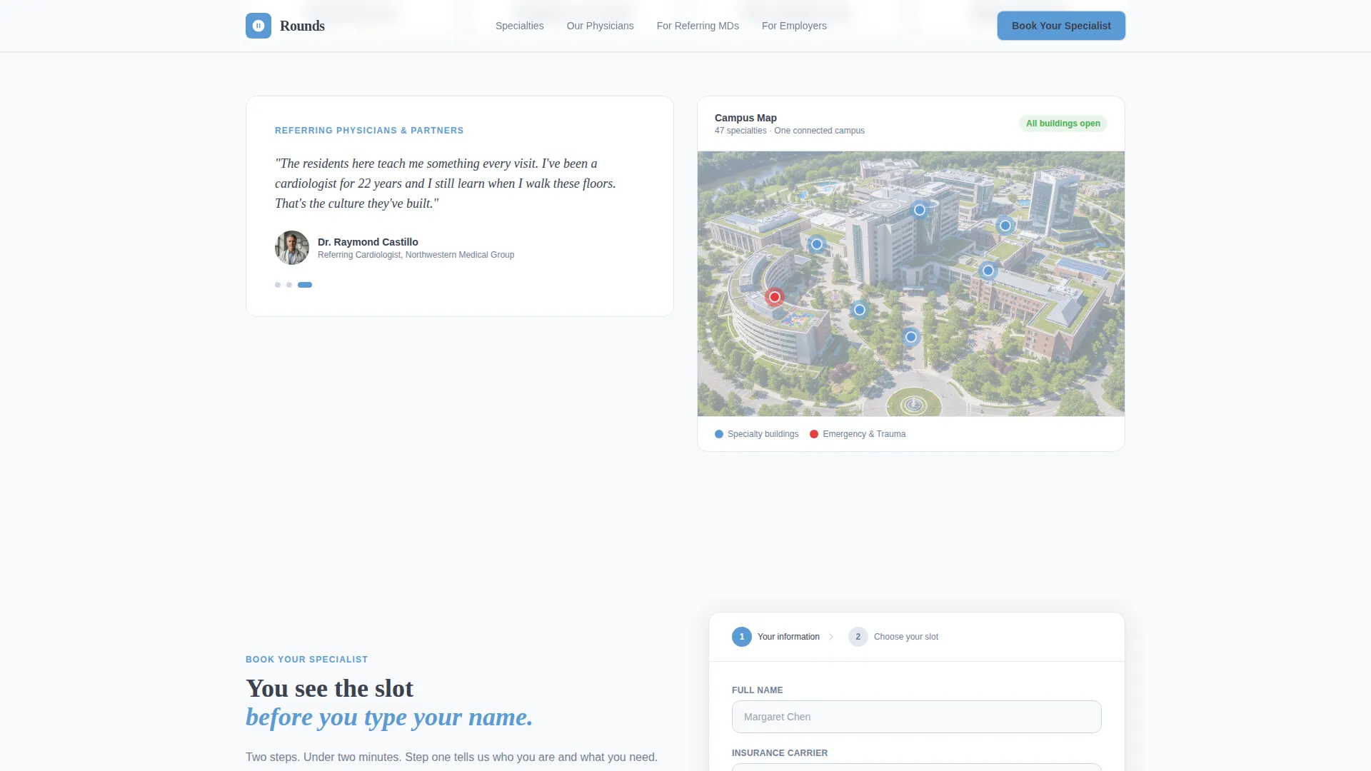
- A social proof section with an animated procedure counter, rotating referring-physician quotes, and a color-coded campus map
Feature list
This section covers the core functional and design capabilities built into the Rounds template.
Award Badge Hero Header
The header floats trust signals, including ranking shields, nursing designation badges, safety grade indicators, and residency match-rate callouts, over a softly blurred aerial campus photograph. A 56-pixel slate headline and a pulsing sky-blue call-to-action button appear immediately below, so the visitor sees both credibility and a clear next step before scrolling.
Symptom-to-Department Finder
Three dropdown menus let visitors filter by body region, symptom type, and urgency level. Selections update the specialty comparison table in real time, narrowing forty-seven specialties down to the most relevant matches and reducing the decision load on anxious or time-pressed visitors.
Ranked Specialty Comparison Table
The table is the centerpiece of the page. Each row represents a specialty and displays wait time, physician count, outcomes percentile, and a live next-available appointment slot shown in vital-sign green. Clicking any row expands it to reveal the attending team, fellowship credentials, and a brief patient-review excerpt.
Two-Step Progressive Booking Form
Step one captures the visitor's name, insurance carrier (selected from an autocomplete list of national payers), and preferred specialty. Step two shows three available appointment slots with the physician's name and photo. The visitor sees real availability before entering any personal information.
Referral Link Path
A secondary conversion option labeled "Send My Doctor a Referral Link" sits beneath the comparison table. It gives patients who need their primary-care physician to initiate the referral a direct, low-barrier action that fits naturally into clinical workflow.
Animated Social Proof Section
An animated counter shows total procedures performed in the current year. A rotating quote block cycles through statements from referring physicians. A campus map uses sky-blue color coding to identify specialty buildings, grounding the page in a real, navigable place.
Page sections overview
| Section | Purpose |
|---|---|
| Award Badge Hero | Establish credentials and prompt immediate action |
| Symptom Finder Dropdowns | Filter specialties by body region, symptom, and urgency |
| Specialty Comparison Table | Compare wait times, outcomes, and live availability across specialties |
| Expandable Row Detail | Reveal attending team, credentials, and patient review per specialty |
| Social Proof Stats | Build trust with procedure volume, physician quotes, and campus map |
| Two-Step Booking Form | Capture visitor details and confirm an appointment slot |
| Single-Row Footer | Close the page with essential links and contact details |
Design & branding system
The Medical Clarity visual theme is built on the principle that clinical authority and human warmth are not opposites. The Slate and Sky color system makes every element's role legible at a glance.
- Charcoal slate (#3B4252) anchors all primary text and section dividers, projecting seriousness and readability
- Clinical sky blue (#5B9BD5) colors every interactive element, so visitors always know exactly where to click
- Vital-sign green (#4CAF50) appears only on live availability indicators and booking confirmation states, never as a decorative color
- Sterile white (#F8F9FA) fills open backgrounds, keeping the layout breathable and uncluttered
- Display headlines use Fraunces for editorial weight; body text and interface labels use DM Sans for clarity at small sizes
Mobile & speed optimization
The template is designed desktop-first because the comparison table is the centerpiece experience. Mobile visitors still get the full conversion path, adapted for smaller screens.
- The primary "Book Your Specialist" button is pinned to the bottom of the viewport on mobile, staying visible as the visitor scrolls
- Static page sections use server-rendered components; interactive elements like the table, filters, and booking form load as client components to keep initial paint fast
- Scroll-triggered animations, expanding table rows, and pulsing green indicators are handled through GSAP ScrollTrigger and AOS reveal patterns
How this template helps you convert
The page is structured around a Problem to Solution arc that answers each visitor's core question before they form it consciously.
- The header badge ribbon establishes institutional credibility in the first two seconds, giving patients and referring doctors a reason to stay on the page rather than bounce.
- The comparison table shows live appointment availability in vital-sign green before the visitor is asked to enter any information, removing the biggest source of booking hesitation.
- The two-step progressive form reduces perceived effort by splitting data capture from slot selection, so the visitor commits to a specialty first and sees real options before completing the booking.
Other information about this template
Rounds is built for the United States healthcare context. Date formats follow MM/DD/YYYY, insurance carrier fields autocomplete from US national payer lists, and address fields expect US city and state input.
- Animation intensity is high throughout: GSAP ScrollTrigger powers the procedure counter, AOS handles section reveals, and table row expansion uses smooth height transitions
- The footer follows a linear single-row layout pattern, keeping the close of the page minimal and uncluttered
- The template supports forty-seven specialty rows in the comparison table as described in the source brief, making it suitable for large academic medical centers with broad department rosters
- The page type is a single-page landing layout, not a multi-page site, so all sections live within one scrollable experience
Theme
Medical Clarity
Creative direction
Problem→Solution Arc
Color system
Slate & Sky
Style
Comparison Table
Direction
Booking/Scheduling
Page Sections
Award Badge Hero Header
Symptom-to-department Finder
Ranked Specialty Comparison Table
Two-step Progressive Booking Form
Animated Social Proof Section
Referral Link Secondary Path
Related questions
Who is the Rounds template designed for?
Can the comparison table handle a large number of specialties?
How does the two-step booking form work for visitors?
Is there a path for patients who need a physician referral first?
What makes the visual design feel trustworthy rather than cold?



