Editorial Landing Page Template for Delivery Drivers
Route is an editorial magazine-style landing page built for gig delivery drivers. It leads with three hard-hitting stats, then unfolds three driver case studies covering mileage deductions, insurance gaps, and vehicle costs. The layout uses an ink-and-paper color system, serif typography, and a single click-through call to action, no forms, no friction.
by Rocket studio
Quick summary
Route is a single-page editorial resource hub designed for delivery drivers working multiple gig apps. It opens with three oversized typographic stats, then walks readers through three case study narratives covering real driver concerns. The layout feels like a long-form magazine feature, clean, authoritative, and built to earn the driver's click.
Who this template is for
This template is built for creators, publishers, and resource-site operators who serve the gig delivery driver audience. It suits anyone building a credible, content-driven destination for couriers and independent contractors.
- Multi-app delivery drivers who need practical guidance on expenses, mileage, and tax deductions
- Resource hub owners or affiliate publishers targeting gig economy workers in the delivery space
- Content creators producing editorial guides for DoorDash couriers, grocery shoppers, and food delivery drivers
What problem this template solves
Most landing pages aimed at delivery drivers feel corporate and transactional. Drivers scroll past them. This template solves the trust problem by leading with data they recognize and stories that mirror their own week on the road.
- Drivers lack a page that speaks their language without oversimplifying or talking down to them
- Generic resource pages bury the most useful information under clutter and vague headlines
- A single clear call to action gets lost when a page tries to do too many things at once
What you get with this template
You get a fully structured, single-page layout ready to carry editorial content from the first headline to the final call to action. Every section has a defined role and a clear visual hierarchy.
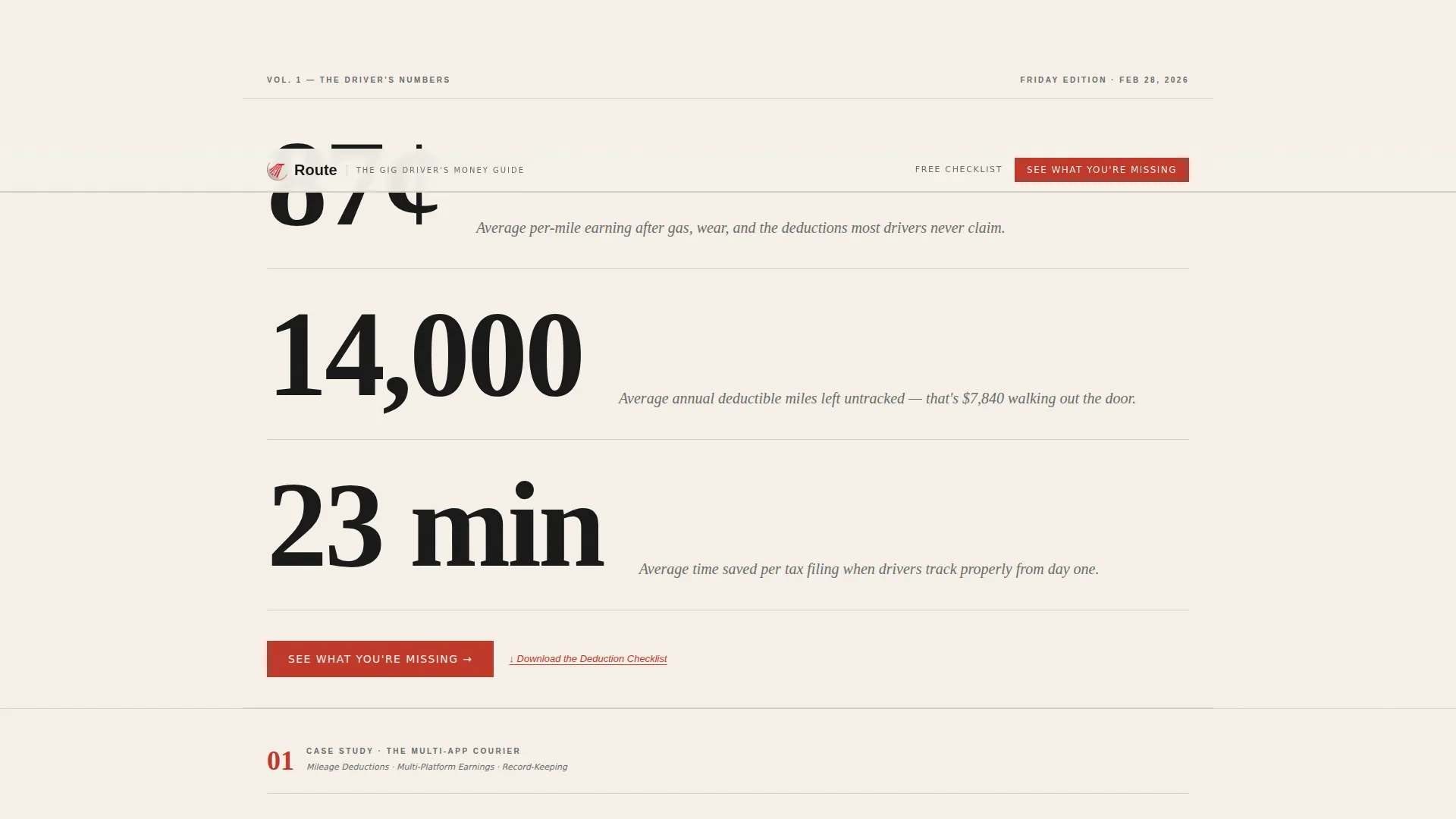
- A header stats block with three typographic figures designed to stop the reader immediately
- Three narrative case study sections, each structured around a distinct driver archetype and topic
- A primary click-through call to action plus a secondary editorial footnote link for a secondary offer
Feature list
This template is built around six core design and layout features that make the editorial experience work.
Oversized Stats Header
Three large serif figures anchor the top of the page. Each number sits on its own line like a front-page headline, with an italicized single-sentence subhead beneath it acting as a byline. No imagery is needed, the numbers carry the visual weight and land immediately with the driver audience.
Case Study Narrative Sections
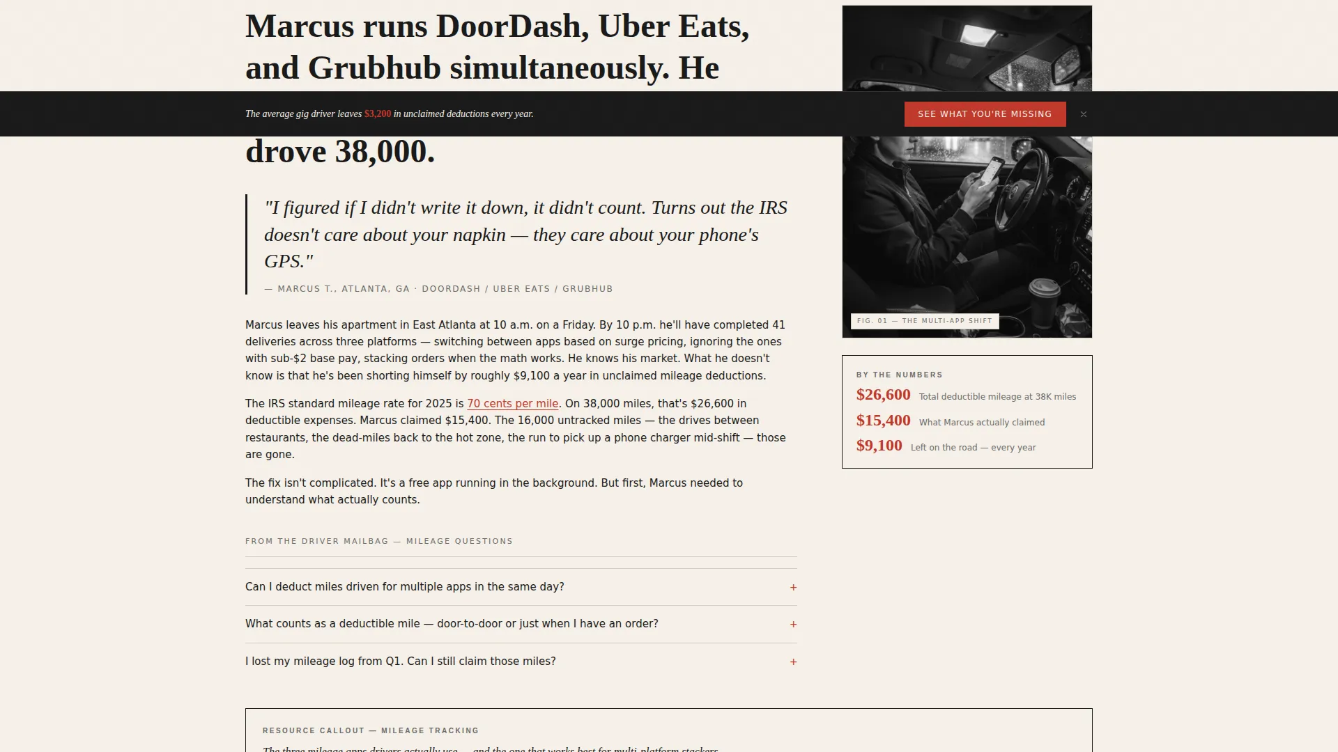
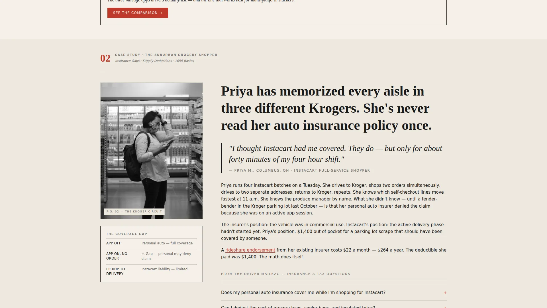
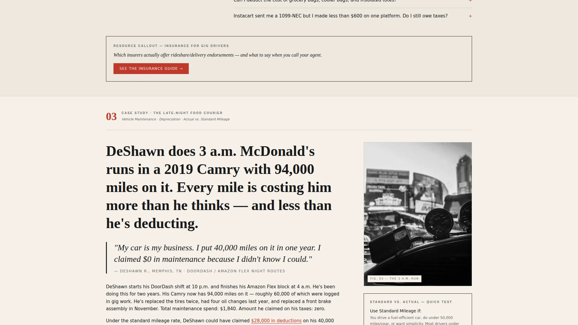
The page unfolds across three long-form sections, each profiling a distinct driver archetype through a working week. Section one covers the multi-app courier and mileage deductions. Section two follows the suburban grocery shopper and insurance gaps. Section three rides with the late-night food courier through vehicle maintenance costs.
Pull Quote Typography Blocks
Each case study opens with an oversized serif pull quote. This design pattern signals a magazine feature format and gives the reader an immediate emotional hook before they commit to reading the full section.
Resource Callout Boxes
Every case study closes with a resource callout framed in a thin black rule. These boxed elements break the editorial flow intentionally, giving the reader a clear summary of what to do next without interrupting the story.
Click-Through Call to Action System
The primary call to action, styled in route-marker red, appears first after the header stats block. It then repeats as a fixed bottom bar after the second case study. A secondary text link styled as an editorial footnote sits alongside for drivers who want a takeaway before clicking through.
Ink and Paper Visual System
The entire page uses a four-color editorial palette. Deep editorial black handles headlines and pull quotes. Warm newsprint cream fills the background. Soft pencil gray carries body text. Route-marker red is reserved strictly for links, callout numbers, and call to action buttons.
Page sections overview
| Section | Purpose |
|---|---|
| Header Stats Block | Opens with three typographic figures that anchor the driver's attention immediately |
| Primary call to action Placement | Pushes readers toward the recommended tools destination right after the stats |
| Case Study One | Profiles the multi-app courier and unpacks mileage deduction guidance |
| Pull Quote Block One | Opens the first case study with an oversized serif hook |
| Resource Callout One | Closes case study one with a boxed action summary |
| Case Study Two | Follows the suburban grocery shopper through insurance gap territory |
| Pull Quote Block Two | Opens the second case study with a recognizable driver moment |
| Resource Callout Two | Closes case study two with a framed next-step resource |
| Fixed Bottom Bar | Repeats the primary call to action after case study two as a persistent scroll element |
| Case Study Three | Rides with the late-night courier through vehicle maintenance math |
| Pull Quote Block Three | Opens the third case study with a late-night driving scenario |
| Resource Callout Three | Closes case study three with a boxed resource summary |
| Secondary Footnote Link | Offers a deduction checklist download styled as an editorial footnote |
Design & branding system
The visual identity is built around an Ink and Paper color system that evokes a broadsheet left on a cafe counter. Every color in the palette has a specific, non-interchangeable role on the page.
- Deep editorial black (#1A1A1A) for headlines and pull quotes, warm newsprint cream (#F5F0E8) as the page background, and soft pencil gray (#6B6B6B) for body text and secondary labels
- Route-marker red (#C0392B) used exclusively for links, callout numbers, and call to action buttons, never as a decorative element
- Serif typeface at display scale for stats, pull quotes, and section headers, creating a consistent editorial voice from top to bottom
Mobile & speed optimization
The editorial layout is designed to read cleanly on small screens where most delivery drivers will encounter it, between drops, at a red light, or in a parking lot between shifts.
- Single-column flow ensures the case study narratives read without horizontal scrolling or layout breaks on mobile viewports
- Oversized typographic stats and pull quotes remain legible at mobile scale without requiring image assets or complex rendering
- The fixed bottom call to action bar is positioned to remain visible and tappable throughout the scroll on touch devices
How this template helps you convert
The page is optimized as a click-through destination. Every structural decision is made to build enough trust that the reader takes one clear action.
- The header stats block leads with numbers the driver already senses are true, creating immediate credibility before a single paragraph of body copy appears
- The case study format keeps readers on the page longer by giving them a story that mirrors their own experience, which builds trust before the call to action repeats
- The fixed bottom call to action bar and the secondary footnote link together serve two driver types, the one ready to click now and the one who wants a free takeaway first
Other information about this template
This template fits naturally into an affiliate publishing workflow or a content-driven resource site targeting the gig economy delivery space. It is built as a standalone single-page layout with no multi-page navigation required.
- The template is categorized under Professional Services with a subcategory focus on delivery driver online presence
- The editorial magazine style and case study narrative direction make this template distinct from generic FAQ or list-style resource pages
- The secondary footnote link for a deduction checklist download gives operators a lightweight lead-capture hook without adding a form or friction to the primary conversion path
Theme
Editorial Magazine
Creative direction
Case Study Narrative
Color system
Ink & Paper
Style
Editorial/Magazine
Direction
Click-Through
Page Sections
Oversized Editorial Stats Header
Three-part Case Study Narrative
Pull Quote Typography System
Resource Callout Boxes
Click-through Call to Action Architecture
Ink and Paper Color System
Related questions
Who is the Route template designed for?
Does this template require a form or sign-up to convert?
Can I edit the three stat figures in the header?
What makes this layout feel different from a standard FAQ page?
Is Route a single-page or multi-page template?



