Cinematic Kenya Adventure Tour Landing Page Template
Safari is a cinematic adventure landing page built for Kenya tour operators who need to sell the feeling before the itinerary. A masonry grid of staggered photo and micro-video cards immerses visitors in the landscape, while a stepped registration modal guides serious travellers from first scroll to confirmed departure. The Rainforest colour palette and search-led header make intent feel immediate and visceral.
by Rocket studio
Quick summary
Safari is a single-page adventure travel template designed for Kenya tour operators. It opens with a drone-framed search box over the Great Rift Valley, flows through a documentary-style masonry grid, and closes with a stepped event registration modal. Every design decision serves one goal: turn a visitor's wanderlust into a confirmed departure.
Who this template is for
This template is built for travel professionals who sell high-immersion Kenya experiences. It suits operators who need a page that earns trust visually before asking for a commitment.
- Kenya adventure tour operators running migration safaris, summit treks, or private conservancy buyouts
- Honeymoon and bespoke travel planners who need a page that feels as premium as the experience itself
- Corporate retreat coordinators booking private group departures for ten or more guests
What problem this template solves
Most adventure tour pages lead with pricing tables or cluttered itinerary lists. Visitors leave before they feel anything. This template solves the desire gap by letting visuals do the persuading first.
- The masonry grid builds visceral desire through roughly forty seconds of scrolling before asking for a single keystroke
- A floating "Reserve Your Departure" bar appears only after the first scroll, so the ask arrives after interest is established
- The stepped modal breaks a complex booking inquiry into three short, focused panels rather than one overwhelming form
What you get with this template
You get a complete, single-page layout ready to represent a Kenya adventure tour brand. Every section is purpose-built and pre-composed.
- A cinematic search-box header with an aerial Great Rift Valley backdrop and three intent toggle pills
- A staggered masonry grid featuring photo cards and silent three-second autoplay micro-video cards
- A three-panel stepped registration modal, a floating bottom-bar call to action, and a WhatsApp deep-link secondary path
Feature list
This template ships with six tightly scoped features drawn directly from the brief.
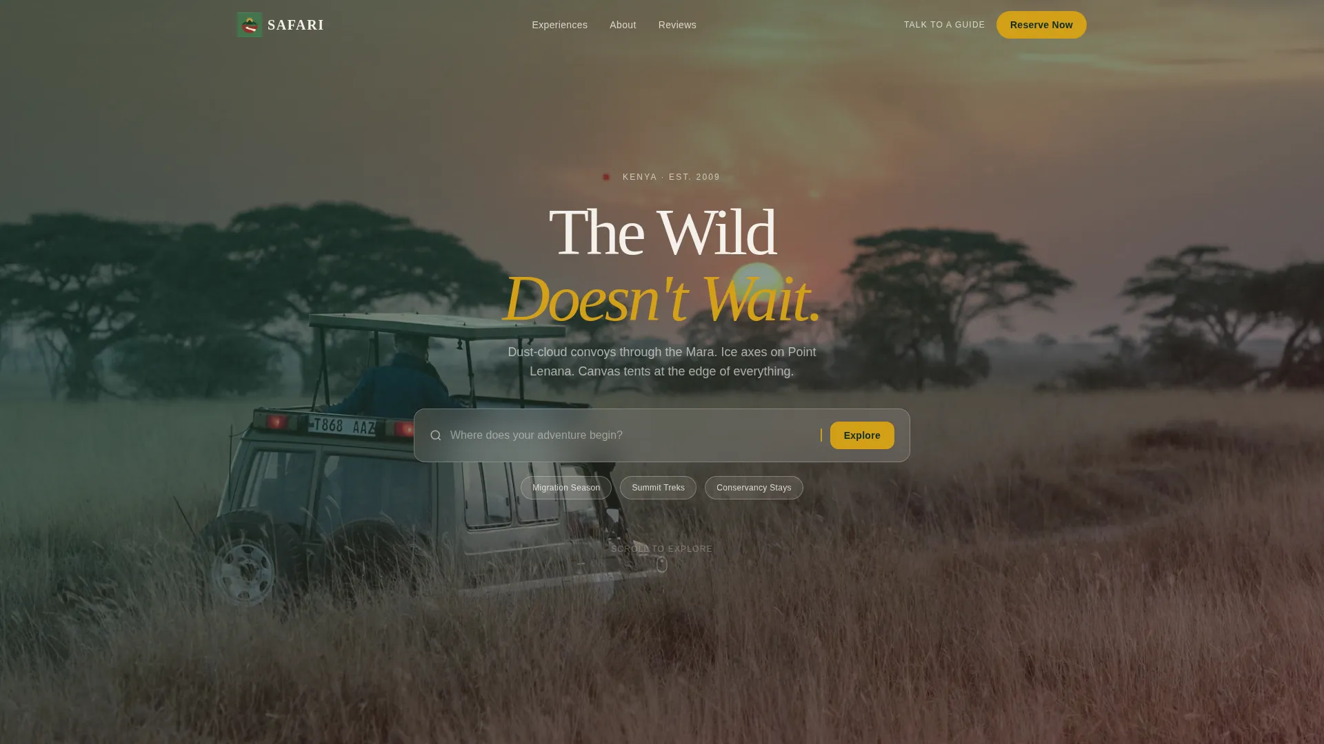
Aerial Search-Box Header
The header centres a search field against a slow-drifting drone shot of the Great Rift Valley. Ghost text reads "Where does your adventure begin?" and three toggle pills below it let visitors pre-filter by Migration Season, Summit Treks, or Conservancy Stays before they have even typed a word.
Staggered Masonry Grid
Cards vary slightly in size and load with a subtle parallax drift, creating the documentary rhythm of cutting between intimacy and spectacle. The first row features close-up detail shots; the second row opens to wide aerial and landscape frames, so the page breathes between scales.
Autoplay Micro-Video Cards
Every third card in the masonry grid is a three-second, audio-free autoplay clip. These short loops keep the grid alive without demanding attention, giving the layout a pulse that static images alone cannot deliver.
Stepped Registration Modal
Clicking "Reserve Your Departure" opens a three-panel modal. Panel one collects departure window and adventure type. Panel two captures group size, dietary or medical notes, and passport country. Panel three takes name, email, and WhatsApp number, with an optional toggle to receive the packing list immediately as a micro-conversion.
Floating Bottom-Bar Call to Action
A persistent bar carrying the gold "Reserve Your Departure" button pins to the viewport bottom after the first scroll. It stays visible throughout the page, ensuring the primary action is always one tap or click away without interrupting the visual experience above.
WhatsApp Deep-Link Secondary Path
Below the masonry grid, a "Talk to a Guide" link opens a WhatsApp conversation with a pre-filled message. This gives visitors who are not ready to commit through the modal a low-friction, high-trust alternative contact route.
Page sections overview
| Section | Purpose |
|---|---|
| Aerial search header | Anchors intent with a drone backdrop and three filter toggle pills |
| Masonry card grid | Builds desire through staggered photo and micro-video storytelling |
| Floating registration bar | Keeps the primary call to action visible after first scroll |
| Stepped booking modal | Collects departure details across three focused panels |
| WhatsApp guide link | Offers a direct, pre-filled secondary contact path |
Design & branding system
The Rainforest colour system drives every visual decision on this page. The palette was chosen to feel like the landscape itself rather than a generic travel brand.
- Canopy green (#1B4332) anchors section backgrounds and the navigation bar; volcanic soil red (#7B2D26) marks active states and urgency indicators; morning mist ivory (#F5F1EB) creates breathing room between dense masonry cards
- Sun-through-leaves gold (#D4A017) is reserved exclusively for call-to-action buttons and hover states, so every interactive element catches the eye the way a campfire ember does at dusk
- The Adventure Terrain theme and Cinematic Sequence creative direction together produce a layout that feels documentary rather than promotional
Mobile & speed optimization
The masonry layout is designed to reflow cleanly across screen sizes. Touch-friendly tap targets and a compact modal panel flow ensure the registration experience works as well on a phone in the field as it does on a desktop.
- The floating bottom bar adapts to thumb-reach zones on mobile viewports, keeping the primary call to action accessible without requiring a scroll back to the top
- Micro-video cards use silent autoplay, which avoids audio permission prompts on mobile devices and keeps the browsing experience uninterrupted
How this template helps you convert
The page is structured to move visitors from passive observation to active registration in a deliberate sequence.
- The search-box header captures intent immediately, letting visitors self-select their adventure type before they commit to reading anything, which means the masonry content they scroll through already feels personally relevant
- The masonry grid with micro-video cards holds attention long enough to build genuine desire, so by the time the floating bar becomes visible, visitors are primed rather than interrupted
- The three-panel modal lowers form anxiety by breaking a complex inquiry into three small, logical steps, and the instant packing-list toggle gives hesitant visitors a low-stakes first action that keeps them inside the conversion funnel
Other information about this template
This template sits at the intersection of the Travel and Hospitality category and the Kenya Adventure Tour niche. A few additional details worth noting before you deploy it.
- The template style is Masonry or Pinterest layout, meaning card order and sizing can be adjusted to reflect your own photo and video library
- The landing page direction is Event Registration, making it well suited to departures with fixed windows such as the Great Migration season in July through October
- Toggle pill labels in the header (Migration Season, Summit Treks, Conservancy Stays) are editable and can be renamed to match your specific product tiers
- The pre-filled WhatsApp message text is fully customisable, so you can tailor the opening line to match your brand voice or guide team name


Theme
Adventure Terrain
Creative direction
Cinematic Sequence
Color system
Rainforest
Style
Masonry/Pinterest
Direction
Event Registration
Page Sections
Aerial Great Rift Valley Search Header
Documentary Masonry Card Grid
Silent Autoplay Micro-video Cards
Three-panel Stepped Registration Modal
Scroll-triggered Floating Action Bar
Whatsapp Deep-link Guide Contact
Related questions
Can I use my own photos and videos in the masonry grid?
Does the stepped modal send booking data somewhere automatically?
Can I rename the three toggle pills in the search header?
Is this template suitable for a small operator with only one tour product?
When does the floating bottom bar first appear?


