South Africa Travel Specialist Booking Website Template
Savanna is a masonry-style landing page built for boutique South Africa tour operators. It presents private game reserve itineraries, Cape Winelands journeys, and Indian Ocean coastal routes through a cinematic editorial grid. Each journey card carries its own call to action, while a persistent bottom bar invites visitors to design a bespoke trip from scratch.
by Rocket studio
Quick summary
Savanna is a luxe minimal landing page for a South Africa safari and multi-journey operator. It opens with a full-viewport portrait header, then unfolds into a masonry editorial grid of curated itineraries. Each card sells a distinct landscape. A secondary bespoke inquiry panel catches visitors who want something entirely their own.
Who this template is for
This template is built for boutique travel businesses that sell experience-led South Africa itineraries rather than commodity packages. It suits operators who need their visual storytelling to do the heavy lifting before a single word of copy is read.
- Boutique safari and multi-journey operators combining game reserves, wine estates, and coastline
- Honeymooner and private family group specialists who position on quality over price
- Travel designers offering bespoke itinerary planning with a defined inquiry process
What problem this template solves
Most travel landing pages present itineraries as a flat list, which strips the sense of discovery from the browsing experience. When a visitor cannot feel the difference between a Big Five safari and a Garden Route slow road, they compare on price and leave.
- The masonry grid recreates the feeling of leafing through a luxury editorial, making each journey feel distinct
- The funneling row structure moves visitors from broad signature trips to seasonal specials to bespoke-only options, building a sense of exclusivity as they scroll
- The persistent bespoke inquiry panel captures undecided visitors without interrupting the browsing flow
What you get with this template
Savanna delivers a complete single-page layout that handles both itinerary browsing and bespoke inquiry in one cohesive flow. The design is editorially rich and commercially purposeful at the same time.
- A full-viewport vertical portrait header with a cinematic headline and gentle scroll cue
- A masonry journey grid with staggered card heights, hover reveal states, and per-card calls to action
- A persistent bottom bar with a slide-out bespoke inquiry panel including travel dates, party size, experience checkboxes, and an email field
Feature list
This template brings together the specific layout components and interaction patterns described below.
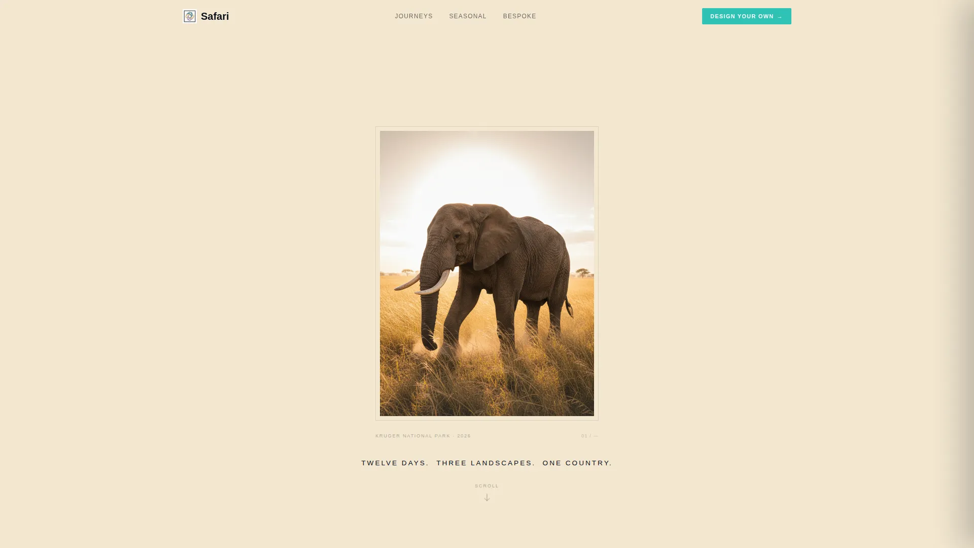
Cinematic Portrait Header
A single vertical image fills the full viewport on load, framed with generous champagne margins so the photograph reads like a gallery print. The headline sits beneath in light tracked-out sans-serif. No button interrupts the mood at this stage, only a subtle scroll cue that invites the visitor downward.
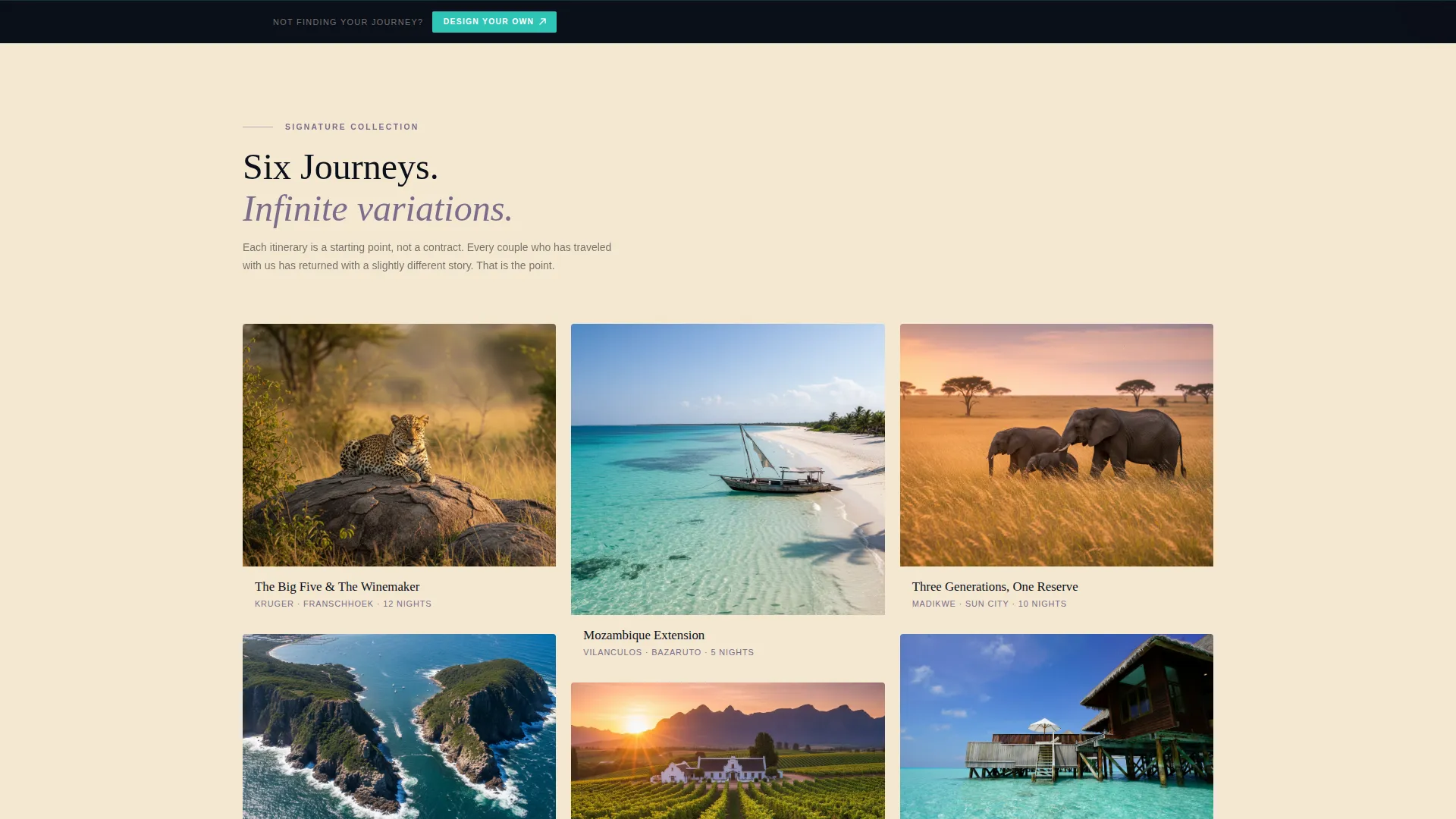
Masonry Editorial Journey Grid
Cards are staggered at varying heights across the grid, mixing portrait wildlife photography with landscape aerials and tight detail shots. Hovering any card lifts it slightly and reveals the journey duration, a price-from figure, and a one-sentence hook before the call to action appears.
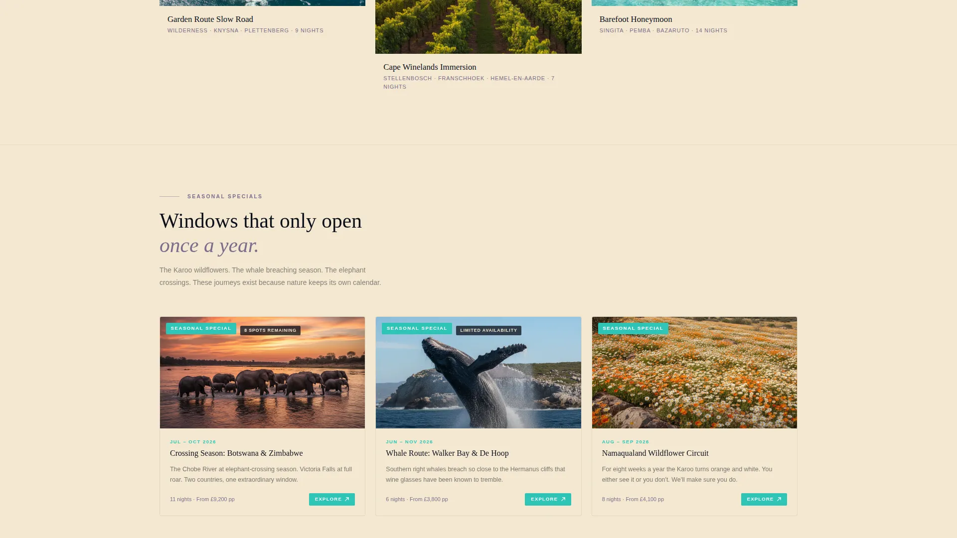
Progressive Exclusivity Row Structure
The grid narrows in scope as the visitor scrolls. Broad signature itineraries appear first, then seasonal specials, then bespoke-only journeys. Each row feels more private than the one above it, guiding visitors toward a natural inquiry moment.
Per-Card Journey Call to Action
Every masonry card carries its own "Explore This Journey" link. This directs the visitor to a dedicated itinerary page, keeping each trip's narrative self-contained and reducing friction for the motivated buyer.
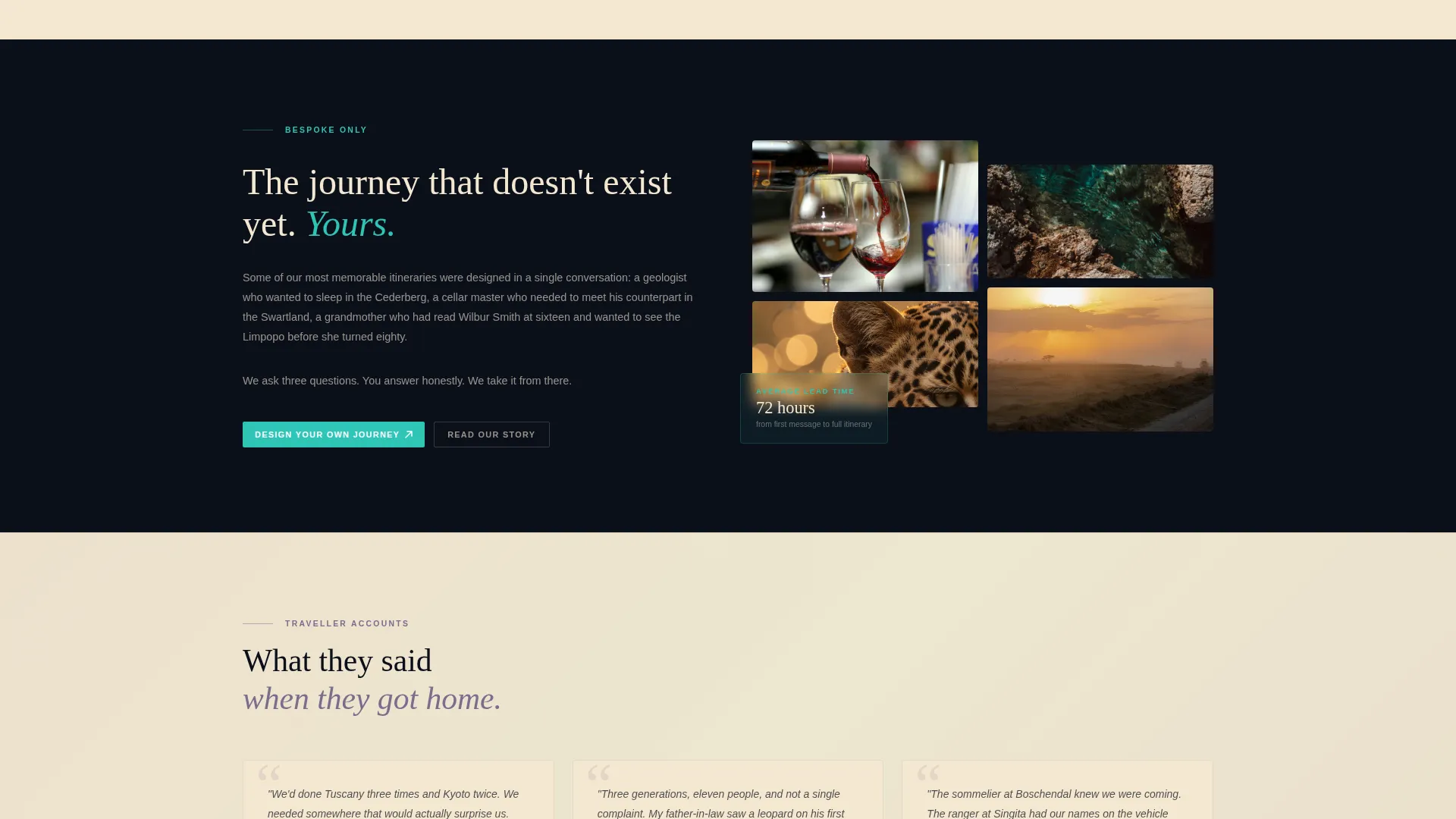
Persistent Bespoke Inquiry Bar
A fixed bottom bar remains visible throughout the entire scroll journey. Clicking "Design Your Own" opens a slim slide-out panel where visitors choose travel dates, party size, must-see experiences, and leave an email address.
Northern Lights Color System
The four-color palette of aurora black, celestial teal, soft violet dusk, and warm champagne is applied consistently across typography, interactive elements, section dividers, and card backgrounds to create a unified and immediately recognizable visual identity.
Page sections overview
| Section | Purpose |
|---|---|
| Viewport Portrait Header | Opens with full-height cinematic image and headline |
| Masonry Journey Grid | Displays curated itinerary cards in staggered editorial layout |
| Signature Itinerary Row | Presents broad flagship journeys first |
| Seasonal Specials Row | Narrows focus to time-sensitive curated options |
| Bespoke Journeys Row | Highlights private and made-to-order itineraries |
| Persistent Inquiry Bar | Anchors bespoke inquiry panel at bottom of viewport |
Design & branding system
The visual identity follows a Luxe Minimal theme built on the Northern Lights color system. Every color has a defined role so the palette reads as intentional rather than decorative.
- Aurora black (#0B0F1A) anchors all typography and navigation; celestial teal (#2EC4B6) marks interactive elements and itinerary tags
- Soft violet dusk (#7B6D8D) appears in section dividers and gradient washes behind testimonial areas; warm champagne (#F4E8D1) fills card backgrounds and hover states
- Typography uses a light tracked-out sans-serif for headlines, keeping the editorial mood consistent from header to the deepest grid row
Mobile & speed optimization
The masonry layout adapts responsibly across screen sizes so the editorial quality carries over to smaller viewports. Card staggering and hover states are considered for touch-based browsing environments.
- Portrait cards reflow naturally into a single-column stack on mobile without losing the height variation that gives the grid its luxury feel
- The slide-out bespoke panel is designed as a slim overlay, keeping the interaction lightweight and unobtrusive on any device
How this template helps you convert
Savanna is built around a two-path conversion model. The photography does the selling first, and the calls to action arrive only once desire has already formed.
- Each masonry card carries its own "Explore This Journey" call to action, directing motivated visitors to a dedicated itinerary page at the exact moment of peak interest.
- The persistent bottom bar offers a low-pressure secondary path throughout the entire scroll, so visitors who browse without clicking a card still have a clear next step.
Other information about this template
Savanna is a strong fit for South Africa tour operators who want their website to feel as considered as the journeys they sell. The template's editorial framing positions itineraries as curated experiences rather than products.
- The template is designed for the Travel and Hospitality category, specifically the South Africa travel niche
- The Curated Collection creative direction is well suited to operators building a portfolio of named signature trips
- The Marketplace and Multi conversion layout supports both individual itinerary sales and open-ended bespoke inquiry in parallel
Theme
Luxe Minimal
Creative direction
Curated Collection
Color system
Northern Lights
Style
Masonry/Pinterest
Direction
Marketplace/Multi
Page Sections
Cinematic Portrait Header
Masonry Editorial Journey Grid
Progressive Exclusivity Row Structure
Per-card Journey Call to Action
Persistent Bespoke Inquiry Bar
Northern Lights Color System
Related questions
Can I display more than three types of itineraries in the masonry grid?
Does the bespoke inquiry panel work as a standalone contact form?
Can I replace the header image with my own photography?
What kind of photography works best in the masonry cards?
Is this template suited to operators who sell only one type of journey?


