Authoritative Senior Insurance Landing Page Template
Shield is a dashboard-style senior life insurance landing page built for guaranteed issue providers. It pairs a dark, data-driven visual identity with a five-step eligibility quiz and interactive plan comparison grids. Designed for adults 75 and older and their adult children, this template replaces uncertainty with clear numbers and a frictionless path to pre-qualification.
by Rocket studio
Quick summary
Shield is a single-page, dashboard-style landing page template built for senior life insurance providers. It combines a full-bleed midnight hero with animated data metrics, stacked plan comparison grids, and a five-step progressive eligibility quiz. The result is a conversion-focused experience that earns trust before it asks for an email address.
Who this template is for
This template is built for senior life insurance providers who serve applicants that standard carriers often turn away. It works for direct-to-consumer insurance brands, independent brokers, and financial services agencies targeting older adults and their families.
- Senior life insurance providers offering guaranteed issue or graded benefit plans
- Brokers and agencies serving adults aged 75 and older, including veterans denied elsewhere
- Financial services teams whose secondary audience includes adult children managing a parent's coverage needs
What problem this template solves
Most insurance landing pages rely on stock photography and vague reassurances. Seniors and their families arrive with real anxiety: will they qualify, how much will it cost, and how long does it take? This template replaces emotional noise with structured data and a clear path forward.
- Visitors cannot easily compare Guaranteed Issue, Simplified Issue, and Graded Benefit plans side by side
- Standard lead forms ask for contact information before showing any useful results, creating friction at the worst moment
- Trust signals are buried or missing entirely, leaving high-intent visitors with no reason to stay
What you get with this template
You get a fully structured, single-page layout built around financial-dashboard precision and progressive disclosure. Every section is designed to reduce hesitation and move the visitor one step closer to submitting their information.
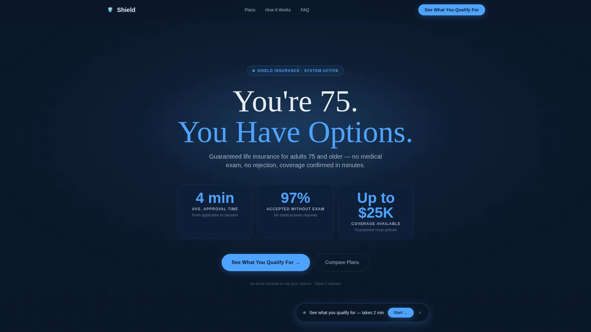
- A full-bleed hero with animated count-up metrics and a radial glow effect that signals authority immediately
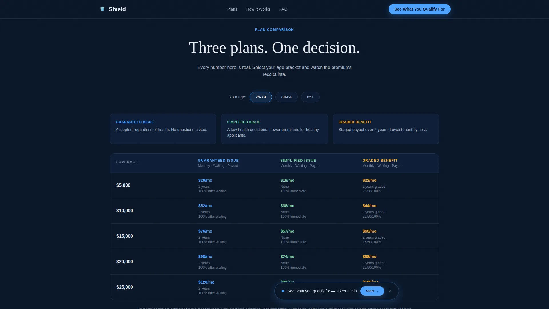
- A dynamic plan comparison grid covering three plan types across multiple coverage tiers and age filters
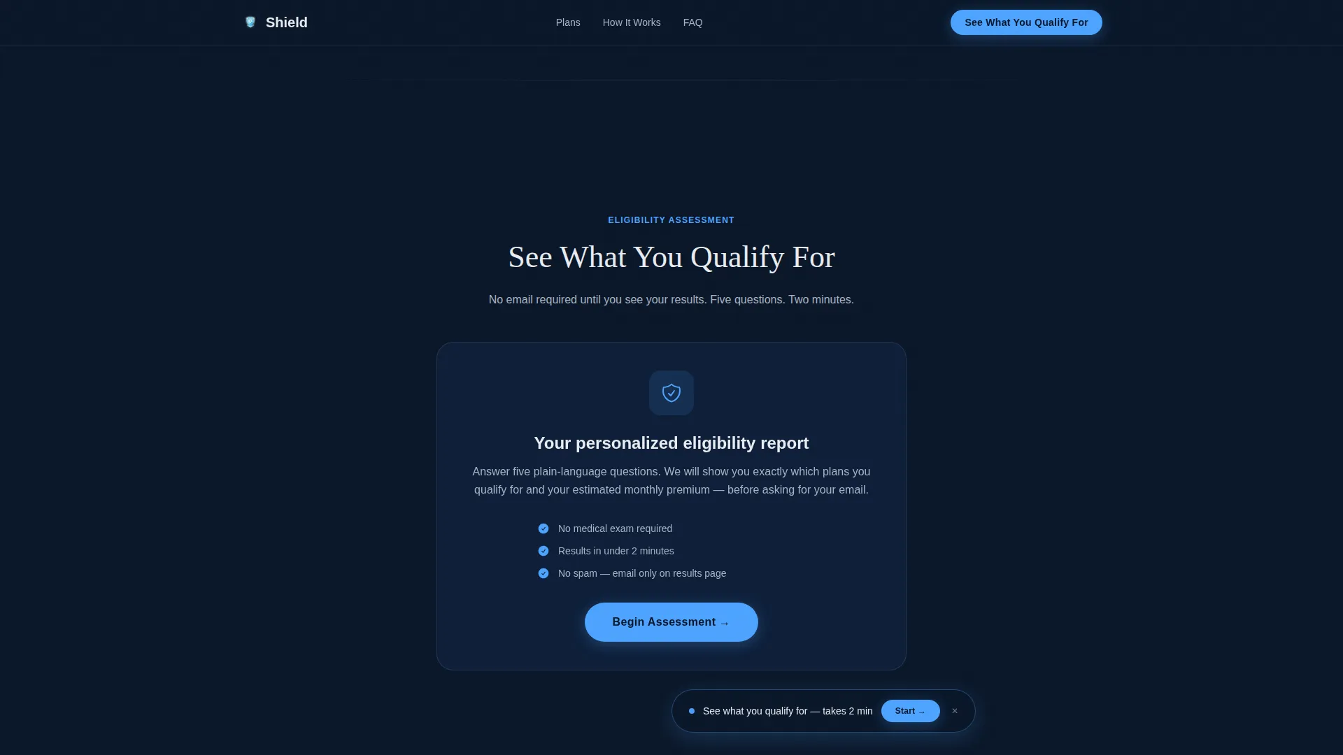
- A five-step quiz with a glowing progress bar that delivers a pre-qualification summary before asking for contact details
Feature list
This template is built with a specific set of interactive and visual features grounded in the source brief.
Animated Hero with Count-Up Metrics
The hero section opens on a deep midnight background with a radial pulse-blue glow at center screen. Three dashboard-style data widgets count up from zero, displaying policy approval time, acceptance rate without a medical exam, and coverage range. The effect is purely light and data, with no photography.
Dynamic Plan Comparison Grid
Three stacked data grids compare Guaranteed Issue, Simplified Issue, and Graded Benefit plans. Columns include monthly premium at multiple coverage tiers, waiting periods, and payout structures. Visitors set their age bracket and desired coverage amount at the top of the section, and the grid data adjusts to match their inputs. Rows highlight in pulse blue on hover.
Five-Step Eligibility Assessment Quiz
The primary call to action leads into a progressive five-step form. Each step occupies its own screen: age bracket selection, a coverage amount slider from five thousand to twenty-five thousand dollars, a plain-language health status selector, a tobacco use toggle, and a beneficiary relationship dropdown. A glowing horizontal progress bar tracks completion across the top of each step.
Pre-Qualification Results Before Email Capture
The quiz delivers a personalized eligibility summary and estimated premium range on a dedicated results screen. Contact information is requested only after the visitor has seen their specific results. This sequence places the email capture at the moment of highest trust.
Floating Call-to-Action Pill
A floating pill button labeled "See What You Qualify For" appears at the bottom of the viewport after three seconds of scroll activity. It persists as the visitor moves through the comparison grids, keeping the primary action visible without interrupting the data review.
Trust and Proof Section
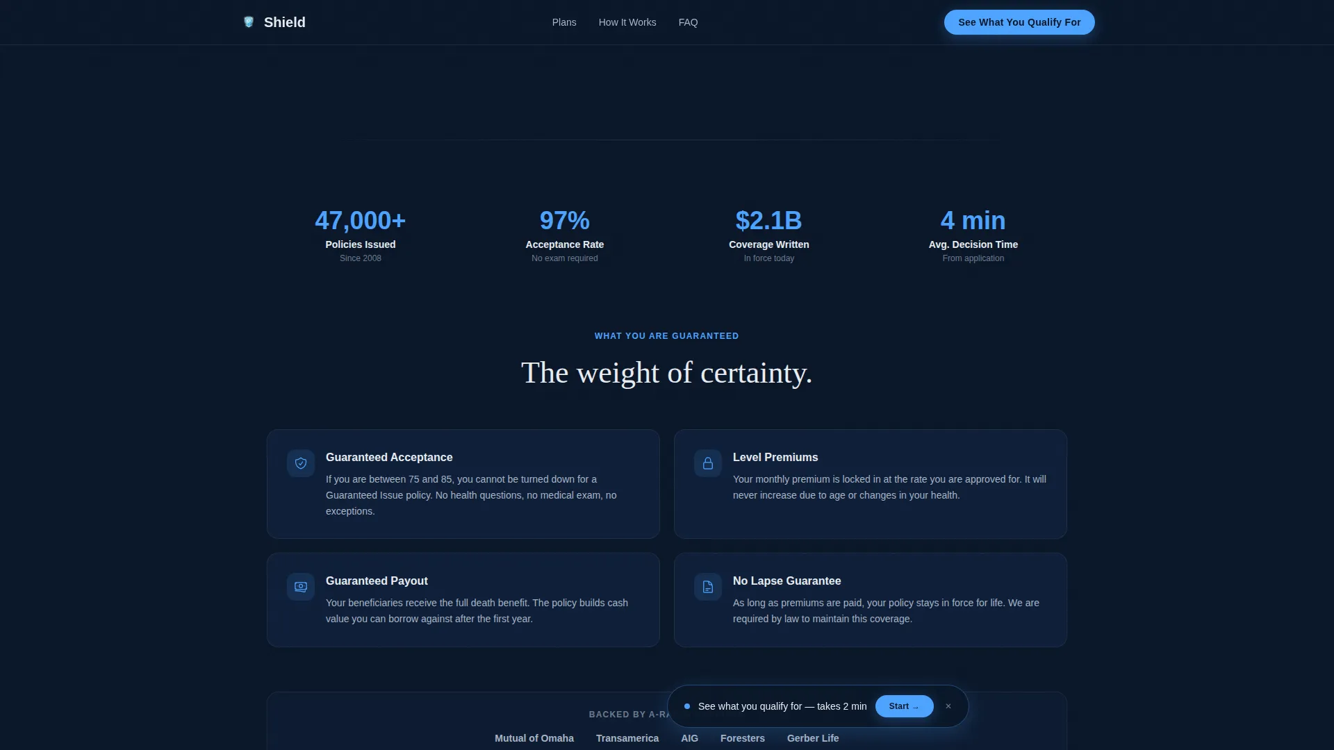
A dedicated section displays approval rate percentages, average payout speed, carrier count, and specific dollar amounts as social proof. Policy guarantee callouts reinforce the no-medical-exam promise for the target age group.
Page sections overview
| Section | Purpose |
|---|---|
| Hero Dashboard | Establishes authority with animated metrics and the "You're 75. You Have Options." headline |
| Plan Comparison Grid | Lets visitors filter and compare three plan types by age and coverage amount |
| Eligibility Assessment Quiz | Guides visitors through five steps to generate a personalized pre-qualification result |
| Trust and Proof | Displays approval stats, carrier callouts, and policy guarantee statements |
| Results Call to Action | Shows the pre-qualification summary and collects contact information at peak trust |
| Footer | Single linear row with essential links and legal context |
Design & branding system
The visual identity follows a Corporate Precision theme. Every color and typographic choice reinforces the feeling of a financial system that has already run the numbers before the visitor arrived.
- Color palette: deep terminal navy (#0A1628) for full-bleed backgrounds, policy-paper white (#E8ECF1) for card surfaces and data cells, steel slate (#3D5A80) for secondary containers and divider rules, and pulse blue (#4DA3FF) reserved exclusively for interactive elements, progress indicators, and glow effects
- Typography: DM Sans handles all data labels, user interface text, and form elements; Fraunces is used for editorial headlines to create contrast between authority and warmth
- Visual style: no photography or lifestyle imagery; the aesthetic is entirely numerical and structural, combining a dark financial terminal feel with the quiet weight of a leather-bound policy folder
Mobile & speed optimization
The template is designed desktop-first to honor the financial dashboard aesthetic. The interactive grids and quiz are built as client-side components layered over a static hero foundation.
- Desktop layout is the primary experience, with a mobile fallback that preserves the quiz flow and comparison data in a stacked, readable format
- Static hero rendering keeps the above-the-fold section light while the interactive quiz and grid components load as separate client elements
- High-animation features including count-up numbers, radial glow, row highlights, and progress bar effects are scoped to client components to avoid blocking the initial page render
How this template helps you convert
This template is structured to reduce friction at every stage of the visitor journey and place the highest-commitment ask at the moment of lowest resistance.
- The hero counts up real data points in the first few seconds, replacing vague reassurance with specific numbers that signal the provider has already done the work. Visitors see authority before they scroll.
- The comparison grid lets visitors self-select their plan type through filtering. By the time they reach the quiz, they have already narrowed their options and are psychologically invested in completing the process.
- The quiz withholds the email capture until the results screen, where the visitor has seen their personalized eligibility and estimated premium. Trust is at its peak at that exact moment, making the contact request feel like a natural next step rather than a barrier.
Other information about this template
This template is built within the Finance and Insurance category, specifically targeting the senior life insurance niche for adults 75 and older. A few additional details are worth noting for buyers evaluating this template.
- Localization defaults are set for English, United States dollar amounts, and MM/DD/YYYY date formatting
- The footer follows a linear single-row pattern, keeping the layout clean and minimal at the bottom of the page
- Animation intensity is set to high across the template, covering count-up numbers, the radial glow pulse, row hover highlights, progress bar glow, and step transition effects
- The quiz flow is designed so that no email address is required until the results screen, reducing drop-off during the assessment steps
- The template supports a secondary audience of adult children in their late forties and surviving spouses on fixed incomes, not just the primary senior applicant
Theme
Corporate Precision
Creative direction
Comparison Journey
Color system
Midnight Blue
Style
Dashboard/Data Grid
Direction
Quiz/Assessment
Page Sections
Animated Hero with Count-up Metrics
Dynamic Plan Comparison Grid
Five-step Eligibility Assessment Quiz
Pre-qualification Results Before Email Capture
Floating Call-to-action Pill
Trust and Proof Section
Related questions
Who is the primary audience for this landing page template?
Does the quiz require an email address to get started?
Can the plan comparison grid be filtered by age and coverage amount?
What visual style does this template use?
Is this template suitable for a broker or agency rather than a direct carrier?



