Pre-Retiree Travel Insurance Landing Page Template
The Safeguard Data Command Pre-Retiree Travel Insurance Landing Page Template is a bold, split-screen insurance landing page built for travel insurance brokerages serving travelers aged 55 to 70. It pairs animated cost counters, a scrolling comparison journey, and a five-step coverage quiz to convert visitors into qualified leads. The Data Command design makes every number impossible to ignore.
by Rocket studio
Quick summary
This is a high-impact insurance landing page built for pre-retiree travel insurance brokerages. The page uses a 50/50 split-screen layout, gold-on-navy animated counters, and a scroll-driven comparison journey to show visitors exactly what standard policies miss. A five-step quiz guides potential customers toward a personalized coverage profile, while an email-capture path catches visitors who are not yet ready to commit.
Who this template is for
This insurance landing page is designed for brokerages and insurance providers who focus on travelers aged 55 to 70. If your insurance business serves clients with managed health conditions who still want to explore the world, this landing page puts your value proposition front and center. The design and form structure are built specifically for that audience's concerns, not for a generic insurance company selling home insurance or auto insurance to everyone.
- Travel insurance brokerages targeting pre-retirees with pre-existing conditions
- Insurance providers who want to generate more leads from bucket-list travelers
- Brokers who need a clear, focused insurance landing page to replace a cluttered website
What problem this template solves
Standard travel insurance landing page designs often bury the most relevant details in dense paragraphs. For a pre-retiree audience, that creates distrust fast. These visitors have specific worries: a medical emergency abroad, a denied claim, a policy that excludes a cardiac history. The template solves this by making the gap between standard insurance products and custom pre-existing condition coverage visible and immediate.
- Standard insurance landing page examples often present generic copy that does not speak to travelers with health histories
- Visitors with complex needs leave quickly when a landing page fails to address their specific coverage concerns
- Brokers lose potential customers because their page cannot convince visitors that custom plans are worth the conversation
What you get with this template
This landing page template gives you a fully structured, section-led insurance landing page ready for your brokerage's content and branding. Every section has a clear goal and a focused layout. The form is short by design, keeping form fields to the essentials so visitors are not overwhelmed before they reach the call to action.
- A 50/50 split-screen insurance landing page with animated counters, a Comparison Journey scroll section, and a five-step quiz form
- A secondary email-capture path using a downloadable pre-existing condition checklist to build trust with visitors not yet ready for a free quote
- A complete Data Command visual system using deep navy, decisive gold, and starched white throughout the page
Feature list
This insurance landing page template ships with a focused set of key features designed to drive conversions and build trust with a discerning pre-retiree audience.
Animated Cost Counter Hero
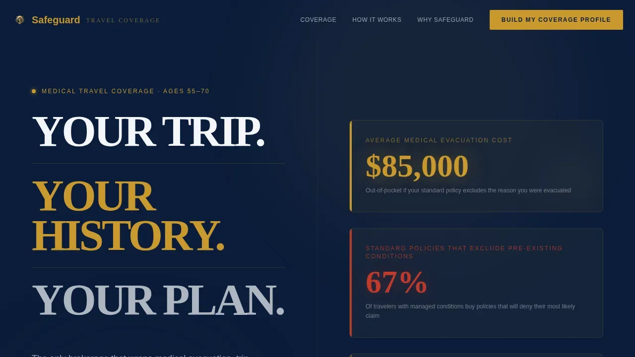
Instead of a traditional hero image, this landing page opens with a split-screen Stacked Type Tower. The right half displays real-time animated counters ticking upward in gold on navy: average medical evacuation cost, percentage of standard policies that exclude pre-existing conditions, and number of travelers denied claims last year. The numbers are the visual. They make the case before a visitor reads a single paragraph.
Scroll-Driven Comparison Journey
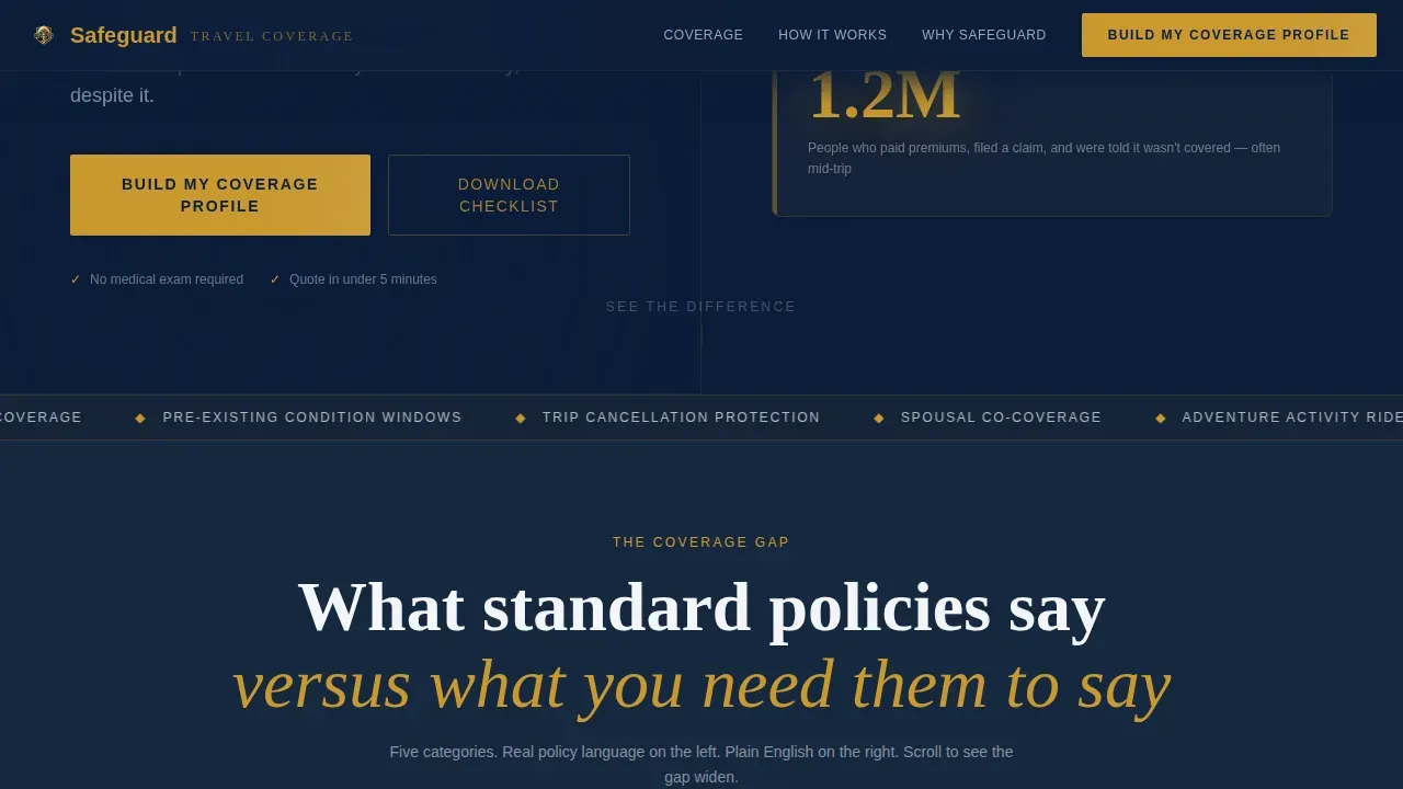
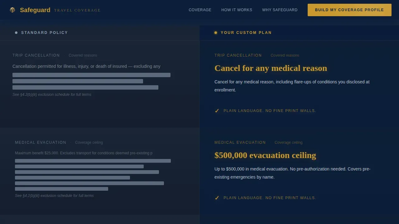
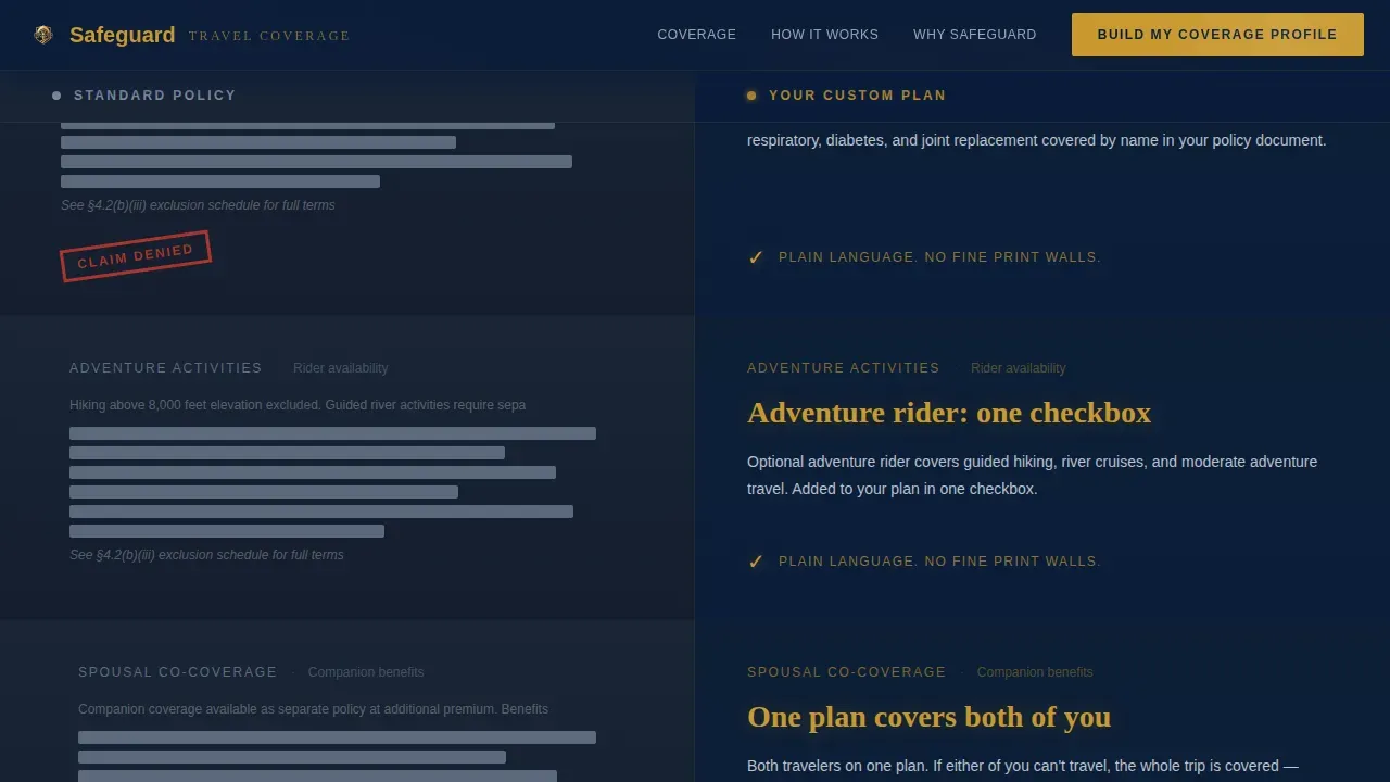
Each scroll section splits the screen between a standard policy view on the left and a custom plan view on the right. The left side uses gray tones, redacted text, and fine-print walls. The right side uses clean gold checkmarks and plain-language coverage summaries. Comparisons escalate across trip cancellation, medical evacuation, pre-existing condition windows, adventure-activity riders, and spousal co-coverage. The contrast does the persuasive copy work for you.
Five-Step Coverage Quiz
The primary call to action, labeled "Build My Coverage Profile," launches a progressive five-step assessment form. Each step occupies the full split-screen layout: question on the left, a contextual insurance statistic on the right. Steps cover travel destination and dates, traveler age and companion details, medical history, activity level, and budget range. This keeps users engaged throughout the form and continues the comparison education inside the quiz itself.
Email Capture with PDF Checklist
A secondary conversion path offers visitors a downloadable PDF listing twelve common exclusion clauses to check in any travel insurance policy. This path captures visitor information via email for leads who are not yet ready to request a free quote. Insurance landing pages that build an email list this way allow the insurance company to stay relevant with potential customers over time, improving overall conversion rates.
Trust and Social Proof Section
A dedicated trust section displays aggregate social proof statistics, claim approval rates, and evacuation cost data. Trust signals are essential on any good insurance landing page, especially for a target audience that has likely experienced a denied claim or heard a cautionary story. Star ratings, credibility figures, and clear coverage ceilings give visitors the confidence to sign up or move forward.
Footer with Horizontal Flow Pattern
The page closes with a structured footer using a horizontal flow layout. This section keeps navigation clean and avoids overwhelming visitors at the bottom of a long page. It reinforces the brokerage's service identity and provides an obvious place for secondary links.
Page sections overview
| Section | Purpose |
|---|---|
| Hero: Cost Counters | Animated gold-on-navy counters reveal evacuation costs and denial rates instantly |
| Comparison Journey Scroll | Side-by-side contrast of standard versus custom plan coverage builds urgency |
| Coverage Escalation | Escalating comparisons cover pre-existing conditions, evacuation, adventure riders, spousal co-coverage |
| Quiz Assessment Form | Five-step form guides visitors through a personalized coverage profile |
| Trust and Social Proof | Aggregate stats, claim approval rates, and star ratings build credibility |
| Email Capture Section | PDF checklist offer captures emails from visitors not yet ready to quote |
| Footer Flow | Horizontal footer pattern closes the page cleanly |
Design & branding system
The design follows a Data Command theme. Think of it as the bridge of a well-run vessel at night: instruments glowing amber against a dark console, every reading legible, every detail accounted for. The result is an insurance landing page that feels authoritative without feeling cold.
- Deep command-deck navy (#0B1D3A) as the dominant background, officer-grade charcoal (#1E2A3A) for secondary panels, starched white (#F4F6F9) for data fields and body copy
- Decisive gold (#C9982E) reserved for call to action buttons, the cta button on the quiz, progress indicators, animated counters, and key coverage figures
- Fraunces heavy serif for display headings and the Stacked Type Tower, paired with DM Sans for body text and form labels to keep the page scannable and readable
Mobile & speed optimization
The landing page is built desktop-first to honor the 50/50 split-screen layout, with a responsive mobile stack for users on tablets and smartphones. Mobile-first optimization for travel insurance pages means ensuring the page loads fast and remains readable on smaller screens. A scannable layout with plenty of white space and short paragraphs helps avoid overwhelming visitors on any device.
- Desktop-first split-screen layout collapses to a clean single-column stack on mobile, preserving section order and quiz flow
- Animated counters and scroll-linked comparison sections are built with performance in mind so the page loads fast for all users
- Short paragraphs and white space throughout the page improve performance for readability on mobile, ensuring the insurance landing page keeps users engaged at every scroll depth
How this template helps you convert
This insurance landing page is designed with one clear goal: turning visitors into qualified leads. Every element on the page works toward that outcome. Companies using landing pages generate 55% more leads than those that do not, and this template is built to earn that result through structure, contrast, and clarity.
- The animated counter hero section creates immediate urgency, giving visitors a concrete reason to focus on the comparison before they scroll past the first screen
- The five-step quiz reduces friction by breaking the coverage assessment into manageable steps, making it easy for visitors to sign up or complete the form without feeling overwhelmed
- The secondary email-capture path with the downloadable checklist builds an email list from visitors who are not yet ready for a free quote, so the insurance business can continue to engage potential customers over time
Other information about this template
This landing page is a great example of how an insurance landing page can focus entirely on one target audience without trying to serve every insurance niche at once. Unlike a page that spreads across home insurance, auto insurance, and car coverage, this template keeps its focus narrow and its message sharp. That focus is what makes it a good insurance landing page for a pre-retiree travel insurance brokerage.
- Pre-retirees frequently need to disclose pre-existing conditions to qualify for waivers, and this template surfaces that disclosure step inside the quiz form naturally
- Travel insurance plans should highlight critical benefits such as emergency medical evacuation coverage and pre-existing condition waivers, and every section of this page does exactly that
- The design prioritizes clarity, scannability, and trust signals for a pre-retiree audience, following best practices for effective insurance landing page design
- Data safeguards protect sensitive health details during pre-existing condition screenings, and the template's form structure is designed to collect only the visitor information needed at each step
- Robust data practices ensure the date of the initial trip deposit is accurately recorded, which prevents disputes over eligibility for coverage protections in most cases
- Modern travel insurance is beginning to include cybersecurity features, and some policies offer real-time alerts if personal data is leaked while using public Wi-Fi abroad; this template can be adapted to surface those benefits in the comparison sections
- The page uses persuasive copy, catchy headline typography in the Stacked Type Tower, and bullet points throughout the comparison sections to keep the value proposition visible at every scroll depth
- Trust signals like industry awards, star ratings, and a better business bureau or business bureau accreditation badge can be added to the social proof section to further build trust with potential customers
- Insurance landing page examples that perform well tend to use short form fields, intuitive layout, and a strong call to action, and this template is structured to deliver all three
- Platforms such as Landingi, Unicorn Platform, Instapage, Unbounce, and ConvertFlow offer landing page builders for insurance teams who want to create and iterate on high converting landing pages without engineering support; this template provides a head start for any of those tools
- The "Download the Pre-Existing Condition Checklist" secondary call to action is a good insurance landing page strategy for capturing visitors who need more information before committing to a free quote
- Social proof in the trust section can include star ratings, aggregate review counts, and claim approval figures to convince visitors and guide visitors through the final decision
- Integrations with email marketing and analytics tools are common landing page builder features that can be connected after deploying this template to improve performance tracking and conversion rates
Theme
Data Command
Creative direction
Comparison Journey
Color system
Navy Authority
Style
Split Screen (50/50)
Direction
Quiz/Assessment
Page Sections
Animated Cost Counter Hero Section
Scroll-driven Comparison Journey
Five-step Coverage Quiz Form
Secondary Email Capture Path
Trust and Social Proof Section
Related questions
Who is the ideal insurance provider to use this landing page template?
Does the five-step quiz form require coding to customize?
Can I adapt this template for a health insurance landing page?
How does the email capture section help convert visitors not ready to quote?
What makes this a good insurance landing page for the pre-retiree market?



