Jobsite Safety Landing Page Template
SafeOps is a single-column construction safety landing page template built for platforms managing jobsite compliance. It combines a data command visual identity, a case study narrative flow, and a gated content offer to guide safety directors, general contractors, and project managers from awareness to action with confidence and clarity.
by Rocket studio
Quick summary
SafeOps is a high-impact landing page template for construction safety management platforms. It uses a dark ops-center visual system, a real-world case study narrative, and a gated resource offer to earn trust before asking for a conversion. The page flows in a single column from a full-width dashboard screenshot all the way to a multi-field download form.
Who this template is for
This template was built for teams selling or promoting jobsite safety platforms where credibility must be established before any form is filled. The ideal user already knows their audience is skeptical, time-pressed, and results-driven.
- Safety directors managing multiple active sites who need proof before committing to a new tool
- General contractors preparing for regulatory audits who want to see real outcomes, not marketing language
- Project managers inheriting outdated paper-based systems who are ready to act but need a clear reason to do so
What problem this template solves
Construction safety teams often lose trust at the top of a page because most safety software landing pages lead with features instead of outcomes. This template solves the credibility gap by leading with a dashboard screenshot and a structured case study before presenting any call to action.
- Visitors leave pages that feel generic; this template anchors them with a real operator story and specific results
- Gated resource offers fail when trust has not been built; the narrative earns the download before the form appears
- Safety professionals are trained to look for evidence; the case study format speaks directly to that instinct
What you get with this template
You get a fully structured single-column landing page designed around a content and resource destination strategy. Every section has a defined role in the conversion flow, from first impression to form submission.
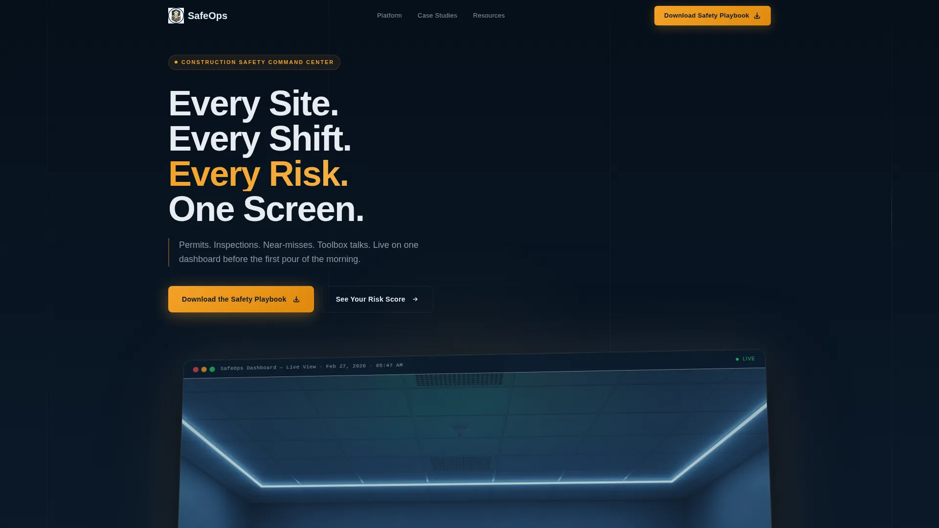
- A full-width perspective-tilted dashboard header with a pre-written headline and live-metric details
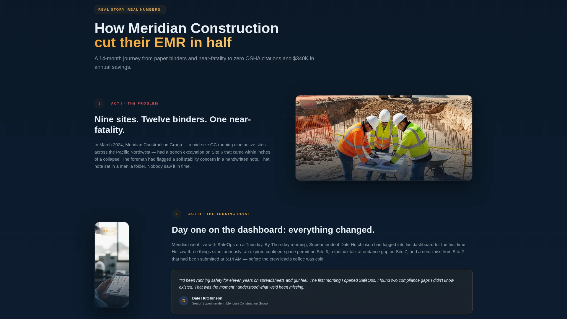
- A scrollable three-act case study section with named outcomes, incident data, and a superintendent perspective
- A gated "Download the Safety Playbook" form with three fields and a secondary mid-scroll risk assessment call to action
Feature list
This section covers the key built-in capabilities of the SafeOps landing page template as described in the source brief.
Full-Width Dashboard Header
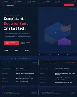
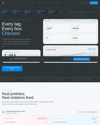
The header features a high-fidelity product screenshot placed on a slight perspective tilt against a deep navy background. It shows three sites in green compliance status, one flashing amber for an overdue inspection, an incident ticker reading zero recordables at 147 days, and a weather widget flagging wind advisories. A single headline sits above it: "Every Site. Every Shift. Every Risk. One Screen."
Case Study Narrative Section
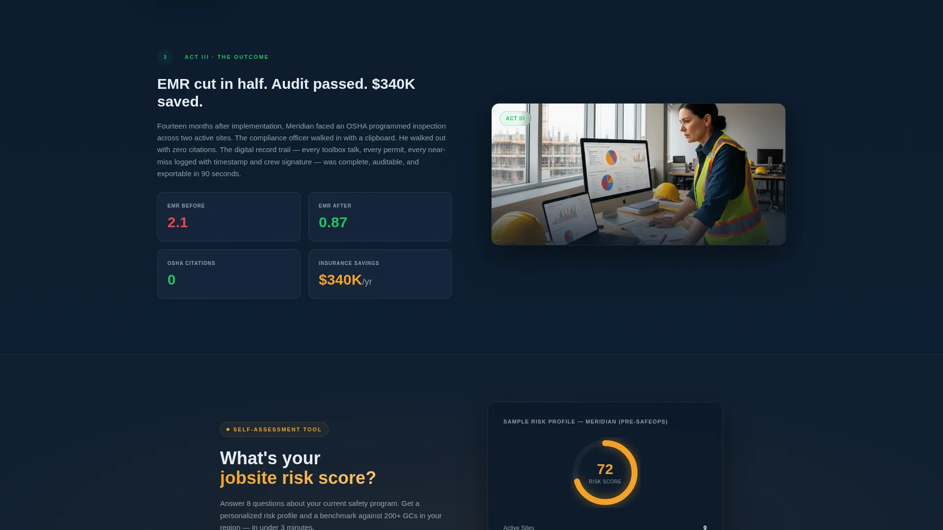
The page drops visitors into a three-act story about a mid-size general contractor with nine sites and an experience modification rate of 2.1. The narrative covers the problem, the implementation turning point, and the measurable outcome. Specific results include an experience modification rate reduced to 0.87, a passed regulatory audit with zero citations, and 340,000 dollars saved in insurance premiums.
Gated Resource Offer with Form
The primary conversion point is a "Download the Safety Playbook" offer for a 22-page guide to digitizing jobsite safety programs. The form collects three fields: work email, company name, and number of active sites. The form appears after the case study so trust is established before the ask.
Secondary Risk Assessment Call to Action
A second call to action, "See Your Risk Score," appears mid-scroll after the case study climax. It links to an interactive self-assessment. This gives visitors who are not yet ready to download a lower-commitment next step to stay engaged.
Data Command Color System
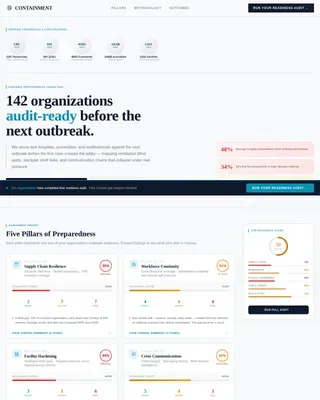
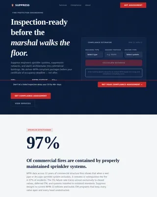
The template uses a four-color palette designed to feel like a control room at night. Deep ops-center navy dominates backgrounds, tactical slate separates content blocks, alert-state amber marks every interactive element and live metric, and interface white is used for typography and data labels. Every color decision has a functional intent.
Single-Column Scroll Flow
The entire page is built as one continuous vertical column. Each section is sequenced deliberately: header, case study setup, case study climax, secondary call to action, primary form, and closing context. Visitors are guided without distraction or branching navigation.
Page sections overview
| Section | Purpose |
|---|---|
| Dashboard Header | Establishes product credibility with a live-data screenshot and bold headline |
| Hero Headline | Sets the single-screen value proposition above the dashboard visual |
| Problem Setup | Opens the case study with scattered paper logs and a near-miss incident |
| Implementation Turning Point | Describes the first dashboard view and what it immediately revealed |
| Outcome Results Block | Delivers specific metrics: EMR, audit result, and insurance savings |
| Superintendent Quote | Adds human voice with a named operator describing a trench collapse catch |
| Risk Score call to action | Offers a mid-scroll interactive self-assessment as a secondary action |
| Playbook Download Form | Three-field gated form for the 22-page safety digitization guide |
Design & branding system
The visual identity follows a Data Command theme built entirely around a Midnight Blue color system. Dark surfaces make every data point feel active and visible, while amber creates the same instinctive attention as a caution light on a tower crane.
- Deep ops-center navy (#0B1929) dominates all background surfaces across every section
- Tactical slate (#1B2A41) separates content blocks and creates visual depth without breaking the dark theme
- Alert-state amber (#F4A127) marks all interactive elements, live metrics, and calls to action; interface white (#E8ECF1) is used for all body text and data labels
Mobile & speed optimization
The single-column layout is inherently suited for narrow screens. Every section in the scroll flow is stacked vertically, which removes the need for complex grid reflows on smaller viewports.
- The full-width dashboard screenshot and all content blocks are designed to resize within a single-column container
- The gated form with three fields keeps the mobile input experience minimal and friction-free
- Amber interactive elements and white text on dark backgrounds maintain strong visual contrast at any screen size
How this template helps you convert
The conversion strategy is built into the page sequence itself. Every section earns the next one, and the form only appears after the case study has done its job.
- The dashboard header creates immediate credibility by showing the product working in a real shift context, so visitors understand the platform before reading a single feature bullet
- The case study narrative builds progressive trust through specific, verifiable outcomes, making the gated resource feel like a natural next step rather than an interruption
- The secondary "See Your Risk Score" call to action captures mid-funnel visitors who are curious but not yet ready to download, keeping them engaged within the page
Other information about this template
This template is part of a broader safety consulting and services category and is particularly well suited for platforms operating in construction safety management. It is designed as a content and resource destination landing page, not a product features page.
- The Engineering Blueprint theme referenced in the matched intersection context informs the structured, evidence-first layout approach
- The Card Grid modular style noted in the intersection fields is expressed here through the case study's scroll segments, each acting as a self-contained content block
- The template suits niches such as construction site safety auditing, jobsite risk management platforms, and safety consulting services for contractors

Theme
Engineering Blueprint
Creative direction
Step-by-Step Guide
Color system
Midnight Blue
Style
Card Grid (Modular)
Direction
Content/Resource
Page Sections
Full-width Dashboard Header
Three-act Case Study Narrative
Gated Playbook Download Form
Mid-scroll Risk Assessment Call to Action
Data Command Color System
Related questions
Who is the primary audience for this landing page template?
What is the main conversion goal of this template?
Does this template require a real case study to work?
Why does the color palette use amber and navy?
How many fields does the gated download form include?