Middle Eastern Cuisine & Dining Certified Booking Website Template
Saj is a hero-dominant landing page template built for a Lebanese fast-casual restaurant. It pairs a hand-drawn saj dome illustration with a scroll-linked sensory build sequence, a tight menu grid, and an inline three-step booking widget. The result is a warm, appetite-first page that moves downtown diners, weekend families, and catering managers from first glance to reservation in a single scroll.
by Rocket studio
Quick summary
Saj is a single-page restaurant template designed to make visitors hungry before they ever tap "Reserve a Table." The hero illustration, scroll-triggered sensory build, and inline booking widget work together to carry three distinct audiences, lunch regulars, weekend families, and catering buyers, straight to a confirmed reservation or catering inquiry.
Who this template is for
This template is built for Lebanese fast-casual restaurants that serve a mixed audience across lunch, dinner, and private events. It works especially well for owners who want a page that feels as handcrafted as the food itself.
- Downtown restaurant operators targeting office workers who want fast, authentic Lebanese food
- Family-friendly dining spots that take weekend bookings and mixed grill orders
- Catering managers and restaurant teams promoting event spreads for corporate clients
What problem this template solves
Most restaurant landing pages feel like digital menus dropped into a generic layout. They list dishes without making anyone want them, and they bury the booking option three scrolls deep. Saj fixes that by putting sensation before information.
- Visitors read a menu but feel nothing, this template builds appetite through a scroll-linked plate construction sequence before the menu grid even appears
- Booking flows that open new tabs or pages lose customers, the inline widget handles date, party size, and time slot without leaving the page
- Catering leads go cold with no clear entry point, the "Feed Your Next Meeting" callout gives catering managers a direct headcount and date form on the same page
What you get with this template
You get a fully structured, single-page layout with every section already in place. The design system, typography pairing, and animation behavior are all defined from the start so you can focus on your content and photography rather than building from scratch.
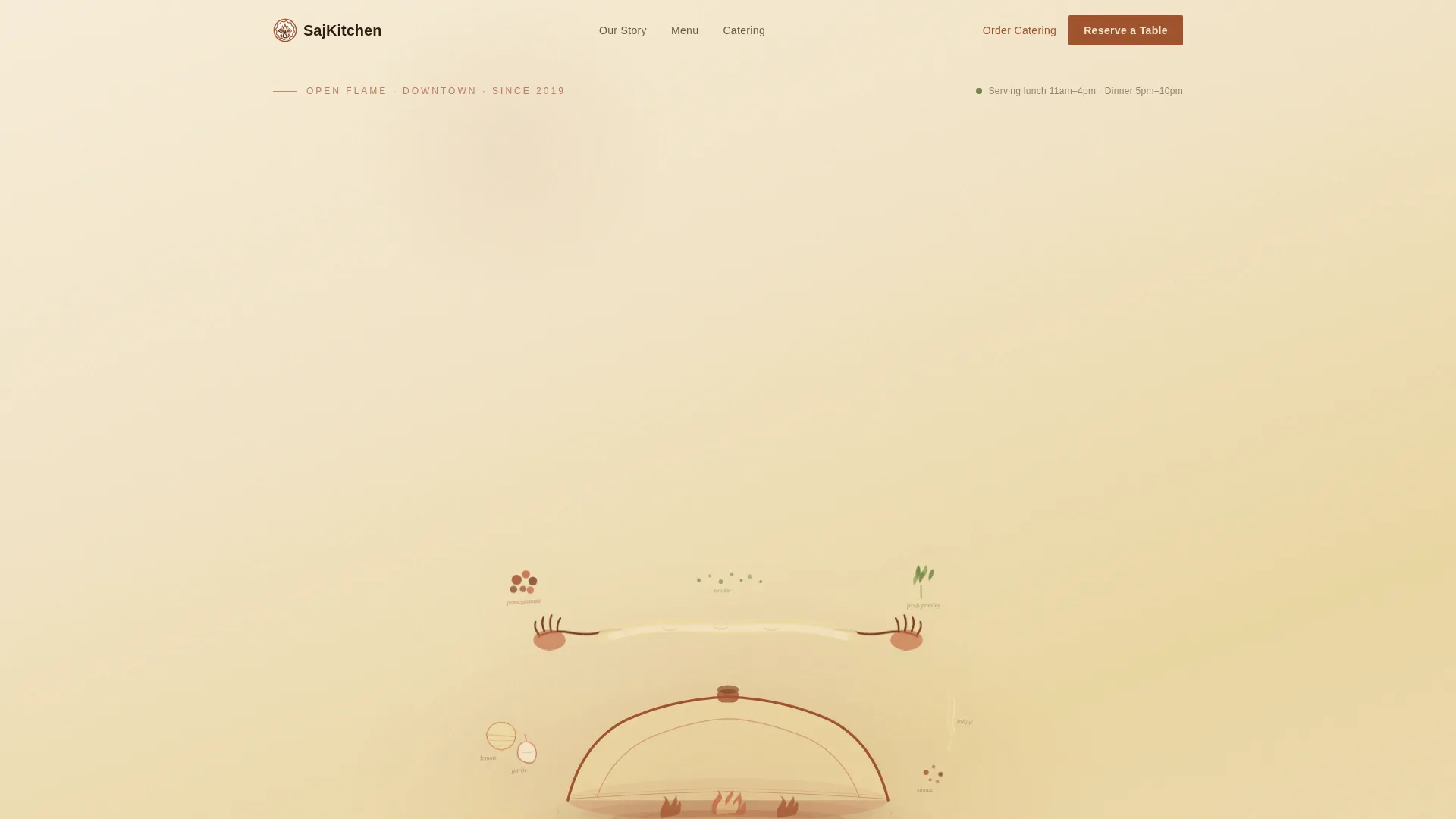
- A full-bleed hero section with a custom hand-drawn SVG illustration, floating ingredient animation, and a primary "Reserve a Table" call to action
- A scroll-linked sensory build sequence, a four-item menu grid with tight food photography slots, a catering callout with form fields, and an inline three-step booking widget
- Fraunces serif display type paired with DM Sans body text, set in the Parchment and Rust color system across every section
Feature list
This template packs several purpose-built components that go well beyond a standard restaurant layout.
Hand-Drawn Hero Illustration
The hero occupies the dominant portion of the page using a custom, hand-drawn scene of a saj dome at center frame. Flames, stretched dough, and orbiting ingredients, pomegranate seeds, parsley, tahini, are rendered in loose line work with watercolor-style washes in parchment and rust tones. SVG motion gives the illustration a sense of still being drawn as visitors arrive.
Scroll-Linked Sensory Build
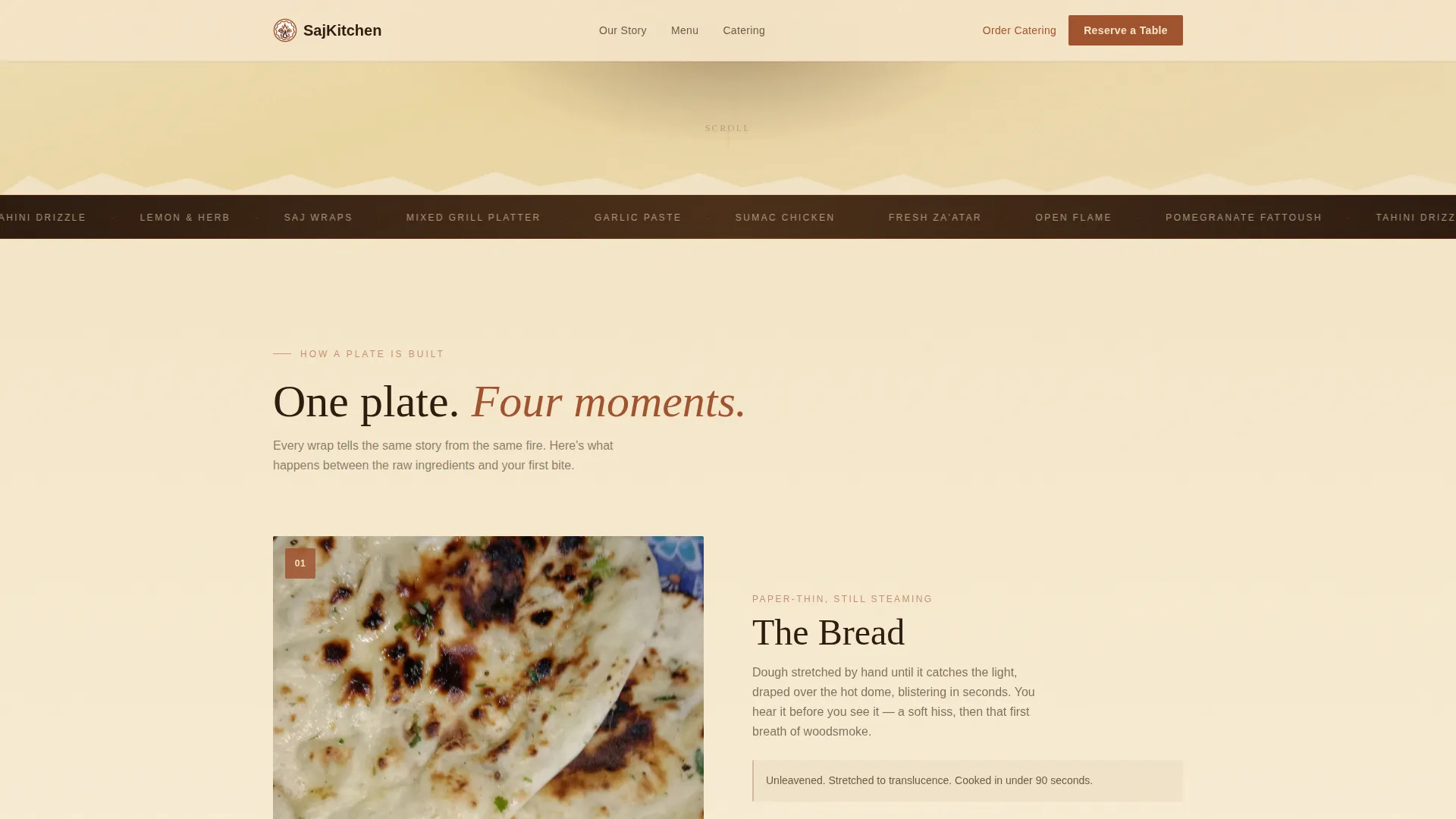
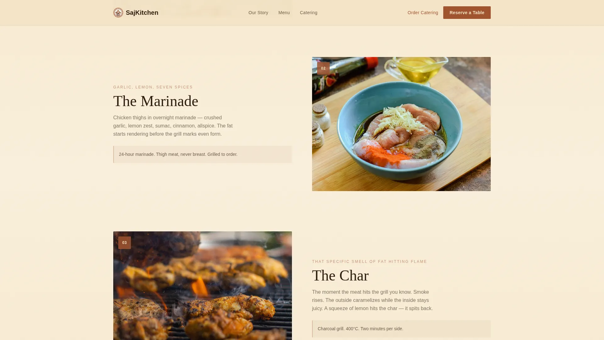
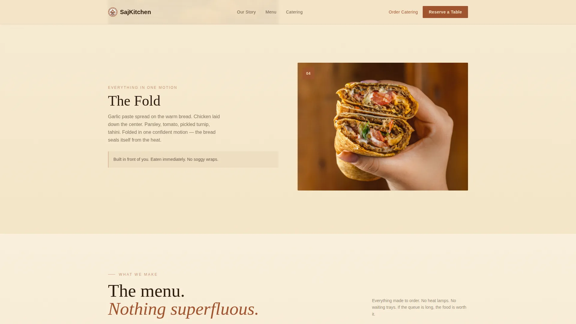
Below the hero, a scroll-triggered sequence constructs a single plate step by step. Each scroll increment reveals a new layer: the bread stretching, the marinade glistening, the char appearing, the fold, then the lemon squeeze. By the time the menu grid comes into view, the visitor has already experienced the food.
Inline Three-Step Booking Widget
The primary call to action in the sticky navigation opens a booking widget directly on the page. It collects date, party size, and time slot across three quick steps with no page reload and no external redirect. A secondary "Order Catering" text link sits beside it in the same nav bar.
Catering Callout Section
A dedicated "Feed Your Next Meeting" section sits below the menu grid. It includes a minimum headcount field and an event date picker so catering managers can submit an inquiry without hunting through a contact page.
Sticky Navigation Bar
The navigation stays fixed at the top of the page as visitors scroll. The "Reserve a Table" button is anchored there in smoked paprika rust, keeping the primary conversion action visible at every point in the scroll journey.
Four-Item Menu Grid
Four signature dishes are displayed in a tight photography-led grid. The close-up shot format, close enough to see bread bubbles and rendering fat, is built into the layout to support appetite-driven food images rather than flat catalog shots.
Page sections overview
| Section | Purpose |
|---|---|
| Hero Illustration | Introduce the restaurant and anchor the primary "Reserve a Table" call to action |
| Sensory Build Sequence | Walk visitors through a single plate being made, building appetite before the menu |
| Signature Menu Grid | Display four dishes with tight food photography and short descriptions |
| Catering Callout | Capture corporate and event inquiries with headcount and date fields |
| Inline Booking Widget | Complete a three-step reservation without leaving the page |
| Footer | Provide single-row linear links and basic contact information |
Design & branding system
The visual identity follows an Organic Flow theme. Every color, type choice, and layout decision is meant to feel warm, handcrafted, and alive, like a recipe notebook left too close to the stove.
- Color palette: unleavened dough cream (#F5E6C8) as the base, smoked paprika rust (#A0522D) for primary actions, charred eggplant deep (#2C1A0E) for foreground text, and bright za'atar green (#6B7F3E) reserved for hover states and garnish accents
- Typography: Fraunces serif for display headings paired with DM Sans for all body copy, creating a contrast between artisan warmth and clean readability
- Illustration style: loose, confident line work with watercolor-style fills in parchment and rust tones, every element carrying a sense of motion and organic imperfection
Mobile & speed optimization
The template is built mobile-first to match the reality that most lunch visitors are ordering from their phones while standing in or near a queue. Every layout decision prioritizes fast scanning and tap-friendly targets on small screens.
- Scroll-linked animations use CSS animations and Intersection Observer so the sensory build and floating ingredient effects run without heavy JavaScript libraries
- The sticky navigation, booking widget, and catering form are all touch-optimized for single-thumb use on mobile devices
- The hero illustration and menu grid reflow naturally for smaller viewports, keeping food photography prominent and call-to-action buttons large and reachable
How this template helps you convert
The page is engineered to move visitors from curiosity to confirmed booking by making them feel the food first and reducing every possible point of drop-off.
- The scroll-linked sensory build sequence creates appetite and emotional connection before the menu grid appears, so visitors arrive at dish choices already primed to order rather than browsing coldly.
- The sticky "Reserve a Table" button and the inline booking widget remove the two most common drop-off points, a buried call to action and a redirect to an external booking page.
- The catering callout with on-page form fields turns a second audience segment, corporate event planners, into leads without a separate contact page or email chain.
Other information about this template
This template is designed for the United States market, with English copy, USD pricing conventions, and a layout that reflects American fast-casual dining expectations. It is part of the Saj brand concept rooted in authentic Lebanese culinary tradition.
- The animation level is set to high by design: floating ingredient effects, scroll-linked reveals, and SVG illustration motion all contribute to the sensory-first creative direction called Taste and Aroma
- The footer follows a Pattern 1 Linear Single-Row layout, keeping the page's closing moment clean and uncluttered
- The template uses the Hero-Dominant (90/10) layout ratio, meaning the illustration and hero section command the majority of the visual weight before the content sections begin
Theme
Organic Flow
Creative direction
Taste & Aroma
Color system
Parchment & Rust
Style
Hero-Dominant (90/10)
Direction
Booking/Scheduling
Page Sections
Hand-drawn Hero Illustration
Scroll-linked Sensory Build
Inline Three-step Booking Widget
Catering Callout with Form Fields
Four-item Signature Menu Grid
Sticky Navigation with Dual Ctas
Related questions
How does the inline booking widget work?
Is there a dedicated section for catering inquiries?
Can I update the color palette and fonts to match my restaurant's brand?
Do I need custom food photography to use this template?
What type of restaurant is this template best suited for?