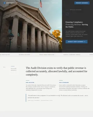
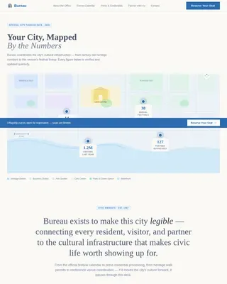
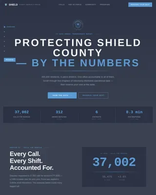
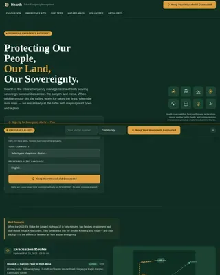
Housing Government Specialist Professional Website Template
The Sovereign donation landing page template is built for tribal housing authorities raising funds to build homes on sovereign land. A bold 50/50 split-screen layout carries donors from crisis to momentum, pairing overcrowding data with family testimony, construction progress, and a transparent donation form that names exactly what each dollar builds.
by Rocket studio
Quick summary
Sovereign is a single-page donation landing page template designed for tribal housing authorities and Indigenous housing nonprofits. It uses a 50/50 split-screen layout, a Community Hearth visual theme, and a scroll narrative that moves from urgent crisis to active building momentum. Every element is built to earn the gift by showing donors precisely what their contribution becomes on the ground.
Who this template is for
This template was built for organizations carrying the weight of a housing waitlist and the responsibility of sovereign land. It speaks directly to teams raising funds for families who have no other option.
- Tribal housing authorities building homes where federal funding falls short
- Indigenous housing nonprofits running focused fundraising campaigns for enrolled tribal members
- Development staff and program officers who need a credible, emotionally grounded donation landing page ready to deploy
What problem this template solves
Housing insecurity on reservation land is a quiet emergency. Families wait years. Grandmothers raise grandchildren in overcrowded HUD homes. Young people return to serve their nation and find no place to live. Nonprofit organizations increasingly depend on digital campaigns to attract donors and scale fundraising efforts, yet most generic donation pages fail to communicate the specific, material reality of what is at stake.
This template solves the gap between urgency and action.
- It immediately communicates the scale of the waitlist so potential donors understand the problem within seconds of arriving
- It replaces vague donation asks with named material costs, insulation, a window unit, a foundation pour, so donors feel confident their gift is real
- It structures the scroll as a case being made to the heart, moving visitors from crisis to construction progress without distraction
What you get with this template
You get a focused, single-purpose donation landing page built around one goal: earn the gift and make it easy to give. A nonprofit landing page built this way drives a single action rather than scattering visitor attention across multiple offers.
- A full 50/50 split-screen layout with a hero section, crisis and testimony panels, a donation form block, a progress and momentum section, and a final call to action close with volunteer path
- A pre-configured donation form with preset donation amounts tied to real material costs, a custom amount field, recurring giving options, and a volunteer signup path
- A complete visual design system using sovereign navy, hearthstone amber, cloud white, and ceremonial red, with Fraunces display type and Plus Jakarta Sans body text
Feature list
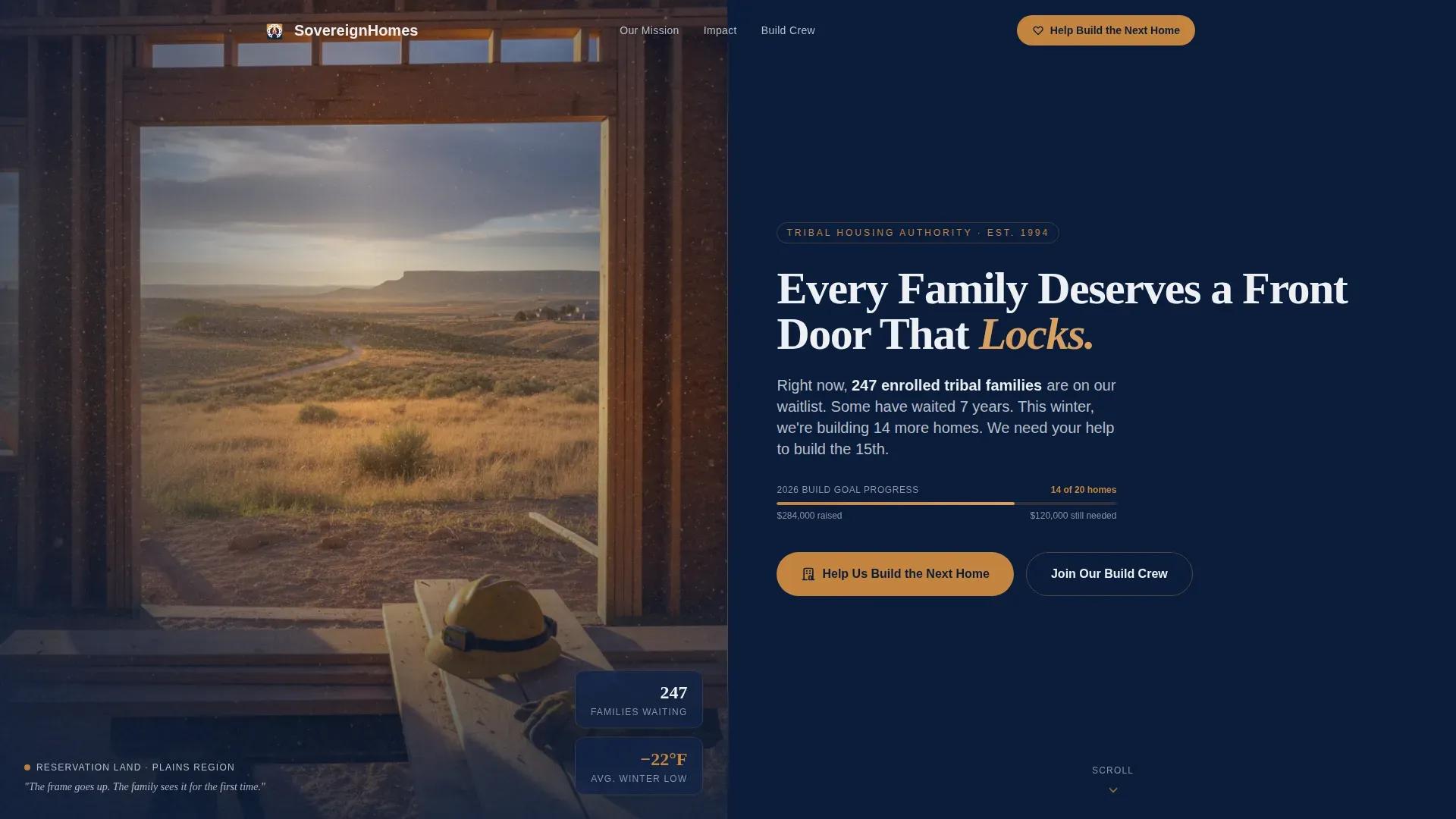
Split-Screen Hero with Real Waitlist Number
The header uses a Half-Page Photo and Text layout. The left panel holds a golden-hour construction photograph shot from inside a newly framed doorway looking out across open reservation land. The right panel carries a bold cloud-white headline on sovereign navy, a single-line subhead displaying the real, current waitlist number, and a hearthstone-colored primary call to action button. The hero section includes a powerful headline paired with a high-quality image to create an emotional connection from the first moment a visitor arrives. An impactful hero image like this, featuring a doorway opening toward open land rather than a polished finished room, immediately communicates what a front door means: security, dignity, and a sense of home.
Scroll-Driven Crisis-to-Momentum Narrative
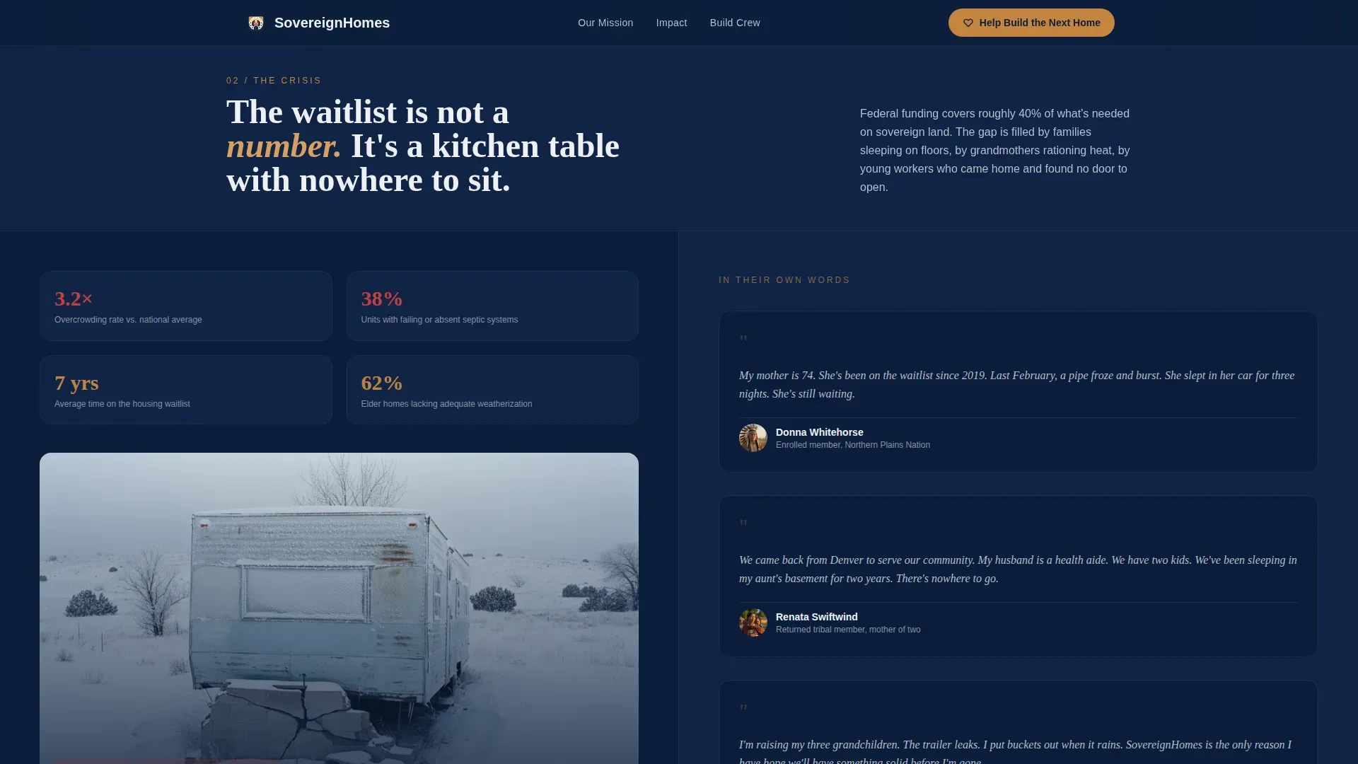
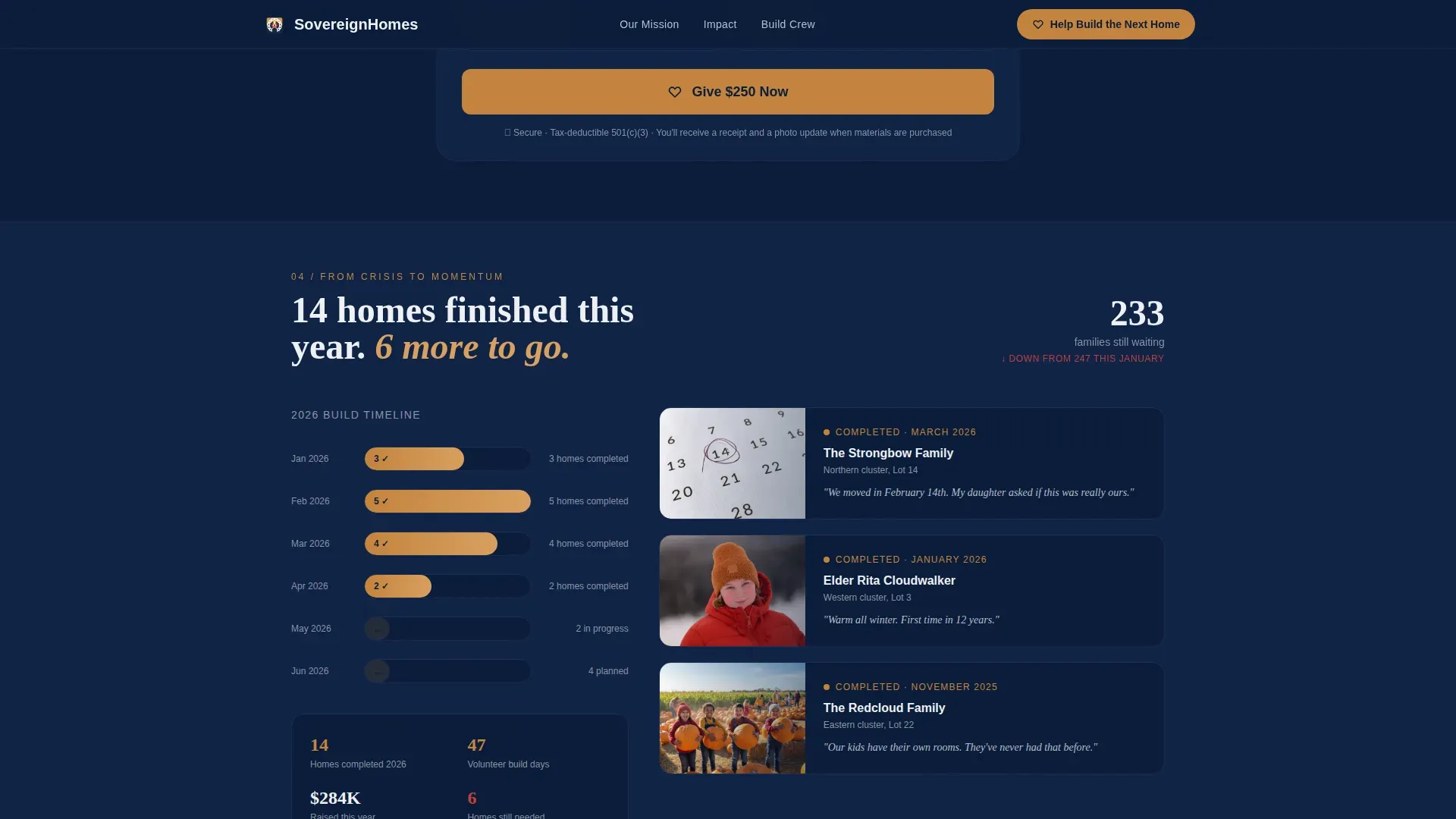
Below the hero, the split-screen layout shifts dynamically as the visitor scrolls. The left panel opens with the problem: overcrowding statistics, winter damage photography, and a service-area map showing housing density across the reservation. The right panel carries family testimony in direct, personal language. Deeper into the page, the right panel expands and construction progress photos grow larger. A timeline shows homes completed this year alongside homes still needed. This scroll structure follows a Movement and Cause creative direction, building the donation landing like a case being made to the heart. Emotional storytelling is essential for creating a strong emotional connection with potential donors, and this layout uses visual storytelling and compelling narratives supported by testimony to move visitors from empathy to action.
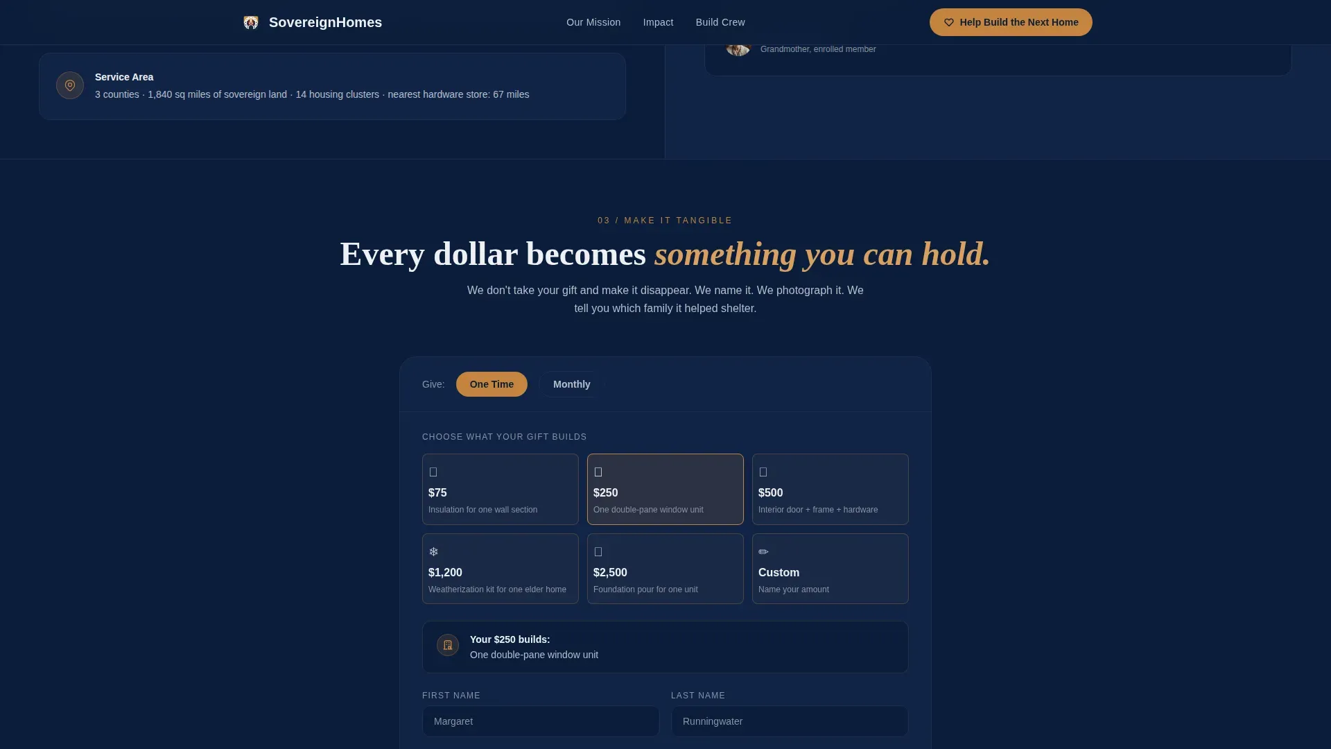
Transparent Donation Form with Preset Amounts
The donation form is the conversion engine of the page. It offers preset donation amounts tied directly to named construction materials: $75 for insulation, $250 for a window unit, $2,500 for a foundation pour. A custom field handles any amount. Offering three to five pre-set donation options helps guide donor choices without overwhelming them. The donation form asks only for essential information to keep the donation process fast and friction-free. Donors feel more confident contributing when they know exactly where their money is going, and naming each donation amount as a physical material makes that transparency concrete. The donation form supports both one time gifts and recurring giving, giving donors the option to convert a single contribution into a monthly donation that builds steady support over time.
Fundraising Progress Bar and Donor Recognition
A fundraising progress bar tracks real-time momentum toward a named goal, such as "100 Doors for 100 Families." A visible progress tracker creates urgency by showing how close the campaign is to its target. This goal thermometer visually shows progress and gives donors a reason to act now rather than later. The page also includes a donor recognition wall where recent donations are acknowledged publicly. A donor wall builds community and social proof, showing arriving visitors that others have already committed. Donor recognition of this kind strengthens trust and encourages repeat contributions from recurring donors who want to see their names alongside a growing list of builders.
Volunteer Signup and Secondary Conversion Path
Not every visitor will give money. Some will give time. The "Join Our Build Crew" volunteer path provides a secondary call to action that keeps those visitors engaged rather than losing them. This secondary form appears after the testimony section and again at the page close, giving donors and volunteers multiple opportunities to commit. A focused donation landing page works by narrowing attention to a single primary goal while supporting secondary paths for different visitor behavior.
Consistent Branding and Typography System
The template ships with a complete design system. Sovereign navy (#0B1D3A) anchors the primary background. Hearthstone amber (#C4843E) activates buttons and accent lines. Cloud white (#EEF0F3) handles body text and open space. Ceremonial red (#8B2E2E) appears sparingly on urgent messaging and the fundraising progress bar. Fraunces, a serif display typeface, carries the authority of a tribal council document. Plus Jakarta Sans provides clean, readable body copy. This consistent branding across every panel ensures the page feels like one coherent statement rather than a patchwork of components.
Page sections overview
| Section | Purpose |
|---|---|
| Hero Split Panel | Introduce the cause with a real waitlist number and primary call to action |
| Crisis Stats Panel | Show overcrowding data and winter damage photography on the left split |
| Family Testimony Panel | Carry direct family quotes on the right split to build emotional connection |
| Donation Form Block | Present preset donation amounts tied to named materials and accept giving |
| Progress Momentum Section | Display homes completed this year, construction photos, and a fundraising progress bar |
| Final Call to Action | Repeat urgent messaging, primary donation button, and volunteer signup path |
| Footer Row | Linear single-row footer with organizational contact and trust signals |
Design & branding system
The visual identity follows a Community Hearth theme. The page feels like stepping into a warm kitchen on a cold night: a woodstove ticking, coffee on, blueprints spread across the table. Every color and type choice reinforces that feeling of warm authority and quiet certainty.
- Color palette: sovereign navy (#0B1D3A) as the primary background, hearthstone (#C4843E) on buttons and accent lines, cloud white (#EEF0F3) for text and open space, ceremonial red (#8B2E2E) used sparingly for urgent messaging and the fundraising progress bar
- Typography: Fraunces serif for display headings to convey governance and weight, Plus Jakarta Sans for body copy to keep reading comfortable and clear
- Scroll animation: medium-intensity scroll reveals, parallax layers, marquee elements, and spotlight hover states bring the page to life without overwhelming the donation process
Mobile & speed optimization
Over 50 percent of nonprofit web traffic arrives from mobile devices, and this template accounts for that reality. The 50/50 desktop split stacks gracefully for mobile users, keeping the donation form and primary call to action accessible on smaller screens.
- Mobile responsiveness is built into the layout so mobile devices receive a stacked single-column view that preserves the crisis-to-momentum narrative flow
- The donation form is positioned above the fold on desktop and near the top of the stacked mobile view, reducing the number of scrolls a visitor needs before reaching the give button
- Server Components handle static content rendering while Client Components manage the interactive donation form, keeping the page responsive for visitors on any device
How this template helps you convert
A great donation landing page has one clear goal: encourage donations. This template earns that conversion by combining clear messaging, emotional storytelling, strong visuals, and visible trust elements across every scroll position.
- The page design starts converting visitors from the first second by pairing urgent messaging in the hero, a real waitlist number, a bold hearthstone call to action button, and a photograph that immediately communicates what is at stake. Combining clear messaging with a distraction-free layout keeps page visitors focused on giving rather than wandering away.
- The donation form presents donation amounts as physical materials rather than abstract numbers, which builds donor confidence and raises the average donation amount by anchoring each choice to a real outcome. Donors who understand what their monthly donation or one-time gift builds are more likely to give more and return as recurring donors.
- The fundraising progress bar, donor wall, and family testimony work together as social proof, showing potential donors that momentum is real, that others have already given, and that the organization's mission is advancing home by home.
Other information about this template
The Sovereign template is a strong reference point when studying donation landing page examples from the cause-driven and Indigenous housing space. Below are additional details that help fundraising teams get the most from this page.
- The donation form supports multiple payment options to reduce friction at the moment of giving. Payment processing can include credit cards, digital wallets, and options like Google Pay, so donors complete their payment details quickly and confidently with secure payment methods they already trust.
- A recurring giving toggle lets donors convert a one time gift into monthly giving with a single click. Monthly donors and recurring donors are the foundation of any sustainable fundraising campaign, and this option is presented clearly within the form without requiring extra steps.
- The embedded donation form is contained within the landing page itself rather than redirecting to an external donation platform. This keeps visitor behavior focused, reduces abandonment, and gives the organization a consistent, branded experience from headline to thank-you message.
- A matching gift prompt inside the form encourages donors to check whether their employer will match their contribution. Tools like Double the Donation help donors verify employer matching programs, which can effectively double your impact without asking donors to give more.
- Donor recognition is handled through the donor wall, which displays recent donations and contributor names. A donor recognition wall like this encourages conversion from page visitors who arrive undecided but are influenced by seeing that others have already committed.
- For teams studying effective donation landing page examples, a few examples worth examining include the International Rescue Committee's landing page, which immediately communicates crisis through bold visuals, the Great Ormond Street Hospital's landing page, which connects potential donors through emotional storytelling and a clear call to action, and Feeding America's donation landing page, which communicates tangible impact through a direct value statement. North Texas Food Bank and food banks more broadly also offer strong landing page examples of how naming tangible outcomes drives giving donors to complete the donation process.
- The page includes social sharing buttons so donors can share the campaign with their own networks after giving, extending fundraising efforts beyond the initial donor list.
- Giving donors a clear sense of progress, through the fundraising progress bar, the homes-completed counter, and donor stories featured in the testimony section, keeps visitors engaged and inspires visitors who might otherwise leave without acting.
- Additional resources such as a volunteer signup form and a secondary "Join Our Build Crew" call to action are built into the page close, ensuring that every visitor leaves with a way to contribute regardless of whether they give financially.
- The dedicated landing page format removes navigation menus and external links, creating a distraction-free layout that focuses all visitor attention on the donation ask and the story behind it.
Theme
Community Hearth
Creative direction
Movement & Cause
Color system
Navy Authority
Style
Split Screen (50/50)
Direction
Donation/Fundraising
Page Sections
Split-screen Hero with Waitlist Counter
Scroll-driven Storytelling Layout
Transparent Preset Donation Form
Fundraising Progress Bar and Donor Wall
Volunteer Signup Secondary Path
Community Hearth Design System
Related questions
Can I change the preset donation amounts in the form?
Does the template support recurring donations?
How does the split-screen layout work on mobile devices?
Can I add a volunteer signup form alongside the donation ask?
What is included in the donor recognition section?