Expert Memory Care Landing Page Template
Recall is a gallery and detail landing page template built for memory care communities. It guides families through an interactive architectural floor plan, a room-by-room spatial gallery, and a dual-path conversion section. The design uses a charcoal and amber palette to communicate institutional competence with genuine warmth, moving visitors toward booking a private tour.
by Rocket studio
Quick summary
Recall is a single-page template designed for memory care communities. It opens with an interactive isometric floor plan, then walks visitors through each space via a scroll-driven gallery. Every section pairs architectural photography with therapeutic design rationale. The goal is straightforward: help families trust the building before they ever speak to staff, then book a tour.
Who this template is for
This template is built for memory care communities that want to earn family trust through architectural evidence rather than emotional messaging. It suits operators who believe the built environment is part of the care offering.
- Adult children managing placement logistics from a distance, often under pressure and short on time
- Retired spouses who need to evaluate a community quickly and confidently
- Geriatric care managers vetting placements for clients whose needs have outpaced home-based support
What problem this template solves
Families researching memory care are not just looking for a bed. They are making one of the hardest decisions of their lives, often remotely, often under guilt. Generic senior living pages with stock photography of smiling nurses do not answer their real questions. They want proof that the environment itself was designed around their loved one's neurology.
- Standard property pages fail to communicate therapeutic design intent or architectural reasoning
- Families cannot visualize the actual spaces, walking loops, or sensory details that matter for safety
- High-consideration decisions stall when there is no clear next step that feels appropriate to the emotional weight involved
What you get with this template
You get a complete, production-ready landing page layout built around spatial storytelling and a deliberate two-path conversion strategy. The structure walks visitors through the community the way a guided tour would, room by room, with design rationale woven into every section.
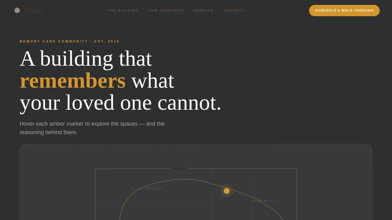
- An interactive isometric floor plan header with pulsing amber hotspots and slide-in detail cards for key spaces
- A room-by-room spatial gallery with large photographs paired with therapeutic design explanation panels
- A dual-path conversion section offering a primary tour-booking call to action and a secondary guide-download path for families not yet ready to visit
Feature list
Interactive Isometric Floor Plan Header
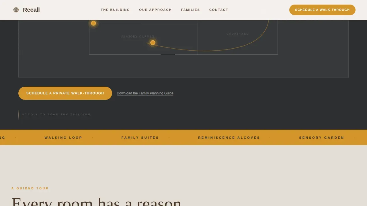
The hero section renders an abstracted architectural floor plan at a slight isometric angle. Amber dots pulse gently at key locations including the sensory garden, music therapy room, memory café, and secured courtyard. Hovering or tapping each dot slides in a detail card with a photograph and a single descriptive sentence about that space.
Scroll-Driven Spatial Gallery
Scrolling moves the visitor deeper into the building, section by section. Each gallery entry presents a large photograph of a specific space alongside a detail panel that explains the therapeutic rationale behind its design. Parallax shift transitions between sections mimic the experience of passing through a doorway.
Therapeutic Design Rationale Panels
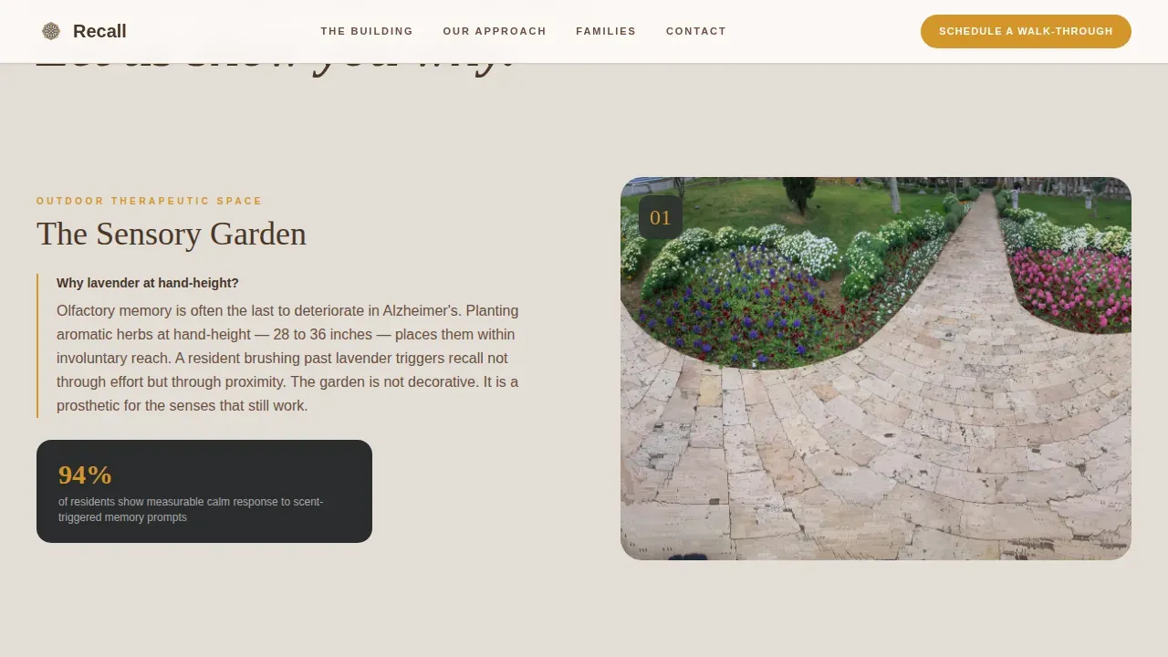
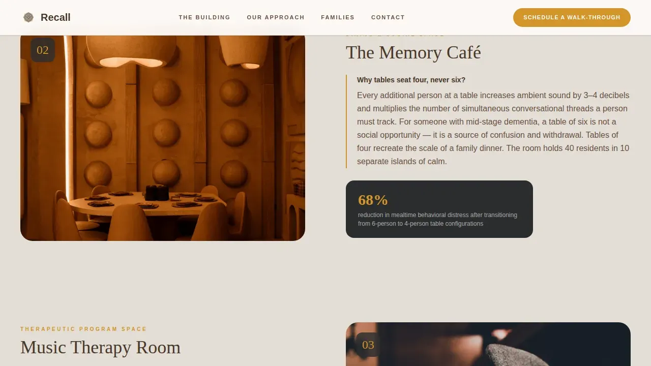
Every room in the gallery includes a dedicated explanation panel. These panels communicate intentionality directly: why the lavender beds are at hand height, why dining tables seat four rather than six, and how each architectural choice connects to resident neurology and daily safety.
Dual-Path Conversion Section
The page supports two distinct conversion paths from a single section. The primary call to action, "Schedule a Private Walk-Through," appears as an amber button anchored after the map header and recurs after every third gallery section. The secondary path, "Download the Family Planning Guide," captures contact details from visitors who need more time before committing to a visit.
Recurring Contextual Call to Action Placement
The primary call to action is not confined to one section. It reappears at regular intervals throughout the scroll so that a visitor who becomes ready to act at any point in the page can convert without scrolling back to find a button.
GSAP-Powered Reveal Animations
The template includes high-interactivity animation behavior: pulsing hotspots on the floor map, scroll-linked GSAP reveal animations, hover states throughout the gallery, and sliding detail cards that respond to user interaction without disrupting the reading flow.
Page sections overview
| Section | Purpose |
|---|---|
| Isometric Map Hero | Orient visitors spatially and introduce key community spaces through interactive hotspots |
| Spatial Gallery Tour | Walk families room by room through the community with therapeutic design context |
| Design Philosophy | Communicate architectural intentionality through narrative and supporting detail |
| Family Voices | Build trust through named testimonials with relationship context and specific observations |
| Schedule and Call to Action | Convert visitors through dual-path options: tour booking and guide download |
| Footer | Provide linear single-row navigation and contact reference |
Design & branding system
The visual identity follows a Corporate Precision theme that balances institutional authority with genuine warmth. Deep charcoal provides structure. Amber acts as a wayfinding accent, appearing on interactive hotspots, call-to-action surfaces, and the walking loop trace on the floor map. Putty gray softens content surfaces, and espresso grounds body text in readability.
- Color palette: charcoal (#2B2D2F) for primary backgrounds, amber (#D4952A) for accents and calls to action, putty gray (#E3DED7) for content surfaces, espresso (#4A3728) for body text
- Typography: DM Sans for interface and body copy, Fraunces as the serif display typeface for section headings and spatial narrative moments
- Amber is used with restraint, appearing precisely where warm light would appear therapeutically in the actual building, never decoratively
Mobile & speed optimization
The template is built desktop-first because the primary decision-makers in this audience research on larger screens. Full mobile responsiveness is included so that family members who follow up on a phone or tablet have a coherent experience. Interactive components use a Client Component architecture to keep static content rendering efficiently while animations and the floor map load as needed.
- Desktop-first layout with full mobile responsiveness for all sections including the interactive map and gallery
- Server Components handle static content delivery; Client Components manage the interactive floor map and GSAP animations
- The floor map, hotspot interactions, and parallax transitions are all designed to remain functional and clear on smaller viewports
How this template helps you convert
The page earns the conversion by building architectural credibility before making any ask. Families who see that every design decision was intentional are more likely to trust that the care inside the building was equally considered.
- The interactive floor plan establishes spatial familiarity early, reducing the anxiety families feel about visiting an unfamiliar community for the first time
- The recurring amber call-to-action button appears after every third gallery section, meeting visitors at the moment they feel ready rather than forcing them back to the top of the page
- The secondary guide-download path keeps families in the funnel even when they are not ready to book, giving the community a contact and giving the family a resource that respects the weight of their decision
Other information about this template
This template sits at the intersection of real estate presentation and senior care marketing. It is built for a high-consideration, emotionally significant purchase decision where trust is the primary conversion lever. The architectural storytelling approach is specifically suited to memory care communities that have invested in evidence-based design and want that investment to be visible and legible to families online.
- Template style: Gallery and Detail, combining spatial photography with explanatory copy
- Theme: Corporate Precision, warm enough for families, authoritative enough for geriatric care managers
- The footer uses a Linear Single-Row pattern for clean, uncluttered navigation
- Localization: English language, United States date format
- The page is structured as a click-through landing page, with the scheduling page as the destination after the primary call to action
Theme
Corporate Precision
Creative direction
Spatial & Architectural
Color system
Charcoal & Amber
Style
Gallery + Detail
Direction
Click-Through
Page Sections
Interactive Isometric Floor Plan
Scroll-driven Spatial Gallery
Therapeutic Design Rationale Panels
Dual-path Conversion Section
Recurring Contextual Call to Action Placement
GSAP Reveal and Hotspot Animations
Related questions
Who is the primary audience for this landing page template?
Can the interactive floor map be customized for a different community layout?
Does the template support both desktop and mobile visitors?
How does the dual-path conversion section work?
Is this template suitable for other senior living property types?



