Human Rights Mutual Aid Fundraising Landing Page
Sanctuary is a modular card-grid landing page built for a human rights mutual aid network. It combines a cinematic team photo hero, a staggered testimonial mosaic, and a transparent impact section to move already-committed donors from scroll to contribution. The botanical color system and earthy typography give the page a warm, community-tended feel that institutional fundraising pages rarely achieve.
by Rocket studio
Quick summary
Sanctuary is a single-page fundraising template designed for a grassroots human rights mutual aid network. It uses a modular card grid, a sticky donation bar, and a transparent spend section to convert emotionally invested visitors into one-time and recurring donors. The design feels handmade and rooted, not corporate, because that is exactly what the community it represents deserves.
Who this template is for
This template was built for organizations doing direct, community-powered mutual aid work. It speaks to the people already at the table, not the people who need convincing from scratch.
- Union organizers, diaspora families, and social workers who give because they have seen the gaps firsthand
- Mutual aid networks and human rights nonprofits raising bond money, interpreter fees, and grocery funds
- Community-led fundraising teams who need a page that earns trust fast and asks clearly
What problem this template solves
Most nonprofit donation pages feel distant. They look like institutions asking for patience. Sanctuary solves the gap between emotional investment and the actual act of giving.
- Visitors arrive already convinced but leave without donating because the page does not reflect their values or show proof of impact
- Networks doing direct aid work lack a page that balances personal testimony with concrete, transparent fund data
- Mobile donors giving after a long shift need a fast, frictionless path to the donation modal without scrolling through filler content
What you get with this template
You get a fully structured, single-page fundraising layout with every section planned and purposeful. Nothing here is decorative without function.
- A cinematic hero section, a staggered testimonial mosaic grid, an impact transparency card, a recurring giving section, and a minimal footer
- A sticky "Fund the Next Bond" call-to-action bar that appears after the third card row, plus a donation modal with four pre-set amounts tied to real outcomes
- A botanical design system with Fraunces serif headers and DM Sans body type, built around loam, fern, clay, parchment, and wildflower violet
Feature list
This template ships with six purposeful, prompt-built features that serve both the donor's journey and the network's story.
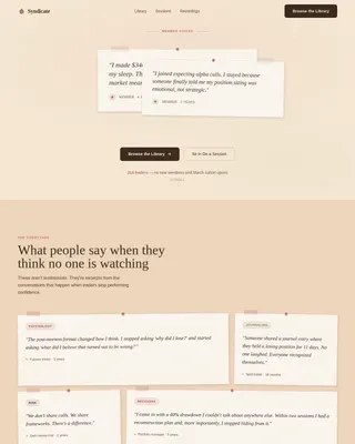
Testimonial Mosaic Card Grid
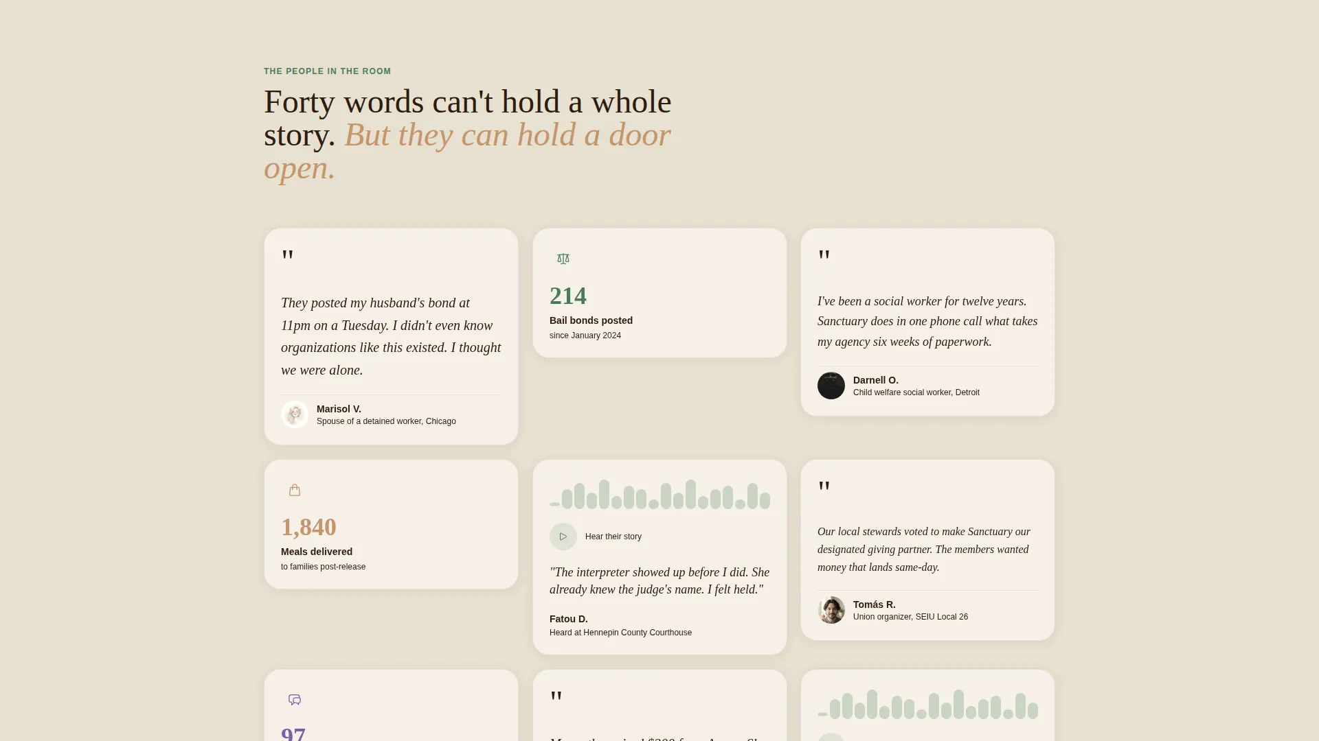
Cards vary in size and type: tall quote cards with watercolor-style portrait illustrations, small stat blocks showing bail bonds posted and meals delivered, and short audio clip cards with a waveform play button. Clusters load in gently staggered groups as the visitor scrolls, so emotional weight and concrete evidence alternate in rhythm.
Sticky Donation Bar with Modal
A "Fund the Next Bond" bar anchors to the bottom of the screen after the third card row. Clicking it opens a donation modal with four pre-set amounts ($25, $75, $150, and $500), each tied to a specific real-world outcome. A custom amount field is also available. No account login is required, only a name and email.
Impact Transparency Card
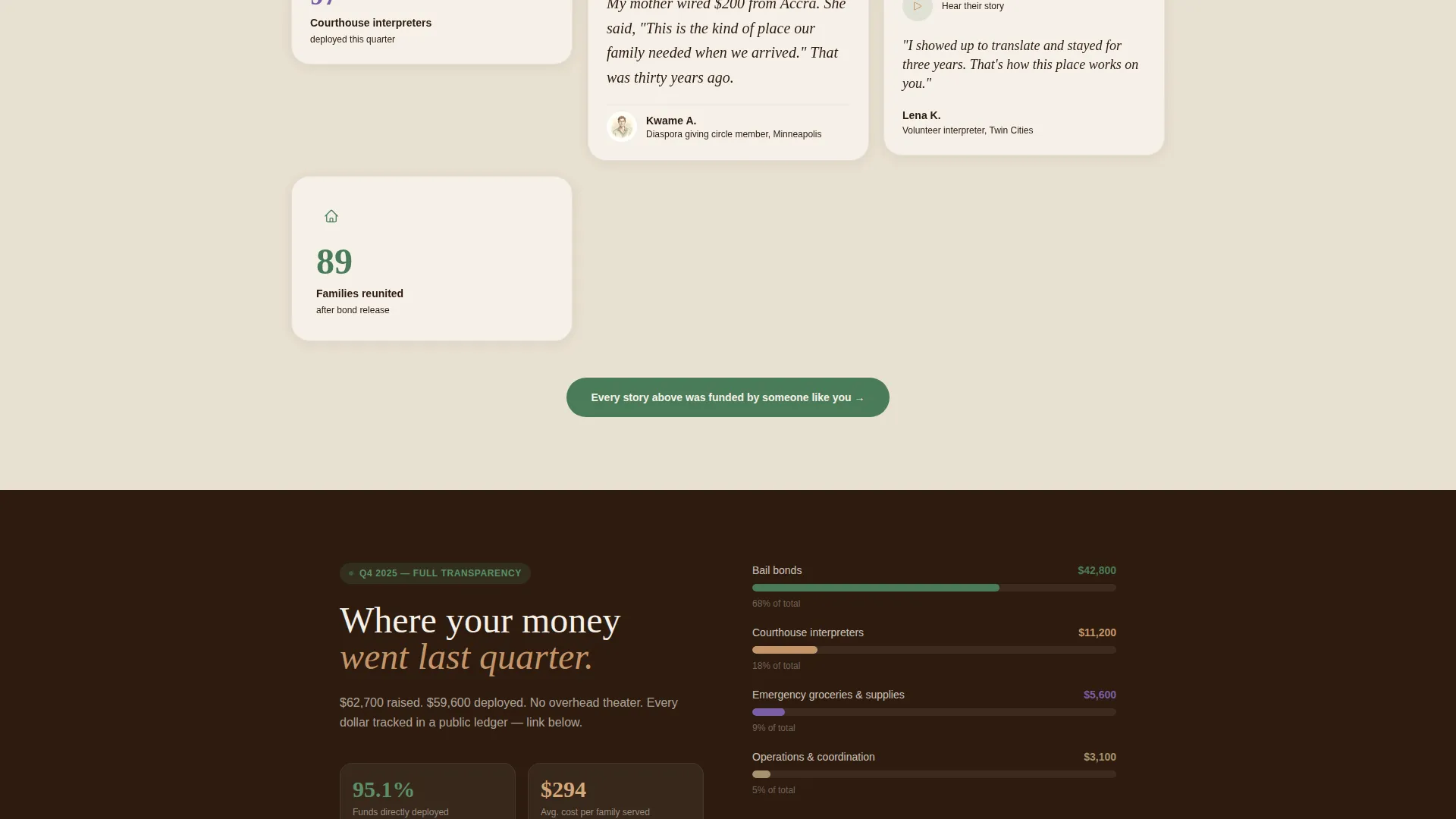
Near the bottom of the page, a single transparent-spend card displays last quarter's fund usage as a simple bar chart. It shows concrete outcomes before the final call to action repeats, so donors can see exactly where their contribution goes.
Recurring Giving Section
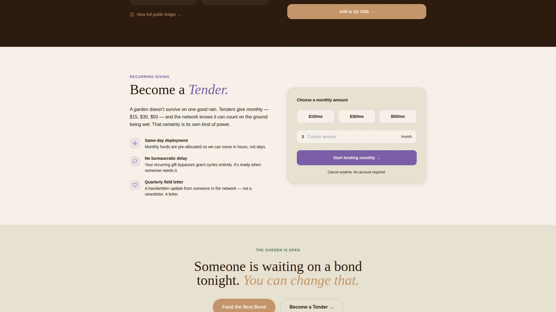
A secondary conversion path invites visitors to "Give Monthly and Become a Tender." The language echoes the garden metaphor woven through the page. This section sits alongside the one-time donation flow, giving returning donors a natural home.
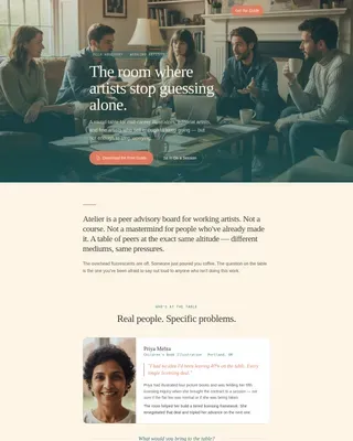
Cinematic Hero with Team Photo
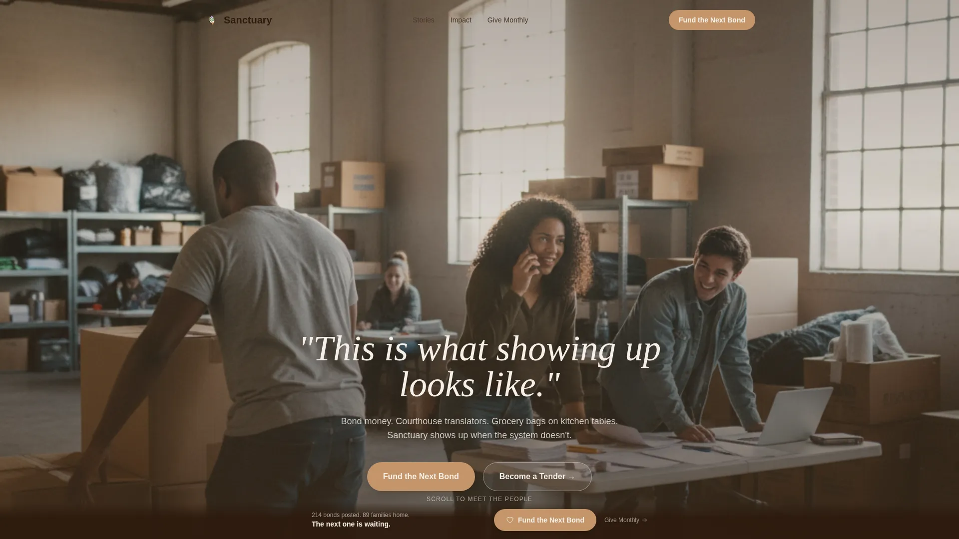
The header uses a wide-angle team photo: fifteen to twenty people mid-work in a church basement, stacking boxes, translating on the phone, laughing over paperwork. A single line fades in over the image: "This is what showing up looks like." The camera angle is slightly above eye level, giving the visitor the feeling of walking through the door.
Botanical Color and Typography System
Deep loam anchors the header and footer. Living fern marks active states and progress indicators. Sun-warmed clay warms buttons and donation tier highlights. Parchment white breathes between cards so the grid never feels crowded. Wildflower violet handles accent interactions. Fraunces serif sets the emotional tone in headers; DM Sans keeps body copy clean and readable.
Page sections overview
| Section | Purpose |
|---|---|
| Hero Team Photo | Opens the page with a cinematic, unposed team image and a single fading headline to establish trust immediately |
| Testimonial Mosaic Grid | Staggered card grid alternating first-person quotes, stat blocks, and audio waveform cards to build emotional and evidential momentum |
| Impact Transparency Card | Shows last quarter's fund spending as a bar chart with concrete outcomes before the final call to action |
| Recurring Giving Section | Invites monthly donors to "Become a Tender" using garden-metaphor language that matches the page's overall tone |
| Sticky Donation Bar | Appears after the third card row and stays fixed at the bottom, anchoring the primary "Fund the Next Bond" call to action |
| Donation Modal | Opens from the sticky bar with four outcome-linked pre-set amounts, a custom field, and a minimal name-and-email form |
| Footer Arc Split | Minimal footer using the Pattern 7 Arc Browser Split layout to close the page cleanly without distraction |
Design & branding system
The visual identity follows a Healing Space theme built around a botanical palette. Every color choice has a function, not just an aesthetic role.
- Deep loam (#2D1B0E) anchors headers and footers; living fern (#4A7C59) marks active states and progress bars; sun-warmed clay (#C4956A) warms buttons and donation tier highlights; parchment white (#F5F0E8) provides breathing room between cards; wildflower violet (#7B5EA7) handles accent interactions
- Typography pairs Fraunces serif for emotional, weighted headers with DM Sans for clean, readable body text
- Watercolor-style portrait illustrations replace photographs in testimonial cards to protect contributor identity while maintaining a warm, human presence
Mobile & speed optimization
Donors reach this page on their phones, often after a shift or while in transit. The template is built with that reality in mind.
- Mobile-first layout ensures the card grid, sticky bar, and donation modal all function cleanly on small screens without horizontal scrolling or cramped tap targets
- Static content sections use server-rendered components while interactive elements like the donation modal, sticky bar, and scroll-triggered card clusters use client-side components to keep the page responsive
- Staggered card reveals and mosaic assembly animations are tuned to medium intensity, loading in clusters rather than all at once to keep scroll feel smooth on mobile connections
How this template helps you convert
Sanctuary is designed around the specific psychology of the already-convinced donor. Every section earns the click rather than demanding it.
- The testimonial mosaic alternates emotional first-person stories with concrete stat blocks, so both the heart and the rational mind are engaged before the donation ask ever appears.
- The transparent spend card near the bottom shows exactly where last quarter's funds went, removing the final hesitation donors have before committing money to a new organization.
- The sticky donation bar with outcome-linked amounts ($75 covers one courthouse interpreter for a day) reduces decision friction by turning an abstract gift into a specific, meaningful act.
Other information about this template
This template belongs to the Community and Nonprofit category with a Human Rights Nonprofit subcategory focus. It is purpose-built for mutual aid network fundraising and community organizing contexts.
- Template style is Card Grid (Modular), making individual sections easy to rearrange or expand as the network's story grows
- The creative direction is Testimonial Mosaic, meaning the grid is the emotional engine of the page, not a supporting element
- The header concept is Team Photo, chosen specifically to show real community labor rather than stock imagery or posed portraits
- The lp_direction is Donation and Fundraising, with both one-time and recurring giving paths built into the core structure
- Localized for English language, United States Dollar (USD) currency, and United States legal and community context
Theme
Healing Space
Creative direction
Testimonial Mosaic
Color system
Botanical
Style
Card Grid (Modular)
Direction
Donation/Fundraising
Page Sections
Staggered Testimonial Mosaic Grid
Sticky Donation Bar with Outcome-linked Modal
Impact Transparency Spend Card
Recurring Giving Path
Cinematic Team Photo Hero
Botanical Color and Typography System
Related questions
Does this template require visitors to create an account to donate?
Can I use this template for a recurring monthly giving campaign?
How does the testimonial mosaic protect contributor privacy?
What donation amounts come pre-set in the modal?
Is the card grid layout flexible enough to update over time?