Wellness-Focused Healthcare Design Landing Page Template
The Atelier healing space healthcare architecture landing page template is built for firms that design hospitals, clinics, and behavioral health facilities. It combines a manifesto-driven masonry layout with a floating parallax hero, clinical outcomes cards, a services bento grid, and a gated lead-capture form, all wrapped in a quiet, monograph-quality visual identity that speaks directly to health system decision-makers.
by Rocket studio
Quick summary
This landing page is designed for a healthcare architecture practice whose work shapes the rooms where patients recover, families gather, and care teams spend their careers. The page moves like a well-argued essay: from philosophy to evidence to invitation. Every section earns its place, and every design choice signals the kind of careful, clinical thinking that health system leaders need to see before they trust a firm with a capital project.
Who this template is for
Healthcare architects understand that building a hospital or clinic is never just a construction project. This template speaks to the firms and the clients who carry that weight every day.
- Health system chief executives and facility directors managing aging campuses or phased expansions while keeping operating rooms live
- Community health boards funding a first standalone clinic with bond money they cannot afford to waste
- Architecture practices whose portfolio spans acute care hospital work, ambulatory clinic design, behavioral health facilities, and campus master planning
What problem this template solves
Most architecture firm websites compete on photography alone. Health system decision-makers need more than beautiful images. They need evidence that the firm understands clinical consequence, infection control as a design discipline, and the operational reality of building inside a live hospital environment.
- Generic portfolio sites fail to communicate why spatial decisions affect patient outcomes, staff well being, and long-term recovery rates
- Standard contact forms feel transactional and miss the collaborative, listening-first approach that healthcare architecture engagements actually require
- Visitors who are not yet ready to commission a project have no early-stage path to engage, so potential leads are lost before a conversation begins
What you get with this template
This template delivers a complete, single-page lead generation experience for a healthcare architecture practice. Every section is purpose-built for the audience and the decision at hand.
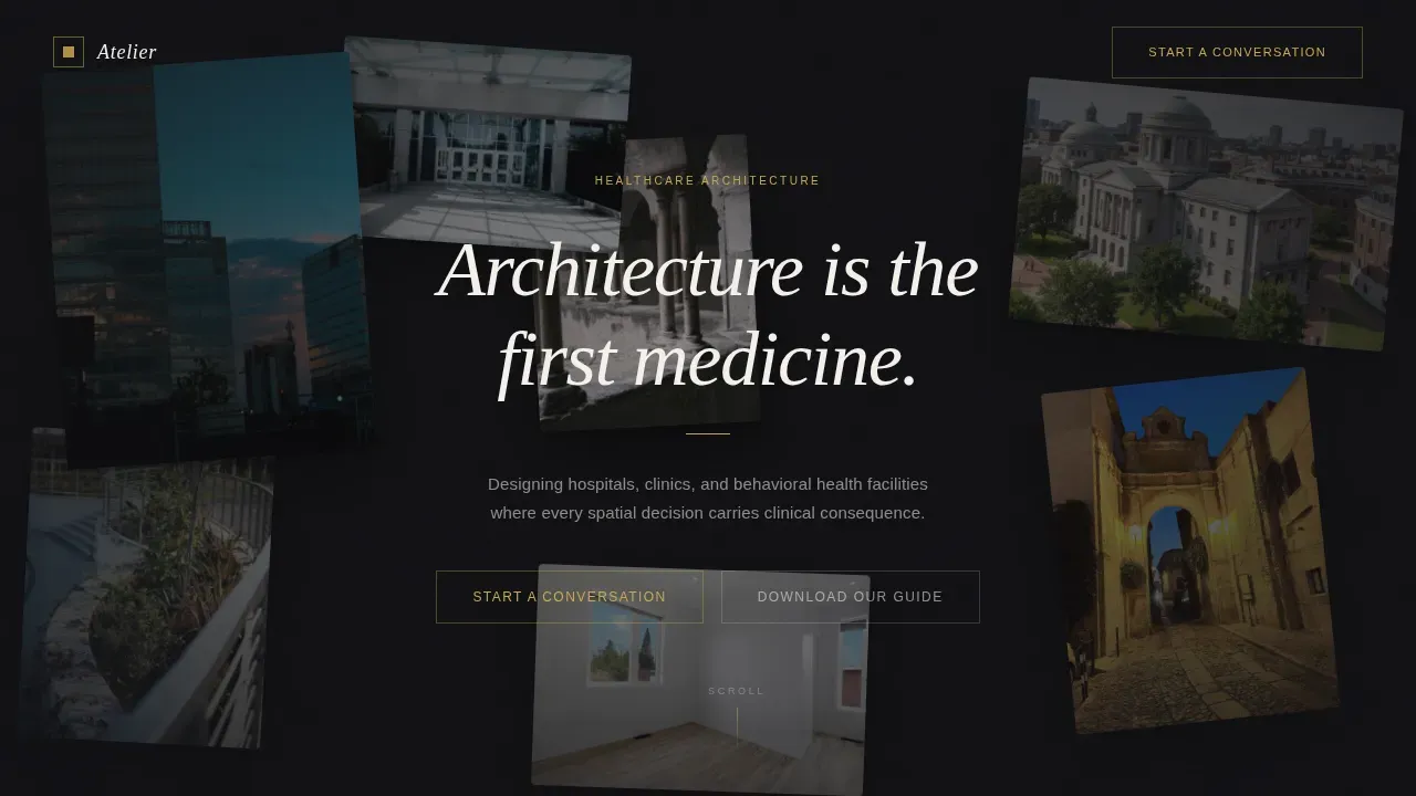
- A floating parallax hero with seven project images, a manifesto headline, and a "Start a Conversation" call to action
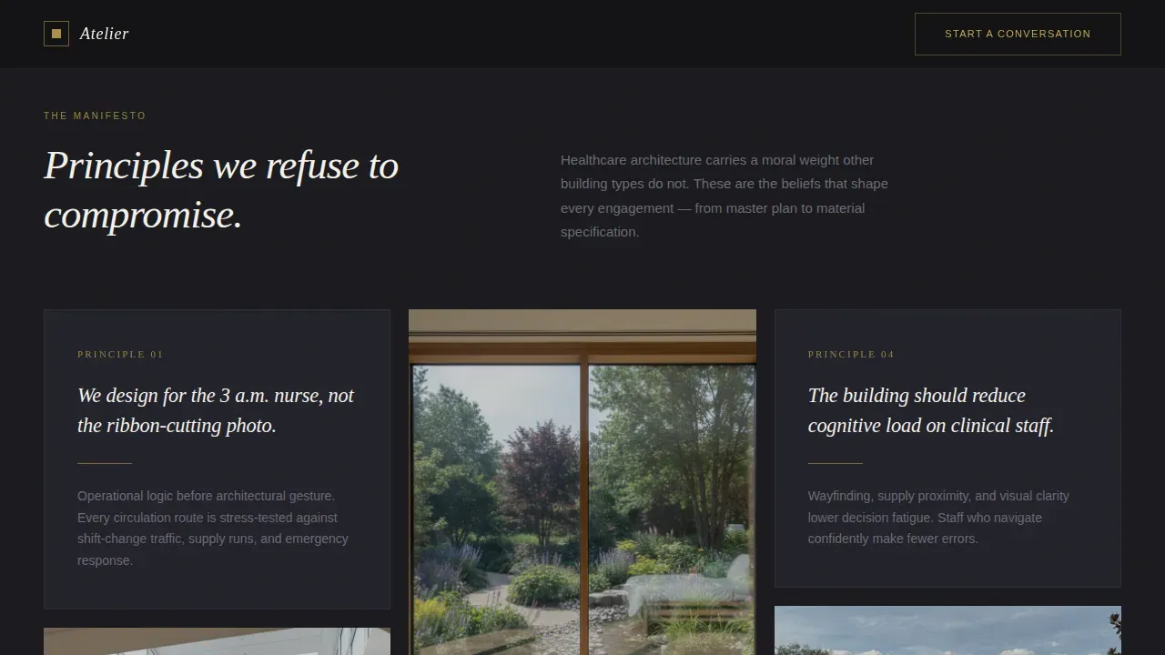
- A masonry principle-and-proof grid, full-width clinical outcomes cards, an asymmetric services bento, a testimonial carousel, and a minimal footer
- Two lead capture paths: a three-question modal form for active prospects and a gated PDF download for earlier-stage visitors
Feature list
This template delivers six core capabilities grounded in the source brief.
Floating Parallax Hero with Constellation Layout
Seven project images drift in gentle parallax against an obsidian field, each slightly rotated as if pinned to a studio wall. The headline "Architecture is the first medicine" fades in at center, setting the tone before a single word of body copy appears. Cursor-responsive movement makes the hero feel alive without distracting from the message.
Manifesto Masonry Grid
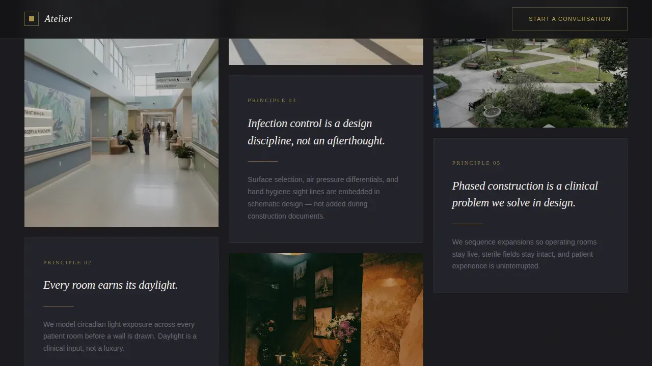
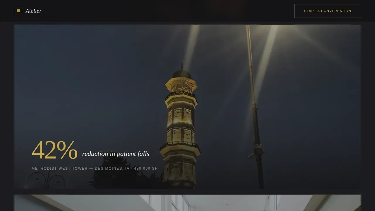
The masonry section builds its argument the way a great essay does: principle first, then proof. Each card pairs a design belief with a single project image. Full-width cards break the rhythm between principle rows, presenting one clinical outcome metric per project, creating a sense of evidence-based credibility that pure aesthetics alone cannot achieve.
Three-Question Lead Capture Modal
The "Start a Conversation" form opens in a gold-bordered modal and guides prospects through three sequential questions: project type (acute care, ambulatory, behavioral health, or master plan), approximate square footage via slider, and a free-text field asking what problem their current facility is creating. This form structure signals deep expertise and improves lead quality from the first interaction.
Gated PDF Download Path
A secondary conversion path offers a downloadable guide gated behind name and email only. This captures visitors who are mentally engaged but not yet ready to commission a project, creating an earlier-stage lead pipeline that the primary form alone would miss.
Asymmetric Services Bento Grid
The services section uses an asymmetric bento layout to present four practice areas: acute care hospital design, ambulatory clinic projects, behavioral health facility work, and campus master planning. The layout gives each service room to breathe without requiring equal visual weight, letting the most relevant service draw the eye naturally.
CEO and Director Testimonial Carousel
Named health system executives and facility directors speak to the firm's impact, with institution names visible and a click-to-advance interaction keeping the section active. Social proof from real decision-makers at this level is crucial for building trust with prospects who are physically and financially committed to a major capital project.
Page sections overview
| Section | Purpose |
|---|---|
| Floating Hero | Parallax photo constellation with manifesto headline and primary call to action |
| Manifesto Masonry | Principle cards paired with project images, building philosophy to clinical evidence |
| Clinical Outcomes Cards | Full-width photography with a single outcome metric per project |
| Services Bento Grid | Asymmetric layout presenting four healthcare design practice areas |
| Testimonials Carousel | Named executive quotes with click-to-advance interaction |
| Minimal Footer | Single-row copyright, privacy, and terms links |
Design & branding system
The visual identity draws from the tradition of the architectural monograph: the kind of book left open on a credenza, where the weight of the paper and the precision of the typography communicate craft before the images do. Every color and type choice reinforces the quiet luxury of serious, careful work.
- Obsidian (#1A1A1E) primary background, warm gold (#C9A84C) for hover states and accent lines, parchment white (#F4F1EB) for card surfaces and type containers, and muted graphite (#4A4A52) for body text
- Fraunces display serif for headlines and Decima Mono or DM Sans for body copy, creating a contrast between the emotional weight of the headings and the clinical clarity of the supporting text
- Gold appears only at moments of interaction, hover states, modal borders, accent lines, never shouting, always present at the right moment, like the gilded edge of a turned page
Mobile & speed optimization
The template is designed desktop-first, reflecting the reality that health system chief executives and facility directors review capital project materials on large screens. The layout remains fully responsive for smaller viewports without sacrificing the immersive quality of the hero or the masonry grid.
- Hero parallax and modal interactions are built as client components, keeping static sections lean and fast to render
- High-resolution project images are intended for compression before deployment so the page loads quickly and visitors are not lost to slow render times
- The mobile layout preserves the masonry reading experience and ensures interactive elements remain accessible and clearly tappable on smaller screens
How this template helps you convert
This landing page is built around one primary conversion goal: getting a qualified health system leader to start a conversation. Every section removes friction and builds the confidence needed to take that step.
- The manifesto masonry grid builds trust progressively, moving visitors from philosophical alignment to clinical evidence before they reach the call to action, so the form feels like a natural next step rather than a cold ask.
- The three-question modal form qualifies leads at the point of capture, asking about project type, scale, and the problem the current facility is creating, meaning every submission carries context the firm can act on immediately.
- The gated PDF path captures visitors who are not yet ready to commission a project, creating a second lead channel that supports longer sales cycles common in health care capital planning.
Other information about this template
The Atelier healing space healthcare architecture landing page template sits at the intersection of evidence-based design thinking and quiet luxury visual presentation. It is inspired by the growing body of research confirming that the built environment profoundly affects patient outcomes, staff well being, and long-term recovery rates. Designing healthcare spaces that promote healing is a concept that combines critical and abstract thinking, and this template gives that philosophy a platform worthy of the work.
- The page is grounded in evidence-based design principles: natural light in patient rooms, green spaces and gardens visible from clinical areas, warm materials like wood on interior surfaces, and ceiling heights that reduce the feeling of institutional confinement
- Healthcare centers and hospital environments must adapt to changing patient and professional needs, and the template's flexible section structure can accommodate future additions such as an orthopedic center case study, a natural landscape project feature, or a dedicated infection control design principle card
- The services bento is structured to highlight the full scope of modern healthcare facilities work: from a single clinic room to a multi-building campus, from behavioral health environments that protect patients who are physically and mentally compromised to acute care towers serving thousands of visitors and families each year
- The template supports the display of relevant credentials and design philosophy statements, allowing the firm to communicate its core approach, whether patient-centered design, evidence-based healing, or biophilic integration of nature into the healthcare environment, clearly and credibly to every site visitor
- Color psychology and aesthetics are embedded in the palette itself: the obsidian and parchment tones promote a sense of calm, the gold accent creates security and warmth at moments of interaction, and the overall visual language signals that this firm understands the emotional stakes of health care architecture in any context, from the UK to the US
Theme
Atelier Studio
Creative direction
Manifesto
Color system
Obsidian & Gold
Style
Masonry/Pinterest
Direction
Lead Generation
Page Sections
Floating Parallax Hero Section
Manifesto Masonry Grid
Three-question Lead Capture Modal
Gated PDF Download Path
Asymmetric Services Bento Grid
CEO and Director Testimonial Carousel
Related questions
Who is this landing page template built for?
What lead capture options does the template include?
Can the masonry grid showcase different healthcare project types?
Does the template include social proof sections?
What makes this different from a standard architecture portfolio page?



