Specialty Cleaning Directory Website Template
The Sanitary landing page template is built for commercial trash can and dumpster enclosure cleaning services targeting property managers, facility directors, and HOA companies. It leads with a bold comparison table, a sticky assessment call to action, and a sequential process reveal that turns operational detail into buyer confidence. The result is a page that feels as clean as the service it represents.
by Rocket studio
Quick summary
This is a single-page B2B landing page template for a commercial dumpster and trash receptacle sanitization service. It pairs a cinematic dawn header with a clinical comparison table, a transparent process walkthrough, and two conversion paths: a property assessment request and a gated ROI brief download. Every section is designed to build trust before asking for a meeting.
Who this template is for
This template is built for specialty cleaning operators who serve commercial and institutional clients. If your sales cycle runs through a facilities director, a property management firm, or an HOA board, this page speaks their language directly.
- Commercial trash can and dumpster enclosure cleaning companies
- Specialty cleaning contractors serving property management firms, hospital campuses, school districts, and HOA management companies
- Service businesses that need a high-trust B2B landing page to support a consultative sales process
What problem this template solves
Most cleaning service websites look residential. They use before-and-after photos and generic testimonials. That approach does not work when your buyer is a facility director managing a 400-unit retail center and fielding pest complaints weekly.
- Property managers and HOA boards need data, not stock photos, before approving a vendor contract
- Without a structured page, operators lose leads who need internal approval and cannot find a clear reason to act
- The gap between "I need this" and "I can justify this to my board" is exactly where this template works
What you get with this template
You get a complete, ready-to-customize single-page layout built around commercial trust signals. Every section earns its place by moving a skeptical B2B buyer one step closer to booking an assessment.
- A full-bleed dawn header with a bold headline designed to stop a distracted facilities manager mid-scroll
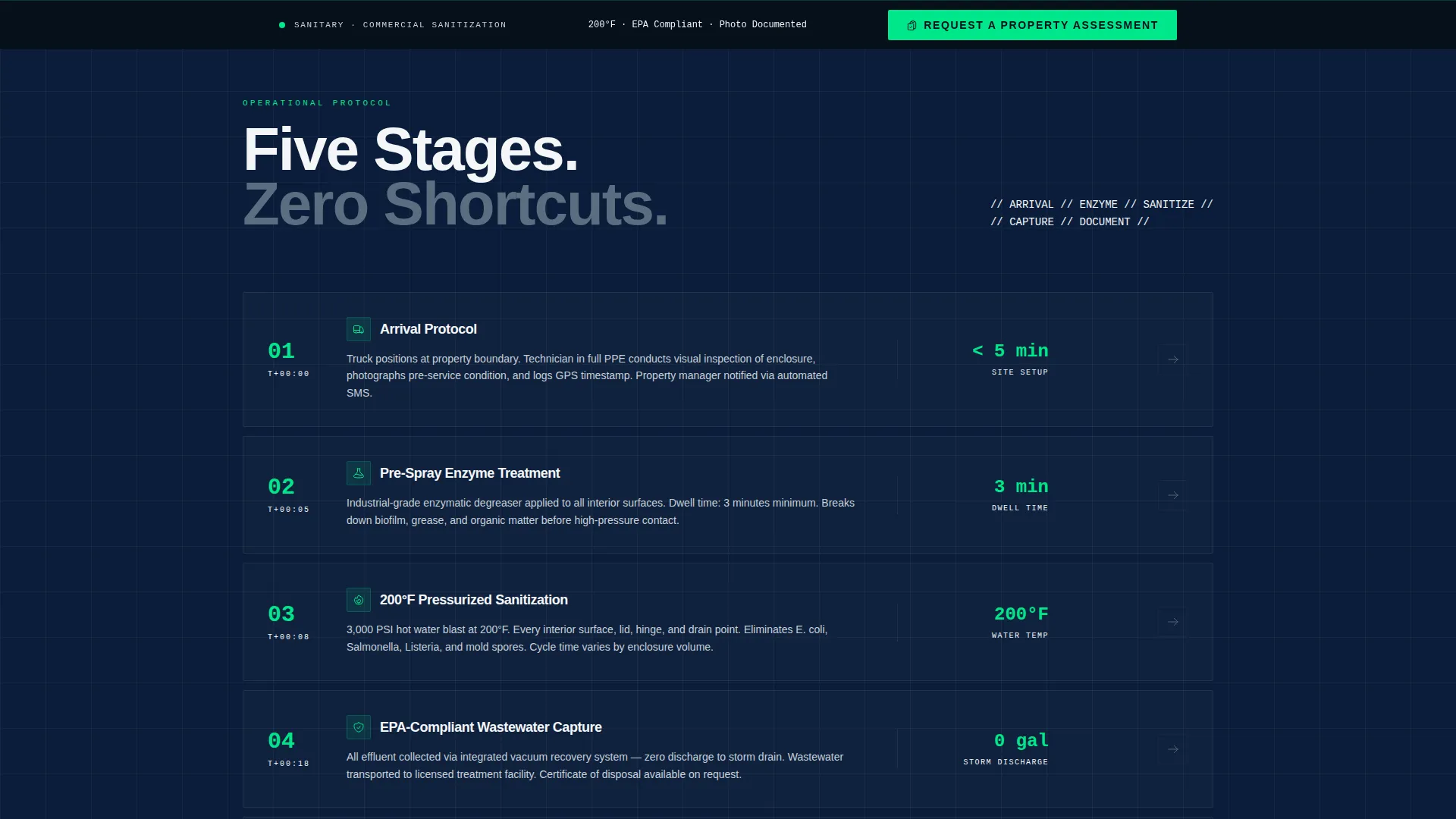
- A multi-stage process walkthrough showing arrival protocol, enzyme pre-treatment, 200-degree Fahrenheit pressurized sanitization, wastewater capture, and post-service photo documentation
- A primary sticky call to action bar locked to the viewport bottom and a secondary gated download path for leads who need more internal buy-in
Feature list
This template is built around a set of deliberate, prompt-grounded components. Each one serves the B2B buyer's decision process.
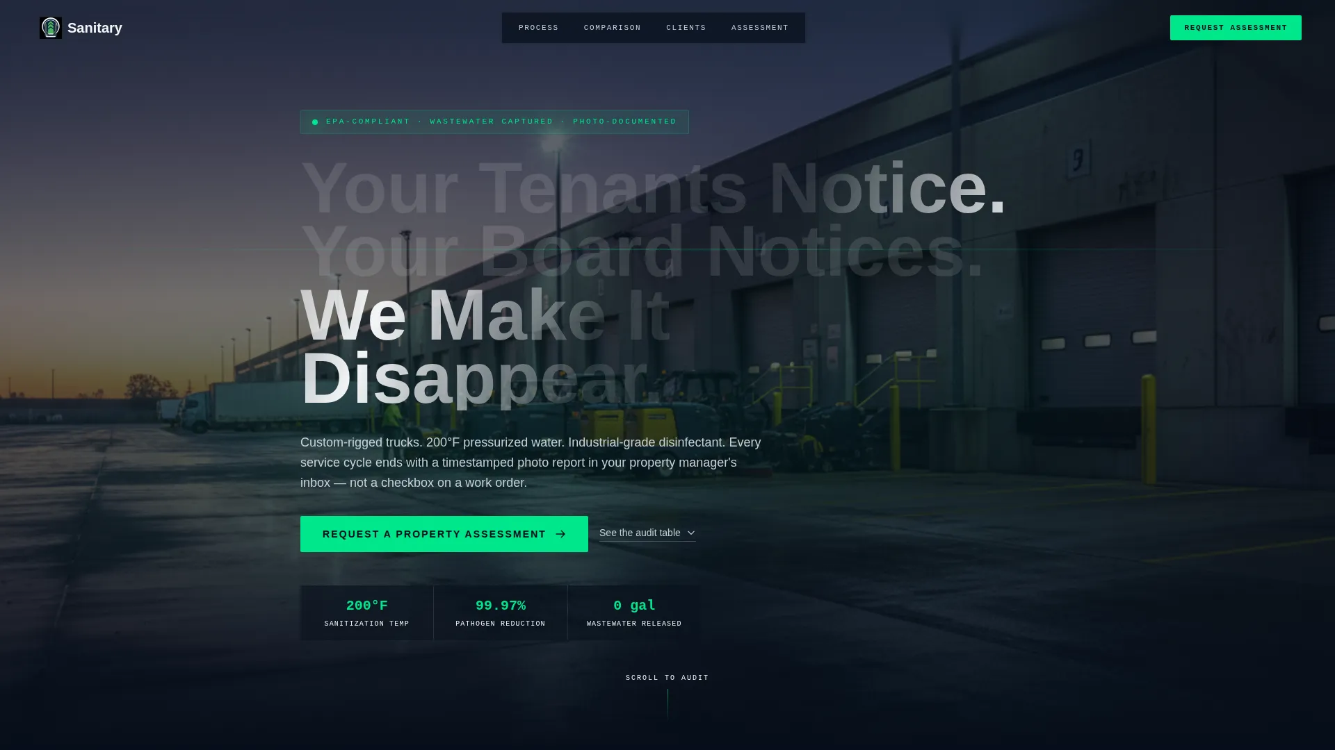
Dawn Header with Cinematic Atmosphere
The header uses a dark, full-bleed photograph set at a commercial loading dock at dawn. Wet asphalt, LED work lights, steam, and a technician in branded coveralls establish immediate operational credibility before the visitor reads a single word.
Animated Headline Fade-In
The headline "Your Tenants Notice. Your Board Notices. We Make It Disappear." fades in over the steam in the header image. The effect creates a moment of theatrical tension that draws the reader into the page.
Sequential Process Reveal
Each stage of the cleaning operation is laid out in order: arrival, enzyme pre-spray, 200-degree Fahrenheit hot-water blast, EPA-compliant wastewater capture, and photo documentation delivered to the property manager. The scroll pacing turns the process into a clinical walkthrough rather than a marketing claim.
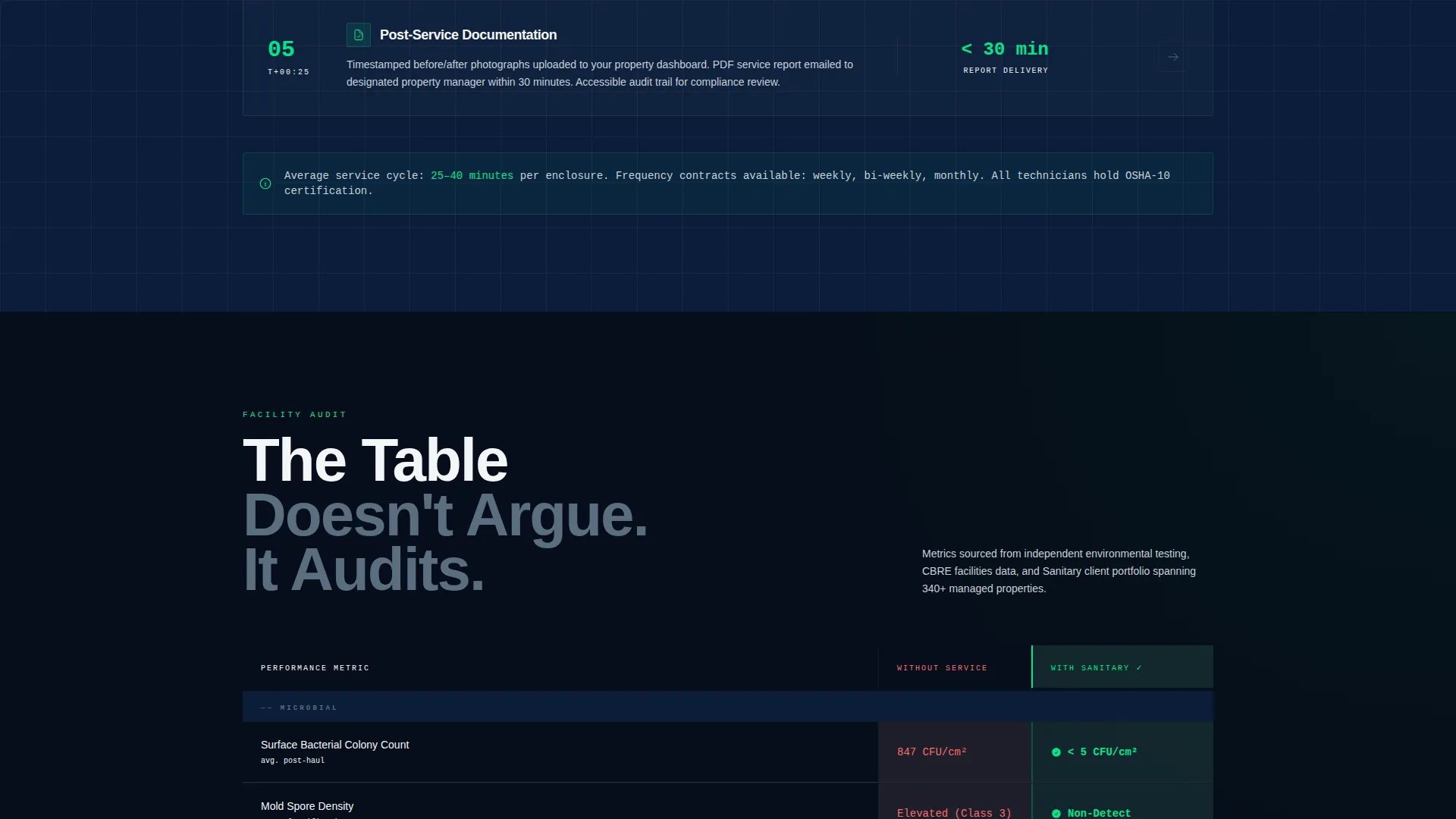
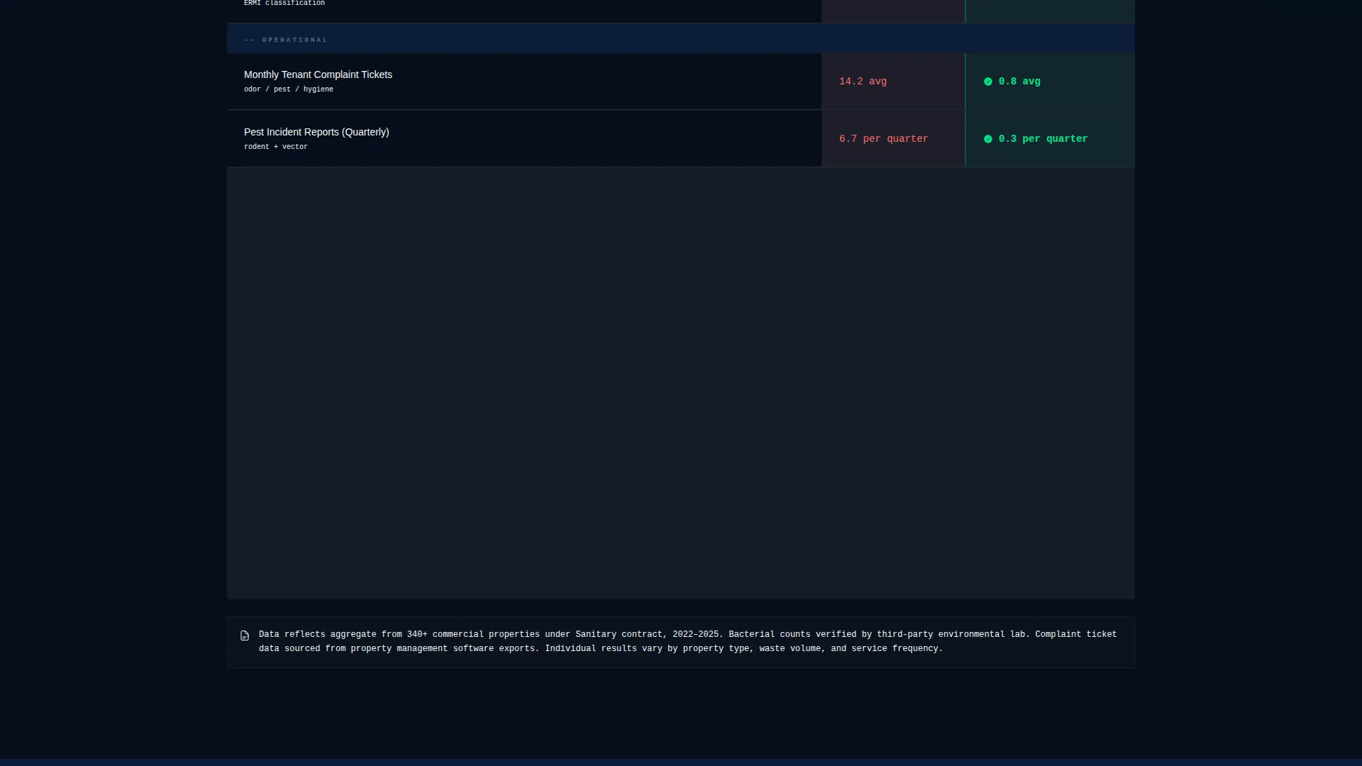
Comparison Audit Table
The core of the page is a structured table contrasting "Without Contracted Service" against "With Sanitary" across specific metrics: bacterial colony counts, complaint ticket volume, pest incident reports, and lease renewal correlation. The table does not persuade with adjectives. It presents numbers.
Sticky Assessment call to action Bar
A slim navy bar is locked to the bottom of the viewport throughout the scroll. It contains a single decontamination green button labeled "Request a Property Assessment." The form collects property name, unit or tenant count, current waste hauler, and service frequency preference.
Gated ROI Brief Download
A secondary conversion path offers "Download the Facility Manager's ROI Brief" behind a business email gate. This captures buyers who are interested but need supporting material before they can get internal approval to sign a contract.
Page sections overview
| Section | Purpose |
|---|---|
| Full-Bleed Header | Establish operational credibility instantly |
| Animated Headline | Hook the reader with a resonant message |
| Process Walkthrough | Show every service stage in clinical order |
| Comparison Audit Table | Let metrics make the case for contracted service |
| Sticky call to action Bar | Keep the assessment request always visible |
| ROI Brief Gate | Capture leads who need internal buy-in first |
| Assessment Request Form | Collect property details for a direct sales follow-up |
Design & branding system
The visual identity follows a Corporate Precision theme. Every color choice reinforces the idea of a compliance dashboard where every metric is green because the right systems are in place.
- Four-color palette: command-deck navy (#0B1D3A) for authority backgrounds, gunmetal operational gray (#3D4F5F) for secondary surfaces, clinical white (#F4F6F8) for content areas, and decontamination green (#00E68A) used exclusively for calls to action, checkmarks, and active table row highlights
- Typography and layout mimic a facilities management interface, keeping text blocks tight, structured, and scannable rather than decorative
- Green accent color is used sparingly and purposefully so that every call to action button and every positive metric in the table reads as a signal, not decoration
Mobile & speed optimization
The layout is structured to translate cleanly from a wide desktop monitor to a tablet or smartphone screen. Facility directors reviewing vendor options on a phone during a site walk need the same clear hierarchy they would get at a desk.
- The sticky call to action bar remains accessible at the bottom of the viewport on all screen sizes, ensuring the assessment request is never more than one tap away
- The comparison table is structured for horizontal scrollability on smaller screens so no data is hidden or truncated on mobile viewports
- Section pacing and image weight are managed to keep the page loading and scrolling smoothly across device types
How this template helps you convert
The page is built around two conversion paths, both designed for the realities of a B2B buying cycle that often requires committee approval.
- The sticky "Request a Property Assessment" bar keeps the primary conversion action visible at all times without interrupting the reading experience, so a buyer who finishes the comparison table can act immediately without scrolling back up.
- The gated ROI brief provides a lower-commitment second path for leads who are convinced but not yet authorized to sign, turning a passive reader into a qualified email contact before they leave the page.
Other information about this template
This template sits at the intersection of specialty cleaning and professional services marketing. It is designed for operators competing for multi-site commercial contracts where trust, compliance language, and operational proof matter more than price.
- The template style draws from Editorial and Magazine layouts, using high visual contrast and structured data presentation rather than generic service-business patterns
- The Service Utility theme means every design decision earns its place by helping the reader understand what the service does and why it matters
- The page is classified as a specialty cleaning landing page for commercial property service operators, making it a strong fit for any operator in that niche looking to upgrade their B2B sales presence
- Custom form fields (property name, unit or tenant count, current waste hauler, service frequency preference) are pre-built into the assessment request layout so operators can begin collecting qualified lead data immediately after customizing the template
Theme
Service Utility
Creative direction
Logo Wall Authority
Color system
Plum Executive
Style
Editorial/Magazine
Direction
Click-Through
Page Sections
Dawn Header with Cinematic Atmosphere
Sequential Process Reveal
Comparison Audit Table
Sticky Assessment Call to Action Bar
Gated ROI Brief Download
Pre-built Assessment Request Form
Related questions
Can I customize the comparison table metrics for my own service area?
What types of businesses is this landing page best suited for?
How does the two-path conversion system work?
Do I need design experience to edit the template?
Can I adjust the accent color to match my own brand?



