Kosher Food & Dining Appointment Booking Website Template
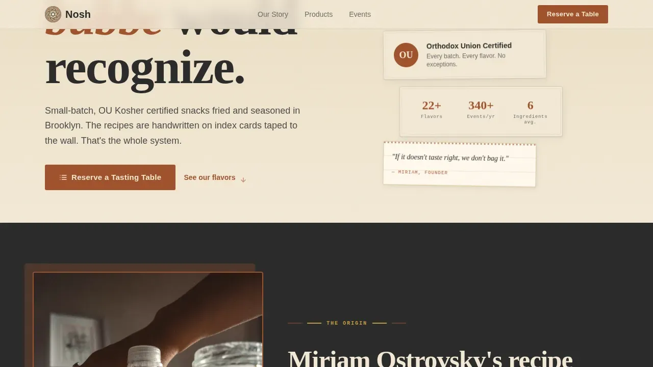
The Nosh Neo-Retro Kosher Snack Brand Landing Page Template is a card grid landing page built for small-batch kosher food businesses. It combines a cinematic mid-century illustration header, a scroll-driven origin story, a collectible product card grid, and a dual-path conversion form into one cohesive, community-rooted page that turns brand spirit into booked tasting tables.
by Rocket studio
Quick summary
This template gives a kosher snack brand a single-page home that feels handcrafted and trustworthy. The card grid layout tells an origin story, displays the product lineup in illustrated collectible cards, surfaces real testimonials, and closes with a tasting reservation form. It is built for event-driven food sales in the Jewish community market and beyond.
Who this template is for
This template speaks directly to small-batch food makers who sell into community-driven markets. It is intended for brands where the origin story is as important as the product itself, and where the buyer needs to feel a human connection before committing to an order. The spirit of this template is relational, not transactional.
- Synagogue event coordinators who stock oneg tables and need a vendor they can trust
- Jewish summer camp purchasing directors filling canteen shelves across an entire program season
- Small-batch kosher food founders who want to reach young parents, corporate planners, and simcha organizers in one place
What problem this template solves
Kosher food brands in the community market face a genuine challenge. They have a remarkable product, a rich origin story, and a loyal circle of friends and repeat buyers. But without a well-designed page, they are invisible to the coordinators and purchasing directors who make bulk buying decisions every april through august planning cycle and well into the fall. A generic food website does not carry the warm, hand-stamped identity that earns trust in this niche. The reality is that most small food businesses lose event buyers before the first conversation even starts.
This template solves that by combining storytelling with a practical conversion path. The page guides visitors from curiosity to connection to commitment, all without a single moment of confusion.
- It replaces bland, plastic-feeling food pages with a warm neo-retro visual world that speaks the language of the community
- It creates a clear journey from brand story to product exploration to tasting reservation, so no buyer is left wondering what to do next
- It gives coordinators and camp directors a form that collects exactly what a food vendor needs to serve them well, in the right order
What you get with this template
You get a fully structured, modular card grid landing page designed specifically for the kosher food and beverage market. Every section is purposeful. Every visual choice is grounded in a design system that draws from decades of deli culture and mid-century commercial art. The template is a complete creative project, ready to explore and customize with your own brand content.
- A panoramic mid-century illustration header, an origin story card row, a full product grid, a social proof bento section, and a dual-path tasting form
- A Parchment and Rust color system with four defined hex values, a three-font typographic stack, and a complete set of hover states, badge styles, and card animation behaviors
- A sticky bottom bar with the primary call to action, a smart form with a headcount slider and event type selector, and a secondary sample box request path
Feature list
The following built-in capabilities make this template a focused tool for food brands that sell through community relationships and event channels.
Cinematic Illustration Header
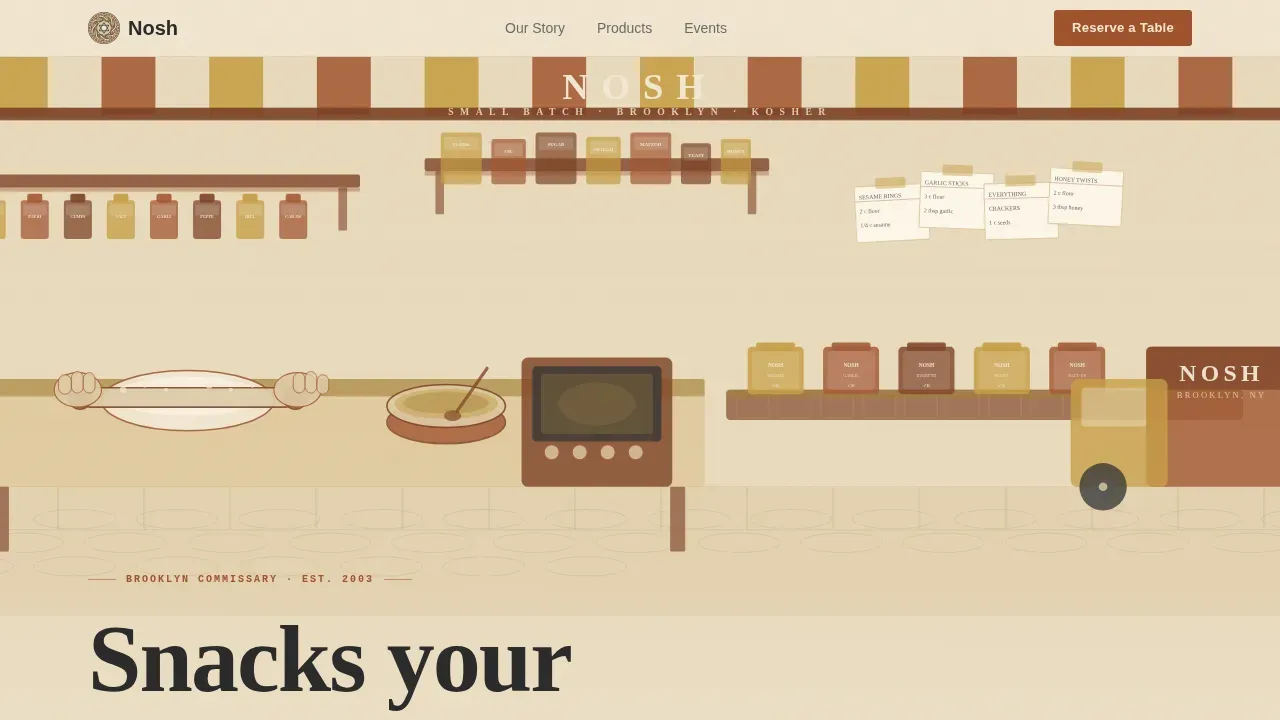
The header is a wide panoramic scene rendered in a mid-century commercial art style. Hands roll dough, jars of spices line wooden shelves, and a conveyor of snack bags disappears into a delivery truck on a cobblestone street. The palette is limited to the Parchment and Rust color system with fine ink linework. The brand name sits hand-lettered across the top like a shop awning, giving the page the feel of a Saul Bass title card for a food film. This kind of art direction signals craft and care before a visitor reads a single word.
Scroll-Driven Origin Story Cards
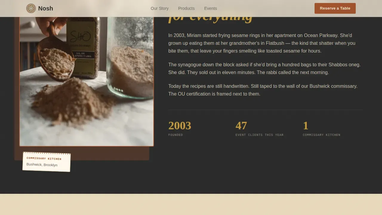
The first card row carries the founding recipe and the family behind it. The layout is asymmetric, pairing a photo-style illustration with a text narrative that draws the visitor into the history of the brand. The spirit of the section is personal, not promotional. It taught the template to treat brand history as a selling tool, not an afterthought. Each scroll reveal is staggered, so the story unfolds naturally as the visitor moves down the page.
Illustrated Product Grid with Kosher Badges
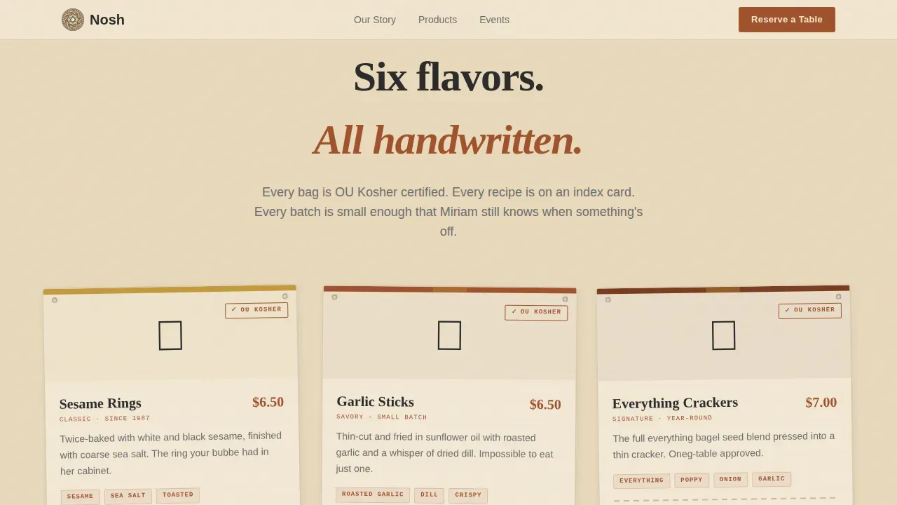
The second card row fans out into the current product lineup. Each card is individually illustrated and carries a flavor description, a texture note, and a prominent hechsher certification badge. The cards feel like collectibles, something you would pin to a corkboard or share with a friend. The combination of illustration style and badge placement means the brand can speak to both taste-driven buyers and certification-conscious event coordinators at the same moment.
Social Proof Bento Grid
The third card row brings real event photos together with testimonial cards from coordinator archetypes and a tasting menu breakdown. The bento grid format gives each piece of social proof its own framed moment, like items arranged behind glass at an appetizing shop. This section is celebrated specifically because it moves the visitor from passive interest to active trust. Headcount stats and named testimonials give the page real-world credibility.
Dual-Path Conversion Form
The tasting form collects event type first, then headcount via a slider, then preferred date, then contact email. This order matters: the easiest question comes first, so the visitor is already invested by the time they share contact details. The secondary path, "Send Me a Sample Box," captures address and dietary notes for visitors who are not yet planning an event. Both paths are served from a sticky bottom bar that appears after the product cards, so the call to action is always visible without interrupting the story.
Neo-Retro Card Hover States and Animations
Every card in the grid responds to hover with a deep schmaltz gold highlight. Scroll reveals stagger the cards into view. The sticky bottom bar has its own entrance animation. These interactions are medium-intensity, meaning they add life and spirit without overwhelming the page. The result is a page that feels alive and crafted, not like a template picked from a plastic stack.
Page sections overview
| Section | Purpose |
|---|---|
| Illustration Hero Header | Establishes brand world and identity at first glance |
| Origin Story Row | Tells the founding family narrative and earns emotional trust |
| Product Card Grid | Showcases the snack lineup with flavor, texture, and certification details |
| Social Proof Bento | Builds credibility through event photos and coordinator testimonials |
| Tasting Reservation Form | Converts event planners with a smart, step-by-step inquiry form |
| Sample Box Path | Captures early-stage buyers who want to taste before they commit |
| Sticky Bottom Bar | Keeps the primary call to action present throughout the scroll journey |
| Linear Footer | Closes with brand essentials in a single clean row |
Design & branding system
The visual identity of this template is built around what you might find behind glass at a Lower East Side appetizing shop. Warm, yellowed, trustworthy, and stamped with hand-drawn authority. The design draws from decades of deli culture, mid-century food packaging art, and the kind of thick, textured label design that made brooklyn neighborhood shops feel famous before the internet existed. Every color, every typeface, and every layout choice was made to create a brand world that feels lived-in and loved.
- The four-color Parchment and Rust palette uses aged parchment cream for backgrounds, oxidized rust for headlines and price callouts, deep schmaltz gold for hover states and badges, and charcoal ink for body text
- Typography pairs Fraunces serif headlines with DM Sans body text and JetBrains Mono for labels and badges, creating a combination that balances retro warmth with clean modern readability
- Illustration style, card borders, badge shapes, and hover states all reinforce the same neo-retro concept, so the page feels like one cohesive creative work rather than a collection of assembled parts
Mobile & speed optimization
This template is built desktop-first, which reflects the reality of how event coordinators and purchasing directors actually browse. They are at a desk, comparing vendors, running a planning program, and making decisions with a spreadsheet open in another tab. At the same time, the page supports full mobile use. Young parents browsing kosher food options often do so on a phone, and the card grid reflows cleanly for smaller screens.
- Static sections including the header illustration, origin story cards, and product grid use server components for fast initial load, so the above-the-fold art renders without delay
- The tasting form, sticky bottom bar, and card hover interactions run as client components, keeping interactivity smooth without slowing down the rest of the page
- The card grid is modular, meaning each row can be adjusted or reordered without breaking the overall layout or the mobile reflow behavior
How this template helps you convert
The conversion strategy in this template is built around one insight: event coordinators do not buy food products, they book food vendors they trust. Every design decision serves that goal. The origin story earns emotional credibility. The product grid demonstrates range and certification. The social proof section proves real-world delivery. The form closes the loop with a low-friction ask.
- The sticky bottom bar with "Reserve a Tasting Table" keeps the primary call to action visible at every scroll depth, so a coordinator who is ready to act can do so without scrolling back to the top
- The dual-path form gives two different buyer types a clear next step: event planners book a tasting table, and early-stage visitors request a sample box, so no one leaves the page without a path forward
- The social proof bento grid, with its event photos and testimonial cards, acts as a trust accelerator, helping the visitor imagine their own oneg table, camp canteen, or simcha spread already served with Nosh snacks
Other information about this template
This section covers the broader context, design philosophy, and practical background that make this template a strong market choice for kosher food brands and the builders who create for them.
The food and beverage market has grown increasingly crowded, and standing out requires more than a great product. It requires a page that carries the spirit of the brand into every scroll, every hover, every moment of hesitation. This template was created for exactly that challenge. It draws inspiration from the visual culture of the New York City food world, specifically the Lower East Side and Brooklyn traditions that have shaped Jewish food identity for generations. A co-founder of a small-batch brand in that tradition will find this template already speaks their language.
The design concept is grounded in vibe coding principles: the idea that a website should resonate with a brand's identity and values at an emotional level, not just a visual one. Engaging snack brand websites built this way can enhance user experience and foster genuine brand loyalty. When a visitor smells the toasted sesame through the illustration, when they feel the crinkle of wax paper in the card design, they are experiencing a page that was built with imagination and intention, not assembled from a plastic parts bin.
From a marketing strategy standpoint, this template supports the practices of niche food brands who need targeted approaches for specific community segments. Participating in community events, offering samples at local markets, and building credibility through storytelling are all strategies that this page is designed to amplify. Collaborations with influencers or celebrated food writers in the kosher space become easier when you can send them to a page that feels as thoughtful as the food itself.
The template also reflects well-documented principles of successful snack brand websites: vibrant visuals, engaging storytelling, user-friendly navigation, and prominent social proof. Neo-retro design invokes a sense of trust in simple, clean ingredients while appearing energetic and fun, making it especially effective for better-for-you food products that carry a hechsher certification.
For builders and brand owners who want to launch quickly, no-code tools and AI-powered platforms make it possible to customize and deploy this template without traditional programming skills. No-code platforms can help snack food brands quickly develop and launch their pages, reducing the time and cost associated with web development. This template is structured to work well in those environments, with modular sections that are easy to configure.
The page draws from the spirit of New York food culture, where the city's appetite for authentic, community-rooted food has been celebrated for decades. The warmth of a Brooklyn commissary, the smell of a Lower East Side market, the thick texture of a hand-salted snack pulled from wax paper. These are the sensory stories this template was built to tell. Whether your brand was founded this april or has been quietly served at onegs for years, this page gives it the home it deserves.
- The template is categorized under Food and Beverage, Kosher Food and Dining, and is specifically scoped for the Kosher Snack Brand niche in the direct-to-consumer and business-to-business event sales market
- The nosh neo retro kosher snack brand landing page template is listed in the marketplace under the Neo-Retro theme, Card Grid template style, and Origin Story creative direction, with a Parchment and Rust color system and Custom Illustration header concept
- Design-forward food brands that have studied the visual language of markets from New York to paris will recognize the palette as part of a longer tradition of warm, appetizing, hand-crafted food identity work
- The turkey of design decisions here was made deliberately: nothing on this page is accidental, from the rust headline color to the gold badge glow to the charcoal body text that keeps every flavor description easy to read
- This template was originally scoped for the USA market with USD pricing, English copy, and Brooklyn and New York City cultural context, but the design system can be adapted to other city markets and community food traditions with straightforward copy and color adjustments
Theme
Neo-Retro
Creative direction
Origin Story
Color system
Parchment & Rust
Direction
Event Registration
Page Sections
Cinematic Mid-century Illustration Header
Scroll-driven Origin Story Card Row
Illustrated Product Grid with Certification Badges
Social Proof Bento Grid
Dual-path Tasting and Sample Form
Neo-retro Card Hover and Animation System
Related questions
Who is this template built for?
Can I use this template for both direct-to-consumer and event sales?
What information does the tasting reservation form collect?
Is this template suitable for a brand that is just launching?
Does this template work on mobile devices?



