Low-Sodium Food & Dining Blog Website Template
Savor is a gallery-style landing page template built for low-sodium meal delivery services. It combines editorial food photography, click-to-expand dish detail panels, and a sticky sodium tracker to turn casual browsers into confident subscribers. The design uses a warm citrus palette and a cinemagraph hero to make healthy eating feel genuinely appetizing, not clinical.
by Rocket studio
Quick summary
Savor is a single-page landing page template for low-sodium meal delivery brands. It guides visitors through a curated gallery of weekly dishes, surfaces exact sodium counts on every card, and channels traffic toward a subscription builder via a bold "Build Your First Box" call to action. Warm editorial design makes dietary eating feel inviting, not restrictive.
Who this template is for
This template is built for meal delivery businesses serving health-conscious customers who need to track sodium carefully without sacrificing the joy of eating. It suits founders and marketers who want their food to speak before any sales copy does.
- Low-sodium meal delivery services targeting post-cardiac-event patients and medically advised diets
- Meal kit brands catering to new parents who need fast, nutritious options without reading labels
- Subscription food businesses serving retirees who want doctor-approved meals that still feel like a treat
What problem this template solves
Most health-focused food pages lean too hard on warnings and ingredient lists. They feel more like a pharmacy than a kitchen. Savor solves the trust-and-appetite problem at once, letting beautiful food photography do the persuading while sodium data provides the reassurance.
- Visitors leave other pages unconvinced that low-sodium food can taste good
- Medically advised customers need transparent nutrition data before they will commit to a subscription
- Prospective buyers want a browse experience that feels editorial and pleasurable, not clinical and form-heavy
What you get with this template
You get a fully designed, single-page landing page that covers every stage of the buyer journey: visual discovery, nutritional trust-building, and a clear path to subscribe. Every section is crafted to keep visitors scrolling forward toward the call to action.
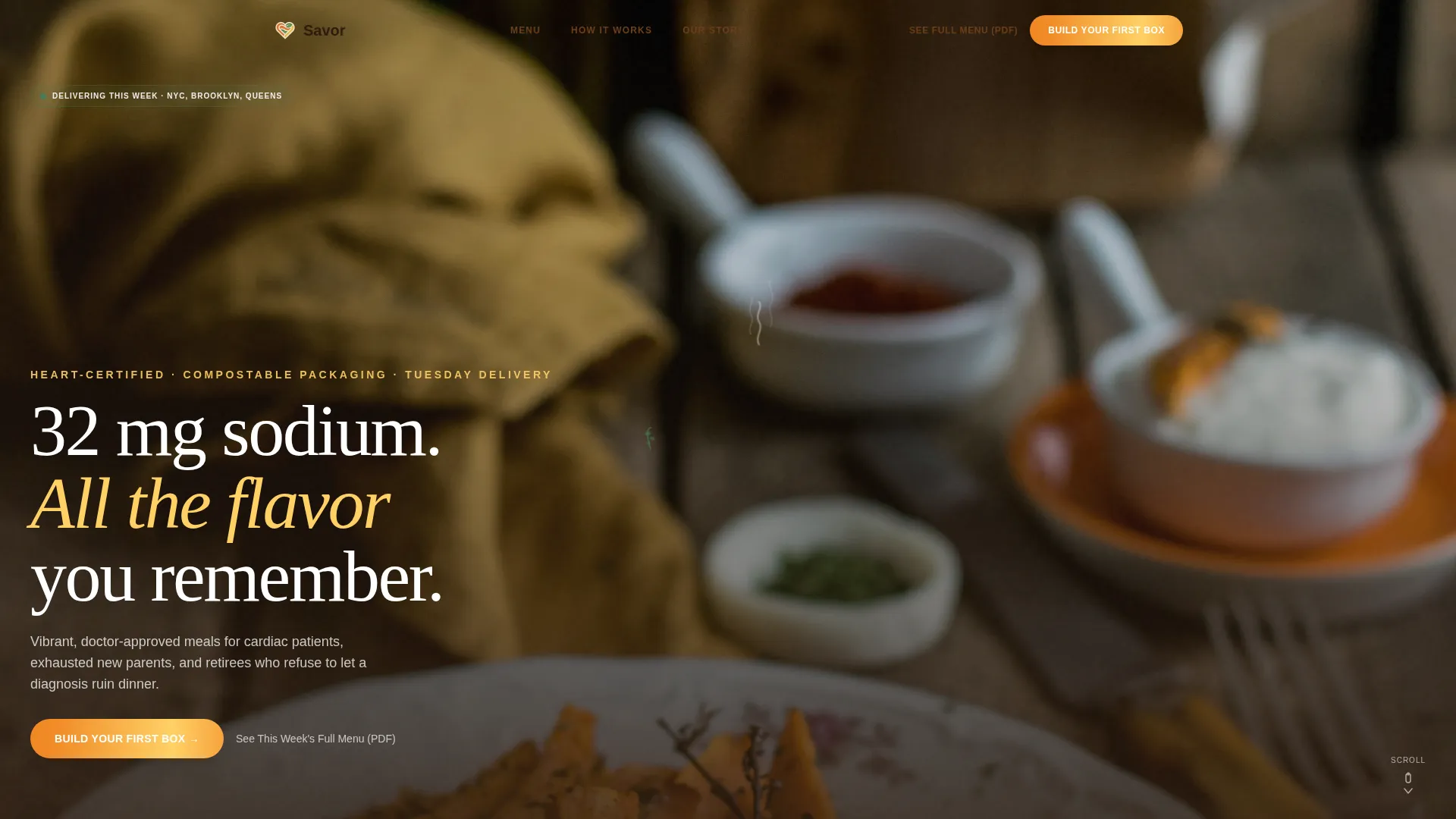
- A cinemagraph hero section with animated steam, a bold headline, and a primary "Build Your First Box" button
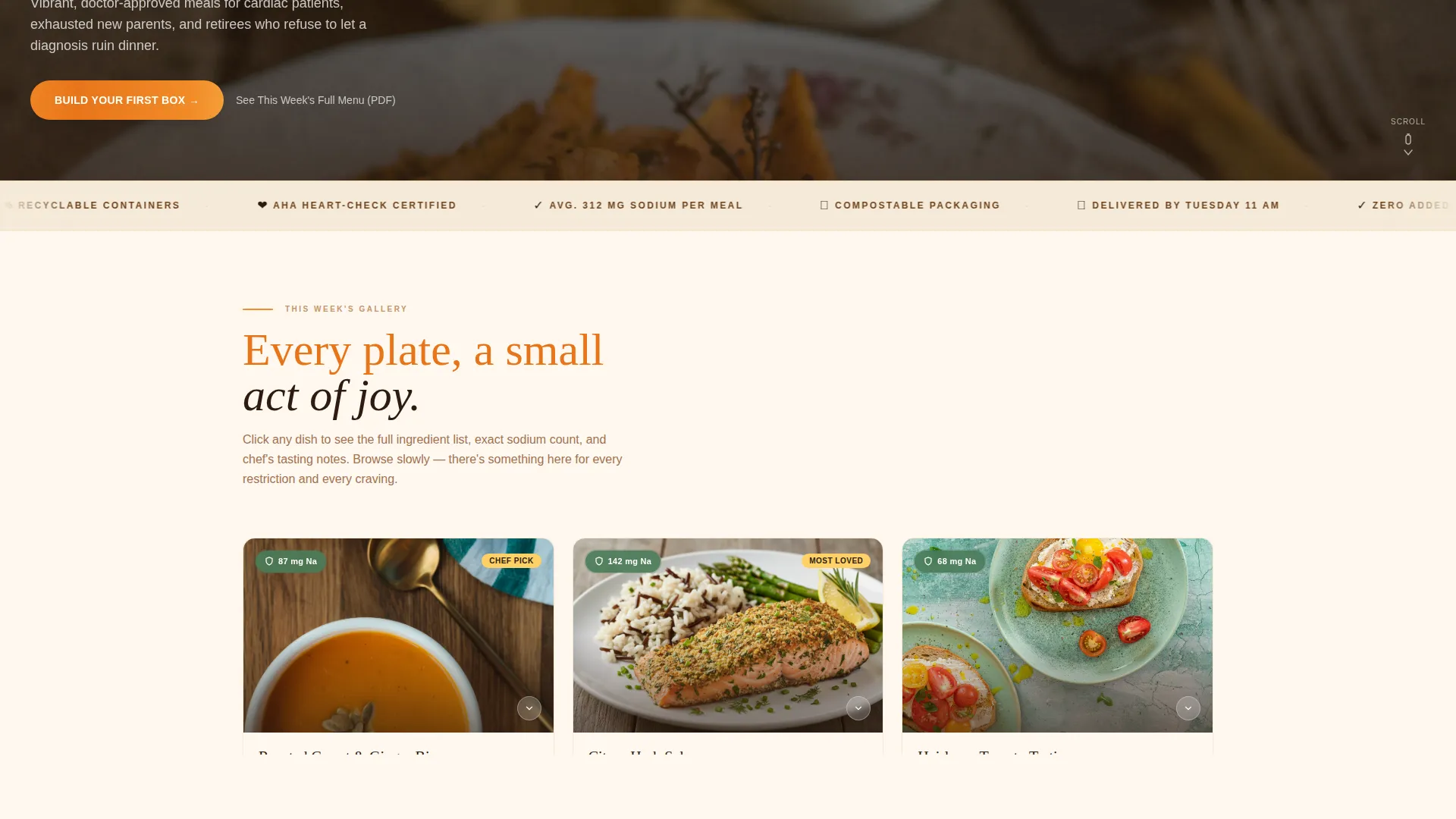
- A Gallery Walk layout with alternating three-card rows, full-viewport hero dish moments, and click-to-expand detail panels showing ingredients, sodium count, chef's tasting notes, and a macro breakdown
- A sticky average-sodium banner, an American Heart Association Heart-Check badge, handwritten-style customer moment quotes, a three-step how-it-works flow, and a secondary PDF menu link
Feature list
This template ships with a focused set of interactive and visual components, each grounded in what a health-focused meal delivery landing page actually needs.
Cinemagraph Hero Section
The header uses a full-bleed forty-five-degree plated meal shot where everything is still except a drifting curl of steam and a trembling cilantro sprig. The headline "32 mg sodium. All the flavor you remember." eases in after the first beat, giving the visual moment space to land before any words appear.
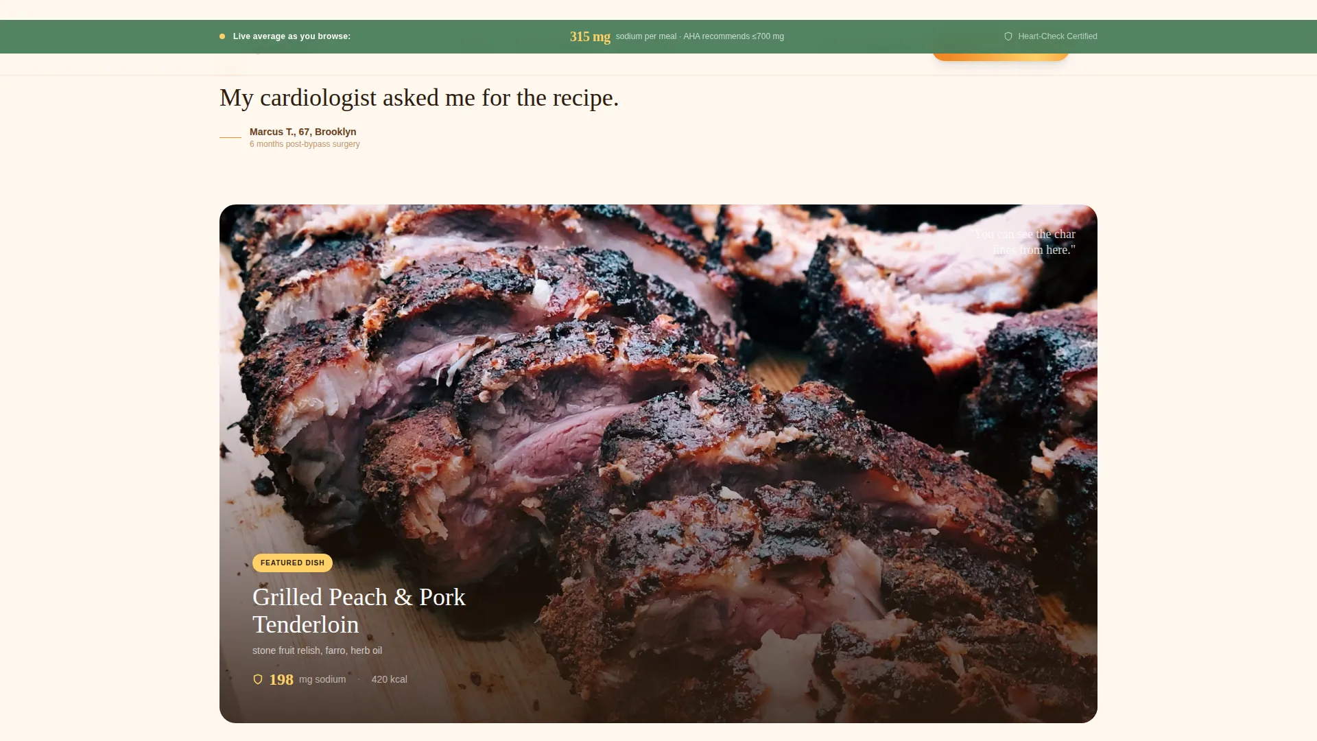
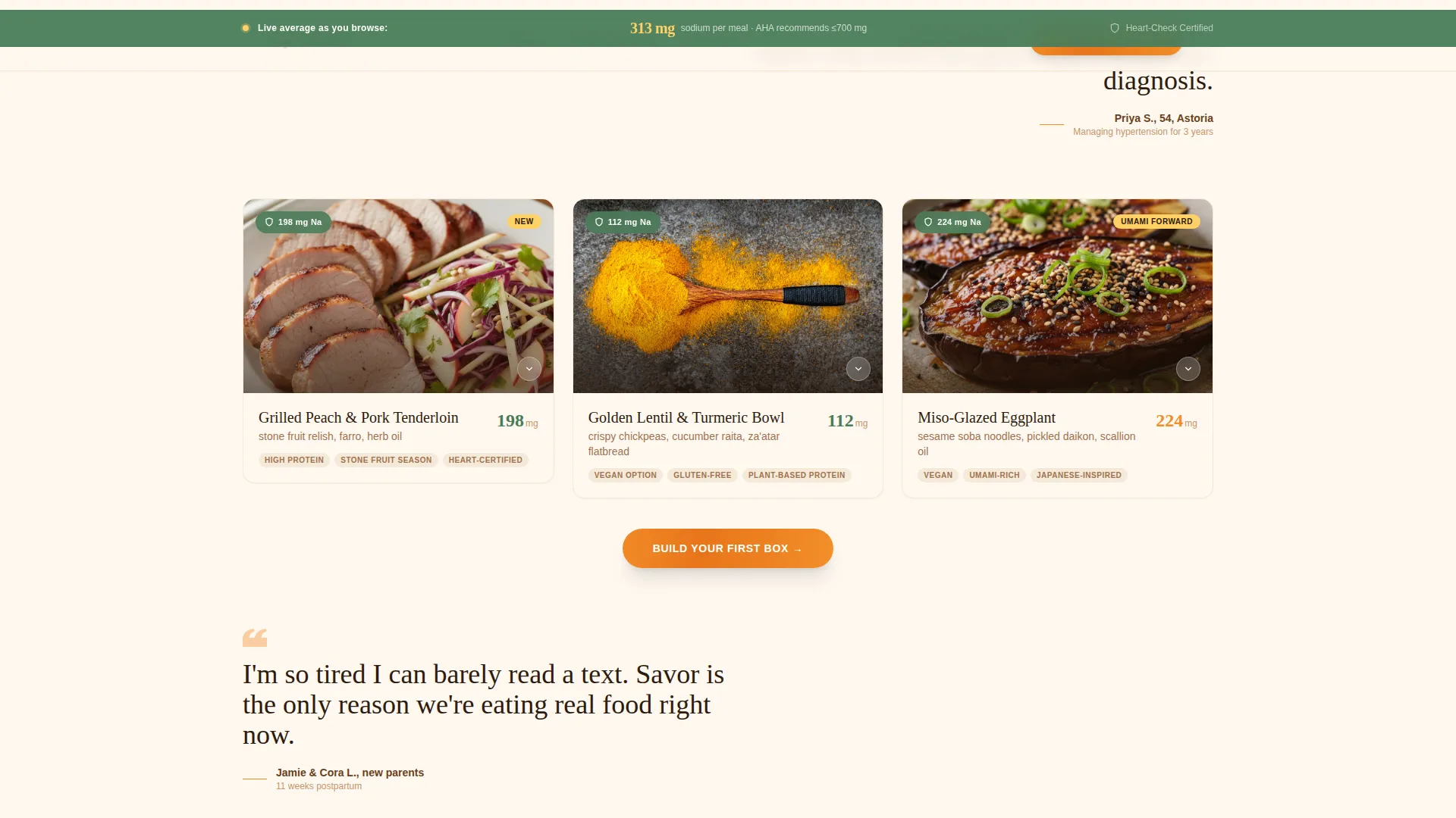
Click-to-Expand Gallery Cards
Each dish appears as an overhead editorial food photography card. Clicking any card opens a detail panel with the full ingredient list, exact sodium milligrams per serving, chef's tasting notes, and a macro nutrient breakdown. No separate page is needed.
Sticky Sodium Tracker Banner
A persistent banner stays visible as visitors scroll, displaying a real-time average sodium count across the dishes they have browsed. This keeps nutritional transparency front and center without interrupting the gallery rhythm.
Repeating Tangerine Call to Action
The "Build Your First Box" button appears first beneath the hero cinemagraph and then resurfaces automatically after every third gallery card. It is always styled in sun-warmed tangerine so it is instantly recognizable without feeling like a hard sell.
Handwritten-Style Quote Breaks
Short customer moment quotes appear between gallery rows in a handwritten-style typeface. These are not service testimonials but emotional snapshots, such as "My cardiologist asked me for the recipe." They add warmth and rhythm to the scroll without breaking the visual flow.
Secondary PDF Menu Link
A quieter secondary link, "See This Week's Full Menu," sits alongside the primary call to action. It gives undecided visitors a low-commitment way to save and share the menu before they are ready to subscribe.
Page sections overview
| Section | Purpose |
|---|---|
| Hero Cinemagraph | Hooks visitors with animated food photography and the primary call to action |
| Gallery Card Rows | Showcases weekly dishes in alternating three-card editorial rows |
| Hero Viewport Dish | Fills the screen with a single close-up dish for emotional impact |
| Expand Detail Panel | Reveals ingredients, sodium count, tasting notes, and macros on click |
| Trust Strip Marquee | Displays the AHA badge, average sodium tracker, and social proof numbers |
| Customer Moment Quotes | Breaks gallery rows with handwritten-style emotional snapshots |
| How It Works | Explains the three-step subscription flow simply and clearly |
| Final Call to Action | Drives visitors to the subscription builder with the tangerine button |
| Footer Arc Split | Closes the page with the green-grounded footer and trust badge area |
Design & branding system
The visual identity follows an Organic Flow theme centered on a Citrus Burst color system. The palette is built to feel warm, alive, and saturated, like a wooden bowl of citrus fruit under a kitchen skylight. Typography pairs Fraunces, a serif display face, with Manrope for body text.
- Cream (#FFF8F0) dominates all backgrounds; tangerine (#F28C28) marks buttons and interactive states; kumquat (#E8751A) anchors headlines; lemon (#FFD166) highlights nutritional callouts; avocado leaf green (#4A7C59) grounds the footer and trust badges
- Fraunces handles display headings for an editorial, farmers'-market warmth; Manrope handles body copy for clean legibility across all screen sizes
- The overall style is organic editorial with gallery-clean layout, scroll reveals, card expand interactions, and a running marquee on the trust strip
Mobile & speed optimization
The template is built desktop-first, with layouts that adapt comfortably to mobile viewports. Full-bleed food photography is a priority, so image loading is handled with performance in mind using CSS-only animations where possible.
- The cinemagraph steam effect and scroll reveal animations use CSS to reduce reliance on heavy JavaScript
- Gallery cards reflow cleanly on smaller screens so the browse-and-expand experience works on mobile without losing detail panel functionality
- The sticky sodium tracker banner and the repeating call-to-action button remain accessible and tappable at every scroll depth on touch devices
How this template helps you convert
The page is structured as a click-through to the subscription builder, so every design decision moves visitors toward a single confident action rather than fragmenting attention across multiple goals.
- Sodium counts and the American Heart Association Heart-Check badge appear before any pricing, so medically cautious visitors build trust through data before they ever see a commitment ask.
- The gallery rhythm, browse, zoom, feel, browse again, keeps visitors engaged long enough for the repeating "Build Your First Box" button to feel like a natural next step rather than an interruption.
- The secondary PDF menu link captures visitors who are not yet ready to subscribe, giving them a shareable asset that keeps the brand in consideration after they leave the page.
Other information about this template
This template is part of a broader design system built around gallery-led, food-first storytelling. It is a strong starting point for any low-sodium meal delivery brand that wants to position quality and health as complements rather than trade-offs.
- The footer uses a Pattern 7 Arc Browser Split layout, with the avocado leaf green grounding trust badges and brand information
- Localization defaults are set for the United States market, with pricing in USD and portion sizes in imperial measurements
- The template style is classified as Gallery and Detail, making it well suited to any subscription food service that leads with visual menus before subscription commitment
Theme
Organic Flow
Creative direction
Gallery Walk
Color system
Citrus Burst
Style
Gallery + Detail
Direction
Click-Through
Page Sections
Cinemagraph Hero with Animated Steam
Click-to-expand Dish Detail Panels
Sticky Average Sodium Tracker
Alternating Gallery Walk Layout
Repeating Primary Call to Action
Handwritten-style Quote Breaks
Related questions
Who is this landing page template designed for?
Does the template include the subscription builder flow?
Can I update the dish photography and sodium numbers?
What makes this template different from a standard food delivery page?
Is the American Heart Association badge included as a real certification?


