Craft Snack Brand Landing Page Template
The Crunch artisan small-batch organic snack brand landing page template is a full-width immersive design for food businesses selling healthy snacks online. Built around a Neo-Retro Warm Stone palette, it uses a collage hero, interactive before-and-after ingredient sliders, a bento product grid, and a sticky cart bar to guide visitors from discovery to purchase without leaving the page.
by Rocket studio
Quick summary
This landing page template is purpose-built for artisan organic snack brands. It gives your food business a visually rich, scroll-driven storefront that lets visitors explore ingredients, pick flavors, and add snacks to their cart, all in one seamless page flow. The design is honest, warm, and built to convert label-readers into loyal customers.
Who this template is for
This template is a good fit for any food business that sells slow-crafted, clean-label snacks directly to consumers. It works equally well for first-time founders and established brands looking to refresh their online store presence.
- Artisan snack makers who sell seeds, nuts, grains, or baked goods and want to highlight their sourcing story
- Health-focused direct-to-consumer brands that need to display multiple products, sizes, and subscription options on one landing page
- Small-batch food producers who want a landing page that explains their process and earns trust before asking for a purchase
What problem this template solves
Selling healthy snacks online is harder than it looks. Customers cannot taste before they buy, so they need your landing page to do the sensory work for them. Generic food website templates fall flat because they treat snacks like any other product. This template is built around the specific trust gap that artisan snack brands face every day.
- Visitors cannot physically taste the product, so the landing page must build confidence through ingredient transparency, sourcing details, and social proof
- Most food business templates do not support multi-product browsing, size toggles, and cart management in a single-page flow, which loses sales mid-scroll
- Brands struggle to communicate handcrafted quality and fresh ingredients visually, and this template solves that with a dedicated before-and-after reveal section
What you get with this template
You get a complete, ready-to-customize landing page that covers every stage of the snack buyer journey, from first impression to checkout intent. The layout is structured to keep visitors engaged, help them navigate the product range with ease, and move them naturally toward a purchase decision.
- A full-viewport collage hero with parallax layers, a bento-style product flavor grid with size toggles, an interactive ingredient reveal slider, a sourcing section with named farm callouts, a staggered testimonials section, and an arc-split footer
- Warm Stone color system, Neo-Retro typography using a heavy rounded serif paired with a typewriter mono, and a consistent visual style across all pages
- A sticky cart bar that tallies selected snacks as visitors scroll, plus a "Build Your Box" sampler bundle path for secondary conversion
Feature list
This landing page template packs in purpose-built features that are designed specifically for food businesses in the artisan snack market. Each feature serves a clear role in guiding visitors from curiosity to confidence to cart.
Collage Hero with Parallax Layers
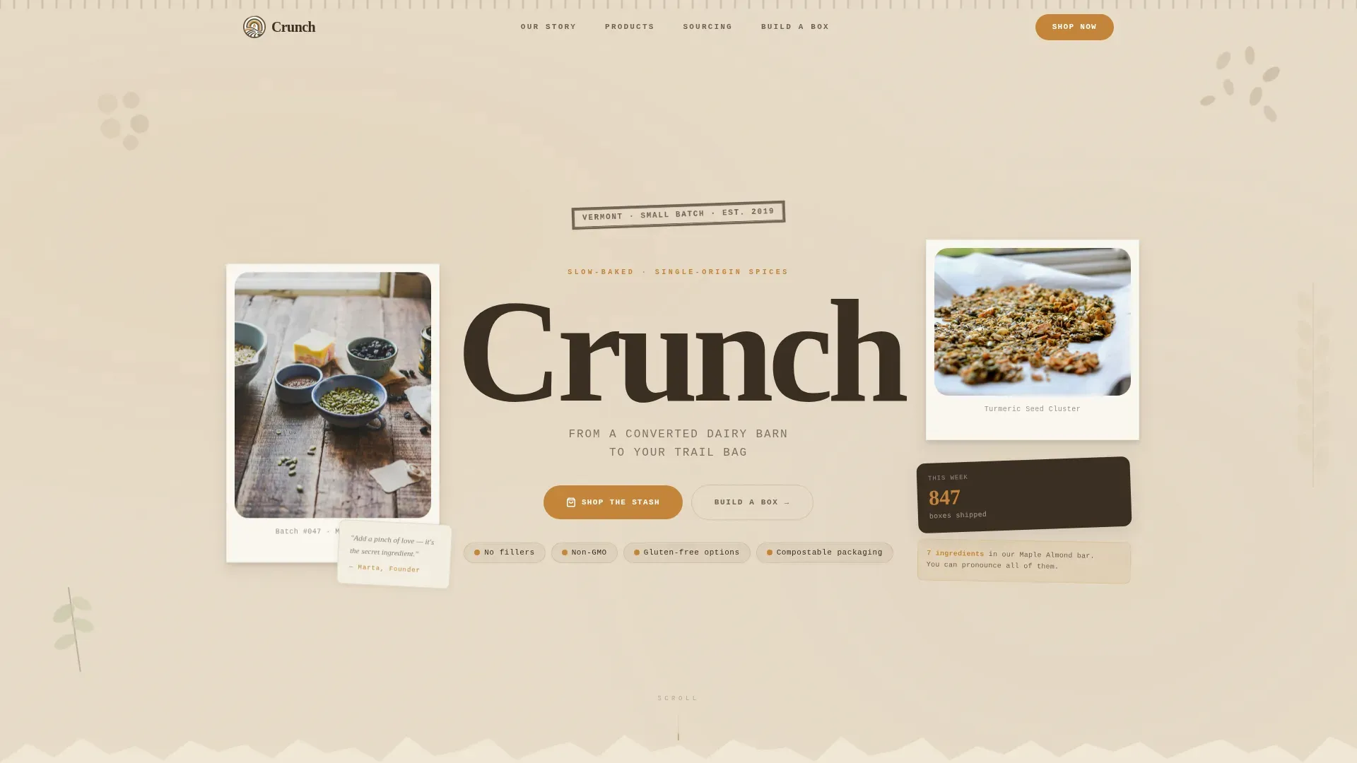
The hero section fills the entire viewport with a layered scrapbook spread. Torn kraft-paper edges, Polaroid-style product images set at slight angles, hand-stamped ingredient illustrations, and a founder's handwritten note sit across stacked collage layers. A subtle parallax effect separates each layer as visitors scroll in, so the design breathes and feels alive. This approach sets the brand's story in motion before a single word is read.
Interactive Before-and-After Ingredient Slider
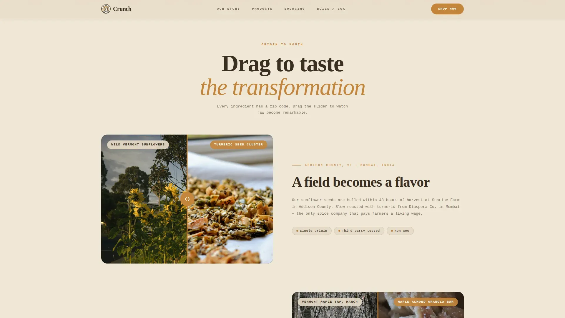
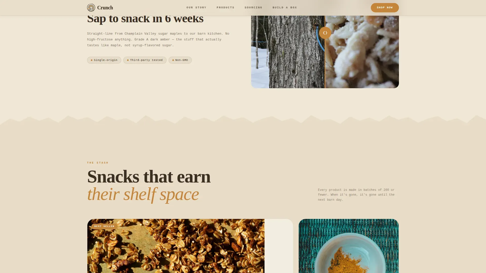
Each product section includes a drag slider that splits the screen between raw ingredients and the finished baked snack. Visitors drag to reveal the transformation: a wooden scoop of whole flax seeds becomes a finished seed cluster, a maple tap becomes a drizzled granola bite. This is the key creative tool that makes the origin-to-mouth narrative tangible. It lets visitors taste with their eyes and builds real trust in the sourcing process.
Bento Flavor Grid with Size Toggle and Add-to-Stash
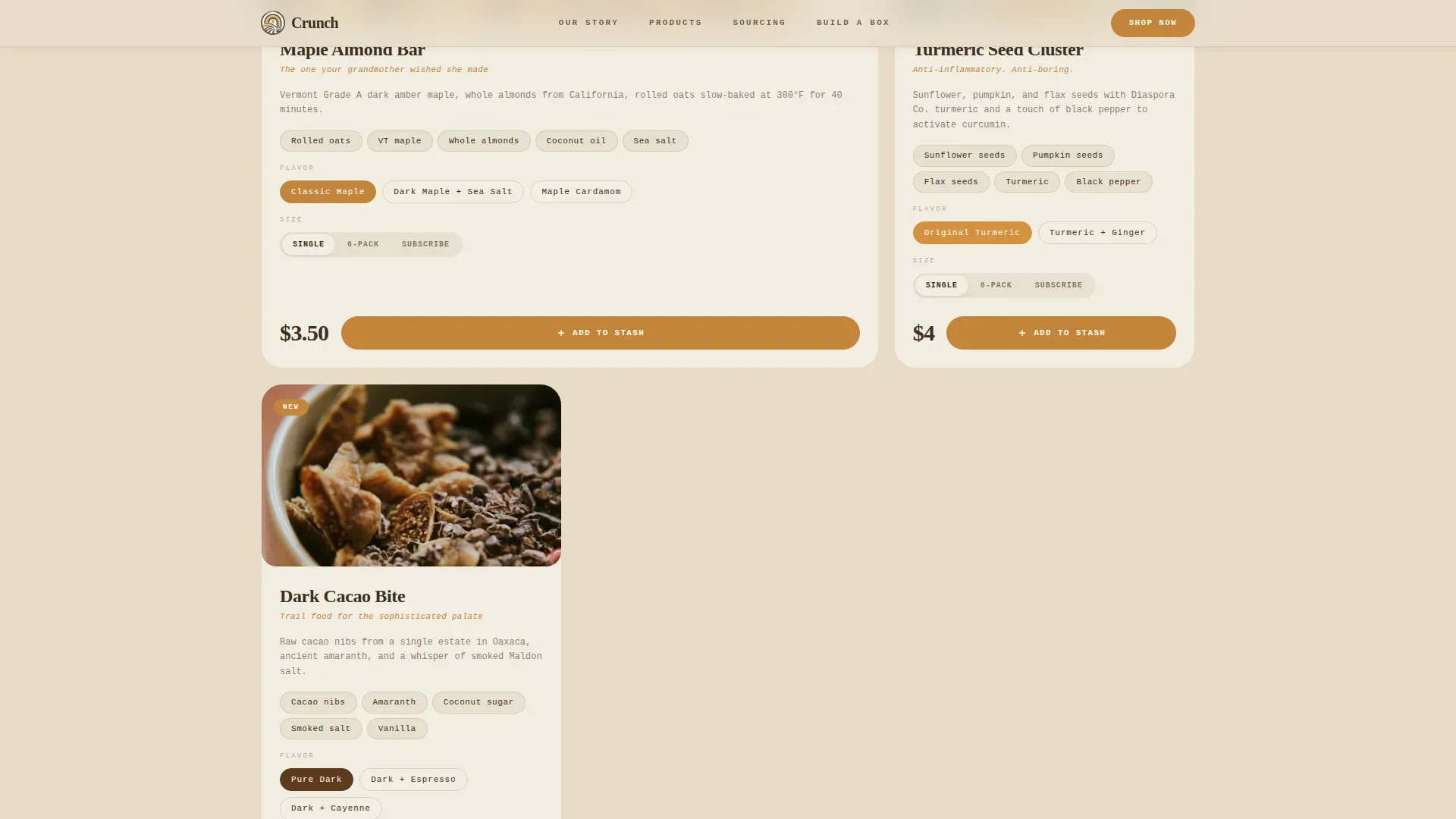
The product section uses a bento-style grid to display each snack flavor with rich product images, short flavor descriptions, and a size selector (single, six-pack, or subscribe). Each card ends with an "Add to Stash" button styled in burnt honey caramel. Visitors can shop multiple snacks without navigating away from the page, making it easy to compare prices, pick options, and fill a cart in one sitting.
Sticky Cart Bar
A persistent bottom bar tracks the visitor's growing selection as they scroll through the landing page. It shows selected snacks and quantities without interrupting the browsing flow. Visitors never have to stop scrolling to check what they have added. This feature is crucial for reducing drop-off between product browsing and final checkout intent.
Named Farm Sourcing Section
The sourcing section names each ingredient origin directly on the page. Single-origin spice farms, Vermont grain suppliers, and regional nut sources are called out clearly. This level of transparency helps the brand stand apart from mass-market competitors and directly addresses the concerns of health-conscious buyers who read every label. It is an honest, specific way to justify premium prices and protect brand trust.
Staggered Testimonials with Customer Context
The reviews section displays testimonials on staggered cards styled in toasted almond shell. Each testimonial includes the customer's context, such as a trail runner referencing a specific flavor, or a parent noting the clean ingredient list. This makes social proof feel like feedback from real people rather than generic five-star ratings. It validates the brand for every core audience segment simultaneously.
Page sections overview
| Section | Purpose |
|---|---|
| Hero collage spread | Immersive brand intro with parallax layers and founder note |
| Origin reveal slider | Interactive before-and-after ingredient transformation display |
| Product flavor grid | Bento layout to shop snacks with size toggle and cart button |
| Sourcing farm callouts | Named ingredient origins to build transparency and trust |
| Customer review cards | Staggered testimonials with audience context and star ratings |
| Footer arc split | Logo, tagline, and navigation links in a clean arc layout |
Design & branding system
The visual identity runs on a Warm Stone color system that feels like a 1970s health-food co-op label redesigned with modern restraint. Every color choice is intentional and consistent across all landing page sections, keeping the brand recognizable at every scroll depth.
- Four core colors anchor the site: sun-bleached oat (#E8DCC8) for backgrounds, toasted almond shell (#A0896C) for secondary containers, burnt honey caramel (#C4853A) for hover states and call-to-action buttons, and deep pantry shadow (#3B2F24) for body text
- Typography pairs a heavy rounded serif for the brand name and headings with a typewriter mono for taglines, creating a Neo-Retro mood that feels handmade yet intentional
- Other design elements like torn kraft-paper textures, off-grid type placement, hand-stamped ingredient illustrations, and Polaroid-style product images reinforce the artisan identity throughout
Mobile & speed optimization
Most visitors browsing snacks will arrive on a phone, especially the label-scanning parent checking options between store aisles and the trail runner ordering before a weekend run. This landing page template is built mobile-first so that every section, image, and interactive element adapts cleanly to smaller screens.
- The hero collage, ingredient sliders, and bento grid all reflow for mobile viewports, keeping the experience visually rich without requiring horizontal scrolling
- Images are structured to support fast loading times, and static landing page sections use server-side rendering while interactive elements like the slider and cart bar load as client components
- The sticky cart bar stays visible on mobile screens so visitors can track their snack selections and move to purchase immediately without hunting for a checkout link
How this template helps you convert
An effective landing page focuses the visitor's attention on one clear direction at a time. This template is structured so that every scroll step builds confidence and reduces friction, moving visitors steadily from curiosity to a committed purchase decision.
- The hero section opens with an above-the-fold value proposition and immersive imagery, immediately capturing interest and setting the brand's story in motion before visitors scroll deeper
- The ingredient sliders and sourcing callouts provide the transparency that health-conscious snack buyers need to feel confident, replacing the in-store label-reading moment with an equally honest digital experience
- Testimonials, star ratings, and named sourcing details act as layered social proof that builds credibility progressively, so by the time visitors reach the "Add to Stash" button or the "Build Your Box" bundle path, they are already convinced
Other information about this template
This template is a strong choice for any food business ready to sell snacks seriously online. It is equally useful as a standalone direct-to-consumer store page or as a campaign-specific landing page that you tailor to a product launch or seasonal promotion. Once built, the landing page template structure can be reused and adapted for future campaigns, saving time and money across your marketing calendar.
- The template supports connections to social media platforms so visitors can share their favorite snack finds with friends or follow the brand for fresh recipe ideas and updates
- The snacks website design approach used here, a single immersive scrolling page with a multi-product store flow, is a proven format in the artisan food market and is a good fit for brands that want to generate traffic from content and convert it immediately on the same page
- The crunch artisan small batch organic snack brand landing page template serves as genuine inspiration for any food business that wants great design, honest storytelling, and a landing page structure that can display the finest ingredients clearly and sell with confidence
Theme
Neo-Retro
Creative direction
Before/After Reveal
Color system
Warm Stone
Style
Full-Width Immersive
Direction
Marketplace/Multi
Page Sections
Collage Hero with Parallax Scrolling
Interactive Ingredient Reveal Slider
Bento Product Grid with Flavor and Size Selector
Sticky Cart Bar for Seamless Checkout Flow
Named Farm Sourcing Section
Staggered Testimonials with Customer Context
Related questions
Can I use this template for multiple snack products?
Does this template work for subscription snack services?
How does the Build Your Box feature work?
Is the color and typography system customizable?
Can this landing page help a food business capture customer contact details?



