Elegant British Kitchen Landing Page Template
Plate is a luxe minimal British cloud kitchen landing page template built for delivery-first food businesses. It pairs a dramatic Citrus Burst colour palette with a modular card grid layout, a Collage/Scrapbook hero, and a booking module that takes visitors from first impression to confirmed order in just a few clicks. Heritage cuisine has never looked this sharp online.
by Rocket studio
Quick summary
Plate is a single-page landing page template designed for a British cloud kitchen brand. It opens with a Collage/Scrapbook hero, moves through modular menu, process, and social proof grids, and closes on a full booking module. The design centres a Citrus Burst palette on a charred black base, making every dish photograph look like it was composed for a gallery wall.
Who this template is for
This kitchen landing page template is built for operators who take their food seriously and want their website to reflect that standard. It works equally well for solo chefs and growing delivery businesses.
- Ghost kitchen and cloud kitchen founders targeting East London delivery zones
- Corporate catering managers building a landing page for office lunch programmes
- Event planners who need a restaurant-quality page to showcase grazing menu offerings to clients
What problem this template solves
Running a cloud kitchen means you compete on screen before you compete on taste. Most delivery-only restaurant brands lose customers because their landing page undersells the food. Plate fixes that gap directly.
- Visitors land on a page that communicates quality instantly, reducing the hesitation that costs orders
- A well-structured menu section helps potential customers understand the full range of offerings without scrolling endlessly
- The booking flow removes friction, so the thing visitors need to do next is always one clear step away
What you get with this template
Plate delivers a ready-to-deploy landing page with every section a cloud kitchen needs to capture leads and convert browsers into paying customers. The layout is modular, meaning each grid block can be adapted to match your specific menu and brand voice.
- A full-page design with six distinct sections: hero, menu grid, process grid, social proof, booking module, and footer
- Flip-card menu components, a Polaroid-style collage header, and a sticky booking bar with a scheduling modal
- Fraunces serif display typography paired with DM Sans body text, set across a four-colour Citrus Burst palette
Feature list
The template's features are purpose-built for a delivery-first restaurant business. Each one serves a clear role in turning page visitors into confirmed bookings.
Collage/Scrapbook Hero Section
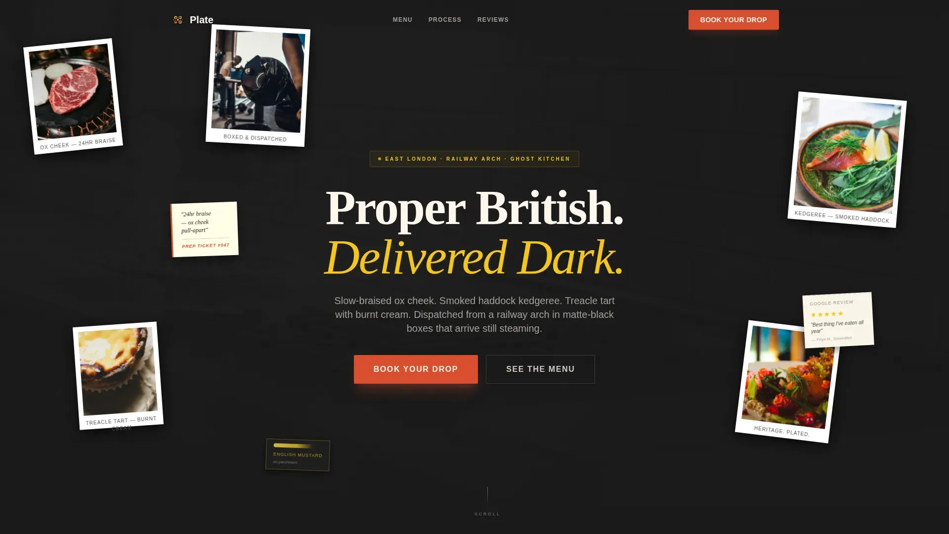
The hero fills the viewport with overlapping Polaroid-style cards scattered at slight angles. Each card shows a different fragment: dish close-ups, a handwritten prep ticket, a torn five-star review, gloved hands packing a box, and a smear of English mustard on parchment. The headline "Proper British. Delivered Dark." is set in a tight high-contrast serif that cuts through the composition. This immersive opening helps showcase the kitchen's personality before a single menu item is read.
Modular Flip-Card Menu Grid
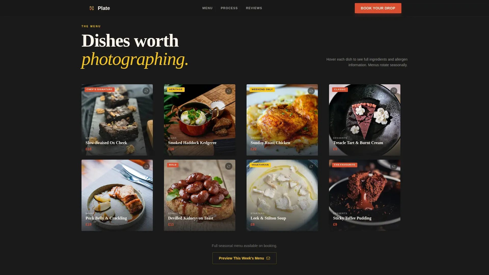
The menu grid displays each dish photographed overhead on dark slate. Cards flip on hover to reveal ingredients and allergens on the reverse face. This design gives visitors detailed information about every dish without cluttering the page. A well-structured menu section like this helps potential customers make confident choices and reduces pre-order uncertainty.
Process Vignette Grid
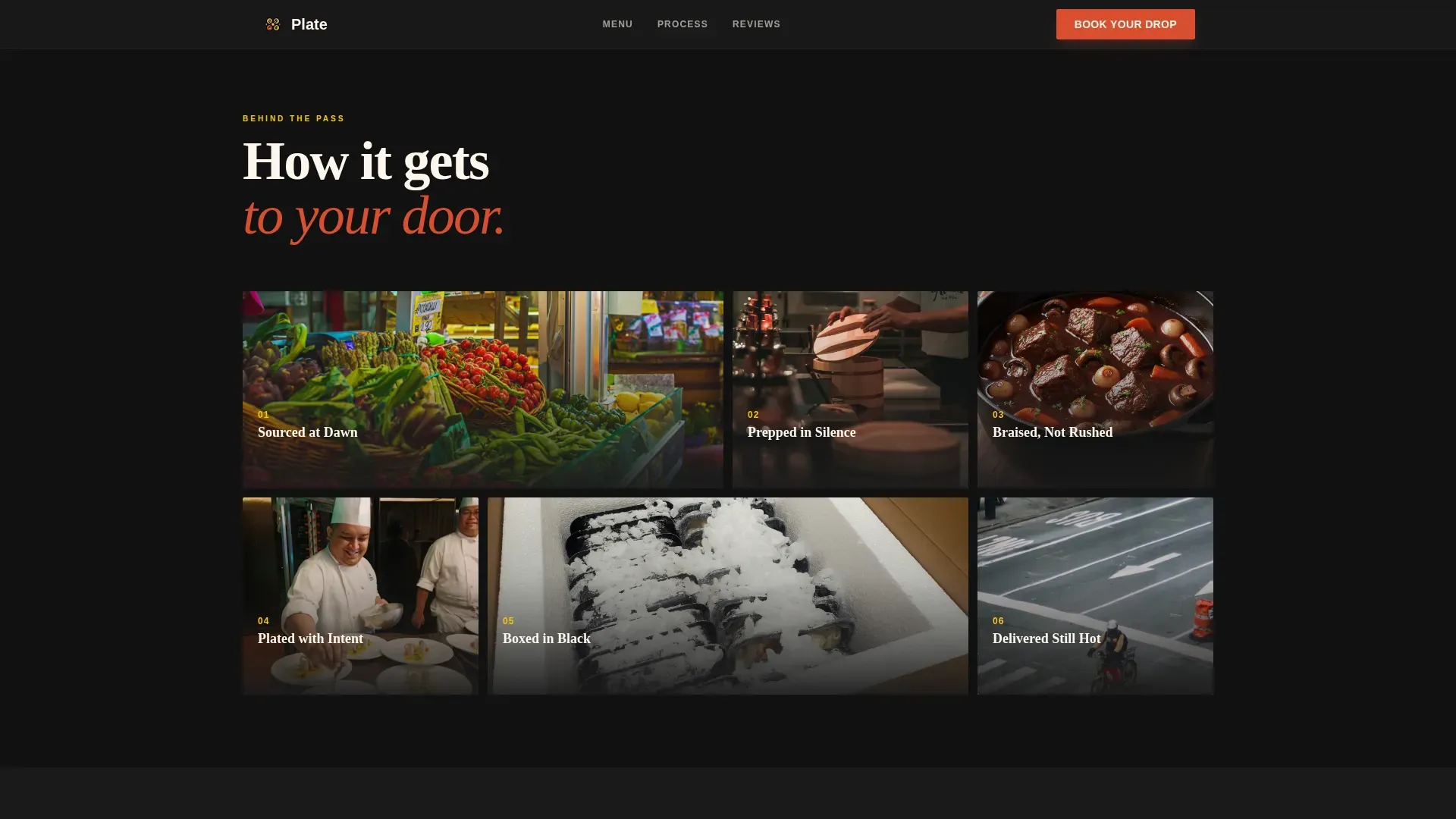
Square vignettes walk visitors through the kitchen's sourcing, prepping, plating, and packing steps in a style that feels like a chef's social story feed. This section builds trust by showing the work behind each delivery. High-quality, professional photography here showcases food as art, highlighting textures and the care taken at every stage.
Social Proof Card Grid
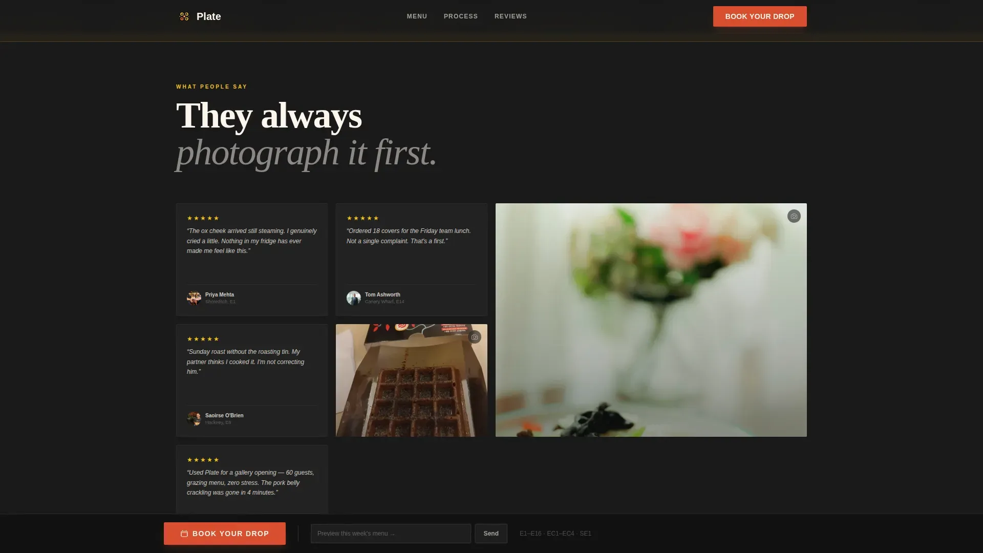
Mixed customer photos, star ratings, and short quotes are displayed together in a dense card grid. The rhythm accelerates as visitors scroll, pulling the eye toward the booking area. Including testimonials from satisfied customers in this format helps build trust and credibility with new visitors who are evaluating the service for the first time.
Sticky Booking Bar and Scheduling Modal
A blood orange sticky bar anchors to the bottom of the page after the menu grid scrolls into view. Clicking the primary call to action opens a scheduling modal with a date picker, a headcount slider from one to fifty, a menu preference toggle for Classic, Seasonal, or Chef's Choice, and a delivery postcode field. This flow lets corporate guests and private customers complete a booking in just a few clicks.
Email Capture Lead Path
A secondary path lets visitors who are not yet ready to book preview the current week's menu via email capture. This keeps the page active for warm leads at every stage of the decision process and helps the business promote offerings to a growing subscriber list.
Page sections overview
| Section | Purpose |
|---|---|
| Polaroid Collage Hero | Establish brand identity and mood with the "Proper British. Delivered Dark." headline |
| Flip-Card Menu Grid | Showcase dish photography and reveal ingredients and allergens on hover |
| Process Vignette Grid | Build credibility by showing sourcing, prep, plating, and packing steps |
| Social Proof Grid | Display customer photos, star ratings, and quote cards to build trust |
| Sticky Booking Bar | Surface the primary call to action after the menu section scrolls past |
| Booking Scheduling Modal | Capture date, headcount, menu preferences, and postcode to confirm a drop |
| Footer | Horizontal flow layout with key links and brand logo |
Design & branding system
The design language is Luxe Minimal: maximum contrast, deliberate whitespace, and a colour system that feels like a strip of lemon zest on a dark slate plate. Every element is chosen to reflect the brand's premium positioning without feeling loud or chaotic.
- Charred black (#1A1A1A) forms the dominant background; cream (#FDF6EC) covers card faces and body text to create calm, readable contrast
- Yuzu yellow (#F5C518) drives hover states and highlight moments; blood orange (#D94F30) is reserved for the call to action buttons and pricing accents so they stay visually dominant
- The catering logo placement and brand typography use Fraunces for display headings and DM Sans for body copy, a pairing that reflects both elegance and readability
Mobile & speed optimization
Most delivery orders are placed on smartphones, so the template is built desktop-first with full mobile responsiveness carried through every section. The card grids reflow cleanly, the sticky booking bar remains accessible on small screens, and the scheduling modal is touch-friendly.
- Navigation uses a simplified hidden hamburger menu to keep the mobile screen uncluttered and focused on the menu and booking flow
- High-resolution food photos are sized and positioned to load with impact on every screen width, ensuring the visual quality that builds appetite and trust is never compromised
- Server-side components handle static sections while client-side rendering is scoped to the interactive booking modal and flip cards, keeping the page responsive under real-world delivery traffic
How this template helps you convert
A restaurant landing page should do one thing well: turn curious visitors into customers. Plate is structured to do exactly that, with each section applying a specific conversion principle.
- The immersive hero establishes instant brand credibility, so visitors know within seconds they have found a premium cloud kitchen service worth exploring
- The menu grid with flip cards gives potential customers the detailed information and visual quality they need to feel confident before committing to a booking
- The sticky booking bar keeps the primary call to action visible at all times, so there is never a moment of waiting or searching for how to place an order
Other information about this template
Plate is ready to customize using intuitive editing tools, making it suitable for cloud kitchen operators who want to start designing without writing a line of code. No-code landing page builders allow users to create and adapt pages quickly from pre-designed templates, and Plate is structured to work within that workflow. You can select your own logo, update menu items, adjust the colour code values, and promote your specific offerings without rebuilding the layout from scratch.
- The template is ideal for operators who want to optimize their online presence and build trust with a new customer base in a competitive delivery market
- Analytics tools, including Google Analytics, can be connected to track page performance metrics once the site is live, helping the business focus on what converts
- The design is perfect for businesses that need to showcase a variety of cuisine styles, from classic British comfort dishes to seasonal chef specials, all within a single page structure
- Operators can download the template and start designing immediately, with the full design ready to match their brand identity from day one
- The page can also protect a lead pipeline by capturing email addresses through the menu preview path, keeping the company's subscriber list active even when visitors are not ready to book
Theme
Luxe Minimal
Creative direction
Immersive Visual
Color system
Citrus Burst
Style
Card Grid (Modular)
Direction
Booking/Scheduling
Page Sections
Collage/scrapbook Hero with High-contrast Headline
Flip-card Menu Grid with Allergen Reveal
Process Vignette Grid
Social Proof Card Grid
Sticky Booking Bar and Scheduling Modal
Email Capture Lead Path
Related questions
Can I adapt this template for a different cuisine or kitchen concept?
Does the booking modal support large corporate orders?
How does the email capture lead path work?
Is the template suitable for operators without coding experience?
What social proof elements does the template include?



